Hamburger Menu, Mobile Hamburger Menu is a navigation button (Navigation Bar) that has lived to see many variations.
Almost all of them have something to do with cooking, food, or fast food. Why? We are not entirely sure.
What do we know, then? Quite a lot. For example, that...
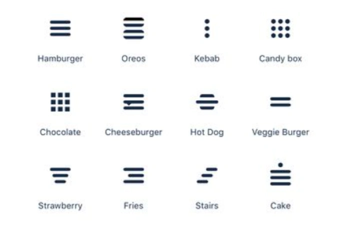
The humorous hamburger menu icon has already taken several shapes, including:
- Kebabs in two variants (Doner Menu and Kebab Menu)
- Meatballs (Meatballs Menu)
- Japanese lunch box (Bento Menu)
- Hot dog (Hot-dog Menu)
- Fries (Fries Menu)
- Strawberries (Strawberry Menu)
- Stairs (Stairs Menu)
- Veggie burger (Veggie Menu)
- Oreo cookies (Oreo Menu)
- Cake (Cake Menu).
Of course, we can joke about the menu icons themselves and the associations aroused by them, but the matter is serious.
As it usually is when it comes to UI/UX Design issues and offering the usability desired by users.
The Hamburger Menu has become so popular that you will find it on desktop websites, mobile websites, mobile apps, utility software, games, and virtually any digital product.
Why is the Hamburger Menu so popular? Why is it worth offering it?
In what situations will the Hamburger Menu work, and in which will it likely cause serious usability problems?
How to design a Hamburger Menu?
The problem, announced in the above questions, may seem imaginary or artificial.
How can this ubiquitous icon, these three horizontal lines, bars be problematic? And speaking of which, what is even to design here? There is nothing special about it. It should be as clear as day, right? Well... Yes and no.
In this article, we will take a look at all the major design problems related to positive User Experience, which are triggered by the keyword: Hamburger Menu.
Are you hungry for knowledge? If so, enjoy our quarter pounder with cheese!
What is a Hamburger Menu?
The name suggests the appearance of the hamburger menu.
In its basic version, the hamburger menu is nothing more than a triple-line, flat, geometric (usually contained on a rectangular plan) icon (Hamburger Button).
Simply put, it consists of three stripes, similar to the Adidas logo, but they are horizontal.
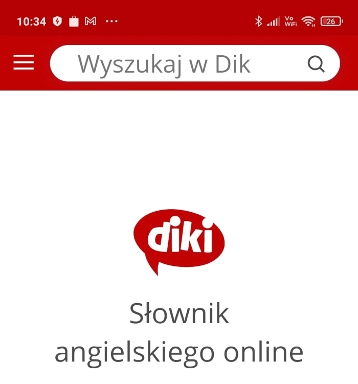
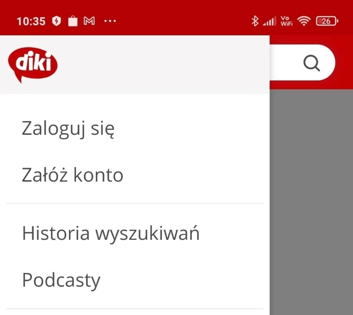
It is usually offered in the upper corners of a website or application screen — either the top right corner or the top left corner.
Looking at the hamburger menu, you might think that this popular icon is a child of the mobile era and was created for mobile applications. Nothing could be further from the truth. The hamburger menu is much older — it was created in 1981 by Norman Cox.
It was first used in the Xerox Star 8010 personal computer, which was a breakthrough in technology, information technology, and design.
On this same computer, the graphical user interface was first used. It was based on windows, icons, and folders, which eventually became the standard.
The hamburger menu used in the Xerox Star 8010 was not so much an expression of creativity, of its designer's love of minimalism, but of a certain necessity.
The hamburger menu, just like today, was used to:
- Economize operations
- Save space
- Compress access.
The Hamburger menu is an icon that allows you to store navigational buttons. What is the purpose of hiding them?
The major advantages of using the hamburger menu include the following:
- Saving space on the page or tab
- Clarity of design
- Easy access to all core features in one place
- The possibility of establishing a clearer visual hierarchy of the categories offered in the menu
- Efficiency (especially in the mobile channel, where space, size, proportion, and light are scarce "commodities")
- The ability to direct navigation.
In addition, the hamburger icon is readable, understandable, functional, and compact. For many, it is also elegant in its simplicity and utility.
You can also use the hamburger menu as a menu in which functions and links of secondary importance to the user are stored.
Functions that are necessary but not of high priority. Those whose frequency of use is small.
No single and universally understood convention has formed that would regulate for what purposes the hamburger menu should be used. There is no convention that would regulate the contents of the hamburger menu.
You can find in it high-priority links and those of lesser importance to the user of the website or mobile application.
In this regard, there is a lot of freedom. There is also no indication that such a convention — widely accepted and, most importantly, implemented — will appear anytime soon.
Hence, choosing the contents of a hamburger menu is always a matter of knowing users' preferences, habits, and expectations. No definite, arbitrary design patterns exist.
Cost of interaction, shortening the access path, and paying attention to performance should be the primary criteria you should consider when deciding on a menu of this kind and establishing its content.
However, you should remember that...
The cost of interaction with a hamburger menu is always a bit higher because it requires an additional click or tap (which on mobile devices is always connected with a greater risk of error).
Hamburger menus also require scrolling, dragging, stretching, or zooming in.
The cost of interaction, while often underestimated as a variable affecting usability, has significance.
The use of a hamburger menu is always related to discovering, searching, and exploring. The result of these activities almost always comes with some risk of frustration, confusion, and resignation.
Although on the other hand, the prevalence of this type of menu makes users (desktop and mobile) quite familiar with it.
The hamburger menu has a high level of recognition and is quite understandable to most users (even those with minimal experience and competencies).
You should also remember that the effectiveness, efficiency, and justification for using the hamburger menu are very individualized.
In one case, it may be a questionable solution; in another, it may even be salvation.
As almost always in UX, in usability issues, everything has its pros and cons. It also raises the typical questions.
For example: Is the hamburger menu a solution that is always desirable, devoid of inherent drawbacks? Is it always a solution dedicated to mobile devices and mobile applications?
These are perfectly valid questions. While its application may seem evident from the above description, the hamburger menu raises several design dilemmas.
Similar to Flat Design, which we recently wrote about, it always requires activating critical or at least problematic thinking.
It requires a comparison of potential benefits, profits, costs, and risks.
Additional advantages of the Hamburger Menu
Recognition and readability are obviously significant gains that we will receive by choosing this type of menu.
But you should keep in mind that the complexity of the interface, the excessive number of options, the extensive menu categories, and the complexity of navigation are all related to the problem of speed of decision-making.
Decision paralysis does not only apply to commercial situations but also to those involving the selection of menu options.
This problem will be even more intense in websites with complex, extensive applications containing multi-level categories and subcategories.
The hamburger menu takes control of this multiplicity and transforms it into a structure that is much more organized, clear, understandable, and easy to use.
Moreover, the hamburger menu is a kind of list, and people like to structure reality with the help of lists.
Lists increase the sense of security, guide ways of thinking, indicate ranges, and are easier to read. In the selection process, they are priceless.
Of course, nothing is so simple, unambiguous, obvious, and doubtless. So it is time to take a slightly more critical look at this solution.
Limitations of the Hamburger Menu
The most common argument against this type of menu is the argument about unconsciously reducing the content of the menu.
This argument is based on the simple belief that what is directly accessible must have a higher priority, rank, importance, and value than what is hidden and tucked away.
Culturally (not necessarily functionally or practically), everything that is handy is always associated with something more significant. Is it true?
Yes, and no. Let's take the contents of a bank safe as an example. The value comes not from accessibility, directness, or packaging but from whatever is inside.
That is why...
The ordering method should be based on the importance assigned by users rather than that derived from abstract, culturally established values.
Which, after all, are not always common and, even more often, do not always determine anything.
The more this argument is questionable, the more it is undermined by experience. And this suggests to users that sometimes things can look different.
There are websites, and mobile apps, where indeed, in the hamburger menu, you can find links of lesser importance. There are also those where you can find key functionalities.
Far more important than the content is the location of the hamburger menu. It can be harder to find when offered in the upper left corner.
A more common practice is to offer a hamburger menu in the upper right corner.
The problem is real, as demonstrated by the findings of researchers from the Nielsen Norman Group, published in the article "Hamburger Menus and Hidden Navigation Hurt UX Metrics."
But the problem is also complex, as shown by the results presented in this article.
According to them, there are significant differences in experience and problems with usability when the hamburger menu is offered on the desktop and mobile channels.
We can summarize them as follows:
- Mobile users use navigation much more often than desktop users
- The hamburger menu probably limits content discoverability on computers more than on mobile devices
- The need to reach functionalities generates a higher probability of error on a desktop computer than on a mobile phone
- There are apparent differences in how desktop and mobile devices are used. In the desktop channel, users are much more likely to use an internal search engine when they do not have direct access to functionality
- The desktop channel is traditionally faster in terms of the time required to complete a task, which does not necessarily disqualify the use of a hamburger menu.
If we aggregate all the objections raised against the hamburger menu, we can say that, to some extent, it is characterized by the following:
- Lower significance, importance
- Lower recognition and discoverability (directly proportional to the size and position of the menu icon and the color contrast it has with the background)
- Low Information Scent — the generic, universal nature of the hamburger menu icon does not suggest its specific content
- Higher workload of using this type of menu
- Lack of clear standardization and conventionalization of the content.
From the above, you can conclude that the hamburger menu is much more natural and desirable for mobile apps and devices and much more problematic for desktop devices.

Thus, the way navigation is offered should be adjusted by taking into account the following criteria:
- The complexity of categories and subcategories (number of navigation links)
- The channel in which the menu will be offered
- The layout of a website and/or mobile application
- Number of interface elements
- Size of elements, proportions, and color contrasts — in other words, the functional and visual context in which text links and icons (including the hamburger menu icon) will compete for the user's attention
- Priority tasks and goals that the user wants to achieve first
- The difficulty of tasks — number of steps required, cognitive load, and cost of interaction
- The context in which the task will typically be performed.
Best alternatives for Hamburger Menu
Of course, the use of a hamburger menu may not suit you, especially if you want to design for the mobile channel. There are some alternatives that you can use, so without further introduction, here are some hamburger menu examples that can better suit your needs.
Floating Hamburger Menu
The Floating Menu is a type of navigation drawer that allows you to save more space on the mobile screen; it's also more prominent, although that doesn't necessarily mean that it will be more discoverable compared to the main navigation. If you locate it in the right place, users can reach it more easily, improving the mobile user experience. However, keep in mind that the options contained within will still be hidden and require a tap/click.
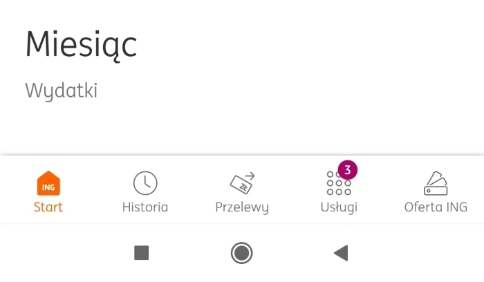
Bottom Tabbed Menu
Bottom Tabbed Menus are located at the bottom of a screen and are eagerly used by developers of mobile applications. Thanks to them, users can quickly find out what options are available to them. It increases the users' engagement and gives them complete access to the app's features. Moreover, they can easily track their location throughout the app.
The downside of this solution is that the number of options you can put at the bottom of the screen is limited due to the small horizontal space, and it also requires designing additional menu icons.
Sliding Top Tab Menu
A Sliding Top Tab Menu is a great solution if you want to include more than 4-5 menu items. A great example of such a menu is YouTube. YouTube recognized that the traditional hamburger menu doesn't suit its needs, so it replaced the "burger menu" with a menu thanks to which users can slide between categories.
However, because this type of menu is located on top of a screen and needs scrolling, it requires users to put in a little more effort and lowers the accessibility of the menu.
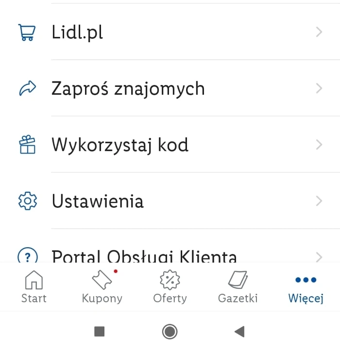
Tab Bar with a "More" option
This type of menu is very similar to the Bottom Tabbed Menu. The difference is that it adds the "More" option that expands the number of additional menu items that are less important. So when designing it, you should pay particular attention to prioritization and decide which one will occupy the first four places since the fifth one will be taken by the "More" button.
Progressively Collapsing Menu
The Progressively Collapsing Menu is an ideal solution for most devices since it has the ability to adapt to various screen sizes. This type of menu consists of many categories and the "more" button, which hides less essential options. Thanks to this solution, depending on what kind of device the user is using, they will see different amounts of options without losing precious screen space.
Full-Screen Navigation
Full-Screen navigation, as the name suggests, takes up the whole screen, and it's usually located on the main page/home page. It allows users to quickly and easily navigate and see all or most menu items, facilitating search. Thus, it is a great alternative to the hamburger menu if you're not worried about losing space.
Drop-down Menu
Drop-down menus are great if your main category or categories can hide similar ones within themselves, which means that you have one main heading, which, after clicking/tapping on it, reveals other options related to the main category. For example, you see a "Country" heading, and after clicking on it, the list displays Poland, USA, Germany, etc.
As you can see, there are some hamburger menu alternatives that can help you manage better the screen real estate and improve user experience. You can also read more about them in the following articles "The designer's guide to hamburger menus (& best alternatives)" and "TOP 6 Hamburger Menu Alternatives 2023."
Methods for optimizing Hamburger Menus
"It all depends." States the popular answer to the question of how to solve a given usability problem.
Individualizing problems, seeking solutions based on UX research, and learning about preferences, expectations, and usability problems will provide knowledge and data that will become a design guide.
Optimization recommendations serve as a model, not a universal remedy, for every website or mobile app.
They should not be implemented comprehensively but selectively — tailored to the needs and problems diagnosed in UX research.
Finding answers to the following questions helps optimize the hamburger menu:
- What are the user's goals, preferences, and experiences?
- What feature of the menu is most important to the user?
- What competencies and capabilities does the user have? (e.g., age is a variable that strongly differentiates users, and the manual dexterity of seniors is a flagship example of a variable that affects the choice of menu type)
- Which features should be offered directly, and which ones may require more effort to access?
- To what extent is the menu content in a particular industry, type of website, or mobile application standardized or conventionalized? In other words, to what extent will the hamburger menu content be a surprise to the user?
- To what extent is the hamburger menu icon familiar and understandable to the user?
- What is the preferred size of the hamburger menu icon in relation to the screen size, the type of device, and the complexity of the website layout or application screen?
- What level of category complexity in the menu is challenging for the user? (As a standard, it is recommended not to use a hamburger menu if the menu structure consists of up to 4 items).
Using the hamburger menu should also come from the:
- Number of navigation elements
- Method of categorizing navigation elements
- Location of the different groups of items (e.g., main menu, top menu, side menu, bottom menu)
- Approach to grouping — some users like to have essential links grouped and contained in a separate place.
In the process of optimizing the hamburger menu, you should also ensure the following:
- An appropriate size of the menu icon
- An Appropriate color scheme of the menu icon — especially the color contrast, which allows users to find it more easily in the structure of the website or mobile application
- A proper form of the icon — its typicality and relevance to the style of the site or application
- Attractiveness — you can make the hamburger menu icon more attractive with animations and micro-interactions
- Proper size and contrast of items offered in the hamburger menu
- Appropriate location of the menu elements in one column, according to a clear, understandable for the user order and importance
- Proper location of the icon — the upper right corner of the page, application tab is recommended
- Adherence to the standards established in the Human Interface Guidelines and Material Design
- Onboarding, in which the hamburger menu should be presented in terms of its accessibility, content, and logic behind it.
How to design a Hamburger Menu? Summary
- The hamburger menu is a navigation button that has lived to see many variations — for example, Doner Menu, Meatballs Menu, Bento Menu, Hot-dog Menu, or Fries Menu.
- The illustrative names do not suggest its specific content. They are just a humorous, industry-specific way of labeling different graphic variants.
- Graphically and aesthetically, the hamburger menu is a flat and geometric icon consisting of three lines.
- The hamburger menu was created in 1981 and has gained importance and popularity again with the era of mobile apps.
- The hamburger menu is primarily used to save space and compress access.
- The main advantages of the hamburger menu are space-saving, clarity of design, accessibility to essential elements in one place, and the ability to direct navigation.
- Choosing the contents of the hamburger menu is always a matter of knowing users' preferences, habits, and expectations.
- Categorical, arbitrary patterns and design recommendations do not exist.
- The use of the hamburger menu is always related to discovering, searching, and exploring. The result of these activities almost always comes with some risk of frustration, confusion, and resignation.
- The hamburger menu allows you to control the structure and offer it in a much more organized, clear, understandable, and easy-to-use form.
- Far more important than the content of the hamburger menu is its location.
- A more common practice is to offer the hamburger menu in the upper right corner.
- There are significant differences in experience and usability problems when the hamburger menu is offered on the desktop and mobile channels.
- The hamburger menu is much more natural and desirable for mobile apps and devices and much more problematic for desktop devices.
- Optimization recommendations serve as a model, not as a universal remedy for every website or mobile app.