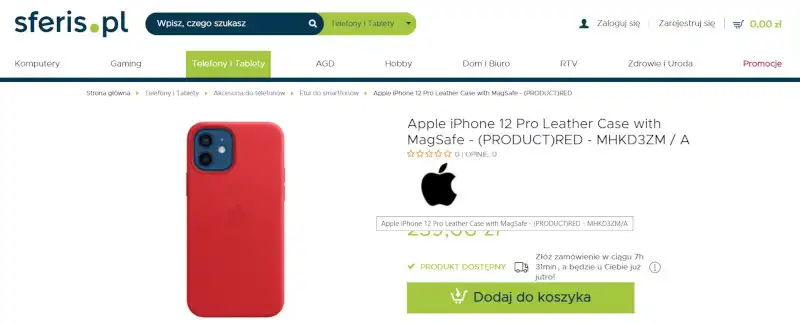
E-Commerce navigation on a Product Page includes all the interactive elements with which the store's customer can interact. Buttons, forms, galleries, and sliders are some of its most common parts.
What role does Navigation play? Well... We're in the center of an online store. The Product Page. This is where the most important decision is made. Here the most crucial dilemma is resolved: to buy or not to buy?
The more optimized the Product Card is, the easier it is to make a decision and resolve the dilemma in favor of the store. In modern E-Commerce, "how we buy" is as important as "for how much we buy" and on what terms.
Optimization of the Product Page, Product Card, in particular, concerns Navigation. The more optimized it is, the better it performs its sales and image function. The better User Experience it can provide to the store user.
The UX of an online store determines sales to a much greater extent than any other factor.
Today we'll look at this very problem.
What is Navigation?
As we said, Navigation in an online store is nothing more than all the site elements with which its user can interact. For this reason, it's one of the most important sources of problems that must be solved when designing an online store.
The Product Page of the online store is designed to:
- provide the information necessary to make a purchasing decision
- engage in the purchase process and strengthen the need to buy
- guide and give a user a simple, intuitive way to make a purchase.
Only with adequately optimized Navigation is the Product Page able to convert a user into a customer, a product buyer. With that said, not every element of navigation is equally important.
Vitaly Friedman, in an article, "Website Navigation - Planning And Implementing," distinguishes the two most basic types of Navigation:
- Primary Navigation
- Secondary Navigation.
Primary navigation in an online store consists of the most popular elements used more frequently by the majority of the store's customers.
Their role is to allow users to perform actions and achieve goals. Of course, in the case of an online store, these are sales and acquaintance with the offer.
Secondary Navigation, however, includes elements that are used less frequently by fewer users. At the same time, we shouldn’t ignore their lower usability. Even if users don't use them frequently (e.g., the About Us, F.A.Q. subpages), that doesn't mean they don't expect them to be in the store.
Another generic division is that of:
- scrolling navigation
- clickable navigation.
Considering the UX of an online store, the cost of interaction and the need to scroll through the Product Page and click to get the necessary information should be as low as possible.
In terms of the visual aspect, we can also distinguish a:
- icon-based navigation (e.g., a magnifying glass icon used to indicate a search engine)
- symbol-based navigation (e.g., the heart symbol used for Wishlists)
- text-based navigation (e.g., text link)
- graphic-based navigation (e.g., buttons, linked images).
The menu is perhaps the element most associated with (but not limited to) Navigation. Usually, we'll find it at the top of the page, in the central part of it, or on the left side.
The menu organizes the structure of the website's content, establishes a hierarchy of importance, and provides access to important parts of the store.
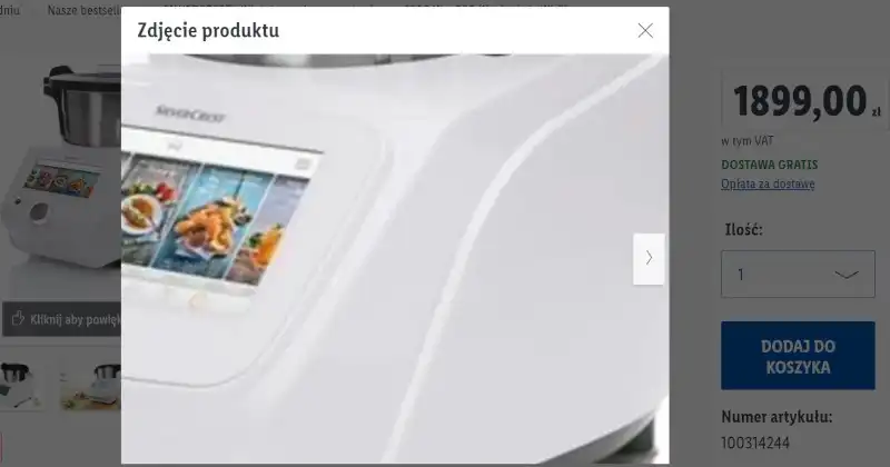
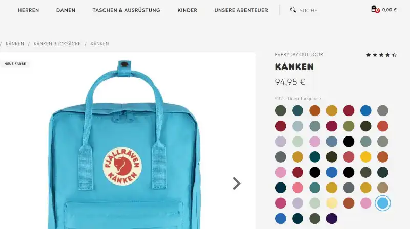
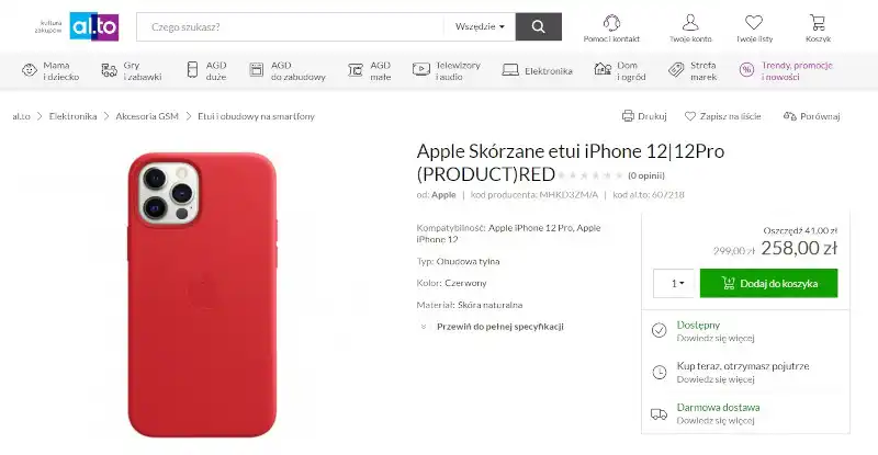
For instance, it allows users to reach the Product Card.
The location and the type of menu are a matter of:
- dominant design conventions to which customers are used to
- user's expectations of a particular store
- goals the users want to achieve
- the UX we want to provide them.
The Design of Navigation should also come from understanding customer needs, which is best learned through UX Research. We strongly discourage you from automatically imitating patterns that dominate the market.
When designing Navigation throughout the store, especially on the Product Page, there are several issues to keep in mind. The Product Page should provide a clear answer to them.
First and foremost, we should consider the following:
- the consistency of navigation
- its logic
- the hierarchy of importance
- the availability of functional elements
- the transparency and visual legibility of Navigation elements of online stores
- the clarity and comprehensibility of labels used to mark elements
- the recognizability of icons, symbols, signs
- the location and spatial dependency of the elements (e.g., size, distance, color).
The most general problem concerns the information, clues, and impulses necessary to make a purchasing decision, which the Product Page should provide.
The most crucial question the Product Card should answer is how easy it is to add the product to the shopping cart and proceed to checkout.
The Impact of Navigation on Product Page Usability
One of the methods of determining the usability of a Product Page is a UX audit. A popular method of diagnosis is heuristic analysis.
We've already written about Jakob Nielsen's Usability Heuristics and Shneiderman's Eight Golden Rules. Today we'll write about the usability heuristics contained in the ISO/IEC 9041-1: 1997 standard.
The heuristics contained within are a set of 7 diagnostic questions, identifying:
- Suitability for the task
- Self-Descriptiveness
- Conformity with user expectations
- Suitability for learning
- Controllability
- Error tolerance
- Suitability for individualization.
The Product Page should therefore be designed so that its user primarily focuses on completing the task (buying the product).
Navigation should be as transparent as possible. It shouldn't draw attention because of its appearance and the way it works.
The Product Card should also suggest what the user can do, how to do it, with what buttons, and with what result. The location of the elements should be evident to the store's customers. So should the actions that they can perform on it.
The Product Page should be in line with expectations, standards, conventions, and design trends for this to happen. Of course, it isn't about automatic imitation but matching patterns and solutions to customers' needs. We should discover the needs through research.
Thanks to such optimization efforts, the Product Page becomes predictable, understandable, and, most importantly, easy to use.
From the point of view of sales effectiveness and supporting purchasing decisions, it's also vital to tolerate user errors (e.g., regarding the choice of size or quantity of products).
Even more importantly, the Product Page should offer the ability to tailor the information, the way it is presented, to the customer's capabilities and needs.
Petter Silfver, in an article, "The Elements Of Navigation + 6 Design Guidelines," has collected and formulated 6 very useful design recommendations worth following when designing Navigation on a Product Page. They refer to the linguistic layer, which also shouldn't be ignored.
The Navigation should, above all, be:
- simple
- clear
- it should avoid redundancy
- it should be mindful of the context
- it should be aware of word-icon correlations (labels/icons)
- it should pay attention to the tone of the message (regarding color, typography, and graphic forms).
Petter Silfver suggests avoiding jargon labels that operate with technical terms. A language familiar to the user is recommended the most. Transparency should be understood as a form of communication that is unambiguous, concrete, and direct. In other words, the language used must not be ambiguous or incomprehensible.
Labels should be as concise and communicative as possible. It's also worth considering whether they indicate a particular scope or category unambiguously. They should allow users to distinguish levels, locations, functions, and tasks seamlessly.
The last three characteristics are particularly significant, as they indicate the environment in which a label will operate. It's worth being mindful of what message is created by combining labels with icons and the context in which users will view it.
We should also remember that the color scheme and typography affect how the label is perceived and interpreted. And this can encourage or discourage users from interacting with it.
The most common problems in designing a Product Page Navigation
One of the common shortcomings of Product Pages is the randomness of navigation elements.
They often resemble a scattered jigsaw puzzle rather than an ordered, logical tool with a hierarchy of importance.
It's important to note that elements ordered by hierarchy:
- are a legible signpost
- provide better orientation in the page structure
- point to collections and their scopes
- meet the natural need to categorize
- provide better User Flow and User Experience
- are perceived as natural, logical, sensible, and convenient.
Other common faults found on Product Pages are the location and functionality of the menus. This is particularly true of drop-down menus, which are sometimes located against prevailing conventions. It's often not sufficiently distinguished in terms of graphics and color.
It's worth remembering that interaction costs are significantly higher in such situations. A store that introduces unpopular solutions has to account for the fact that customers will have to learn them. And they rarely want to do that.
Even the most impressive solutions are perceived as an obstacle, a hindrance, rather than something received with joy and gratitude.
A common problem with navigation on Product Pages is an overabundance of interactive elements. It would seem that quantity is turning into quality in this case. But that's not what happens. Instead, we're faced with a kind of "paradox of plenty" that results in a customer having too many options and simply beginning to avoid choosing. This happens for several reasons.
An excess of stimuli, opportunities, information, and choices:
- requires more mental energy, work, time, and involvement of cache memory
- creates more doubts
- generates more risk
- it requires a more extensive competence to operate the Navigation
- unnecessarily complicates the path to the destination
- it forces users to experiment, which they don't usually like to do.
That said, it's worth remembering that the mythical Three-click rule is not always the best model either. Researchers from the Nielsen Norman Group remind us about it in an article, "The 3-Click Rule for Navigation Is False."
The article's author, Page Laubheimer, points out that the number of clicks isn't a meaningful indicator in every case.
This is because it completely ignores the following:
- the complexity of a task
- the importance of a task (established by a customer)
- the response time of a page to a click (it can vary).
Excessive focus on the number of clicks makes us overlook other elements that also affect the page's usability.
Rather than counting clicks, Page Laubheimer suggests avoiding multi-level drop-down menus in the first place.
He advises identifying, and refining, from a navigational perspective, the essential tasks users will want to perform in the store.
It's also worthwhile, regarding the mistakes made during the design of the Product Page Navigation, to keep in mind the observation made in the article "The Difference Between Information Architecture (IA) and Navigation."
When creating navigational elements, we should:
- determine the importance and function of an element from the user's perspective
- define the change that its use causes
- indicate the location of an element in terms of its importance and popularity of use
- select a design pattern that ensures the most effective Findability (intentional and purposeful placement) and Discoverability (accidental placement) of elements.
Other recommended design patterns
One of the most common recommendations in various studies and reports (e.g., Product Page Usability, Ecommerce User Experience Vol. 03: Product Pages) is the consistent use of links to a top-level page on Product Pages.
The easiest, most effective, and most popular method is the use of Breadcrumbs.
Easy access to category pages and sub-categories from the Product Card level simply makes the process of comparing products easier.
However, we must remember to place Crumbs in their standard location - at the top of the page, under the main navigation bar.
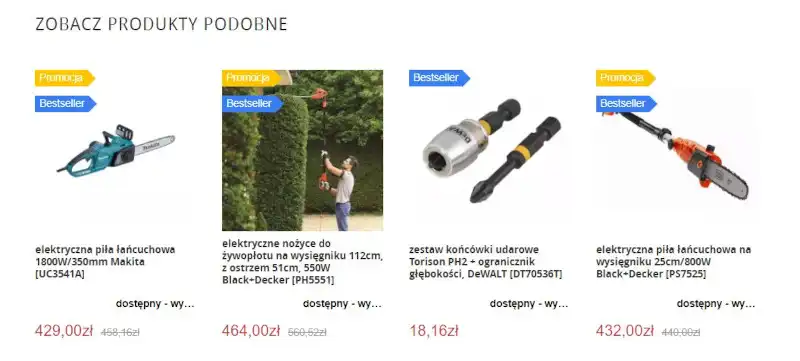
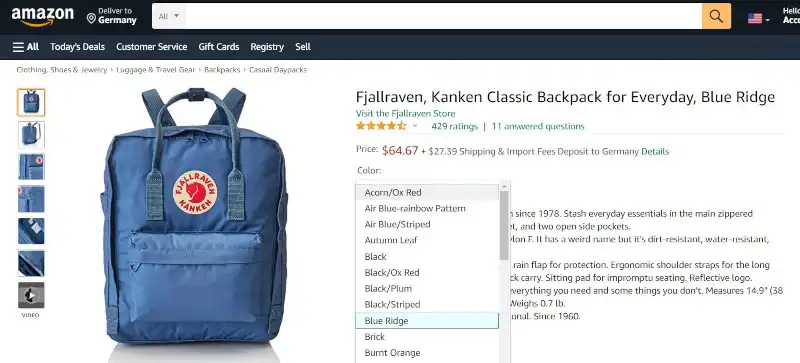
The Product Page standard should also include offering related products. With that said, their pairing must be understandable, logical, and reasonable to the user. Product bundling should be done based on the following:
- reasonable similarity and slight difference
- enhancing, expanding, and complementing functions (e.g., Wi-Fi signal booster)
- compatibility
- completeness of a set
- relative necessity of additional product (e.g., drill and drill bits)
- reminders (e.g., recently viewed products)
- popularity (e.g.,bestsellers).
The presentation of additional purchasing options should be optimal in quantity and discretion.
Navigation on a Product Page. Summary
- Navigation on the Product Page includes all the interactive elements with which the store's user can interact.
- The purchase decision is often made on the Product Pages of online stores, and Navigation contributes significantly to this decision.
- In E-Commerce, the way of buying is just as important as the price and terms of sale.
- The optimization of the Product Page should address Navigation in particular.
- The optimized Product Page Navigation better performs its sale and image function.
- Navigation is also responsible for User Experience.
- The most important element associated with Navigation is the menu.
- The method of organizing Navigation should be based on research (UX Research).
- We can determine the usability of a Product Page most effectively with the help of a UX audit, a heuristic analysis.
- The Product Page should be used mainly to complete a task - purchase a product.
- Navigation should be as transparent as possible.
- The Product Page should offer the ability to tailor the information, the way it is presented, to the customer's capabilities and needs.
- Navigation on the Product Page should also be optimized in terms of language.
- It's worth being mindful of what message is created by combining labels with icons and the context in which users will view it.
- The color scheme and typography affect how the label is perceived and interpreted.
- Often, the shortcomings of Product Pages are the randomness of navigation elements and the overabundance of interactive elements.
- The Three-Click Rule isn't always the best design pattern.
- When creating navigational elements, we should first determine, among other things, their importance and function, indicate the location of an element, and select a good design pattern.
- It's recommended to consistently use links to a top-level page on the Product Pages of online stores.
- The Product Page standard should also include offering related products.