Every Netflix user knows Dark Mode. Even if they are not fully aware that the application of the leading VOD service uses it.
Dark Mode has become a standard in video streaming services. It has become a standard quite justifiably. The typical manner and context of consuming video content is night and darkened or dimly lit room.
It has become a standard also for health reasons. In many cases, using Dark Mode prevents Computer Vision Syndrome.
All digital media users are exposed to the consequences of prolonged exposure to the light emitted by the screens. We suffer from headaches, dry eyes, and fatigue, to name only a few typical symptoms, more or less regularly.
Dark Mode in the menu is nothing but the answer to the issues of reduced comfort and health risk. It aims to reduce discomfort and make digital product use the least harmful and as friendly as possible.
What is Dark Mode? Is designing in Dark Mode simply about the predominance of a dark palette and changing the light background to dark?
Doesn’t Dark Mode give rise to significant problems in terms of contrast, typography, and brightness level? Isn’t it a problem to be solved with regard to usability, availability, and interface design method?
Today, we will try to answer these questions. Enjoy reading!
Is Dark Mode in vogue?
The users of older computers, software, and operating systems will surely remember the way the interfaces were designed, also as regards colors.
Although Dark Mode was not yet called Dark Mode, it was used out of necessity. At some point, it disappeared to return a few years ago with full force.
Is Dark Mode in 2023 more of a fashion or a strong design trend and the answer to actual problems and needs? It is difficult to answer this question unambiguously.
It certainly is a tendency that has been with us for a long time and is more and more willingly offered and developed in terms of design, User Experience, and technology.
Smaller businesses follow in the footsteps of Apple, Chrome, Google, YouTube, HBO GO, WhatsApp, and Adobe and increasingly choose to offer light and dark modes to their users.
Intentions and reasons for this phenomenon are pretty clear, and most often, they include:
- The desire to follow the positive trend of standardization and offer light and dark website versions as default
- Care for user comfort and needs
- The willingness to maintain user attention and extend their engagement
- Offering more control and comfort of use
- Increasing the attractiveness of a website and web or mobile applications
- Brand identity and image building
- The will to prevent adverse effects of the devices on the eyes.
Technology itself is an issue that is often overlooked. Sohail Rao highlights its influence in his article “Dark Mode — the fad that wasn’t.”
He suggests that Dark Mode used to be a certain technological necessity, and only with time things changed when displays employing new technologies entered the market.

Technology was the real game changer. Today, UX plays this role, caring not only for application attractiveness but also convenience (the possibility to adapt the mode to light conditions and task-related needs).
Considering the time spent using applications and various devices, offering Dark Mode will certainly not be merely a temporary trend soon to pass.
The combination of issues related to User Experience, health, competition, usability, and ethics will determine the sustainability of such solutions.
What is Dark Mode?
In a more or less conscious and intentional way, Dark Mode has accompanied the IT industry, website and web and mobile application designers and browsers, or generally interface developers for quite some time.

Although Dark Mode is an intuitively quite comprehensible solution, it would be good to clarify that it does not consist in replacing the light background with black. On the contrary, black is not recommended in most cases due to its ineffectiveness and problematic nature.
The interfaces offered in the dark version display light text, graphics, and buttons against a dark background while maintaining appropriate contrast and color scheme.
Keep in mind that the dark mode is not a simple reversal of colors. Conversely, it is an autonomous manner of interface presentation, taking into account the issues of color schemes, contrast, size, proportions, forms, and layouts.
Dark Mode is a separate set of design and UX problems, designed to offer interface and navigation as optimally as possible fitting into the end user’s expectations and needs and offering a very positive User Experience.

To sum up, Dark Mode is primarily intended to:
- Reduce screen luminance
- Reduce eye strain
- Reduce energy consumption (it is a highly desirable goal for mobile devices because savings can amount up to several dozen percent)
- Increase interface readability in various contexts and light conditions
- Extend the working time of the devices and mobile and web applications use time.
The role of colors in Dark Mode UX design
Let’s start with a bit of theory. When we talk about colors, we mean three components: hue, saturation, and value.
Both in the dark and light modes, the colors of individual interface elements play a significant role.
They are responsible for the readability of the text and the clarity of the graphics. In both modes, color schemes are governed by slightly different rules.
In the Dark Mode, you should:
- Avoid using saturated colors (they cause faster eye fatigue)
- Maintain the contrast compliant with the Web Content Accessibility Guidelines (WCAG) 2.0
- Use lighter colors
- Limit the number of color accents
- Increase the area of the dark background
- Use one dominant color
- Avoid color accents.
Also, remember what the authors of Apple’s Human Interface Guidelines remind us about. Namely, that perception is also conditioned by font size, screen resolution, and light conditions.
Increasing the contrast of visual elements improves interface availability. It becomes more readable also for people with various visual impairments.
If so, then you should consider the role of contrast and how to achieve it in the application design process.
What is the role of contrast in a website?
What is contrast? It is the difference between levels of brightness of two design elements (e.g., background color and button color).
We talk about low contrast when the differences are slight. When they are significant, the contrast is high.
In Dark Mode, contrast is even more important than in light mode.
In an application or website, contrast primarily affects:
- Readability of text
- Recognizability and clarity of elements
- Perception of details and smaller elements located less centrally
- Content scannability
- Navigation
- Understanding of application functioning
- Number of mistakes made
- Interaction cost.
Remember that dark elements on a light background are more readable for most users (regardless of sex, age, experience, competencies, or the condition of the eyes).

The level of contrast is essential for User Experience and directly affects the satisfaction of using the application.
In extreme cases, incorrectly selected contrast prevents the execution of any actions and activities or makes the interaction cost so high that it puts off the user.
Similarly to colors, contrast largely depends on a device, resolution, screen size, context, tasks, and insolation level.
Naturally, the highest contrast is between black (#000000) and white (#ffffff). However, using such extreme contrast in the Dark Mode is strongly discouraged.
When determining the contrast level, it is good to use tools such as Color Contrast Checker.
According to Web Content Accessibility Guidelines (WCAG), the Luminosity Contrast Ratio should be selected after determining the following:
- Level of availability (AA or AAA)
- Text size
- Normal or bold font size.
Contrast is particularly important when you want to present and highlight:
- Data (e.g., statistics and graphs)
- Visual content (graphics and photos)
- Text in order to provide key information quickly and concisely.
Contrast is largely responsible for how quickly your eyes get tired. And it is responsible for the sense of comfort and satisfaction experienced during application use.
How to design a Dark Mode in a website or application?
The most direct answer to the above question is: avoid saturated colors, maintain appropriate contrast, and do not use pure black.
Whether you define colors by the content and proportions of primary colors (RGB: Red, Green, Blue) or by determining the hue, saturation, and lightness (HSL), always remember that the contrast between a specific color and light background (light mode) gives completely different results than the contrast between the same color and dark background. The emotional perception in both modes differs significantly.
The perception of color significance and its emotional impact changes with:
- Background color
- Contrast
- Saturation
- Visual hierarchy imposed.
Also, be aware that Dark Mode allows you to much more efficiently emphasize:
- Elegance, luxury, charisma, prestige, and status
- Mysteriousness and inaccessibility.
Therefore, it plays an important part in branding, brand image building, and communication of important features and attributes of brands and products.
Although it is, to a large extent and in many cases, very useful, Dark Mode has its limitations.
Dark Mode is not recommended for applications with a lot of content, forms, and interactive elements.
When designing a Dark Mode, also keep in mind the following:
- Use cases
- Contexts of its activation
- Its objectives
- The time when it will be used (time of day or night and use duration)
- Sensations, emotions, and feelings to be provided
- Expectations, experience, and habits that determine the perception of the interface in the Dark Mode.
Dark and light user interface
Dark Mode should primarily serve usability and availability. It should provide a positive and satisfactory User Experience. It is not always recommended to follow the trend, and it also applies to Dark Mode.
The more complex the application user interface, and the more elements and functions it has, the more problematic the Dark Mode is.
Some of the interface functionalities and elements can be perceived as unclear or may be ignored entirely.
For example, drop-down lists and forms (especially with many fields) look much worse in the dark mode than in the light mode.
Dark Mode also creates problems for branding, i.e., adapting the brand color schemes to the needs, requirements, and limitations of this mode.
Translating what worked well in the light mode into the dark mode can be difficult.
When designing a web or mobile application interface in Dark Mode, it is worthwhile to:
- Use a wide range of shades of gray
- Always check the Luminosity Contrast Ratio between the key interface elements (e.g., buttons, icons, and fields)
- Check the effectiveness of contrasting for various devices, screen diagonals, and resolutions
- Take into account the time and digital eye strain
- Consider the typical distance between the user and the screen; the distance is particularly important for the design of applications for TV screens
- Layout: distances and proportions of the interface elements and the feeling of space and lightness are entirely different in the Dark Mode.
Dark Mode is often perceived as much tighter, and the elements seem too close to one another.
Typography and text readability in the Dark Mode
Dark text on a white background is a standard, and it seems to be the most natural color scheme to present longer texts.
Quite understandably, in Dark Mode, the amount of text should be reduced to a minimum.
Although Dark mode makes the text more readable and distinct, it paradoxically causes faster eye fatigue during extended reading.
Dark Mode and lengthy text blocks, paragraphs, and articles are mutually exclusive. The user will not be willing and feel comfortable reading them. They even will be scanned without pleasure.
Even the best-matched contrast, font type, size, justifications, or line spacing won’t be able to change the perception of such content fundamentally.
When designing content in web and mobile applications in Dark Mode, it is essential to:
- Reduce its length
- Ensure maximum readability of the font, words, sentences, paragraphs, and headings
- Ensure minimum contrast, which should be 7:1 for the body text
- Ensure the appropriate size, readability, distinctness, and contrast of text labels
- Select appropriate fonts for Dark Mode.
Is Dark Mode user-eye-friendly?
According to a common stereotype, Dark Mode is more human-eye-friendly. Is it really?
Raluca Budiu has covered the problematic nature of the friendliness of both modes in her article “Dark Mode vs. Light Mode: Which Is Better?”.
According to the research findings cited and discussed by Budiu, for persons without vision problems, light mode (she uses the term Positive Contrast Polarity for Light Mode) is much more natural and is perceived as more comfortable.
Various studies undertaking the issue of relationships and problems (e.g., between fatigue and readability) showed that the efficiency of the light mode was higher. The dark mode seemed to be significant for persons with various visual impairments.

However, as Raluca Budiu also indicates, it should be stressed that the number of available research is low. Therefore, settling this issue in favor of Light Mode or Dark Mode does not really make sense at the moment if you want to be intellectually honest.
The studies cited seem to indicate certain hypotheses rather than clarify and settle research issues.
Irrespective of the results of detailed studies, remember that, generally, the quality of vision is determined by many factors crucial to how a given specific mode is perceived and evaluated.
The effort, readability, distinctness, and scannability of an application interface design depend on the following:
- The intensity and type of external light (natural vs. artificial)
- Screen brightness
- Mode compatibility with ambient brightness: in dark places, Dark Mode seems more natural, less invasive, and less strenuous, while in light areas, Dark Mode can be viewed as more unfriendly
- Viewing angle and the distance between the eyes and the screen
- Type of vision defect (e.g., far-sightedness or near-sightedness)
- Duration and continuity of exposure to the light emitted by the screen
- What you watch or follow (text, graphics, or moving images)
- Knowledge of the subject matter, materials, mode of operation, and functions.
How to design a Dark Mode? Summary
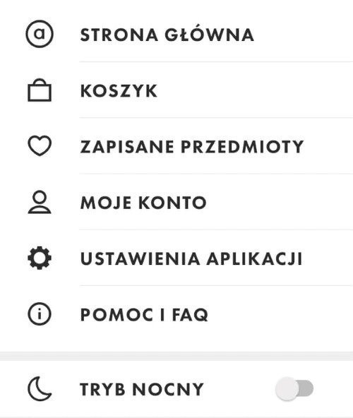
- Dark Mode is slowly becoming a standard option in web and mobile applications.
- Dark Mode is the answer to the problems related to the discomfort that appears after some time and under certain conditions during the use of digital media, products, and devices.
- More and more applications allow users to choose the light or dark mode by default.
- Usually, the companies want to fit into the positive trend, care for the users’ comfort and needs, extend the time of user engagement, and increase the control the user has over the digital product.
- Offering both modes is primarily due to the issues related to User Experience, user health, business, usability, and ethics.
- Dark Mode is not a simple reversal of colors.
- Dark Mode is an autonomous manner of interface presentation taking into account the issues of color schemes, contrast, size, proportions, forms, and layouts.
- Dark Mode is a separate set of design and UX problems, designed to offer interface and navigation as optimally as possible fitting into the end user’s expectations and needs.
- Dark Mode is primarily intended to reduce screen luminance, eye strain, and energy consumption, increase readability in various contexts and light conditions and extend the working time of devices, and mobile and web applications use time.
- Both in the dark and light modes, the colors of individual interface elements play a significant role.
- Colors are responsible for the readability of the text and the clarity of the graphics.
- In each mode, color schemes are governed by slightly different rules.
- The level of contrast is essential for User Experience and directly affects the satisfaction of using the application.
- Incorrectly selected contrast puts off the user or even prevents application use.
- Contrast is responsible for how quickly your eyes get tired and the sense of comfort and satisfaction experienced during application use.
- When designing Dark Mode, avoid saturated colors, maintain appropriate contrast, and do not use pure black.
- The emotional impact of colors changes with background color, contrast, saturation, and visual hierarchy.
- Dark Mode is not recommended for applications with a lot of content, forms, and interactive elements.
- Dark Mode should primarily serve usability and availability.
- It should provide a positive and satisfactory User Experience.
- When designing the application interface in Dark Mode, you should always check the value of the Luminosity Contrast Ratio between the key interface elements and the effectiveness of contrasting for various devices, screen diagonals, and resolutions, and take into account the typical distance between the user and the screen and the distances and proportions of the interface elements.
- When designing content in the Dark Mode, you should reduce its length and ensure the maximum readability of font, words, sentences, paragraphs, and headings, and select appropriate fonts for Dark Mode.
- Also, remember that the way the users view the interface is determined by many factors crucial to perceiving and evaluating a specific mode.