
Vision impairments affect a wide range of users – they include not only people with disabilities but also type 2 diabetics and even patients with depression. What should a UI Designer consider if many types of users use an interface?
Color vision impairments, also known as color blindness, can be congenital or acquired. There are many articles in the subject literature about daltonism and color perception disorders that are genetically determined. What if the condition is acquired and its cause is a common disease like diabetes or depression?
This article is an expanded version of a note from the knowledge bank, which we are gradually developing as we work on more assignments and projects. We design interfaces aimed at different groups, including those with chronic diseases (e.g., diabetes) or recurrent diseases (e.g., depression).
So, what should a UI designer keep in mind when designing for people affected by depression or diabetes?
In this article, I focus on these two conditions. I will discuss other cases later by updating and expanding the knowledge below.
Depression. Perception of colors by people suffering from depression
As many as 3.8 million Poles bought antidepressants in 2019. These are figures taken from the National Health Fund's report "NFZ o zdrowiu. Depresja" (NHF on Health. Depression).
While they are pretty surprising, the actual situation may be even worse. Depression has become a disease of civilization and poses a challenge not only to doctors but also to interface designers, who must consider the problems of such a large user group.
To a person suffering from depression, the world may seem flat, monochromatic, or even tinged with blue and gray.
For a long time, researchers assumed that this was a purely psychological phenomenon. However, research suggests that changes in visual perception in people suffering from depression may have a biological origin.
The favorite color of a person with depression
Depression makes certain shades of color attract the attention of those afflicted more than others. A person suffering from depression will prefer darker shades, especially darker blue.
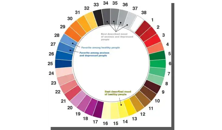
The darker blue is worth considering when choosing a theme for a website, app interface, promotional materials, or research materials aimed at users with depression.
When designing for people suffering from depression, we shouldn't try to use color therapy or think: "I'll make them feel better, so I'll use bright colors."
Choosing a brighter blue, yellow, or green will trigger rejection among users with depression instead of acceptance.
How was this relationship discovered?


