How to design mobile applications so that users want to use them? What principles should we pay attention to? What kind of design strategies should we use?
In this article, you can find everything you need to know about mobile app design.
Mobile application development and mobile devices usage patterns
Understanding the typical, most popular purposes and reasons for using mobile devices is essential in the application design process. That is all the more important during a pandemic in which the role of mobile phones and tablets is even more crucial.
Users mainly use their phones at home, although the BYOD (Bring Your Own Device) trend is gaining momentum. It's becoming increasingly difficult for us to part with our devices, and most of us have our phones always in sight.
They're most often used for text messaging, emailing, instant messaging, online banking, taking photos, publishing, and consuming content (such as statuses and posts).
For what purpose do we use the mobile channel? Mainly in order to:
- communicate
- search for information
- develop interests
- manage tasks, finances, or work
- make purchases.
What do all these needs have in common? They seem to have nothing. Yet they do, and that thing is called "tasks." With the help of mobile devices, we most often perform specific tasks. You can read more about Task-Oriented Design in a separate article. I only want to point out the peculiarity of mobile devices and their difference from desktop computers.
Limitations arising from range, computing power, available memory, battery life, screen size, operation methods, and constant stand-by mode force a completely different mindset and method of use. Experiences on desktop and mobile devices are vastly different.
Speed and reliability of task completion is a much more important, more stressful issue when using mobile phones and tablets compared to desktop computers. Mobile devices are also much more susceptible to unintentional, accidental errors.
The context of their use is also completely different. It's necessary not to talk about context but about contexts. Each time, a completely different bundle of stimuli affects the user, which triggers different behaviors.
The context in which a user is situated greatly influences how they use mobile devices, both in terms of manual handling as well as focus and commitment.
That's why it's essential to design mobile applications that make tasks as easy and simple as possible. And that is the purpose of strategically using principles, design patterns, and best practices. Here are the most important ones.
Developing mobile applications according to the rule of minimizing Cognitive Strains
The human mind's cognitive limitations affect how mobile applications are designed. An excess of information, features, colors, text, and typography negatively affects a user who may feel overloaded with them. The consequences of this are easy to imagine.
Mobile applications that fail to reduce Cognitive Strain are perceived as difficult and inaccessible. Tasks started in them may not be completed, fostering the impression that they're useless.
Reducing the Cognitive Strain, the effort we have to put into a task isn't only desirable but necessary. To achieve it, it's essential to minimize the amount of information and provide only those related to the task at hand.
The "less is more" principle is the best guideline here. We can also reduce the Cognitive Strain by referring to the knowledge already possessed by a user, either concerning the operation of mobile application interfaces or typical iconography, symbols, characters, button design, and functions.
How to design mobile apps in accordance with the Consistency Rule?
The rule of Mobile Application Consistency is perhaps one of the most important in the design process. Consistency is a complex concept and refers to three issues:
- Visual Consistency
- Functional Consistency
- External Consistency
Visual Consistency is the attention to consistently repeating a visual pattern we once applied, which can consist of colors, proportions, dominant shapes and forms, typography, icons, and symbols.
Consistency helps reduce Cognitive Strain and makes it easier to remember how an interface works and functions.
Functional Consistency means that the operation and results of the various functionalities available in any part of an application are identical. That makes a mobile app predictable, secure, understandable, and convenient.
On the other hand, External Consistency of a mobile application means compliance of the adopted solutions with the prevailing design conventions. Thanks to this, a mobile app allows users to use the knowledge gained from using similar applications.
External Consistency is also about compliance with the guidelines and standards of different platforms and operating systems. Adapting to these norms avoids the problem of Cognitive Friction. It also increases the credibility of an application.
Mobile Application Design – One Screen, One Task Rule
The peculiar nature of using mobile devices makes it necessary to divide each complex task into less complicated tasks. That's especially important for tasks with higher risk from the user's point of view (such as payments and payment card data entry).
Fragmentation into smaller actions introduces a sense of order and suggests logic and a result, thanks to which it has a positive emotional impact on a user.
The need for a clearly defined goal and the necessary actions to achieve it, communicated clearly and precisely, makes the mobile application look rational and logical.
Splitting tasks also helps avoid overloading our working memory. As users, we store up to seven pieces of information at a time. We also should keep in mind the size of the screens of mobile devices. Limited space makes it necessary to reduce the number of elements that must be both legible, understandable, and easy to use.
That's why the best solution is to apply the One Task, One Screen Rule. In other words, on each screen, the user should be able to perform a single action that is crucial to them and is a source of significant value.
By minimizing options in a situation of attention deficit and multiple distractors (distracting stimuli), we can improve the user experience of an application. An excess of capabilities is an outright enemy of mobile apps – you should remember that.
Hick's and Parkinson's Law
Reducing functions and choices also has psychological justification. In developing mobile applications, it's worth reminding ourselves of two essential laws – Hick's and Parkinson's.
Hick's Law is actually the discovery of two psychologists – William Hick and Ray Hyman. The researchers were concerned with the problem of decision-making and were particularly preoccupied with the issue of speed. They found that the more alternatives a chooser has, the more time they need to make a choice.
Interestingly, Hick and Hyman even created a mathematical formula to calculate the time required to make a decision. Even more interestingly, increasing the decision-making time doesn't really make us less wrong.
Parkinson's Law, on the other hand, formulated by writer Cyril Parkinson, goes as follows: "Work expands so as to fill the time available for its completion."
In other words, people tend to complete tasks using 100% of the available time rather than finishing them ahead of schedule.
How does this law relate to mobile app design?
Mobile app users want to make decisions and perform actions quickly, safely, and with a sense of purpose. For this to happen, they need to make the right decision in a short amount of time, so it's necessary to design actions, messages, and instructions as clearly, simply, and helpful as possible.
Tasks, if they're to be completed quickly and efficiently, can't be work-intensive or time-consuming.
The process of creating and developing an application should be aimed at achieving this result.
Mobile application development – Gesture Design
The specificity of mobile devices' usage in terms of how we can operate them and the contexts in which they're used requires the use of an appropriate strategy for gesture design and application development.
Potential errors that occur due to the size of buttons, the sensitivity of the tactile technologies in individual devices or models, and the efficiency of the users' fine motor skills make it necessary to take a different approach to design.
The minimal size of buttons must correspond to the average size of fingertips, which are usually between 10 and 14 millimeters.
What's equally important is to keep the proper spacing between the buttons. The OS User Interface Guide documentation explicitly states that we should maintain a minimum of 44 points as a tapped area.
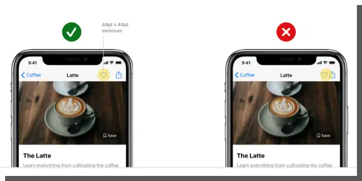
Directly related to the size of buttons is the adaptation of the types of gestures to the users' capabilities, which depend on age (e.g., health condition – seniors and developmental stage – children). While typical gestures (such as tapping) are conventional, common, and expected, more elaborate gestures always risk worsening the User Experience.
Mobile applications – Thumb Zone Design
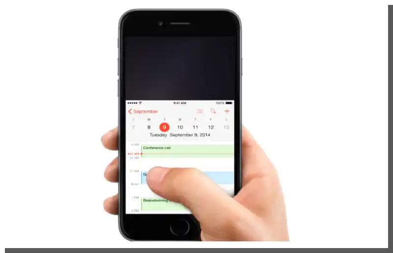
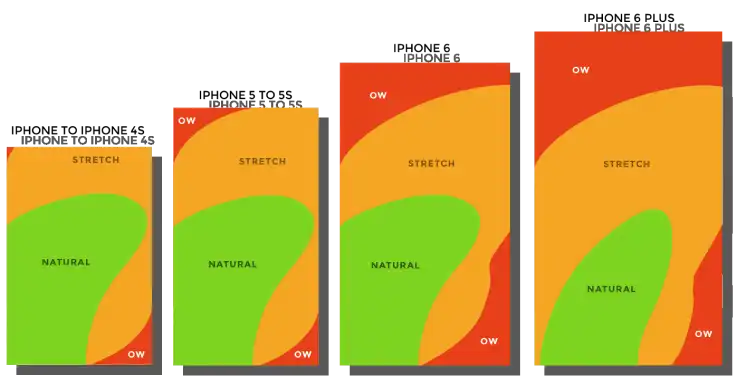
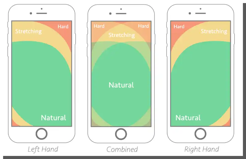
The thumb is the most commonly used finger for operating mobile devices. This rule holds true the more distracting and engaging the context is. Movement, external stimuli, multitasking, and distractions make the thumb not only the primary "tool" of operation but it's also seen as the most natural finger.
Therefore, the area of its reach (the Thumb Zone) is essential from the point of view of mobile application design. The placement of buttons must be based on their accessibility and importance.
We should remember that accessing zones beyond the thumb's reach may involve repositioning the device in hand, using the other hand, or using other fingers (single or in pairs).
The following things should be available within the thumb's reach:
- navigation buttons, especially those frequently used, as well as CTA buttons.
And these things should be beyond the thumb's reach:
- potentially dangerous buttons (such as the Delete button).
The placement of buttons should counteract accidental actions that may be undesirable or harmful from the user's point of view.
Application Development – The One Thumb, One Eyeball Test
The universal design method, or rather a method of project evaluation, is the One Thumb, One Eyeball Test, proposed by Luke Wroblewski. Wroblewski's (Product Director at Google) idea is brilliant in its simplicity.
Wroblewski found that the way to deal with distractors is to design a project so that it's legible, understandable, functional, and useful when perceived in a limited way. For instance, in a situation where the interface is used with only a thumb.
If a design is useful under maximally unfavorable conditions, involving minimal mental and manual resources, it will be all the more helpful under favorable conditions.
In other words, the design of mobile applications has to consider, first and foremost, the most inconvenient situations from the point of view of user convenience.
If users can perform tasks under "field conditions," their satisfaction with using an application will be very high.
The mobile app development looks pretty easy, right?
In practice, the One Thumb, One Eyeball Test allows us to check the effectiveness of task performance in a short period of time (usually no more than 60 seconds) under distracting conditions.
Mobile app users are already accustomed to solutions that provide fast and efficient task completion. For this reason, interfaces should be as minimalist and simple as possible, with fewer alternatives and functionalities. They should also provide the best possible User Experience in even the most uncomfortable conditions.
UX Design – designing applications for mobile devices. Summary
- Understanding the typical, most popular purposes and reasons for using mobile devices is essential in the application design process.
- Often we use mobile devices to perform various tasks.
- The limitations of mobile devices influence attitudes toward them and how they're used.
- The speed and reliability of task completion are important issues when using mobile phones or tablets. The design of a mobile application should be aimed at achieving such results.
- Mobile devices are susceptible to unintentional, accidental errors.
- The context in which a user is situated greatly influences how they use mobile devices.
- Mobile application development, or more precisely, mobile application interface design, should be focused on making it as easy as possible for users to perform tasks.
- A mobile application that fails to reduce Cognitive Strain is perceived as difficult and inaccessible.
- Consistency helps reduce Cognitive Strain and makes it easier to remember how an interface works and functions.
- Mobile app interface design is all about minimizing options.
- In a situation of attention deficit and numerous distractions, a minimal number of functions helps improve the user experience of an application.
- When designing mobile apps, it's worth remembering two laws – Hick's and Parkinson's.
- Potential errors occurring due to the size of buttons, the sensitivity of the tactile technologies, and the efficiency of the users' fine motor skills make it necessary to take a different approach to design.
- The Thumb Zone is extremely significant – the placement of buttons must be based on their accessibility and importance.
- The One Thumb, One Eyeball Test evaluates the usability of mobile apps in contexts that limit the use of multiple fingers or cause distractions.
- According to the One Thumb, One Eyeball Test, if a design is useful under maximally inconvenient conditions, it will be all the more helpful under more comfortable conditions.