
Designing applications for seniors is quite a challenge. So is designing apps for children or those with different perceptions.
Age is a differentiating variable that should significantly affect how we design applications.
Unfortunately, it is not always taken into account to the detriment of seniors, who continue to experience digital exclusion. We can't fool or overlook age. It affects our physical and cognitive abilities and shapes our needs.
How to design applications for seniors? To put it simply, we should create applications for seniors in accordance with their capabilities and needs. What does this entail exactly? You will find out by reading this article. I invite you to read it!
Who are seniors?
It's an interesting question. Who is a senior? Does age define this category? If so, at what age can we begin to call ourselves that? Are pensioners and annuitants seniors? Can we be sure? Unfortunately, there is no good answer to this question.
While there is no point in setting an upper age limit, we won't be able to establish a lower limit without controversy.
As a user group, seniors are best defined not by age or life situation but by the typical changes that occur in the human body over time.
And the first signs of aging appear as early as the age of 20 and intensify with each passing decade. The age of sixty, like the age of forty, is, of course, a conventional limit. However, people of 60+ age share similar characteristics.
Worse eyesight, short-term memory, cognitive abilities, and failing fine motor skills are the most common problems affecting how we use mobile and web applications.
But they aren't the only ones. In addition, more general issues – social, economic, and even civilizational – significantly affect seniors.
Seniors as users of web and mobile applications
To understand this group, we will refer to two articles. "Computer and the Internet in E-Seniors' life – a Qualitative Research Report" written by Barbara Szmigielska, Anna Bak, and Aleksandra Jaszczak. "The elderly as the Internet users," an article written by Barbara Szmigielska, Anna Bąk, and Malgorzata Holda, will be our second resource.
Both texts present seniors as a group of very special users. Understanding the characteristics of this group is necessary for the conscious design. After all, applications for older people are not simplified versions of apps for younger people. They are a separate and very unique segment of the market.
Since we mentioned civilization issues, let's note that most seniors are still collectively called the BC (Before Computers) Generation. While their grandchildren are acquiring skills in using devices and apps from an early age, BC generation seniors are often digitally excluded.
In practice, this means two things: seniors aren’t proficient in operating devices and using apps. And they very often don't want to use them for many reasons. One of the most important is the lack of adaptation of a large part of a web or mobile application and not meeting this group's expectations and specific limitations.
Although campaigns such as Polish "Seniorze – spotkajmy się w scieci" (Seniors – let's meet online) are meant to combat exclusion, the elderly are still the smallest group of digital media users.

Other reasons for avoiding Internet use are "changes in the functioning of sense organs and cognitive abilities.
These likely contribute to older people's frequent fear of using the Internet and low sense of self-efficacy in this area."
Even more importantly, "the acquisition of new skills, including learning to use modern technology, are greatly hindered in old age due to the weakening of perception, attention, memory and learning processes.
In addition, the characteristic onslaught of stimuli on many websites, colors that are difficult to distinguish, or letters that are too small impede the perception of text and discourage this form of activity."
If we add to this a lower tolerance for new things, less adaptability to change, and a tendency to withdraw from active life, we get a picture of users requiring a different approach.
According to the authors' research and analysis, seniors often need to learn for what activities they can use the network, applications, computers, and phones. They are often unaware of the opportunities offered by the Internet.
From a design standpoint, a very important discouraging factor is a low sense of efficiency and control (e.g., over the interface). In other words, they feel that nothing depends on them and that the applications work beyond their will and contrary to their expectations.
Among the most frequently mentioned difficulties are:
- learning how to use a mouse and keyboard
- an excessive number of functions and the associated need to remember how to launch them
- creating, copying, and moving folders and files
- using search engines.
We can also learn quite a bit about the motivations of this group from the articles mentioned above. The most common reason for using the Web is to learn something.
Seniors rarely seek entertainment online, and they usually aren’t content creators. Instead, they are keen on using the Internet to maintain family and social connections.
Designing applications for the elderly – the most important design problems
Although the outlined image of the situation may not be optimistic, it's improving from year to year. Seniors, thanks to various engagement programs (governmental and undertaken by private companies), are opening up to the use of digital devices and applications. Likewise, the increase in knowledge and awareness of designers is changing a lot in this topic.
In his article "Usability for Senior Citizens: Improved, But Still Lacking," Jakob Nielsen highlights several vital issues from the perspective of designing applications for the elderly.
First of all, vision, hearing, and dexterity of the hands deteriorate with age. And these are the crucial abilities needed to use the application satisfactorily.
Unfortunately, many digital products are still designed without considering the age of the target users. Issues as obvious as contrast, font and button size, and color schemes aren't used to improve the User Experience of seniors.
Design Patterns of Applications for Seniors
Minimum font size – 12 points
Contrast – high
Typefaces – sans-serif
Interline – more than 1.2
Links – greater spacing between links in the text
For example, the minimum font size recommended in designing applications for seniors is 12 points. Another standard that is sometimes overlooked is the function to enlarge the font size.
It is also worth remembering that we can improve text legibility by using sans-serif typefaces, which make it easier to read and scan text.
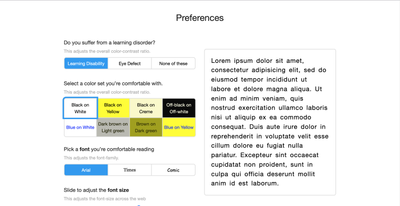
Equally important is improving the readability of links. It is necessary to increase their size and spacing between them to minimize the number of errors resulting from the deterioration of fine motor skills. The same is true for the size of the buttons, which should also be adequately larger.
Younger generations that live in a world filled with icons and symbols are much more accustomed to such a language of communication. Seniors tend to prefer traditional verbal communication much more.
Not all iconic and symbolic conventions are clear and understandable to them, even if they seem obvious and clear to us.
It is also worth remembering that flashy solutions based on movement and animations (e.g., drop-down menus and icons with animations) are a source of problems for seniors. The pull-down menu often "offers" seniors a game of cat and mouse.
An excess of animated elements can be a source of information noise (Information Overload, Infoxication) and lead to the overstimulation of older users.
Designers rarely remember the important Tolerance Principle, which I described in an article on interface design. Seniors make more mistakes than people with better visual or manual dexterity. Interfaces should be designed with these issues in mind and tolerate a much wider range of errors.
Forgiving errors is insanely important but equally important is the flexibility of the interface, which should adapt to the different variations of data input.
Its rigidity and lack of alternatives can cause a lot of frustration and discourage seniors.
Error messages should also be an element of "special care." Reduced cognitive abilities and lack of experience from previous stages of life with digital products mean that seniors often have trouble understanding errors. The KISS (Keep It Simple Stupid) principle is particularly applicable here.
How to design applications for seniors? Behavioral issues
We should be aware that the friendliness, usability, and experience of seniors can be discovered, studied, and even measured. Of course, there are many ways of evaluation, and each time they should be adapted to the specific problem and project.
Nevertheless, general design guidelines should include issues such as:
- speed at which seniors perform tasks
- number of mistakes made
- efficiency with which tasks are completed (what percentage of users can complete the task)
- satisfaction/frustration stemming from using a digital product.
Tests of these dimensions equally apply to mobile and web applications.
When studying seniors' interactions with a mobile or web app prototype, it is worth paying attention to users' emotional reactions and behavior.
As I have already written, seniors are a group characterized by a much lower level of openness to new solutions. They are skeptical about acquiring new skills and require more encouragement to take action.
They also have far less patience and get discouraged more quickly, especially when they associate the use of the application with a lot of mistakes, failures.
The most frequently observed responses from seniors in research conducted by Nielsen Norman Group for its report "UX Design for Seniors (Ages 65 and older)" were:
- discouragement
- hesitation
- resignation.
As the authors note, "In our study, 45% of seniors exhibited behaviors that indicated they felt uncomfortable trying new things or were reluctant to explore them.
For example, when they failed on their first attempt at a task, some seniors were hesitant to try alternative paths."
Deficits in short-term memory, attention, patience, understanding of processes, functions, modes of action, and effects cause seniors to abandon undertaken activities much more often and faster than younger people. At the same time, they are much more inquisitive, methodical, and precise as a group.
Applications for seniors from a senior's perspective
The most critical issue to keep in mind when designing apps for seniors is how older users understand a given app.
For most seniors, they are highly abstract. Their experiences mainly involved operating equipment that performed a single action. That was activated with a push of a single button.
Electronic devices and digital applications are designed differently. A peripheral device and its various functionalities are designed to achieve different goals and perform different tasks. Taking control of such a complex system can sometimes be challenging for older people.
Reduced cognitive abilities also prolong the process of learning how to use interfaces. It requires frequent reminders of the rules of operation.
The gained knowledge is accompanied by considerable effort, so from the perspective of seniors, updates to mobile or web applications are undesirable. They are even more problematic if they involve a significant change in the look and feel of the application.
It's easy to overlook this problem because it seems "transparent." A large part of the terminology used in descriptions, commands, warnings, alerts, reminders, and app notifications can sometimes be incomprehensible or at least foreign-sounding to seniors.
The use of technical jargon, even colloquial language, requires a strong linguistic sense – verification in research of the level of comprehensibility of the language used, its naturalness, and adequacy.
Issues with fine motor skills become particularly relevant when using mobile applications, whose tactile screens require considerable proficiency.
Performing gestures on the surface of the phone's screen, such as:
- tap, double tap
- drag
- flick
- pinch
- spread
- press, press and tap
- rotate
is extremely problematic for many seniors. Although on the other hand, tactile navigation for many of them seems more natural than moving the cursor with the mouse.
In designing mobile applications for seniors, the most important principle is simplicity. This includes gestures used for navigation. Their number should be limited, and we should reduce them to the simplest.
Vertical, horizontal, and diagonal movement is the most natural and seamless for the elderly, so it should be used wherever possible.
It's also worth remembering that a tablet is the most preferred device among seniors. And this is the group that uses them most often.
The future of applications for seniors
Forecasting trends and predicting the future are challenging in the highly volatile world of digital technology. Nevertheless, the seeds of future standards can always be seen in modern trends.
Will this happen in this case as well? I don't know, but it's worth reflecting on the conclusions of Sajith Sivanandan's article. His meaningful title speaks for itself – "Demographics are dead: Welcome to the age of intent." The findings give even more food for thought.
According to Sivanandan, targeting advertisements based on classic demographic variables is no longer effective. A change is necessary. It is (or will be in a while, if the idea takes hold) targeting ads based on implied intent.
Visited places and sites, searched and viewed products, services. Our behaviors are much better predictors of consumer preferences. Ads tailored to the needs that behaviors indicate are much more relevant and personalized.
How does this affect the future of applications for seniors? Each successive generation of seniors will likely become more and more technologically proficient, and digital exclusion in this user group will decrease. This means that seniors will be an even more active group of consumers.

Of course, the issue of changes in the human body probably will not be eliminated, and they will continue to be critical variables in the design process.
Adapting apps to actual needs, derived from behavioral observations and analysis, can influence how apps are designed for seniors. It is good to be aware of the changes that are taking place today.
Designing applications for the elderly – the most important principles
We should develop applications for seniors by considering this group of users' specific expectations, limitations, needs, capabilities, and preferences.
In the process of developing mobile and web applications, it is essential to take into account the following design patterns and principles:
- consistently use one typeface
- don't be condescending
- do not enforce the configuration of the application (use the standard: Ready To Use mode)
- offer feedback after tasks are completed – older people need it much more than other users
- limit features and adapt technologies
- limit the number of possible actions on a single screen
- limit the amount of text
- check the appearance of applications in simulators of visual impairments, which allow us to see through the eyes of an older person with various impairments (e.g., daltonism, glaucoma)
- use descriptive links
- avoid mixing, overlaying images on top of a text
- simplify navigation, a path to a destination
- maintain high interface flexibility
- use simple gestures
- make sure the instructions are simple and easy to understand
- ensure readability of the return function to a previous state, tab, subpage, home page
- make sure the text is legible
- make sure there is an appropriate contrast
- be careful about the size of icons and buttons (they should have at least 48 pixels)
- instead of entering data, allow it to be selected
- ensure quick achievement of goals, completion of tasks
- always combine icons with text.


