Year after year, mobile phones, tablets, and laptops as sources of access to the Internet, websites, instant messaging, and applications are becoming business tools regarded on par with desktop computers.
While, just a few years ago, desktop computers handled almost 100% of typical business activities (web browsing, email communication, B2B shopping), now mobile phones and tablets are starting to play an increasingly important role.
The design of B2B mobile websites isn't just a complementary, sales-supporting activity, but a key one. The mobile channel is becoming increasingly significant, hence the need for mobile websites that are fully responsive to the needs of B2B customers.
By reading this article, you will know what to keep in mind when designing mobile versions of B2B websites. Let's get started.
Why is Mobile First Design discussed in B2B communication?
Let's start by announcing the most important connection between the Mobile First approach and the phenomenon of "the cost of switching from device to device" (from desktop to mobile device and vice versa). I discuss this relationship in more detail at the end of this article.
Digitization of sales will be one of the top four sales trends in 2020 in the B2B sector.
Let me just begin by saying that from a B2B customer's point of view, the Device Inertia phenomenon, as described in the NN Group report "B2B Website Usability for Converting Users into Leads and Customers. 3rd Edition," is crucial. Without taking into account:
- the business use of desktop and mobile devices
- the cost of using them
- the relationships and dependencies (including necessities and opportunities, gains and losses) occurring between them
It isn't easy to fully understand a B2B customer's needs. Therefore, it isn't easy to design an effective B2B mobile website. It's worth remembering that a B2B mobile website is a working tool for customers. It must make it possible to perform business activities efficiently, securely, conveniently, and trouble-free on any device.

The Mobile First approach (understood broadly, not just technically) makes it possible to create fully usable B2B mobile sites from the very beginning of the design process. In order for them to truly be like that for a customer, it's necessary to understand what Device Inertia is all about. But before we get there, we need to clarify a few issues along the way.
Mobile First or a mobile version of a website
The change in behavior is noticeable in every industry, and in every industry, mobile business websites (B2B platforms, B2B stores) are becoming a vital sales channel.
So it's not surprising that the approach to the functionality and usability of B2B websites is also changing. It also applies to designing mobile sites (Mobile First approach).
B2B mobile website design cannot be based on the same pillars as the UX design of desktop sites. It has its own special characteristics.
More so, it can't result in a simplified variant of a website designed for a desktop computer. Unfortunately, very often, a company website or a company store in the mobile variant is a tool with limited usability for the B2B customer.
Characteristics and needs of the B2B customer – web design for B2B
The B2B sector, while it may seem almost identical to B2C, nevertheless has its own unique characteristics, knowledge of which is essential for designing effective B2B mobile sites. It's necessary equally in terms of their usability, functionality, and the experience they evoke.
Among the most important unique characteristics of B2B are the following:
- the decision-making process (often a group makes the purchasing decision, and on average, there are 7 people involved) – which is why functionalities that make it possible to share, access, co-create, edit, create multiple accounts, and give them different roles are extremely important
- volume, frequency, recurring sales – in B2B, you sell more than in B2C, more often and more regularly. Therefore, the business relationship is much more critical. B2B customers (according to several studies conducted over the past years) value the relationship more highly than a more attractive price, except that the relationship also includes convenient tools, including mobile versions of B2B platforms and B2B stores
- usability and functionality of a sales platform, B2B mobile website makes it possible to maintain effectively and develop the relationship
- buyers/customers are increasingly choosing online as the main shopping, and information channel, mainly because of the time saving and the ease, speed, and convenience of it
- they increasingly prefer Self-Service over the classic contact with a sales representative
- the rate of sales growth in recent years suggests that the mobile channel will become just as significant, and in some industries even more so, making the problem of designing effective mobile sites for B2B extremely relevant.
A mobile phone is used at all stages of the purchasing process. Mobile devices are used in business mainly for comparing prices, checking features, or contacting vendors.
B2B goes mobile – mobile version of a website
The issues of relevance of B2B mobile sites to expectations (convenience, speed of ordering, ease, availability of offerings without time, space, and trade constrictions) are becoming a priority.
Design decisions must also consider distinctive features of the mobile medium itself. And the method of purchasing and navigating, while to some extent identical to the desktop variant, is determined by its own characteristics, associated with:
- screen size
- the horizontal or vertical position of a screen
- screen resolution
- the tactility of a screen
- the technology used to create mobile websites
- website navigation (movement occurs within one window and one tab)
- default verticality of presented information
- searching, sorting, and presenting products
- operating systems.
The peculiarities of mobile devices require a completely individual approach to the design of Customer Experience (CX), functionality, and usability (UX – User Experience), which aren't a simplified variant of desktop solutions.
Simply put, website design and the mobile website design are two separate domains. With all the peculiarities of mobile devices, the design of a B2B website must be a fully functional tool. Customers place the same expectations on it.
B2B mobile site must:
- be viewed by them as practical, easy to use, friendly, helpful, and personalized in terms of functionality – these qualities determine the willingness to establish and renew cooperation
- have a path to purchase (for first and repeat purchases) designed with simplicity and speed of the entire process in mind
- include all functionalities available in the desktop version (e.g., shopping carts, calculators, converters, and dynamic price lists)
- have personalized information, offers, catalogs, price lists, and negotiating options.
With that being said, one of the basic mistakes made during the design of B2B mobile sites is treating them as truncated, incomplete versions. Although there are fewer and fewer examples of this, they're still present.
A proper understanding of the Mobile First formula is all the more important because more and more mobile functionalities won't be mobile versions of desktop solutions but will take advantage of the changing capabilities of the devices themselves. That is why the coming years will be characterized by the development of B2B mobile website functionalities.
Website design won't be the big sister of mobile web design but a parallel field, a design specialization. However, to meet their goals, they'll have to be designed with an awareness of the issue of positive shopping experiences.
But before we take a closer look at them, we need to familiarize ourselves with the Mobile First approach itself, which is a method and, at the same time, a particular "philosophy" for creating mobile websites.
Mobile First – the mobile version of a website
The term Mobile First refers to two issues:
- the Google algorithm (Mobile First Index), which favors the mobile variant of sites
- the Mobile First Design Approach.
In a design sense, Mobile First means a complete departure from the outdated way of creating a mobile website.
Before the appearance of the Mobile First approach, the desktop version (usually refined and extensive) was created first and only based on that a mobile website design (usually underdeveloped and simplified) was made.
This often meant that the mobile version was a variant "poorer" in information and functionality. As a result, mobile variants were created that didn't live up to expectations.
What's more, a widespread belief was formed regarding the incomplete value of such sites, an idea that still persists today among B2B users and customers. This, in turn, results in not using the full capabilities of the mobile channel.
Mobile first is an approach dominated by the opposite direction. The mobile website is not a variant but a fundamental interface. Only in later production stages it's developed with consideration of the characteristics of larger devices (Progressive Enhancement).
In addition to Progressive Enhancement, another important concept is Prioritization, which makes it possible to prioritize information and functionalities.
Among the key advantages of the Mobile First approach are the following:
- code simplification, making the mobile site lighter and faster to access
- faster design and execution time
- establishment of a standard currently widely accepted and developed
- dedicated rather than adapted design – this translates into the greater aesthetic appeal of sites created using the Mobile First approach
- SEO optimization
- proper presentation of layout and content regardless of resolution and diagonal screen size of a device
- the mobile version made in the Mobile First formula is more friendly and provides a better Mobile Experience (MX), Customer Experience (CX), and User Experience (UX)
- speed of operation – influencing Conversion Rate and Bounce Rate
- the ability to find adequate, simplest, and most functional solutions tailored to and derived from the characteristics of a device.
B2B mobile website design in RWD, PWA technology, and AMP standard
Responsive Web Design
The responsiveness of a website viewed on a mobile device can be seen almost immediately. A layout looks chaotic, and blocks of text are arranged horizontally (if you view a website on a mobile in a vertical position).
You have to scroll through them. Fonts are most often displayed in a way that is inconsistent with the initial design of a website created for desktop computers.
Using such a site is frustrating and, in many cases, downright impossible. Designing websites in RWD technology makes it possible to avoid such situations, thanks to the automatic adaptation of the page template to the device. Its size and other technical parameters.
Responsive Web Design, while considered a standard with many advantages, also has disadvantages.
The most essential features of Responsive Websites Design include the:
- flexibility – a site adapts to the size of the screen, browser window, and display resolution of a mobile device
- the undesirable need to simplify the design due to the collective limitations imposed by different devices
- cost of design and production is 10-20% higher than the desktop-only version of a site, but at the same time lower compared to maintaining two separate versions of a website – the "regular" (desktop) version and the mobile version.
- cost of maintenance is 10-20% higher compared to the desktop-only version – it's necessary to control all variants, and with each change, you need to check all of them
- SEO Friendly in terms of website positioning
- the website in the mobile and desktop variants is available under one web address
PWA - Progressive Web Application
Progressive Web Applications provide an excellent Mobile Experience (MX). They are also an affordable alternative for mobile applications, the design, production, maintenance, and development of which involves creating two variants – for Android and iOS.
This technology often makes applications challenging to distinguish from traditional websites. Their appearance and the way they work are confusingly similar. What makes them different is the scope of application, capabilities, functionality, and advantages. The most important features of PWA technology include the following:
- automatic updates
- attractive cost (of production and development)
- security (PWA uses the HTTPS protocol)
- positive Customer, Mobile, and User Experience
- availability and operation in two modes – online and offline
- ease of "sharing" – just copy the link and send it
- optimality – combines the best features of an application and a website
- the ability of continuous development
- uniformity – there's no need to create separate versions for different operating systems (iOS, Android)
- stability of operation
- standardization – it's created and recommended by Google
- speed – loading time is usually around 1 second, thanks to which it counteracts the high Bounce Rate
- responsiveness and versatility – it can work on any device (e.g., phone, TV, laptop) and in any environment (e.g., different browsers)
- direct accessibility – runs in a web browser (doesn't require downloading an installation file from, for example, Google Play or Apple App Store).
Google AMP – Accelerated Mobile Pages
A B2B mobile website created in accordance with the AMP standard is very easy to recognize. It will be marked with an AMP icon (distinctive lightning bolt), symbolizing the speed at which a site loads.
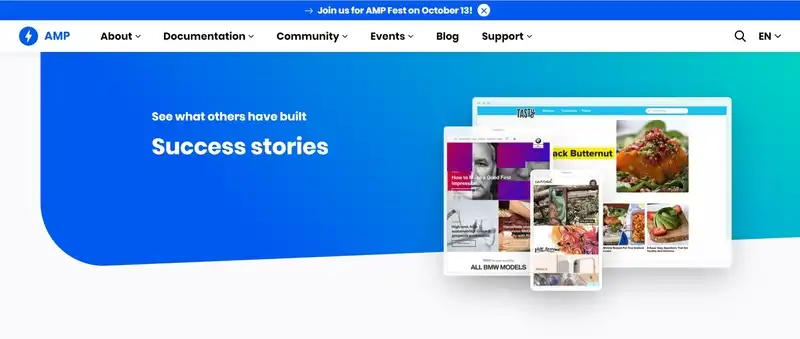
A mobile version of a website marked with a lightning bolt is also a kind of Google recommendation, suggesting a better user experience while interacting with the site. Among the most important advantages of the Google AMP standard are the following:
- availability – using AMP doesn't require the purchase of a license, and the libraries are open source
- flexibility – AMP can be implemented on the entire site or any subpage of a mobile website
- integration with Google Search Console – which supports positioning, SEO optimization
- compatibility – the technology is supported by all major web browsers
- the positive impact on key indicators – Bounce Rate and Conversion Rate
- optimization and support – Google provides a number of optimization tips and recommendations that affect the position of a website in the search engine index of mobile sites
- standardization – AMP consists of three components – HTML code recommendations, AMP JS library (JavaScript library), which significantly speeds up the loading time of a website, and AMP CDN (Google AMP Cache), which increases the performance of the mobile site
- the loading speed of a mobile website
- versatility – this technology can be applied to static and frequently updated sites (such as blogs).

In conclusion, B2B mobile websites should be responsive (Responsive Web Design). They can, but they don't have to be made in PWA technology. However, it's recommended that they implement the AMP standard.
Thanks to this, in a technological sense, they fit into the expectations of the B2B customers, who value websites that load quickly, display correctly, are aesthetically pleasing, and are fully functional. They value websites that provide the ability to work both online and offline.
Customer Experience in B2B and the role of Mobile First
Customer Experience is a concept that is most often defined as the sum of all interactions and resulting customer experiences with a company, brand, product, or service.
It includes the purchase of the product itself, ordering the service, and the stages preceding them (searching, comparing, choosing, and deciding). It encompasses the action itself and the channels and touchpoints where the interaction occurs.
Customer Experience has become a crucial issue in E-Commerce (B2C, B2B). According to several studies conducted over the last decade, the shopping experience, the impressions it leaves in the consciousness, and the customer's memory determine the purchase and the desire to repeat it.
No other factor, not even price, has such a strong influence on the purchasing decision. Customers would rather pay more (or at least they say they would) than pay less but at the cost of a poor, unsatisfactory experience and relationship.
Expectations regarding Customer Experience in B2B are very high. Especially since Customer Experience is still not a priority for many companies with mobile information and sales channel. This happens for several reasons:
- service processes, often diversified between departments, aren't optimally integrated
- customers aren't offered tools to automate repetitive processes or to expand self-service
- investments in Customer Experience are considered unnecessary and fail to increase sales volume.
Meanwhile, Customer Experience in B2B can be improved with the following values and goals:
- empathizing – understanding typical, repetitive situations and the satisfactions, pains, limitations, and frustrations they give rise to, as well as generally positive and negative emotions and attitudes
- personalization of an offer – it should be tailored as much as possible to a customer's needs and made responsibly, so there can be no empty promises in it. This aspect also relates to the issue of thorough diagnosis of needs and problems
- process optimization – with the help of tools available on the mobile website, facilitating calculations, estimations, ordering, re-ordering, and learning about individual offers
- support – at every stage of the process, saves time and reduces uncertainty.
Overlooking Customer Experience in the mobile channel is a big mistake that can result in a loss of market position.
The aesthetics of a B2B mobile website, its ergonomics, at least full functionality compared to a desktop site (preferably extended to include capabilities of mobile devices), its loading speed, and usability are all criteria that are becoming central to B2B users.
Web Design – Recommendations of Nielsen Norman Group
A report prepared by Nielsen Norman Group, "B2B Website Usability for Converting Users into Leads and Customers. 3rd Edition," presents more than 400 guidelines for the effective optimization of B2B websites.
The report's authors also considered the growing role of B2B mobile websites and made some interesting suggestions. When creating and designing B2B mobile websites, it's worth keeping them in mind.
Device Inertia
Ethnographic observations sometimes result in discoveries of behaviors that, while obvious, are rarely brought to attention.
This is a case with Device Inertia, in which users feel strongly reluctant to change a device while performing a given task.
The reluctance to change is extremely strong. Even with a device at hand on which users will complete the task faster, they tend to continue the process on the device on which they started it.
The planning horizon for most people is extremely short. Most of us act based on hunches. We are naturally predisposed to be short-sighted. Therefore, most of us would rather stick with the device on which we started the process than change to a more efficient one, for example, a time-saving one.
"The cost" of such a transition from device to device is high enough to discourage website users from taking action. What does this mean in practice? Something very important.
The task started on a mobile device will be completed on it or abandoned in favor of another website.
The user won't use a desktop computer to look at the offer to take advantage of all its functionalities.
He prefers to use his phone and find another B2B mobile site on it that is much more convenient to use.
So, if a B2B mobile website isn't fully functional, doesn't load quickly, doesn't provide a positive MX, CX, and UX experience, and doesn't use standards and mobile technologies, then its Bounce Rate will be very high. A company will lose a customer. Such websites simply lose the competition. They can't improve customer retention.
And it's worth mentioning that websites are a much more important source of information for many members of the millennial generation than the salesman.
HTML versus PDF
In the B2B sector, presenting technical specifications and offers on PDF sheets is extremely popular. While this practice doesn't cause significant problems on desktop computers, on B2B mobile sites, it's a problem of crucial importance.

Essential information, from the point of view of a user/customer, should be available on both devices in a 1:1 ratio. The limitations of mobile devices don't prevent the full presentation of information.
All there is to do is present them not in a PDF file, but with HTML code, on an offer or product subpage. Reading and viewing ("pinching," constantly zooming in and out) a PDF file on mobile devices is uncomfortable, frustrating, and encourages website abandonment.
BYOD – Bring Your Own Device
The vast majority of young and middle-aged employees believe that the mobile devices they use in their personal lives are much more effective and efficient than those offered by their employers.
The change in companies' operating model often comes from observing the behavior of employees. And they've been using their own mobile devices at work for a long time. Increasingly also for business purposes. New habits and behavioral patterns can be used in designing a mobile website.
Today, sharing B2B and B2C services is a fact, and many service providers (mainly SaaS) are aware of it. A company with a mobile version of its B2B website should also have a B2C version, allowing its users to switch from private to corporate accounts and vice versa seamlessly.
Access to the history of orders
The permanence of relationships, the high volume of orders, the cyclic nature of orders, and their repetitiveness are characteristics of B2B. Does the mobile version of a website allow easy access to the history of orders and shopping lists? Speed, simplicity, intuitiveness, flexibility (e.g., possibility of edition) ability to re-order should be a priority when designing a mobile version of a B2B website.
Tactility – the problem of the size of the elements being touched
Navigating a site with a mouse and fingers is a different experience. Even from the design point of view. All kinds of button and selection elements (e.g., checkboxes) should be designed with consideration of screen size and standard size of fingers (thumb, index finger, both male and female).
As a rule, mobile interface elements should measure at least 1 cm by 1 cm or in pixels; they should be 44×44 px and 48×48 px. On iOS and Android, respectively.
The issue with Drop-down Menu
The Drop-down Menu, which appears quite often on B2B mobile websites, may seem at first glance as an optimal solution. If only for the sake of saving space.
In the case of numerous items in a Menu and an extensive structure of categories and subcategories, handling such a solution on mobile devices can be very frustrating.
Especially since the Drop-down Menu can be displayed differently on various devices, the solution to this problem is to design a dedicated menu.
Content Format
The content of the home page, product, and offer pages should be designed and formatted with the characteristics of a device in mind. So that each time the presentation of information uses the device's potential and avoids errors resulting from its limitations.
What's possible on a desktop screen (e.g., the use of so-called white space: tables, bullet lists) must find its informational-visual equivalent on mobile sites (e.g., in the form of presentations using accordions).
A mobile website and a desktop website are two, only to some extent, similar sets of problems regarding information architecture.
Consistency of information across channels
Possessing a mobile site as well as a desktop website requires adopting a consistent, uniform, and standardized information policy.
Each channel (mobile and desktop website) should have the same information, images, graphics, prices, specifications, statuses, and stock data.
In other words, information discrepancy should be avoided. It generates a number of negative experiences, reduces credibility and trust, and fosters misunderstandings.
Jumping between channels
The research of the Nielsen Norman group also shows a fascinating observation related to life situations. It's common for users to have their access data stored either in the memory of their computer, phone, or tablet.
Starting a task on a device on which they don't have this data stored and not remembering it at a given time will force them to jump to a device where they have this data.
If it so happens that the only way to complete a task (e.g., of high priority) is to use a B2B mobile website, but it isn't:
- equivalent to the desktop version
- updated with it
- it doesn't have the same functionalities
Then we have a situation where each of the most relevant experiences (UX, MX, CX) is highly negative. As a result, the relationship, which is crucial in B2B, and which mobile tools should also sustain and shape, becomes too costly and unsatisfying for the customer.