What is a user interface (UI)? Simply put, this is the part of an application or software responsible for user interactions.
How does interface design work?
It is said that a well-designed interface is ‘invisible.’ Of course, it doesn’t mean it is visually absent but that it is perceived as an integral, helpful and convenient tool.
The topic of interface design is complex. It cannot be described in one or two articles.
Many books have been written about interface design (e.g., Designing Interfaces: Patterns for Effective Interaction Design by Jennifer Tidwell), and many hours of training have been prepared. That is why this article is only an introduction to the topic of interface design. But you have to start somewhere.
What is User Interface for?
The digital product user uses the interface to interact with the software. It is a tool for human-device communication. It is used to control, perform tasks and achieve goals.
When we talk about User Interface, we usually mean Graphical User Interface (GUI). However, it is not the only means of communication between a human and a device and software.

For example, there are Command Line Interfaces (CLI), Text-Based User Interface (TUI), and increasingly used Voice User Interfaces (VUI).
Graphical User Interface is an essential component of any software, from desktop programs to web and mobile applications. However, you cannot forget that its role is not only to serve the users’ purposes but also to help achieve business goals.
Interfaces are ‘invisible’ because of their aesthetics, integration with other application components, appropriateness of individual functions, and the adaptation of the mode of operation to user needs and expectations.
What should be the Graphical User Interface design like?
The answers to this question are probably as many as there are interface designers. But it’s not their preferences and expectations that are of crucial importance.
Interfaces should be, and in most cases are, user-oriented.
In practice, it means creating them based on reliable and repetitive studies to determine the target users’ preferences and expectations.
The research methods most commonly used in the interface design are direct observations of the users using prototypes and interviews.
Creating an interface design is not an easy task, as evidenced by the list of expectations for it. From the user’s perspective, an interface should primarily be:
- Efficient
- Available
- Intuitive
- Visually appealing, aesthetic: Aesthetic interfaces are perceived as more usable (Aesthetic Usability Effect)
- Functional
- Reliable
- Helpful
- Handy
- Minimizing cognitive effort and reducing psychic energy needed for learning to operate and use it.
What are the components of a Graphical User Interface?
Interfaces will differ significantly depending on the device and the type and complexity of a digital product. They will vary depending on the number of functionalities and the purposes for which they are intended.
They are also different because of the users. For example, the interface of an application for senior citizens, visually impaired persons, or kids will be designed differently than for persons without constraints of any kind.
Basically, the interface components can be assigned to one of the following four categories:
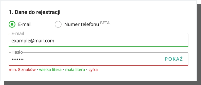
- Input controls including data input fields, checkboxes (e.g., of date or city), drop-down lists, switches, and buttons
- Containers, e.g., accordions
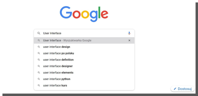
- Navigation components: menu, search box, sliders, icons, and tags
- Information components: progress bars, notifications, and message windows.
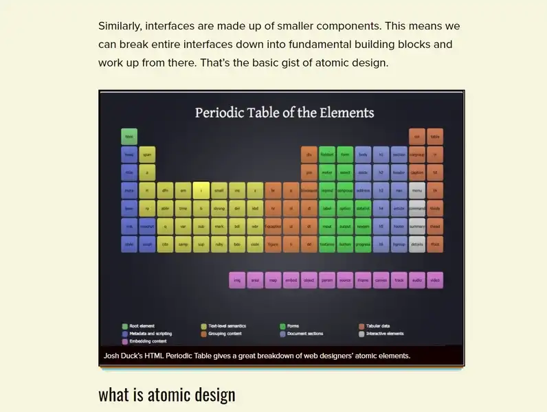
User Interface design: Atomic Design
We definitely prefer the Atomic Design approach in which an interface consists of components.
These components perform specific actions and respond to a specific user and system needs. For example, a text box is used to enter detailed data, e.g., first name.
The approach to interface design created by Brad Frost enables you to create them in a much more methodical, organized, and thoughtful manner. Atomic Design facilitates the creation of the hierarchy of components.
Brad Frost proposed a method inspired by chemistry and atoms that reflects the structure, relations, and interdependencies observed in the material world.
To create a more complex system, organism, or object, you need components from lower, more basic levels.
Hence the name. Atoms are the basic building blocks of the material world. With web and mobile applications, it’s precisely the same.

The Atomic Design methodology assumes that the graphical interface design consists of five stages. The three most basic stages are created by the analogy to chemical compounds. So, we can distinguish the following:
- Atoms
- Molecules
- Organisms
- Templates
- Pages.
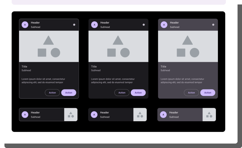
In the context of interfaces, atoms are, for example, fonts or buttons. When the smallest components are already created, we can move to a higher level, the level of molecules. It is the point where individual atoms are grouped, and a more complex structure is created out of them with its own characteristics.
Out of the molecules, we create even more complex structures: organisms. When an organism is created, we actually have a component that can be repeatedly used in templates. The templates will be used to create pages.
The main advantage of the Atomic Design methodology is its simplicity, convenience, clarity, and focus on structure. Furthermore, Atomic Design provides much more consistency to the interfaces (the issue of consistency will be discussed in the second part of this article).
Graphical User Interface design: principles
In the interface design process, the designers make use of multiple principles. They aim to achieve the best results possible.
It's about meeting the majority, or preferably all, of the expectations mentioned above. Is it always possible? Well, not so much. For this reason, interface prototypes are subject to analysis and testing.
We have already discussed Jakob Nielsen's heuristic analysis which is very useful for evaluating interface usability. We have also covered Ben Shneiderman's Eight Golden Rules, which are also very helpful in interface design.
Although influential and widely respected, they are not the only principles to be considered when designing interfaces. We will complement them with another approach, namely the proposal formulated by Lucy Lockwood and Larry Constantine.
Next, we will present further principles widely used by designers. Thanks to their use, application interface designing is much more effective.
Larry Constantine and Lucy Lockwood's 6 Principles of User Interface Design
The proposal of these authors derives from the usage-oriented approach to interface design. The usage-oriented design is based on three models and processes:
- Model of roles played by the users in the interactions with the system
- Model of tasks needed by the users
- Model of content and organization of the user interface.
To put it slightly differently, it's about getting to know users' intentions and typical usage patterns. On this basis, the authors have developed 6 Principles of User Interface Design. These are:
The Structure Principle
It applies to the relations between the elements in an interface, their architecture, and how they are organized. The elements related to one another should be structured together and clearly separated from other elements. The connections and separations should form a clear hierarchy.
The connections and separations should also be created in a manner that is coherent, consistent, and recognizable (familiar) to the user.
In other words, the elements with similar functions and scopes of operations should be similar in appearance and have similar modes of operation. The functions and locations of the elements should not change.
The Simplicity Principle
The interface should facilitate the performance of simple and typical tasks. It should communicate with the user through clear and straightforward language.
More complex tasks should be divided into simpler, shorter, and easier ones. The interface should be characterized by clarity and include only the essential components.
The Visibility Principle
The interface should only include the options that are necessary for the performance of a specific task. The benefit of this principle is supporting user concentration and avoiding distractions with unnecessary information. Only important and indispensable information and functionalities should be visible and emphasized.
The Feedback Principle
The interface should provide the users with feedback on the most important changes, exceptions, errors, and states using clear, specific, and concise messages.

The Tolerance Principle
The interface design should also take into account the possibility of user mistakes.
It should prevent undesirable changes by allowing correction and reinitiation of specific actions without any costs (e.g., performing some work again).
Wherever possible, the principle of tolerating permissible mistakes should apply. A properly designed interface should also prevent mistakes using prompts and tips and enhance the user's sense of security.
The Reuse Principle
It applies to avoiding duplication of interface elements and information and increasing the consistency of the interface by avoiding creating new elements for the performance of similar tasks. A smaller number of elements facilitates learning and memorizing the functions of individual elements.
The conclusion from the above principles is quite clear.
In the interface design process, you should avoid creating unnecessary functions, minimize cognitive load, predict behavior and simplify processes.
A well-designed interface does not distract and enables the user to focus on the task being performed. Consistency can also be achieved by creating shared elements to perform various tasks.
Interface design: proven design patterns
Interface design is a complex problem that requires considering a number of issues. The above principles need to be supplemented by further ones.
The Interface Zero State Principle
The first impression is extremely important for the users’ evaluation, attitude, and sensations in the initial contact with the interface.
It is also the occasion to introduce the users to the main functionalities, facilitations, and benefits.
The design of Zero State, i.e., the state where the user is greeted and familiarized, is of extraordinary importance.
The Zero State acts as a host who onboards the user and hands over the operation of the interface to them.
This makes it possible to avoid many problems and frustrations while learning to operate an interface. Introducing the rules to the users allows you to earn their liking and gratitude.
The Cognitive Load Reduction Principle
I already mentioned it in this article. However, it is worth repeating as it is extremely important. It boils down to making the interface as little:
- Labor-intensive
- Intellectually challenging as possible.
The interface use cannot be an experience similar to solving a puzzle. It should be as intuitive as possible, almost without thinking about it.
The User Work Protection and Correction Principle
When designing interfaces, you must also ensure the comfort of saving the work done. Nothing is more discouraging than the need to reenter and reconfirm the data and selections.
In particular, it is important in situations where the user or the system makes mistakes. The loss of the work done cannot be the ‘punishment’ for a mistake.
The interface should also enable the user to correct the work and return to the previous states and steps. This is, of course, related to Lucy Lockwood’s Tolerance Principle.
The Action Comprehensibility Principle
Learning to use an interface should be as fast, trouble-free, and pleasant. The interface should familiarize the users by means of specific, unambiguous, simple, and easy-to-understand answers to the fundamental questions:
- What can be done?
- Where can it be done?
- With what can it be done?
- When can it be done?
- Why can it be done?
- How can it be done?
- With what result can it be done?
The Interface Customization (Configuration) and Maximum Control Principle
Modern interfaces increasingly need to allow users to customize settings, parameters, and states.
The interface customizability increases the sense of control crucial as regards the sense of comfort, satisfaction and usability.
The sense of control primarily provides and enhances the following:
- Speed of operation (system response to an action taken)
- Clear causality: user’s action is the cause, and the system response is the desirable effect
- Possibility to stop, undo, edit and correct
- Smooth operation, even in the situation when the user makes a mistake
- Interface adaptation to the habits, expectations, standards, abilities, and typical goals
- Possibility to return to the default settings
- By the confirmation of action performance with visual, text, and audio messages.
The Efficiency Principle
The interface efficiency can be determined by subjective user sensations but also by means of measurable indicators. For example, the speed of action execution, the speed of page loading, and the speed of reaching the goal (the number of necessary clicks, screens, and subpages).
The Flexibility Principle
This principle echoes the previous ones. By the way, most principles complement each other. It is similar with the Flexibility Principle where it is most important to design an interface that is:
- Adapted to the knowledge, abilities, and experience of every user
- Friendly: sets its users as few conditions as possible
- Open to various preferences and enabling configuration of modes and functionalities
- In line with standards, habits, and typical expectations but not in a dogmatic manner.
User Interface design basics. Summary
- The interface enables user-software interactions.
- A well-designed interface is perceived as an ‘invisible’ tool, both helpful and handy.
- Interfaces must meet a number of expectations and be characterized, among others, by efficiency, availability, visual attractiveness, functionality, and reliability.
- Interfaces are created based on multiple principles, patterns, and approaches (e.g., Atomic Design)
- Lucy Lockwood and Larry Constantine’s proposal derives from the usage-oriented interface design approach.
- The essence of this approach is the roles, tasks, and interface organization modes.
- When designing interfaces, you should avoid creating unnecessary functions and minimize the cognitive load.
- It is also very important to predict behavior and simplify processes.
- The most important principles, though not the only ones, include the principles of Flexibility, Efficiency, Customization, Maximum Control, Action Comprehensibility, User Work Protection and Correction, Cognitive Load Reduction, and Interface Zero State.