
UI/UX Design often crosses paths with psychology, especially cognitive psychology.
User Experience also uses the achievements of psychology in the form of Gestalt. Its basics and first works about it appeared at the beginning of the XX century.
UX design and Gestalt are fields that "look in the same direction."
Gestalt Principles have become very useful in User Experience and web or mobile application design.
Designers draw fully from the achievements of Gestalt, and their primary goal, as you can guess, is to create applications tailored to the needs, expectations, experiences, and cognitive capabilities of their future users.
And the principles discovered under this subdiscipline of psychology significantly help with it. What's the most important, however, is that conscious design decisions are the result of learning from the achievements of Gestalt.
What is Gestalt? What are Gestalt principles? What are its main assumptions? What principles were formed within this school of psychology?
How can UI/UX Design use these principles? What are examples of Gestalt principles?
What essential Gestalt principles have entered the canon of knowledge and user-centered design practice?
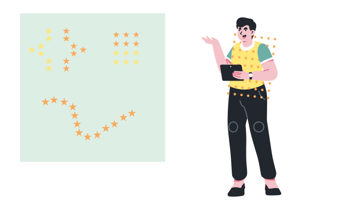
Today we'll play a psychologist :)
But do not fear. Gestalt has a practical use, and it's not about flooding a reader with abstract theory but about raising awareness of rules related to the perception of relationships between elements and a whole.
It's about how humans see figures and groups, categorize and interpret them, and react to them cognitively, behaviorally, and emotionally.
But we'll talk about the details in a moment. We invite you to read on!
What is Gestalt Psychology?
In German, "Gestalt" means a form, shape, figure, layout, and configuration.
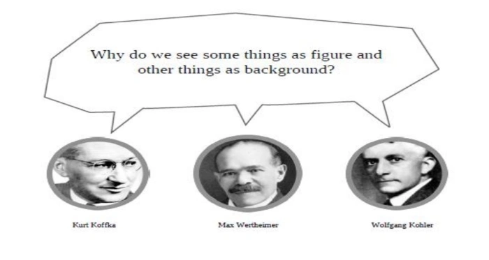
German Gestalt psychologists Max Wertheimer, Wolfgang Köhler, and Kurt Koffka created this theory. At the beginning of the XX century, they started to systematically study how people organize, categorize, understand, and see visual elements.
Initially, Gestalt was a philosophical and psychological concept that tried to explain ways of perceiving and interpreting reality.
Above all, it tried to describe, explain how human perception reacts to objects that consist of elements.
One of the crucial findings concisely included in Koffka's maxim was that "The whole is other than the sum of its parts" (e.g., graphical elements).
When we see complex objects, we first see them as a whole, and only after some time can we see, distinguish, and describe the parts that make them up.
As the authors of the article "Gestalt Principles" published on the Interaction Design Foundation blog, German psychologists identified and formulated a set of principles relating to the natural compulsion to find order in disorder (and they called it the Gestalt Laws of Perceptual Organization).
According to these psychological principles, the human mind processes visual information as a whole, whose components can only be recognized after reprocessing.
From the perspective of user experience design, one of the most important works of the Gestalt school was that of Max Wertheimer, namely "Laws of Organization in Perceptual Forms," published in 1923.
That's where you can find seeds of Gestalt principles which UI/UX designers commonly use today.
Wertheimer discovered that the human mind perceives visual stimuli in a determined and tendentious way.
By understanding how the human mind works and how visual perception is represented in the mind, you can understand how users of web and mobile applications see interfaces.
You will know how to organize graphical elements and interactive functions to achieve a desirable effect from the perspective of the user and the digital product owner.
Using knowledge from psychology in designing allows you to replace intuition and assumptions with certainty resulting from scientific research.
UI/UX design, especially oriented toward end-user needs, aims to create web and mobile applications that are as useful as visually attractive. Equally intuitive, simple, and aesthetic.
Gestalt principles explain how people reduce complex shapes to simple forms and automatically recognize patterns and thus enabling you to create products with higher usability, comprehensibility, intuitiveness, obviousness, and simplicity.
An important lesson and design guideline that comes from Gestalt principles is the understanding that the human mind has a natural, innate, automatic, and unconscious tendency to order chaos, find order, and see forms.
UI/UX design (of user interfaces or navigation) involves, among others, creating forms that, in a natural way, focus attention on themselves, that use Gestalt principles.
Moreover, Gestalt principles are very helpful in applying perhaps one of the most universal and well-known design recommendations, which states that the designer, first and foremost, shouldn't force the user to think.
Finding a "thread of understanding" between natural human ways of perceiving, their needs to organize visual elements, and methods of organizing interfaces of a website or mobile application allow you to avoid irritation, deconcentration, frustration, and, primarily, stop the user from resigning from using an app.
Using Gestalt principles also enables you to influence the following:
- Users' perception, mainly they allow you to direct their attention
- Behavior, actions
- Understanding
- Assessments
- Cognitive, behavioral, and emotional reactions.
It's not worth underestimating Gestalt principles. They have crucial significance for designing a positive user experience.
UI/UX designers, while creating a user interface of a website, need to know how to help users find individual elements and make them understand how they work.
Discoveries of psychology allow you to reduce the number of mistakes made and increase the conversion rate, as well as the credibility and trust that the website evokes.
The Law of Proximity
Research conducted on the basis of Gestalt psychology showed that proximity, the physical proximity of objects, is a trait that determines human perception much more strongly than color or shape.
The Law of Proximity states that people tend to see elements close to each other as interconnected, forming a larger whole.
Objects that are seen close to each other seem to be more related than objects that are further apart.
The human mind doesn't perceive elements that are adjacent to each other as individual and independent (e.g., dots, squares) but as a group.
Spatial distance suggests a relationship between design elements. Hence you should keep this rule in mind during interface design.
Buttons placed in proximity will be seen as a collection and, what's even more crucial, as a set of elements with similar functions and roles.
This law also applies to formatting blocks of text on a site. If they are sufficiently away from each other, they will be seen as unrelated paragraphs, a separate whole.
That's why in UI/UX design, offering users a clear layout structure and intuitive visual hierarchy (e.g., through negative space) is crucial.
It significantly speeds up the process of recognizing and reacting. In other words, it reduces interaction costs with websites' or mobile apps' interface elements.
The Law of Similarity
The Law of Similarity specifies the tendency of the human mind to treat objects similar to each other (in form, color, texture, or size) as one group, and the objects within this group are considered to have the same function.
This similarity doesn't have to be a configuration of many features; one is sufficient for people to start distinguishing similar elements as parts of a larger whole.

That said, it's worth noticing that visually different elements that are close to each other won't be seen as parts of a separate set.
It's also equally crucial that elements different from the group will be seen as contrasting, which may result in positive and negative reactions.
The Law of Similarity is very helpful in grouping interface elements that have similar functions and roles.
Their visual similarities will suggest a common use and goals that can be achieved with them.
The Law of Similarity significantly facilitates understanding how a website's/mobile application's interface works.
Practical design recommendations resulting from the Law of Similarity include giving:
- Similar forms to elements that work in a similar way
- Similar shapes to elements that have a similar meaning
- Similar appearance to elements at the same level of visual hierarchy.
The Law of Similarity should also be used in UX Writing and microcopy.
Consistent terminology, nomenclature, labeling, contents of messages (e.g., alerts, hints), typography, and color scheme allows you to give intuitive, simple, and logical character to the digital product.
Content that looks or sounds similar will suggest a similar function, meaning, and hierarchy level.
Elements with different functions, roles, and meaning designed in this way will be a source of mistakes and frustration which, naturally, should be avoided.
The Law of Symmetry
Symmetry is a layout that suggests order, harmony, peace, and purposefulness. It's associated with elegance, sense, and care.
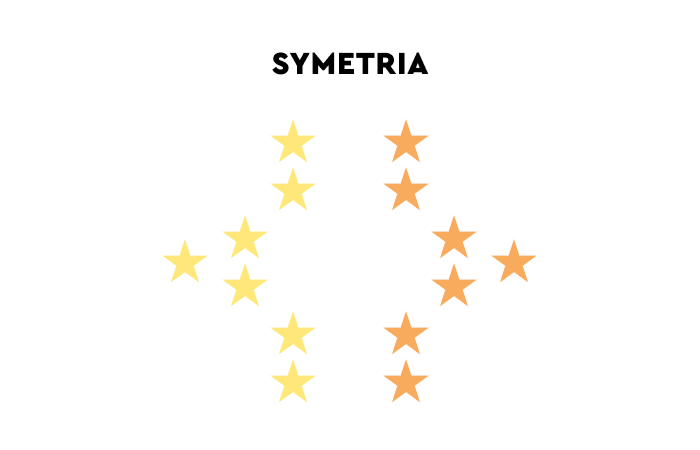
Moreover, it's also a source of pleasure, and people prefer this method to organize elements.
According to the Law of Symmetry, people have a natural tendency to group symmetrical elements.
What's more, they actively look for symmetry. Hence elements related to each other (e.g., in terms of functions) should be placed symmetrically.
Symmetry positively influences the following:
- Comfort of use
- Scanning of websites
- Readability and navigation flow.
Sites designed asymmetrically increase interaction costs and are seen as less intuitive and convenient.
Symmetry is a desirable trait not only in interface elements but should also be used to give form to the text layer on websites.
The Law of Figure-Ground
The Figure-Ground principle states that people can distinguish and categorize elements based on how far away they're from them.
They see objects as being in the foreground or the background.
The distance, not just a specific determined shape, also suggests the importance and relevance of an element. Foreground objects are considered more important than objects that are in the background.
The perception of an object can be manipulated with an appropriate color scheme, contrast, and focus.
The Law of Figure-Ground is used in UI/UX design to direct the user's attention.
The Law of Focal Point
The Focal Point principle states that if an element stands out visually against other elements, it will naturally catch the attention of website users.
The user's sight naturally looks for distinctive elements which focus their attention.
The Focal Point principle lets you visually highlight elements that users are supposed to see first (e.g., call-to-action buttons or short forms).
Not only can focal elements gain attention automatically, but they also can keep it much longer than elements that don't have this form.
The Law of Continuity
The Law of Continuity states that elements that form continuous lines or curves are perceived as a whole.
The human mind tends to discover patterns and follow them, thanks to which it's possible to guide attention.
A sequence of dots placed next to each other is not seen as a set of unrelated, independent elements but as a line in which people can indicate a beginning and an end.
Thus, these kinds of arrangements are seen as a path that should be followed.

In the case of websites, the Law of Continuity is often used to visualize processes, improve their flow, and suggest stages, distance, and time. It's a certain signpost, instruction manual, and legend which users need.
The Law of Common Region
The common region principle says that elements that are placed within the same closed region and surrounded by a common barrier are seen as a whole.
The Gestalt principle of Common Region enables you to create groups without the need to use identical color schemes or shapes to achieve a positive user experience.
The Law of Common Region is frequently used on websites and is one of the most popular ways of establishing a visual hierarchy.
Thanks to this law, the content on a site is:
- Clear
- Understandably ordered
- Separated
- Defined in terms of shared information, functions, roles, goals, and meanings.
Elements grouped in a shared space clearly and unambiguously suggest that they're a separate group.
The Law of Closure
The Law of Closure states that people tend to perceive objects as complete even if they are not.
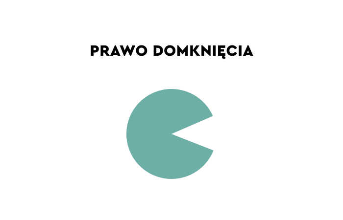
The human brain interprets incomplete forms, shapes, and lines as closed forms, thanks to which an unfamiliar shape is reduced to a well-known one, and thanks to that, people save their cognitive effort. Even if a given image is missing some elements, the human mind will see it as a complete picture.
By filling out gaps in an image, the human mind reduces it to a well-known form, thanks to which it's possible to use fewer elements in a design to achieve a desirable effect.
According to the Gestalt Law of Closure, every complex layout is reduced to a recognizable pattern.
This comes from a natural need to:
- Make sense of objects
- Replace chaos with order
- Emptiness with fullness
- And discover something familiar in something unfamiliar.
The Law of Closure is often used when designing icons for a website.
Gestalt Principles in UI/UX Design. Summary
- Gestalt Principles have become very popular in user experience design.
- In German, "Gestalt" means a form, shape, or figure.
- Gestalt psychology studied how people organize, categorize, understand, and perceive visual elements.
- The main idea of Gestalt is that a whole is not a simple sum of elements.
- At first complex objects (e.g., the layout of graphical elements, irregular shapes) are seen as a certain whole.
- Only after some time it's possible to see and distinguish separate elements.
- Gestalt principles state that the human mind strives to reduce complex images to simple forms. They determine what approach it takes toward images every time.
- Gestalt makes it possible to understand how people recognize patterns.
- UI/UX design (e.g., of an interface) involves creating objects that focus attention on themselves, use Gestalt principles.
- Gestalt principles in designing allow you to reduce mistakes, improve the conversion rate, and increase the credibility and trust that a website evokes.
- The Law of Proximity states that the physical proximity of objects is a trait that more strongly determines human perception than color or shape.
- The Law of Similarity states that the human mind has a tendency to treat groups of similar objects as one group.
- The Law of Symmetry says that the human mind strives naturally and innately to group symmetrical elements (e.g., text layouts).
- According to the Law of Figure-Ground, people can distinguish and categorize elements based on how far away they're from them. People instinctively perceive objects as being in the foreground or background.
- The Law of Focal Point allows you to visually highlight elements that users are supposed to see first.
- The Law of Continuity states that elements that form a line or curve are perceived as a whole. With it, you can mark subsequent stages of a purchasing process or guide the user's attention to desirable elements.
- The Law of Common Region enables you to create groups without the need to use identical color schemes or shapes.
- The Law of Closure states that people tend to perceive objects as complete even if they are not.


