We should start with the most fundamental question: What is responsive web design (RWD)? We'll answer it as simply and concisely as possible.
A responsive web application (responsive website) design changes its size and layout and supports different resolutions depending on the diagonal of the screen on which the application is displayed. This technique improves the performance of web pages, helping them load faster.
In other words, a web application will be displayed differently on different screens, adapting to them each time to achieve the optimal layout of elements. This influences font size, image size, or layout appearance.
Responsive web design, in basic terms, has two primary goals.
To achieve the best possible user experience on each device and obtain visual consistency.
The appearance of a web application displayed on a monitor screen, laptop screen, phone screen, or tablet screen shouldn't differ significantly.
Responsive design (RWD website development, RWD technology) grew out of the belief that the size of available space, aspect ratio, and screen size and resolution are the key contexts.
It's treated as a design challenge aimed at meeting user expectations. Its popularity also stems from mobile devices gaining a larger share of the market pie every year.
Responsive web design and the challenges of mobile
As my statistics professor used to say: "You don't argue with numbers; you interpret them." The numbers have indicated for many years that the future belongs to mobile devices.
Already in 2015, Google recommended creating responsive web applications.
Websites created in the spirit of the mobile first approach, dedicated to mobile devices, could expect to rank higher in search results. The change was so revolutionary that it earned its own name in the trade press — Mobilegeddon.
By the end of 2020, more than 3.5 billion people were using smartphones. On average, we spend almost 3 hours on mobile phones. Nearly 70% of "smart users" search for product information via mobile devices.
A similar number of people use a mobile device to make purchases in online stores, and so on. For those interested in more statistics, I've included the source of this data. You can find it here.
From a design standpoint, these trends imply the need for RWD applications (responsive websites). The mobile-first approach has become a standard approach, although not the only one. Later, I'll write more about the competitive approach (adaptive design) in this article.

Responsive web design is also related to the uniqueness of mobile devices. The tactility of mobile phones and tablets forces web developers to use a different approach to design (e.g., interfaces, menus).
Here, we arrive at the pivotal divide between the two dominant approaches to web application development: responsive web design and adaptive web design.
Where did responsive web design and adaptive web design come from?
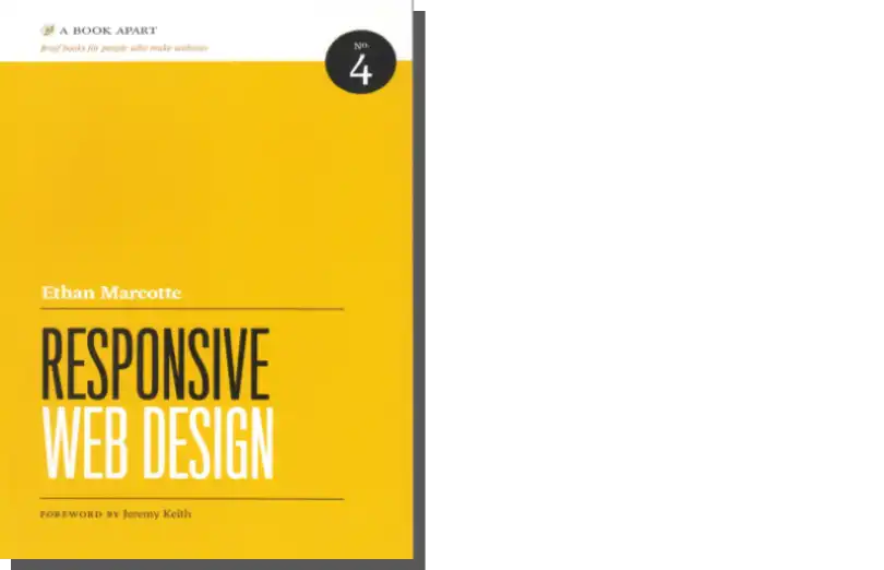
Both terms, approaches, and design methods owe their popularity to books published by Ethan Marcotte and Aaron Gustafson. The first author wrote "Responsive Web Design," while the second is the author of "Adaptive Web Design: Crafting Rich Experiences With Progressive Enhancement."
Both works have left their mark on web application development and divided the design world into two camps—followers of responsive web design and adaptive web design. However, the current balance of power strongly suggests that the first approach is more popular.

It's worth learning more about both approaches because they each have advantages and disadvantages. Many variables influence the decision to choose one of them, and it simply depends on our goals, needs, and capabilities.
What is the difference between responsive and adaptive design?
All signs indicate that the problem of adapting application designs to current devices on the market will continue to grow. The variety of sizes, proportions, and resolutions requires deciding on the preferred design type.
What is the difference between responsive and adaptive design? Let's start with the RWD design.
An application's responsiveness means its smooth and automatic adaptation to the available space. The style changes depending on the target device; hence, the main design point is simplicity.
Adaptive web design doesn't rely on an application's smooth and automatic adaptation to the size and resolution of a device's screen. Instead of one "flexible" design, we have many "static" designs.
There are usually six for the six most popular screen width sizes: 320, 480, 760, 960, 1200, and 1600 pixels. The appearance of an app on each device is slightly different, and the difference comes not only from the limitations of a device but also from the need to create an app that provides a very good user experience.
Advantages and disadvantages of responsive design and adaptive design
Both approaches have many advantages and aren't without flaws. Evaluation of their usefulness is largely subjective and depends on needs and goals.
We'll find an equal number of applications from reputable companies created in RWD and AWD models. Let's review the key characteristics of both approaches.
Responsive web design is:
- Less work-intensive
- Relatively more straightforward, certainly more consistent
- Less problematic but not problem-free
- Problematic if the application is to be upgraded rather than built from scratch
- SEO friendly — to a greater extent — it's recommended by the Google search engine
- Relatively easier to implement
- More effective in terms of user experience
- Enabling designers to create the best UX for a given device
- More flexible when it comes to less common screen sizes
- More challenging to control — however, applications aren't as time-consuming to maintain
- Requiring more work on the programming side
- Easy to modify and optimize
- Based on a medium-sized pattern
- Less responsive to user needs.
Adaptive web design is:
- More work-intensive
- Less flexible for non-standard screens
- Considered as more problematic
- More helpful in upgrading or customizing existing websites
- SEO unfriendly — in many cases, Google's crawlers may have trouble recognizing the identicality of content in different versions
- More difficult to implement
- Providing more control but is more time-consuming to maintain
- Less problematic in terms of programming
- Much more problematic in terms of modification and optimization
- Devoid of a template acting as a reference
- More capable of meeting user expectations.
Standalone mobile design
For the record, let's note that there is a third approach: creating separate mobile versions. Although many companies used such a solution a few years ago, it's no longer popular or recommended today.
This solution didn't prevail for several reasons. One was Google's search engine policy, which didn't favor mobile versions. Another was the problematic nature of maintaining consistency between variants.
The three major principles of responsive design
Responsive design has lived to see not only its fans and popularizers but also patterns of best design practices. Here they are.
Fluid Grid Systems
So far, websites have been designed like newspaper layouts. The elements' placement, size, spacing, and hierarchies were expressed in absolute values — in centimeters and millimeters. In the case of websites — pixels. The good old days of designing with only desktop screens in mind are gone, and a completely different approach to design is needed in the mobile era.
In responsive design, it's much more useful to express such values relatively and, therefore, dependent on two variables—the target size and the display context, i.e., the value of the dimensions on a given device.
The idea is simple, but it requires an example for better understanding. The relative size equals the target size ratio to the context size. So, if the design was created with a standard page width in mind, i.e., 960 pixels, and will be displayed on a device with a width of 1280 pixels, the relative size will be 75%. In practice, our project will occupy 75% of the available area.
Now, we need to specify the percentage (width, margins, etc.) in the CSS script properties.
Fluid Image
Responsive design also involves the problem of adjusting graphic elements to a given size, such as photos or graphics. An effective way to deal with this problem is to use the CSS command: img {max-width: 100%;}.
This clearly indicates to the browser how the image should be scaled. It also protects images from overstretching when the available space is larger.
These types of images are also called flexible images or responsive images.
Media queries/breakpoints
Media queries allow us to specify how to display an application on a given device and at a given size. They enable us to determine under what conditions the site layout can be changed and how to do it.
Designing responsive layouts in such a way enables us to adapt them to a given browser width or device width.
For example, an application whose layout in the desktop version is based on three columns in the mobile version will be displayed in a single-column variant. With breakpoints, it's possible to specify the points where the layout will be changed.
Frameworks
The development of the mobile first approach has resulted in several publicly available frameworks. Hence, one of the best practices is to use them to create a responsive site.
Looking for solutions on our own usually means an unnecessary waste of time. Bootstrap is an excellent example of a recommended framework, which you can download here.
Summary
- Responsive design (RWD) involves adapting the size and layout of a web page to a device, as well as the diagonal and screen resolution on which the application is to be displayed.
- Responsive web design is one of the two dominant approaches to web application design. Adaptive web design is a less popular approach (at the end of 2020).
- RWD is the approach recommended by the Google search engine.
- Both approaches—RWD and AWD—have advantages and disadvantages, and deciding which to choose is a matter of goals, needs, and individual preferences.
- Standalone mobile version designs with the distinctive letter "m" in the address (e.g., m.example.com) are slowly becoming obsolete and aren't recommended.
- Responsive web design has lived to see patterns of best practices.
- The three major principles of responsive design recommended by the Interaction Design Foundation are Fluid Grid System, Fluid Image, and Media queries/breakpoints.
- Interaction Design Foundation researchers recommend supplementing the abovementioned principles with another concerning open-source frameworks.