
Flat design is a minimalistic approach to designing graphical user interfaces with its own character and tradition. It allows designers (e.g., UI designer/UX designer) to look at their designs from a more functional perspective.
This design style has its supporters and critics (such as researchers and authors associated with the Nielsen Norman Group).
Some praise its well-understood simplicity, which supports enhancing usability and offering a very positive user experience, while others see this approach to interface design as just a temporary trend.
Not much more than a fad that will soon disappear or be replaced by another equally time-limited one.
Supporters of flat design appreciate its elegance. Critics would like to abandon it because they see it as a boring convention that limits the imagination and results in unusual graphic and aesthetic monotony.
Perhaps the strongest critical argument against flat design is that it harms usability.
No matter what we think about flat design, whether we are its supporters or critics, the truth is that it is currently the most important interface design style for mobile and web applications.
This approach has gained popularity for at least a decade (roughly since 2012).
Today, flat design sets standards, creates conventions, and serves to improve the experience (user experience) and usability. It is expanding and entering new stages of development (Flat Design 2.0).
Where did flat design come from, and what problems was it the answer to? What role does it play in application design, and where does its greatest strength lie?
What are the disadvantages and limitations of flat design? What is flat design?
Material Design vs. Flat Design — how do these approaches differ?
Alright, let's get started. As always, it would be our pleasure if you would take a few minutes to read our article.
Enjoy!
What is flat design?
Before we discuss the latest iteration of this design convention—Flat Design 2.0—we will define the term and outline its origins and history.
Flat design can be defined as a specific, minimalism-based approach to user interface design.
Flat design represents one of the three (along with realism and skeuomorphism) most important approaches to creating graphic, functional, and navigational elements.
Although let's point out as a side note that in design practice, these three approaches are more often used as complementary rather than competitive.
Flat design principles include the following:
- Simplicity (in the good sense of the word) and elegance
- Two-dimensional elements
- Bright color palette
- Minimal graphic noise
- Minimal use of decorative textures and gradients (minimal UX design)
- Fast loading of graphic design elements
- Easy scaling of elements. Adaptation to different devices, screens, diagonals, resolutions, image formats, requirements of browsers, operating systems, and platforms offering mobile applications
- Efficiency – flat design, due to its easy scalability, speeds up design work and thus allows us to create web and mobile applications at a lower cost
As we wrote above, pure and orthodox flat design is a rarity.
UX/UI designers – even the most dedicated to this style – apply solutions that suggest the three-dimensionality of interface elements when this approach favors the design and is desired by users.
Currently, designers use skeuomorphism, three-dimensionality, and depth more subtly and allusively.
The conventions developed under Google's Material Design and Apple iOS' Human Interface Guidelines are excellent examples of such a combination.
Moving away from textures, gradients, shadows, and three-dimensional effects is not dictated by a particular dislike of these solutions but simply by their lesser usability in a world of diverse applications, devices, and technologies.
Flat design is an unavoidable necessity.
As long as we care about offering the same impressions, experiences, and usability in different environments, channels, and contexts.
The departure from more sophisticated aesthetic effects in favor of a more refined, imaginative use of typography, color schemes, and geometric elements is a response to user expectations.
And it is essential to remember that users treat web and mobile applications as equal tools. In addition, they want a continuous experience without a sense of loss or unwanted compromise.
In its development, flat design is inseparable from the growth and popularization of mobile applications.
The development of flat design and the increasing popularity of mobile devices and applications are not coincidences. They are phenomena that mutually condition themselves.
In the era before the mobile boom, interface design strongly encouraged skeuomorphic design.
This was understandable because it was driven by the needs of users who were learning and getting used to new technologies and digital tools, and thus, how to use them, which the interface designs were meant to help, not hinder.
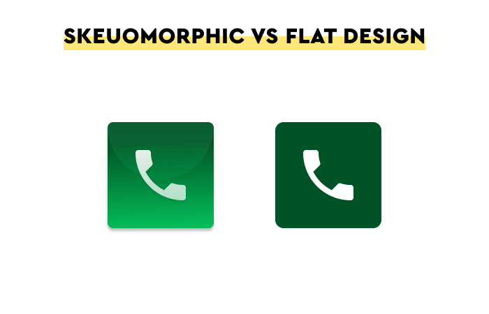
As the authors of the article "What is Skeuomorphism?", published on Interaction Design Foundation's blog, note, skeuomorphism mainly has the advantage of creating simple and evocative affordances in user interfaces. They help people understand the function, how it works, and the expected results of a given functionality much faster.
For example, a realistic, three-dimensional bin icon immediately suggests function, role, meaning, and use. It makes UX design much simpler.
Over time, users of digital products have become more familiar, experienced, and "educated" in terms of functionalities and ways of operation of various interface elements.
And, increasingly less, needed a three-dimensional bin icon to understand how it works.
The conventionalization of solutions and design patterns that inevitably occurred favored the design of interfaces that were becoming "readable."
Not so much by suggesting their function through appearance, the way they work, as by making them recognizable—as copies, further examples of a certain type.
As a result, skeuomorphism-based designs have become less helpful and a little outdated.
Explaining what the bin is used for is no longer necessary – it has become perfectly understandable.
That being said, flat design isn't only used to create icons.
This design style is most commonly used to create such design elements as:
- Typography (sans serif typography)
- Menus (hamburger menu)
- Illustrations
- Logos
- Ads
- Animation
UX design, or a concise history of flat design
Of course, the story of minimalist, reductive design outlined above, conditioned by technological and generational changes, is only half the truth.
Flat design has much deeper roots, and its origins trace back to international typographic style (also known as Swiss style), modernism, and the achievements of artists associated with the Bauhaus.
Flat design did not come from anywhere but was a continuation of earlier design trends adapted to the new digital environment.
Thanks to these roots that have prepared the suitable ground for this approach to design, flat design has been received quite well by UX/UI designers and users.
Two competing but largely complementary systems played a significant role in popularizing flat design, making it almost a visual symbol of the mobile era.
Material Design had its first iteration in 2014, and Human Interface Guidelines, the foundations of which were developed even earlier, back in 1978.
Both Material Design and HIG, in their philosophy and basis, have a common core, and that is the desire to give the design maximal:
- Clarity
- Simplicity
- Logicality
- Structure
- Resultability
- Purposefulness – randomness is a trait that both systems try to counteract in every possible way.
An important characteristic of flat design elements is the privileging of function, the aesthetics of which must not get in the way but must support it prominently. An interface is, first and foremost, a functional tool.
This is why we should first evaluate the application's interface from the perspective of its usability rather than its visual appeal. Particularly the kind that is not conducive and does not support functionality.
By prioritizing functionality over aesthetic appeal (but not underestimating the latter's role), flat design makes it much easier to see the user experience.
It lets us notice more quickly how user experience translates into satisfaction, evaluation, loyalty, and spontaneous recommendation and observe the emotional relationship that develops between the end user and a digital product.
Flat design vs. Skeuomorphism
Another no less important factor that determined the popularity and importance of flat design was the speed and the relative ease of creating interfaces with this approach.
Projects in which skeuomorphism is a crucial value are much more work-intensive.
They require proper orchestration of such elements, building blocks as colors, shapes, forms, typography, icons, images, textures, color schemes, and schemes of tonal transitions.
What's more, if we want to effectively convey meaning, function, role, and way of doing things through shape, we need to be much more careful about designing individual elements and the interface as a whole.
Mainly to avoid creating skeuomorphic shapes that are even more incomprehensible or confusing.
We should remember that the success of the interaction, including the user's interaction with the digital product and its interface, depends on the comprehensibility of the code used for communication.
A bin is a commonly understood shape, object, symbol, and form.
However, many functions of a more abstract nature (e.g., editing and archiving) require a higher level of intuition and familiarity.
As a side note, we should remember that in retrospect and with the developed iconographic conventions, some problems solved by skeuomorphism may seem somewhat incomprehensible.
And just a few decades ago, they seemed to be the most pressing.
However, let's do justice to the facts.
Skeuomorphism has/had an essential role in the development and popularization of mobile devices, in which three-dimensional icons (like a camera) suggested the operation of certain functions.
With the appearance of new technologies, devices, and ways of operating (e.g., the tactility of mobile devices), skeuomorphism plays an important educational role. However, when it succeeds in this field, which happens quite quickly, it is replaced by a less "blunt" flat design.
In a multi-channel, multi-tool, multi-app world where seamless transitions from one device to another, from one channel to another, and from one app to another are a certainty, skeuomorphism is a considerable liability.
Adapting three-dimensional designs to such a variety of conditions, constraints, specifics, and modes of operation is a formidable task. And considering the dynamics of changes outright unprofitable.
In addition, skeuomorphism is inefficient in terms of speed. It requires much more memory resources, computing power, and Internet connection bandwidth (and it is still weaker in mobile devices than in fiber-optic networks).
UI design – advantages and basic usability of flat design
Flat UI design reduces the depth, perspective, and spaciousness of objects.
It moves away from imitating the real world and replaces all these elements with their simplified variants, which are characterized by:
- Communicability
- Expression
- Clarity
Benefits of flat design
Why did designers feel compelled to start using the flat design approach? Most probably because of its wide array of benefits for creating functional websites and reducing unnecessary clutter. This is especially important for mobile devices, where clear and readable interfaces are crucial.
Moreover, this design style provides the following:
- Improved readability and legibility
- Clear visual hierarchy
- Quick navigation
- Reduced size of graphic elements, resulting in faster loading
However, at the same time, it has one significant flaw, which flat design critics like to exaggerate and treat as a deciding factor.
Namely, flat design – particularly in its first release, 1.0 – poorly suggested the interactivity of elements, that is, the fact that they are connected via hyperlinks with other elements.
A popular comment on this matter made by NN Group researchers states:
We've noticed that long-term exposure to these flat yet clickable elements has been slowly reducing user efficiency by complicating their understanding of what's clickable and what isn't.
Of course, this is true, but is it that significant?
Does flat design really not support interaction, navigation, or User Flow? It is a highly debatable issue, and, in a sense, it is already in the past.
Today's response to this problem in the form of Flat Design 2.0 has actually made this problem quite irrelevant.
The thesis of flat design's lower navigational usability had its basis in the belief that mobile or web application users have trouble recognizing and distinguishing interactive elements from those that are not linked.
As Kate Moran, a researcher associated with the Nielsen Norman Group, suggests in her article "Flat Design: Its Origins, Its Problems, and Why Flat 2.0 Is Better for Users," without visual cues, the cost of interacting with an app is higher.
It is much more difficult to predict how an element works, its effects, and how it can be used. It is true.
Flat design in the 2.0 version solves this problem with subtle and limited:
- Midtones
- Gradients
- Contrasts
- Combinations of "flat," realistic, and skeuomorphic elements.
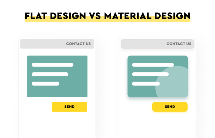
Material Design vs. Flat Design
What does the Material Design developed by Google have to do with flat design?
We can answer this question by referring to various very sophisticated arguments, but the answer is quite simple.
Material Design is a very particularistic, coherent, systemic, extensive, unifying (and therefore conducive to understanding and acquiring competencies and skills), and complete example of flat design in the 2.0 formula.
We should add that it is a design system that is constantly being developed.
It is simultaneously a collection of guidelines, components, templates, examples, recommendations, and research results that, at their core, consider usability.
According to its creators, usability can best be offered and enhanced by appealing to minimalism and combining different design traditions.
To be clear, the word "material" does not appear in this name by accident.
Material is an expression of an attempt to combine and recognize the importance of realism, skeuomorphism, minimalism, and the tradition of simplifying design.

Material Design is an expression of compromise thinking, trying to combine the best of each tradition in its own way.
Material Design mimics the way of working but does so in a simplified manner. It seems simultaneously familiar and fresh.
It does not shy away from depth but does not fetishize it. It does not give it a unique role, only a supporting one. Important, but not the most important.
It is focused on communicating, alluding, hinting, and suggesting, but it does not do so in an ostentatious, exaggerated, and flashy way.
In hindsight, we can clearly see how some skeuomorphic solutions not only served to communicate functions but did so in such an ostentatious manner that they focused unnecessary attention on themselves.
Effectiveness was ahead of efficiency.
Material Design is an improved, more self-aware version of flat design that avoids such unnecessary distractions.
Flat design critics at Nielsen Norman Group
Of course, flat design (versions 1.0 and 2.0) also received thorough criticism.
Perhaps its most traditional critics are researchers from the Nielsen Norman Group, who have devoted more than a dozen articles to flat design.
By reading articles such as: "The Fundamental Flaw in Flat Design," "Windows 8 - Disappointing Usability for Both Novice and Power Users," and "Long-Term Exposure to Flat Design: How the Trend Slowly Decreases User Efficiency," one might become quite skeptical of flat design.
What, for NN Group researchers, is the biggest problem with flat design? The answer is simple – the user and their needs.
According to the authors from NN Group, flat design is:
- More of a trend than an effective way to solve users' problems.
- In the long run, an ineffective solution – convention, instead of increasing, facilitating, and automating the understanding of how elements work, makes them less understandable.
- An unnecessary and, in fact, somewhat harmful r/evolution in codifying the meaning and how given elements work.
- Responsible for increasing the time required to execute tasks in digital applications.
- More costly for the user – the cost of interaction (cognitive, behavioral) is much higher.
- Responsible for lower detection of elements.
What is flat design? Summary
- Flat design is a minimalist design style of user interfaces for digital products.
- Flat design in the 1.0 variant reduced objects' depth, perspective, and spaciousness. It replaced elements known from the real world with their simplified variants.
- Realism, skeuomorphism, and flat design are dominant design styles in web design.
- Simplicity, two-dimensionality, expressive color schemes, easy scaling of elements, and high efficiency characterize the flat design.
- This design style's benefits include a clear visual hierarchy, faster loading, and improved readability.
- UX/UI designers can apply this approach when creating icons, typography, menus, and more.
- In the 2.0 variant, the flat design includes three-dimensionality but introduces it in a very minimalistic way.
- Flat design addresses the need to scale applications to offer fast, useful, fully functional digital products across channels and contexts.
- Flat design is inseparably connected to the development of mobile applications.
- Skeuomorphism allows us to create simple, evocative affordances in user interfaces that help users understand functionalities and how things work much faster.
- The conventionalization of design patterns supported the design of interfaces that became "readable" through their recognition.
- Flat design allows us to see what user experience is by prioritizing function over aesthetics.
- Skeuomorphism has an important educational role.
- Material Design is a very particularistic, consistent, systemic, extensive, unifying, and complete example of flat design in the 2.0 formula.
- Material Design mimics the way of working but does so in a simplified way.


