
The contact form on a website is as much a necessary functionality as a problematic one. The design of forms almost always involves dilemmas that are difficult to resolve.
The needs of website users and business owners almost always conflict or at least do not coincide.
As a rule, business owners, with the help of forms, want to acquire a large amount of helpful and useful information (in terms of marketing, communication, and business).
As a rule, website users want to fill out as few fields as possible and enter as little data as possible.
So what is the optimal way to design a contact form for a website? How to make a form on a website and find a compromise?
Should a form on a website be as short as possible? What to avoid when designing forms?
Does any research clarify that a form on a website must be short, and is it a universally applicable rule that causes conversion problems if not met?
Can the contact form result in a satisfactory conversion, or is it an imperfect, problematic functionality that we have to put up with?
Are you curious about what to do with the infamous contact forms? If yes, please read the following article.
Why do users not like filling out forms?
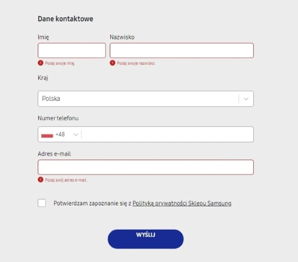
A form on a website, regardless of its type (contact, credit card data, personal information data, order, registration, login, etc.), raises problems and is a source of numerous errors.
So it is worth ensuring that the expected and processed information is seamless for a user.
Forms on websites are not elements that meet with much enthusiasm from end users. Therefore, designing forms means paying attention to what users care about.
When writing about a lack of enthusiasm, we use a euphemism. As a matter of fact, users simply hate filling out forms.
And the topic of reluctance, attitudes, and emotional reactions towards forms has become a very popular topic of articles published in the trade press, in usability and User Experience magazines.
Where does this reluctance come from, and what is its source?
An extensive contact form is more beneficial for the business owner.
The usability of a form comes down to the following:
- relatively simple contact, especially if contact by phone or in person is, for various reasons, impossible or not preferred
- obtaining useful (e.g., sales-related) information
- establishing a longer-term relationship (e.g., through newsletter subscriptions)
- providing contact outside the organization's working hours.
From the perspective of a form user, it is a useful, seamless functionality as long as:
- it has non-problematic questions to which a user does not know the answers or needs to perform additional actions (e.g., check the taxpayer identification number)
- most of the fields are not required
- does not have multiple-choice questions with many options
- does not have a large number of fields requiring a large amount of information
- has simple and easy-to-understand instructions
- information required does not violate user privacy and does not involve sensitive data.
In addition, additional factors, let's call them contextual, affect perceptions, evaluations of forms, and willingness to fill them out.
These primarily include:
- the credibility of a website, what kind of impression it makes (the so-called first impression effect, which is crucial from the UX point of view)
- fear of cybercrimes resulting from low credibility and low trust
- image of a website – to what extent its design, appearance, and manner of operation are perceived as professional, consistent with the prevailing design conventions in a given industry to which the end user is accustomed
- overall impression of a form, whether at first glance it is perceived as simple and unproblematic or overwhelming and unintuitive
- fear of wasting time, failure associated with filling out the form
- adapting the contact form to the device (desktop, mobile), screen size, resolution, and the way of entering data (taps, entering data using the keyboard on a laptop).
Overall, we can narrow down the problems with a contact form on a website to the concept of interaction cost, described in the article "Interaction cost," published on the Nielsen Norman Group blog.
According to the definition proposed by NN Group researchers, the cost of interaction is the sum of all the effort (cognitive and physical) that users must put into interacting with a site to achieve their goals.
Of course, it is impossible to achieve zero interaction cost, but the goal of UX/UI designers should be to minimize it.
When designing forms, we should reduce the following:
- number of fields in a form
- amount of text necessary to read to understand the operation of a contact form
- need to scroll through a website to fill out all the form fields
- the necessity to search for relevant information
- amount of data that must be entered
- methods of validating the entered data
- amount of information that end users need to remember (Short-Term Memory load) or recall (Long-Term Memory load) to perform a task successfully
- repetitive information that needs to be entered in forms.
When designing a contact form, it's also worth keeping in mind a point made by Marieke McCloskey, User Experience Specialist at Nielsen Norman Group, in the article "Form Design Quick Fix: Group Form Elements Effectively Using White Space."
Marieke McCloskey, referencing NN Group research, notes that even the smallest moment of hesitation when filling out a form can significantly reduce the conversion rate.
Contact forms are just a means to an end, and users should be able to fill them out quickly and without errors.
By tailoring the design of a form to users' expectations, it is possible to eliminate hesitation or significantly reduce its impact.
So how should we design forms to lower interaction costs and minimize the risk of hesitation?
How to design a contact form? General principles
Most of the research (which we will continue to mention in this article) and design patterns recommended in the User Experience trade press suggest that the contact form should be, first and foremost:
- simple
- short
- convenient
- consistent and structured
- readable
- easy to scan
- limited in terms of the amount of data required
We should use the contact form to obtain only the necessary information (from the perspective and opinion of a user) to make contact and a successful response.
Using a contact form to acquire commercially useful marketing data is inadvisable from a User Experience perspective.
Also extremely important is how the various fields of a contact form are organized and arranged. We should establish the order of fields and their logical relationship according to the principle of "First things first," that is, putting the most important information first.
In terms of the visual structuring of contact form fields, those related in terms of logic and content should be placed closer together.
The rationale for such design choices is the Law of Proximity discovered as part of Gestalt psychology.
According to the Law of Proximity, we tend to see close objects as a whole, not as the sum of the parts.
Grouping of the related fields helps end users understand the information they need to fill out. This also suggests their significance and inseparability.
It is crucial to ensure that the labels of input fields and functionalities for making choices (e.g., checkboxes, sliders) and validating the entered data are understandable.
Labels and field names should be as concise as possible and simultaneously understandable. They should clearly indicate what type and in what format the data should be entered.
NN Group researchers suggest labels should be placed above fields where data is entered. This solution makes scanning the contact form much easier.
The action buttons should make it possible to send the entered data easily. After an action is executed, an end user should be clearly informed about the result of their action.
How to design a form with good conversion? Examples of success stories
We can find a valuable and very useful addition to the principles described above in the article "Website Forms Usability: Top 10 Recommendations," published on NN Group's blog.
Its author, Kathryn Whitenton, who formulated 10 design practices, suggests the following:
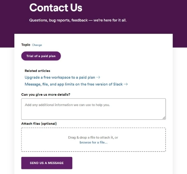
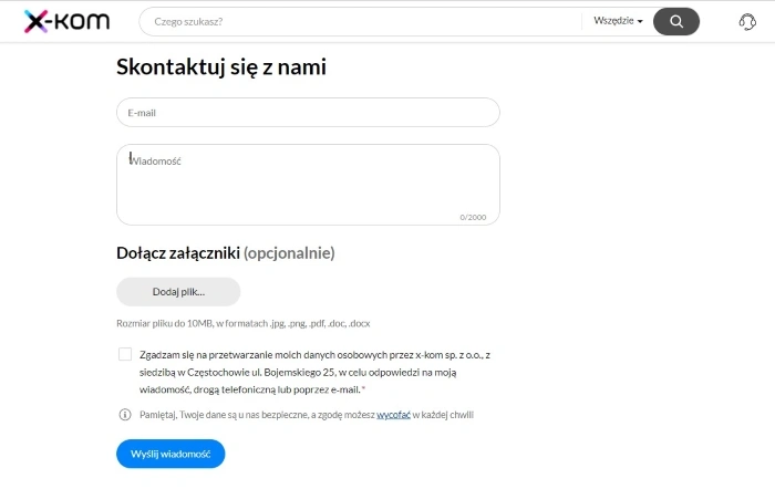
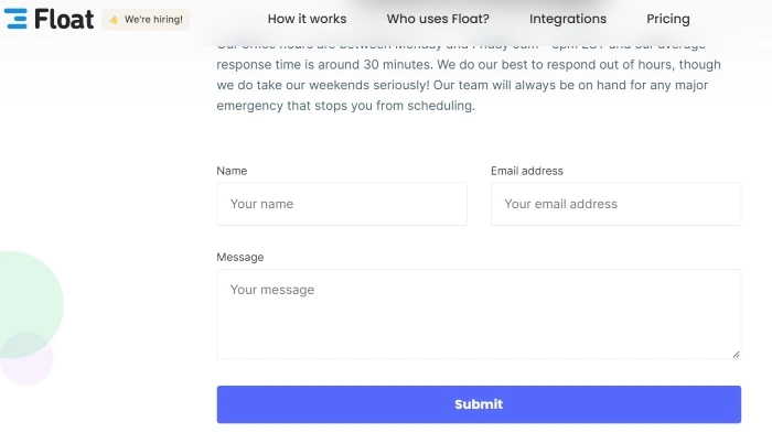
- Keep it short
- Visually group related labels and fields
- Present fields in a single column layout
- Use logical sequencing
- Avoid placeholder text
- Match fields to the type and size of the input
- Distinguish optional and required fields
- Explain any input or formatting requirements
- Avoid Reset and Clear buttons
- Provide highly visible and specific error messages.
Of course, the primary goal is to improve and optimize the conversion rate.
Shortening a form and reducing the number of fields significantly improves results, as the researchers found out for themselves. The form on the NN Group website has been shortened from 6 to 2 fields.
Another example of the positive impact of reducing the number of form fields on conversion rate is described in the article "Which Types of Form Fields Lower Landing Page Conversions?" published on the HubSpot blog.
HubSpot is an American software company listed on the New York Stock Exchange, offering HubSpot CRM, inbound marketing, sales support, and customer service software.
As the article's author notes, the number of fields on a landing page comes down to balancing supporting a positive user experience and business needs. In order to find the relationship between the number of fields and conversion, 40,000 landing pages were analyzed.
The conclusions are pretty clear. As the number of form fields increases, the conversion rate decreases. The conversion rate increases slightly as the number of single-line text fields increases.
The use of multiple drop-down fields in a form lowers the conversion rate. The optimal number of fields in a form on a website should be between 3 and 5 fields.
If the first two examples do not convince you, let us show you the next one. Marketo, one of the first laboratories focused on optimizing sales processes, also studied the relationship mentioned above.
The results were described in the article "Lead Generation: Testing the length of form fields reduces cost-per-lead by $10.66."
A/B tests of forms consisting of 5, 7, and 9 fields were conducted. The testing clearly showed that as the number of fields increased, conversion decreased by 10 and 12%, respectively.
Further examples of research are presented in the article "How To Optimize Contact Forms For Conversions."
The first involves Imagescape, which, by reducing the form from 11 to 4 fields, improved conversion by 5.5%.
The second example shows a twofold increase in conversion on Expedia.com's form after removing one field.
Why does reducing the number of fields increase conversion? Fogg Behavior Model
Brian Jeffrey Fogg is an American social psychologist affiliated with Stanford University and the author of the Fogg Behavior Model.
Fogg's behavior model consists of three elements that determine actions. It's about Motivation, Ability (the difficulty level of doing something), and Prompt.
As the difficulty of an activity increases, the chance of performing it decreases, particularly if it is not combined with strong motivation.
Fogg's model provides a compelling explanation of the relationship between the number of form fields and the amount of conversion rate.
The fewer the number of fields in a form and the better it is designed (according to the design recommendations we presented above), the easier and faster it is to fill out, and thus the conversion increases.
As users' motivation to fill out a form increases, the likelihood of filling out a form rises – even when it is a longer one (within reason, of course).
At the same time, the optimal number and level of complexity of fields and functionalities in a contact form should be determined by A/B tests, which will help decide which variant is more effective in a given case that achieves a higher conversion rate.
Designing forms. Summary
- The process of designing contact forms raises many dilemmas.
- With the help of forms, business owners want to acquire a large amount of useful information. One field is usually insufficient, but each additional field lowers the conversion rate.
- Website users want to fill out as few fields as possible, enter as little data as possible, and only provide essential information.
- Due to the above incompatibility of interests, website forms arouse strong negative emotions.
- For the user, a form is only as useful as long as it is short, there are no problematic questions, no multiple-choice, the data submission is done in the correct format, and the field labels are understandable. As long as the data is used to establish communication.
- Most contact forms on websites generate too high a cost of interaction.
- The cost of interaction is the sum of all the effort (cognitive and physical) that users must put into interacting with a site to achieve their goals.
- To reduce the cost of interaction, it is worth ensuring the implementation of messages, minimizing the number of fields in a form, the amount of text, and the need to scroll through a website.
- By tailoring the design of a form to users' expectations (for example, by grouping fields), it is possible to eliminate hesitation or significantly reduce its impact.
- Above all, the contact form must be simple, short, convenient, and easy to scan (among other things, the arrangement of fields, option buttons, and checkboxes is key) and limited in terms of the amount of data required.
- We should establish the order of fields, labels, and action buttons and their logical relationship according to the principle of "First things first," that is, putting the most important information first.
- Contact form fields related in terms of logic and content should be placed closer together.
- The goal of a form is to maintain visual consistency and eliminate any additional fields. The best solution is to make it easy for a user to fill out.
- Fogg's model provides a compelling explanation of the relationship between the number of form fields and the amount of conversion rate.
- The smaller the number of fields and the better it is designed, the easier and faster it is to fill out.
- The ease of filling out a contact form increases the motivation to complete it, thus increasing conversion.


