Unless it involves the design of credit card forms or order forms, the design of text fields rarely becomes a separate design problem.
Indeed, it doesn't receive as much attention as it should, especially since it's a significant problem that can cause as many losses as profits.
You encounter text fields in web and mobile applications all the time. To a large extent, their intuitiveness, effectiveness, and understandability affect the Conversion rate, Bounce Rate, and overall evaluation of the website or mobile application regarding User Experience.
However, remember that the text field is the most obvious, well-known, and acceptable method for obtaining information from the mobile application or website user.
You must focus on a few inconspicuous but significant matters to make it as helpful and efficient as possible.
Text fields have lived to see many design variants. Their most changeable variables are the definitions regarding their form, size, color, visual style, descriptions (labels, placeholder text, and hints), and how they work. How to design them?
What standard elements should a text field consist of? How to design its form, size, and color?
Which design patterns that guarantee the best User Experience should you use?
How to make the text field more useful, intuitive, simple, friendly, visible, and efficient?
These questions can't be omitted or treated negligently in the design, optimization, and digital product development processes. The design of text fields is too important to be left to chance.
Let's get to the details. We invite you to read on!
What is a text field?
Shouldn't it be clear as a day?
It could be said that every internet user or user of a mobile application knows what the text field is.
The text field (form) is one of the fundamental functionalities which users use to enter text. It is a tool that allows them to communicate and interact — perform an action or achieve a goal.
Text fields most frequently appear in forms (e.g., contact form), dialog boxes, and important stages of processes (registration, purchase, logging in).
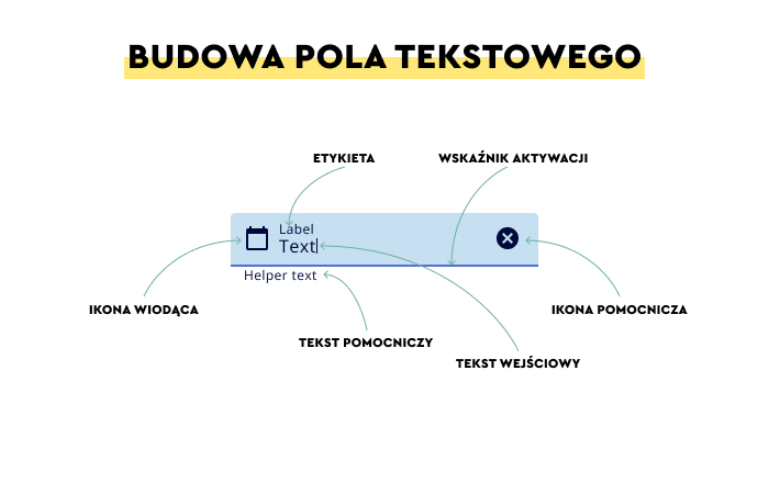
The typical text field consists of the following:
- Container — a graphically distinguished area in which the user enters alphanumeric data, which usually can fit a certain number of characters or placeholder text.
- Label text — a description informing the user which data types and in what form they should enter into the container in question or a form in general.
- Placeholder text — it's an example of the content and form of the data that the user should enter into the container.
- Validation text — can be optionally offered, and its goal is to inform the user about the validation of data, their acceptance, or the need to correct them.
- Clear button — for deleting incorrectly inserted data.
- Icons — indicating which fields are required, essential, and which are optional.
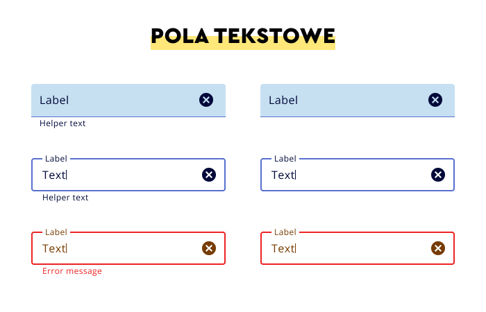
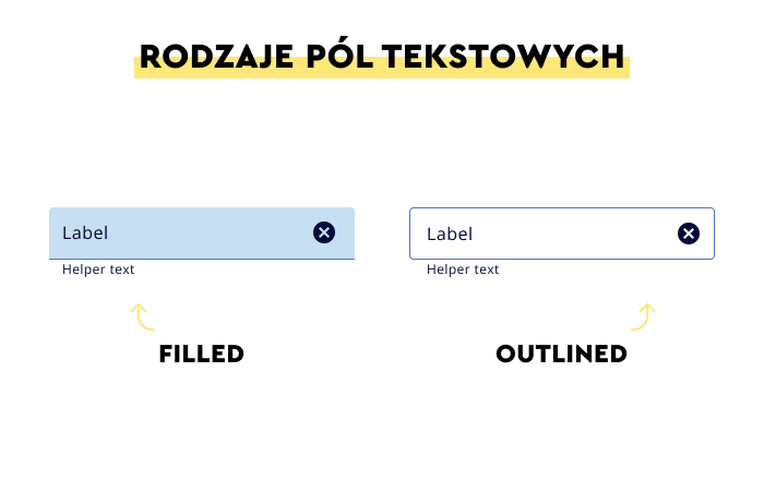
In the visual sense, typical text fields come in two variants:
- Filled text field
- Outlined text field
The choice of a particular option should be motivated by the following:
- Adequacy to the visual style of the digital product
- Relevance to other functionalities offered in the user interface
- Ability to easily distinguish the text field from other interactive elements (such as buttons).
The primary goal that you should achieve while designing text fields according to recommendations included in the Material Design (Text Fields) is to make them:
- Discoverable — text fields should stand out from the page's structure and be easy to spot while scanning the website or mobile applications.
- Clear — the state of the fields should be seamlessly, quickly, and obviously distinguishable.
- Efficient — their main goals should be to support the user in understanding which information they should enter and how to correct mistakes.
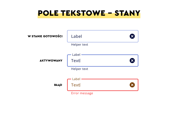
Furthermore, the interaction with the text field should suggest to users the state of the field.
According to the distinction proposed in Taras Bakusevych's article "Text fields & Forms design — UI components series," text fields should communicate one of the following states:
- Inactive
- Active
- Hover
- Disabled
- Validation
- Error
All the form's states have to be quickly and seamlessly distinguishable.
They also need to be consistent across the application or website as well as compatible with users' experiences, habits, and expectations.
Designing text fields — recommended design patterns
The design of text fields from the practical point of view means a collection of minor design problems.
While individually, they're easy to ignore, they create a significant design problem when added up.
User experience regarding text fields means carefully solving the issues regarding the visibility, size, placement of the form, color scheme, description (a form of input data), labels, typography, efficiency, and support of the user during the use of these interface elements.
Here are the most crucial design recommendations concerning the key elements and issues related to the text fields and forms design.
The visibility of the text field
The text field that can't be easily and quickly found while scanning the application's screen or scrolling the page has low usefulness.
The visibility of the text field is crucial for the effective operation of its other features and attributes.
The visibility effect can be achieved with the help of two design patterns:
- The use of the filled variant
- The use of the outlined variant.
Both options can be used within a single digital product but cannot be used simultaneously within one field.
They should be used in separate places within the structure of the page or screen.
The label of the text field
Labels of text fields can have many functions, among which the most important include:
- Informative (what data should be entered)
- Explanatory (why it should be entered)
- Instructional (how to enter it)
- Predictive (what results should be expected after entering the data).
Considering the function the text of labels performs, it becomes clear that labels should be used for all text fields.
It facilitates the speed of use, typing, and ease of decision-making and makes the supported tool more friendly.
As a rule, labels should be aligned with the input row and maximally visible.
The text of labels should, above all, be:
- Concise so that it is not necessary to cut it and divide it into several lines
- Placed under the container, in the vicinity of input data which provides a faster time of completing the task.
Digital product users want to know "what information" and "what for" they need to enter and "what result" they are supposed to expect.
Labels are the most natural method for informing about goals, means, and results. In most cases, they are more effective than icons.
Hence, labels should be maximally:
- Concise
- Specific and unambiguous
- Helpful
- Legible
- Handy
- Encouraging to take actions
- Descriptive.
Thanks to offering helpful labels, the use of text fields will be much easier, and the cost of interaction will be lower. And this, in turn, decreases the resentment toward their fulfillment.
The cost of interaction is usually defined as the total cost of all the user's efforts (cognitive and behavioral) necessary to interact with a website and achieve goals.
You can read more about the cost of interaction in Richard Yang's excellent article "Interaction Design – How to Evaluate Interaction Costs and Improve User Experience."
Remember that all types of forms — even the best-designed ones — evoke some opposition and resistance. In general, filling them out is not seen as pleasant or light.
The size of the font and the color of the labels of the text field
The font size and typeface used for the text field labels should suit the style of the website or application, and simultaneously its size should come from the context, nature, and length of the text and color scheme.
In other words, the color of the label's text should result from the implemented Design System and be established in accordance with the contrast ratio.
According to the most popularized and prominent standard developed by World Wide Web Consortium (W3C), it is recommended to use the 4,5:1 contrast for small texts and 3:1 for texts with the 14 font size and larger.
Autocomplete function and suggestions for text inputs
Supporting users in data-entering processes involves, among other things, offering autocomplete mechanisms and suggestions in real time.
The abovementioned resentment and distance users feel towards text fields need to be minimized.
One of the methods to do that is to automate data entering through the mechanism of drop-down lists.
Their advantage is not only shortening the time needed to fill out the fields but also the certainty that they're entered in an acceptable way by the system.
Autosuggestions allow users to enter a desired phrase or value. It directs the process of inserting information, speeds it up, and makes it less prone to errors.
The optimal size of the text field
The size of the text field isn't unrelated to how it is seen — whether filling it out is cumbersome and lengthy or quick and seamless.
You should adapt the size of text fields in terms of convenience and communicativeness to the number and length of expected input data.
With that said, you should minimize the amount of data required from the user. With the help of all types of text fields, you should collect only essential data.
That's why the size of the fields needs to provide convenient data entering so that the user should not have to remember already inserted information and have access to them all the time.
Indicating the character limit is the best practice, and you should clearly inform the user about limitations.
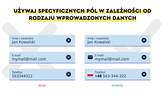
Text fields that accept a variety of data entry formats
Forcing the user to enter data in the format imposed by the system is not a recommended practice.
In particular when it's about information that can be entered in various ways (such as dates).
The best way to handle this problem is to learn about the most common formatting method and offer it to users.
Equally important is to accept various methods and automatically adapt them to the desired (from the system perspective) format.
In other words, while designing the text field, you should provide high tolerance regarding the formats in which data is entered.
It's definitely more important to make it easier for users to perform a task (and do the work in the background for them) than obtain data not requiring conversion to a desired format.
The task of the text field designers is to predict what users want to type in and how they want to do it.
Validation and error handling in the text field
There are situations where checking the correctness of data (also regarding format) is necessary or even essential to successfully complete the process (e.g., validating credit card data).
In this case, the user should be informed about the results of this validation which can be performed in two ways:
- In real-time during the entering of data (Inline Validation)
- After filling out all the fields and sending them for validation (After Submit Validation).
Regardless of whether the feedback regarding the correctness is offered immediately or after completing the task, it is necessary to offer understandable and instructive suggestions which will allow users to correct the errors if they appear.
Only informing about an error is insufficient. It's essential to show where it is and how to fix it.
Remember that some errors are conditioned by offered tools (e.g., type and adequacy of the keyboard, size of buttons in mobile apps).
Filling out the form should also be maximally accessible and shouldn't be challenging for people with various competencies, skills, and limitations (e.g., visual or manual).
In mobile apps, it is commonly adopted that the optimal size of the targets with which users interact needs to be large enough to be easily touched and enter data.
In practice, the size of text fields should be between 32-40 pixels.
How to design visual cues in text fields?
To perform their function efficiently, intuitively, and seamlessly, text fields need the support of visual cues.
With that said, remember that the lack of visual cues not only results in abandoning the interaction with the text field but also increases the time users need to spend on it.
The most obvious and essential visual cues in text fields include:
- Cues that show clickability — in the form of thin field outlines
- Cues that allow users to distinguish buttons from the text field — white is a color that, in the most precise way, suggests the function of an interface element
- Cues informing the user about the action that needs to be performed in the blank field — the suggestion should unambiguously indicate that the text field is active/inactive (e.g., with color change, bolding, the form of the field outline)
- Action verbs suggesting the desired activity (e.g., select, write).
Is it worth it to round the corners of the text field?
The readability of text fields is a desirable feature, but their emotional impact also should be considered.
Rectangular, sharp outlines, or rounded? It's a common design dilemma that results from discovering the impact the outlines devoid of "softness" have.
It has been discovered that hard shapes based on right angles evoke a greater sense of danger and are perceived as less friendly and pleasant than geometric figures in which the corners have been rounded.
Rounded corners are not a visual cue but significantly impact the user's attitude toward an interface element.
Text fields with soft shapes are seen as more pleasant, friendly, and encouraging.
That said, the outline's form supports usability but doesn't determine it.
The text field still needs to be designed according to the above recommendations.
Rounded corners are only a form of encouragement, important, but it doesn't exhaust the problem of the text field's usability.
How to design a text field on a website? Summary
- The text field is one of the fundamental functionalities which allows users to communicate and interact through letters, words, and characters.
- Thanks to the text fields, users can perform actions and achieve goals on the web or mobile app.
- Text fields often appear in forms, dialog boxes, and important stages of processes — in registration, during a purchase, or logging in.
- The text field should be discoverable (compared to other user interface elements), clear, and efficient.
- The interaction with the text field should suggest to the users the state of the field, offer default values, and precisely indicate the character limit acceptable in the text field in question.
- All the states of the field should be visually distinguishable, consistent, and compatible with users' experiences, habits, and expectations.
- UX of the text fields is expressed in their visibility, size, placement, color, labeling, typography, and efficiency.
- The text field that can't be quickly found has low usability.
- Labels of text fields have the following functions: informative, explanatory, instructive, and predictive.
- Labels are the most natural method for informing about goals, means, and results.
- Labels should be maximally concise, unambiguous, handy, and descriptive.
- The font size and typeface used for labeling should come from the context, nature, length, and color scheme.
- Supporting users in data-entering processes involves, among other things, offering autocomplete mechanisms and suggestions in real time.
- The size of text fields should be adapted to the number and length of expected input data.
- You should collect only essential data that is not problematic (e.g., doesn't require the use of special characters) through text fields.
- It's not recommended to force users to enter data in the format imposed by the system.
- Filling out text fields should be maximally accessible.
- Text fields need support in the form of visual cues.
- Text field shapes based on right angles are perceived as less friendly and pleasant than geometric figures with rounded corners.
- Text fields with rounded corners are seen as more friendly and pleasant.
- Rounded corners are only a form of emotional encouragement.