A form on a website, especially regarding online stores, is one of the most troublesome elements.
It's bad enough that it's disliked by most users, E-Commerce customers; it's also most often the source of frustration, mistakes, and cognitive friction.
So how should you design the Order Form on a website? What should an E-Commerce form look like and work? What are the form design patterns that are worth following?
Do web forms have to be such an ungrateful element of an online store? Is there no way to make them more friendly, corresponding to the needs, expectations, and capabilities of users?
As you can see, the matter is pretty severe. And it's worth paying attention to it, especially as forms, particularly imperfect, thoughtless Order Forms and Checkout Forms, are sometimes a reason for shopping cart abandonment. Because of this, people often opt for a ready-made form creator, which isn't necessarily good in terms of e-commerce user experience.
Today, we invite you to take a closer look at these issues.
Order Form in an online store as a design problem
Designing Order Forms in E-Commerce (e.g., return forms in an online store) is a challenge. Thanks to them, you can register in online stores (registration form), pay, subscribe to newsletters, or enter discount codes.
Obviously, online store customers use Order Forms to achieve a goal and complete a task by making a purchase, but simultaneously they pose quite a challenge for them.
Entering data, and that's what completing form fields is, is one of the most critical and annoying tasks in E-Commerce.
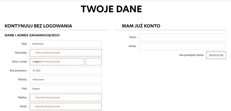
First, forms require engagement, focus, work, and investing additional time. Second, they often involve inputting data that the user doesn't want to enter if they don't have to.
And they usually assume that entering this data is unnecessary.
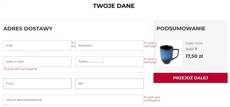
However, the natural need to economize the time to perform these tasks doesn't always overlap with the needs of online store customers. Conditioned by the logic of order processing but also, and not so rarely, legal requirements (e.g., the need to obtain consent to process particular types of data).
How to design an Order Form in an online store? Key issues
Forms cause many cognitive frictions, involve a much higher interaction cost, and are largely responsible for the experiences of the online store customer. That's why it's crucial to create a well-designed form.
In the most general sense, taking care of the E-Commerce Customer Experience (UX) comes down to making the form:
- As simple, convenient, and consistent as possible
- Clear, readable, and supporting concentration
- Minimalistic in terms of the number of fields and data.
Data collection
The Order Form in the online store should, first and foremost, be used to collect essential data for order processing.
Unfortunately, it also often serves to collect relevant data that are useful for marketing and sales (e.g., by encouraging to join various types of programs, promotions, and special offers).
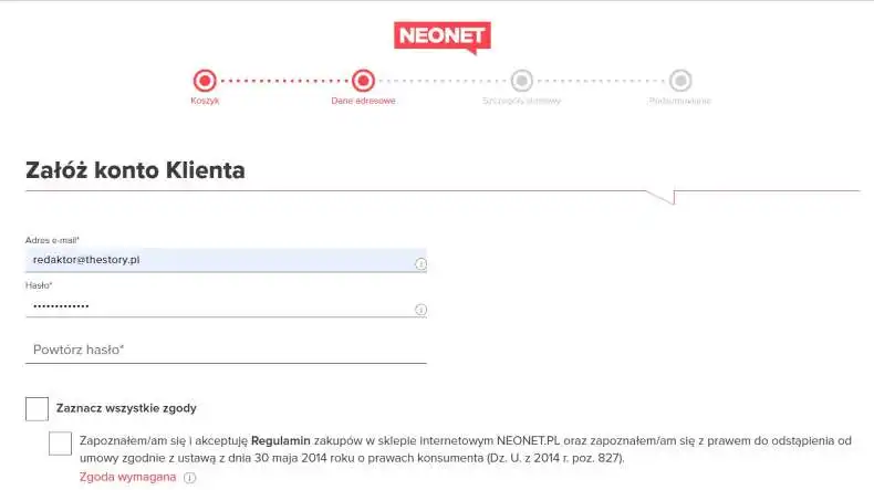
And such activities, although understandable to a certain degree, obviously lower its friendliness in the eyes of the customer.
It's also worth remembering that filling out the Order Form involves using more cognitive resources. It also puts a more significant burden on working memory, particularly in the case of long forms and multi-step forms.
By filling out forms, users need to store more information in the working memory than they would like to. And such necessity is always associated — to a greater or lesser extent — with a sense of cognitive burden, which you should want to avoid.
Number of form fields
It's not surprising that one of the most frequently recommended design patterns in the literature is:
- Reducing the number of form fields
- Decreasing the number of steps during order processing
- Supporting the customer in successfully completing the Order Form as error-free as possible
- Making the process clear, logical, predictable, and compliant with customers' experiences.
While designing the Order Form in the online store, it's worth considering one more general remark, namely that the form should be the product of two goals — business one and purchasing one.
It must equally help business owners achieve their business goals and support the customer in making a simple and seamless purchase.
The Conversion Rate is the best measure of quality, efficiency, and friendliness of the E-Commerce form; hence, caring for an appropriate and desirable (by the customer) user experience is a priority in form design. E-Commerce customers like forms that are easy to understand and simple to fill out.
It's also worth remembering that customers of online stores don't only have experiences and expectations based on them, but also they've developed ways of reacting to specific online store elements.
Order Forms will first be — usually unconsciously and automatically — analyzed in terms of their complexity which suggest the speed and easiness of filling them out.
The estimated interaction cost with the form determines the desire and willingness to fill it out and continue the process.
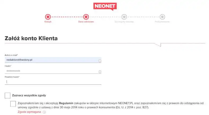
From the customer perspective, eliminating irrelevant form fields will positively influence the conversion and cart abandonment rates. You should keep this in mind.
Structure and layout of a typical form. How to create a form on a website?
A structure is a way of linking the dependencies that occur between the various elements of a given layout. In the case of forms, especially Order Forms, the structure refers to the order of subsequent fields, their logical relationships, and layout (e.g., arrangement of columns, division of the form into stages).
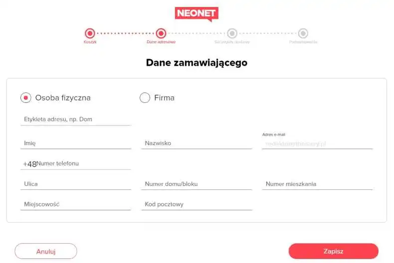
Equally important are those form elements used to enter input data (text fields) and make choices (e.g., selection fields, sliders).
The understanding of the function of a given field and its importance should be supported by field labels that, in a short, concise way, should suggest what data the customer needs to enter and in what format.
Another element of the form is the "action button," which allows users to perform an action — send the entered data. After doing it, the customer should be informed about the result through feedback.
A typical Order Form in the online store should contain minimal fields and data. Thus it should include the following:
- Name and surname of the customer — it's not recommended to split these two into two form fields or offer the choice of the form of address "Mr. or Mrs."
- Shipping address
- Postal code — it's recommended to automatically complete the place of residence based on the postal code
- Selection field for the delivery address, if it is the same as the invoice address — having to enter the same data twice is a source of frustration
- Phone number
- Selection field for the method of payment in the online store
- Separate fields for the payment card number, expiry date, and CVV code.
How to offer feedback and error messages in Order Forms?
Perhaps the most crucial issue is to inform the users of the online store about whether the data were sent or didn't contain errors. Feedback, especially communicating mistakes, should briefly explain the problem and have instructions on how to fix it.
An error message for the E-Commerce customer should be:
- Understandable and have a well-balanced language that the customer prefers to use, not the programmer
- Unambiguous
- Helpful — instructional, containing instructions on how to operate in a "step by step" formula
- Directive — they should focus on fixing the problem and continuing the purchasing process.
Error messages aren't just a matter of language or function but also of expressing them graphically. In addition to highlighting with color (red is conventionally used), the fields where errors have occurred should also be distinguished graphically, visually, and with color.

According to Dual-Coding Theory, verbal and visual messages trigger different ways of perceiving and understanding the same information in our brains, making them more effective when used together.
Understanding error messages is easier if you offer them in a verbal-visual form.
Model error messages designed in accordance with the best recommendations are as follows:
- Sensitively and tactfully inform the customer about the occurrence of an error
- Indicate through text and visually distinguished fields where the problem appeared
- Are offered at the top of the page as well as next to the field where the error is
- Explain what information is lacking or which data is incorrect.
Problems, mistakes, design patterns, and best practices for designing an Order Form
What else can be done to improve the design of the Order Form, and what else should you avoid? Let's take a look at more recommendations and best practices.
Autocorrect and autocompletion systems
In the case of online forms, especially Order Forms, it's essential to offer the correct operation of autocomplete systems provided by web browsers. In the case of mobile devices, this matter is even more crucial.
Autocomplete systems are very eagerly and often used by E-Commerce customers because they speed up the process of filling out forms (it's easy to find them).
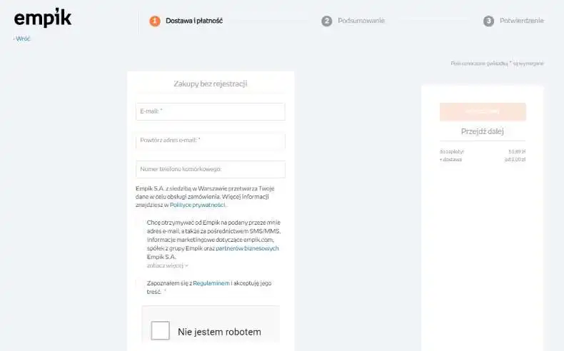
Simultaneously, they're also a source of many frustrations and abandonment of the purchasing process if the data is filled out incorrectly. Even worse, editing and correcting errors means entering and deleting them.
Even more detrimental, from the perspective of the efficiency of the ordering process, is the prevention of automatic reentry of data. And very often, the system, instead of accepting the correction after the autocompletion, completely ignores it.
And while the cause of these errors may be the configuration of the browser, its outdated version, or the device on which the purchase is made. Unfortunately, the online store is most often blamed for the errors. It's considered the sole source of the problem.
The order of form fields
The order of fields should express a certain logic that is easy to follow for the E-Commerce customer.
Namely, it should be:
- Acceptable
- Understandable and justified
- Resultant
- Natural
- In line with habits and conventions.
That's why it's necessary to ask for the name first, then the address, never the other way around. Such a convention is widespread — known, for example, from correspondence via traditional mail, official documents, etc.
For instance, asking for credit card details before filling out the personal data and address can be perceived as an attempt to phish for sensitive data. From the customer's perspective, the order of data is not indifferent.
A best practice is to order questions by the difficulty criterion. First, you should ask about the simplest matters and move on to more difficult ones.
Grouping of data
Another issue is the data grouping according to the criterion of belonging to the same category. This type of structuring introduces order and is much more readable, simpler to understand and accept, and more efficient from the perspective of cognitive processes.

Form Layout
Equally important is the layout of the form. As we wrote above, E-Commerce customers scan the form and estimate the time and energy needed to complete it before they start to fill it out.
Subjectively perceived easiness/difficulty of the Order Form is a product of its layout, among others.
The most fundamental recommendation, the pattern according to which forms are created, is to offer form fields in one column, not two or more.
The speed, difficulty, and flawlessness of filling out depend on the perception of the form, on how the fields are seen as individual fields and as groups, as a whole.
Forms, if for various reasons need to be expanded, should be divided into smaller groups and offered on one page, in one column, or divided into smaller stages that are seen differently and characterized by lower interaction cost and smaller cognitive load.
It's worth taking this opportunity to look at the results of eye-tracking studies discussed in the article "Web form design guidelines: an eyetracking study." They clearly show that the layout and division significantly improve the perception and efficiency of the web form.
Labels
It's also worth remembering the most optimal position of the form labels. The most convenient and supportive of data entry is to place labels just above the form field. Thanks to this, the customer scans the form from top to bottom and is not distracted by having to redirect their eyes to the side, as is the case in the format of placing the label on the left side of the form.
No less important is the incentive to fill out the form. While it may seem that a customer who is determined to make a purchase and understands the meaning, purpose, and function of the Order Form does not need additional motivation, an adequately worded Call To Action in the form of a headline significantly promotes its completion.
It's also not recommended to put labels in the form field. Unfortunately, the label as a placeholder text makes it necessary for customers to store its meaning and content in working memory when they start to complete the field. And this can foster distractions, increase the number of errors, and, finally, unnecessarily engage mental energy, resulting in a sense of difficulty and fatigue.
It's also worth bearing in mind that labels as placeholder text will be even more inconvenient for people with visual impairments because, for example, screen readers usually ignore this type of text. We've written more about this in the article "Color vision disorders of interface (UI) users. Accessibility of interfaces for people affected by common diseases."
Data validation
Data validation should occur in the inline formula, that is, after entering it and before sending the form.
With that, the goal of correct data entry is less problematic and costly. It also involves fewer cognitive frictions and ensures better user flow. We've written about it in the article "User Flow – the path to a successful purchase. The importance of User Flows."
The size and formatting of form fields
The size (length and width) of individual fields also is significant and should be adapted to the amount of data expected to be entered into them. Too short fields don't support customers in catching their own mistakes. They may cause the desire to enter incomplete data in the form of abbreviations or symbols.
Imposing a determined format for entering data (e.g., of phone numbers) is definitely not recommended. Unfortunately, even instructions for entering data in a specific format with examples won't counteract the errors, frustrations, and resistance caused by enforcing the proper form.
A recommended way to handle the problem of data formatting is to use the masking of the input data, which automatically formats them. Thanks to such compromises, customers don't feel pressured, and store owners obtain data according to their expectations.
Designing forms for mobile devices
We talked about the general design principles that apply to web forms. However, how to create well-designed forms for mobile devices?
A mobile device differs from a desktop one, primarily regarding the available space. Of course, that's not the only difference. We carry smartphones almost everywhere and on a daily basis. They're essential tools for our everyday lives. They help us at work and at home.
That is why the design of an Order Form for an online store should be responsive so that it can easily adapt to the change in the channel. It can make our site more mobile user-friendly and thus facilitate registration and the purchasing process, among others.
A great article on HubSpot, "Form Design Best Practices: 15 Tips to Boost Conversions and UX," offers handy UX design tips that can help you increase conversions and improve the user experience of your mobile web forms.
So let us summarize them for you.
Implement a single-column layout
This will help you save space and, most importantly, help users read and navigate through the form. This layout will ensure that website visitors complete one form field at a time, thus facilitating the entire process of completing it.
Enable autocorrect and autocomplete
We mentioned this guideline already, but it's even more crucial to remember in the case of mobile devices. The article on HubSpot emphasizes that the screen is not the only thing that is smaller. You need to remember about the keyboard.
Not everybody is a master at typing, especially on small keyboards. Of course, everything depends on your target audience, but, for example, an older person can still find their way to your site and may encounter typing problems.
So, offering the autocomplete and autocorrect functions helps them fill out forms more quickly and, above else, more accurately and with correct information.
Make your form beautiful
Although mobile devices in some way force you to keep your web form design minimalistic, it still shouldn't stop you from making them visually appealing.
Design it in a way that reflects your brand's character. It will help users remember who they are dealing with.
Keep it minimalist
This step ties into the former one. Keeping your form minimalist lets website visitors quickly find what they want. A cluttered form can discourage them from continuing the process and abandon the potential purchase. Keep in mind that you need to fit the most important elements in a relatively small space, and the rule of "less is more" can help you achieve this.
Design of CTA buttons
Kristen Baker, the author of the article mentioned above, also draws attention to the CTA button design that always accompanies web and Order Forms.
They are crucial from the perspective of persuading your customers or users to take desirable actions. Thus, it's beneficial to pay attention to how they're designed.
Kristen Baker offers five tips that can assist you in this regard.
Five things to keep in mind when designing CTA buttons
Pay attention to the size of the call-to-action button
You should determine the size of your CTA buttons by examining the web forms and web pages as a whole. Ensure they're not too small or too big so they won't cause clutter on the page and still be noticeable.
The appearance of the action button
The appearance of the Action button matters. The action button is the button that the users click on. For example, in the case of this article, it is the "Check our offer" button.
You should make it stand out, by, for instance, using the right color contrast. Also, keep in mind that the text on such a button should be concise and direct.
Choose the right font
The selection of the font is crucial for a positive user experience. It affects how a website visitor perceives the content. Therefore, it should be easy to read. Call-to-actions, among others, impact sales, so the text on them should have the right size and typeface.
Consider adding special effects
Special effects can help your call-to-action button be more noticeable and appealing. You can enhance its appearance by using effects such as drop shadows, rounded corners, or gradients.
Carefully think about the placement of the CTA button
You should place the CTA button in a place that feels the most natural, where the user can organically encounter it during form completion. Remember, you want them to click on it, so do not hide in a place where they do not expect to see it.
Design patterns for Order Forms. Summary
- The Order Form in an online store is one of the most troublesome elements.
- A Shopping Form should support the goals of store owners and their customers.
- The purchasing process in an online store should be improved with the help of a form. Hence, the most crucial design recommendation is the reduction of steps and field forms.
- You should avoid collecting irrelevant information from the perspective of order processing.
- Forms require engagement, focus, work, and investing additional time. Interaction with them requires a specific cost.
- Forms are mainly responsible for the experiences of the online store customers and their willingness to continue shopping or abandon the cart.
- Customer experience is essential. That's why E-Commerce form design should be as minimalistic, simple, convenient, and consistent as possible.
- It's also worth remembering that filling out the Order Form in an online store involves using more cognitive resources.
- Customers of online stores developed ways of reacting to specific online store elements. Their estimated interaction cost with the form determines their decision to continue or abandon the purchase.
- Some of the most critical design issues are the order in which the fields appear, their logical relationship, size, and layout.
- The sequence of fields of the Order Form expresses a certain logic that should be for the E-Commerce customer understandable and justified.
- Informing the online store customer of errors and offering feedback should include a brief explanation of the problem and instructions for correcting the mistakes.
- Understanding error messages is easier if you offer them in a verbal-visual form.
- Subjectively perceived easiness/difficulty of the Order Form is a product of its layout, among others.
- Forms should be divided into smaller groups and offered on one page, in one column, or split into smaller stages.
- The most convenient and supportive way of data entry is to place labels just above the form field.
- Data validation should occur in the inline formula.
- The size of form fields should be adapted to the amount of data expected to be entered into them.
- A way to handle the problem of data formatting is to use the masking of the input data.
- Remember to make your forms mobile-friendly.
- Do not forget about the design of CTA buttons.


