
Registration in an online store is as handy as unnecessary.
As beneficial as disliked and avoided by E-Commerce customers. Where does all this resentment come from?
Of course, there are a lot of reasons. Everybody who at least once had to register in an online store that didn't ensure a positive user experience of the online store knows how discouraging this procedure is.
However, let's not exaggerate; the devil is not so black as he is painted. And he may have a much friendlier face.
Thus, let's take a look at the typical problems with registration. It's a fascinating area, from the perspective of UX Research but also from the design and optimization side. In this regard, something can always be improved, and you need to be very sensitive regarding E-Commerce customers' needs and expectations.
Are you ready? Then let's begin!
Why do E-Commerce customers despise registering so much?
The answer seems obvious. The need for registration is a kind of obstacle in the purchasing process that E-Commerce customers would love to avoid.
To a large extent, the need — especially imposed by the store — to register is the cause of shopping cart abandonment.
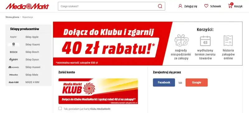
Registration for E-Commerce customers is problematic because they don't see direct benefits but instead associate it with the gain the online store obtains from it, for example, by sending information about a sale.
Registration in E-Commerce is conventionally seen as a thankless, tiring, and unnecessary task.
Unfortunately, it is rarely associated with benefits thanks to which the customers have the possibility to:
- Track the order
- Speed up future purchases
- Make complaints and communicate with the store's staff
- Benefit from special offers
- Use offered functionalities (such as wishlists).
The perception of registration as a problematic activity is also the result of the ability to make purchases without it. Particularly if a competing store, that's also considered a potential place to buy, offers shopping without registration.
The resistance of E-Commerce customers towards registration is also motivated by the one-time nature of purchases.
Customers don't always want to tie themselves to a specific store, especially when they know that the purchase is incidental and they won't most likely repeat it in the future.
Their other concern is data security. Online store customers approach the need to share their personal data with a growing number of stores/platforms with considerable skepticism.
Equally essential are the online store's requirements during the registration process. This mainly concerns the amount and complexity of data needed to create an account successfully. It is a time-consuming and error-prone task with a high cost of interaction.
In particular, it concerns the need to create a password that may not necessarily match the format of passwords that E-Commerce customers use in other stores and platforms.
And here, it is worth remembering that using the same passwords on different portals is a common practice.
The need to create a new password and remember it is so burdening and inconvenient that customers reluctantly approach this task.
The issue with registration is also a problem with creating a login, which, like a password, involves similar costs and risks (such as forgetting about it and needing to recover it; this procedure is not always quick, easy, and pleasant).
You should also remember that online store customers often create mailboxes for purchasing, resulting in the common problem of losing access data to them and, thus, the inability to recover access data to the online store.
They also make purchases on various devices. And we don't have in mind the most classic division into mobile and desktop devices but a division according to ownership criteria.
Online shopping is sometimes done in personal and business contexts, at home, and on the road. And this means that customers would have to store data on each of these devices, and that's not always possible or desirable.
All these accumulated issues lead to the intense resentment of E-Commerce customers toward the need for registration.
In the confrontation of two stimuli — positive, encouraging to purchase (e.g., attractive price) and potentially negative, discouraging from purchase (the need for registration) — unfortunately, very often, the potentially negative stimulus is stronger.
That's why often repeated design recommendation that improves user experience in E-Commerce is to stop forcing customers to create accounts.
Of course, the improvement of the experience of store's customers doesn't boil down to just offering the ability to purchase without registration. Its process should also be continuously optimized and made as convenient as possible.
And that's the purpose of research-based design recommendations and best practices published cyclically by research companies such as Baymard Institute or Nielsen Norman Group.
Registration in an online store — best practices
It is pretty apparent that you simply need to convince E-Commerce customers to register.
Preferably with specific and attractive benefits.
You should also take care of not only benefits or specific arguments but also the language and tone of the presented message.
Lightness, humor, and a specific concept are definitely recommended. A too-technical, dry, and emotionless message will be less effective. That's why it's worth testing different forms of incentives.
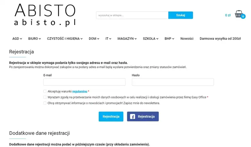
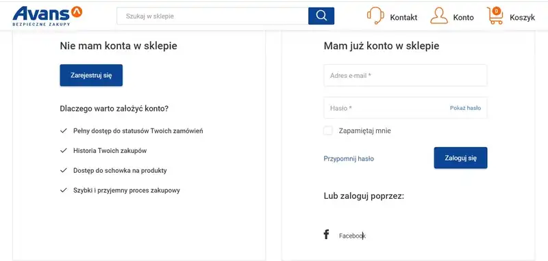
As we've already mentioned, some customers will not want to create an account because they treat the purchase incidentally. That's why you should offer the possibility of buying as a Guest for this category of users.
That said, the information about this option should be clearly communicated on every subpage of the store.
The optionality of registration should be specifically expressed and combined with information and the possibility of registration at any shopping stage.
Beyond the apparent benefit, you won't lose the customer because of this, and additionally, you provide them with a sense of:
- Control over the process
- Freedom
- Fluidity of the purchasing process
- Buying comfort, free from barriers, requirements, expectations, and difficulties.
Another recommended solution is to offer online store customers the breakdown of the registration process into subsequent stages in which they will enter further data.
The number of steps and complexity should be guided by self-restraint and limitation. In other words, gathering all the data is not recommended but only those necessary from the perspective of order fulfillment.
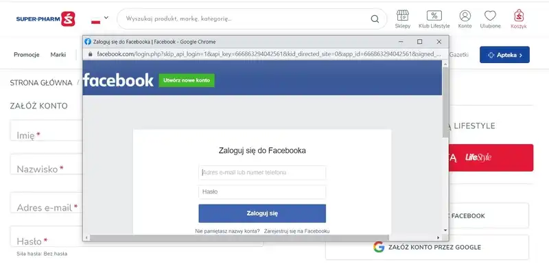
It's pretty popular to offer the ability to register through social media, thanks to which users avoid the creation of new passwords and logins or adapting already existing ones.
With that said, offering a quick form of registration should not be an excuse to collect additional data (about demographic, for example).
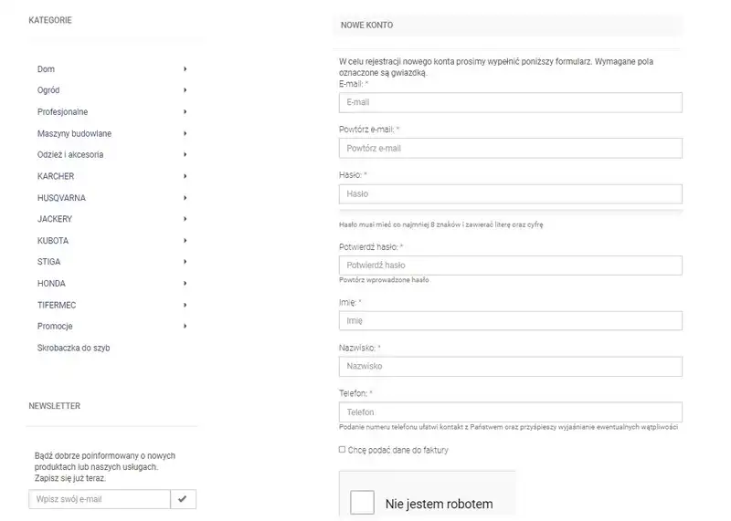
One of the most common design mistakes is the necessity to repeat some of the information — usually, a password and a login.
From the store's perspective, it is a measure to prevent possible mistakes (such as typos). However, from the customer's standpoint, it is unnecessary action, just as the need to verify the account through a link.
The verification of the account should be offered in the form of "postponed necessity," the execution of which can be delayed.
Account verification shouldn't be mandatory for placing an order and its fulfillment.
Remember that spreading some activities over time also improves the experience of online store customers.
How to ensure a good user experience regarding login and password?
Coming up with a new password or adapting the existing one in different stores and platforms is always painful. It's also extremely frustrating!
A significant number of customers have problems with remembering new access data.
This mainly happens when the store imposes very restrictive expectations towards logins and, above all, passwords. While from the standpoint of security, these are desirable practices, customers definitely dislike them.
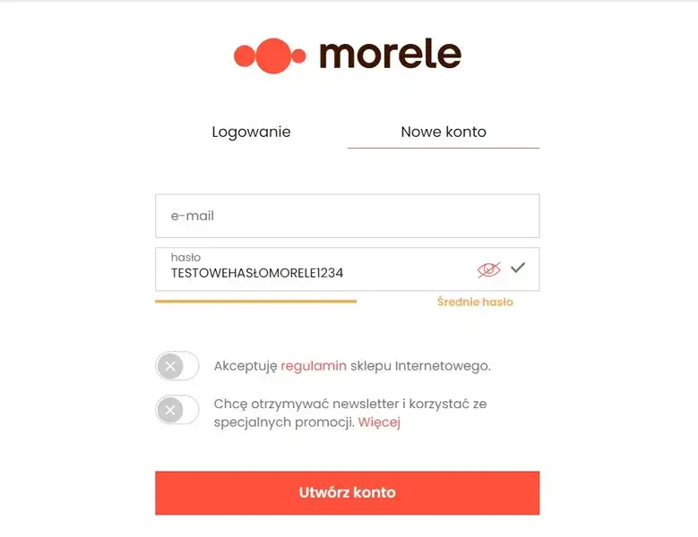
The more secure and thus complicated password, the higher probability of forgetting it right after coming up with it.
Even more so when the password is masked. Password masking is a practice that may result in numerous errors, especially when the store doesn't provide the option to unmask it, which is a functionality that makes the password visible while typing.
Balancing security and customer protection with their convenience is difficult, but nonetheless, it is possible.
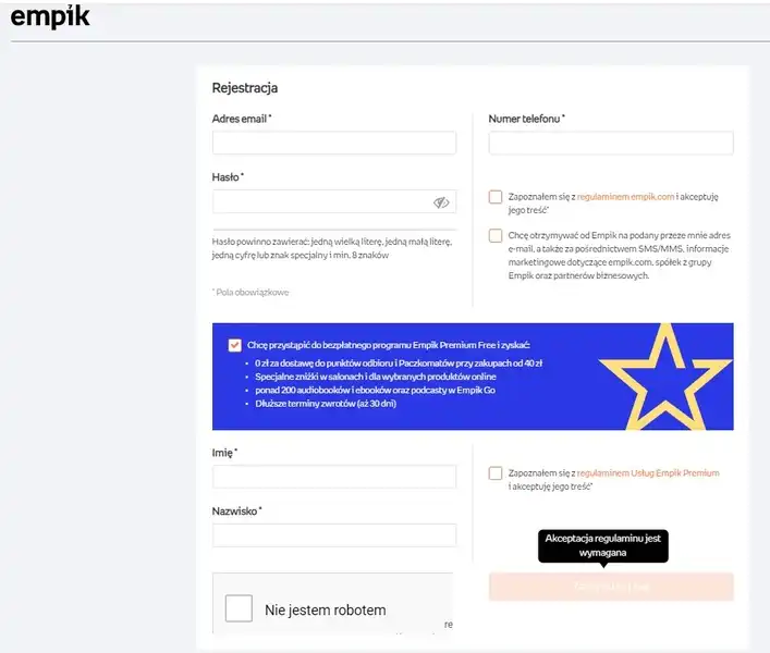
All it takes is to request no more than two of the typical repertoire of required password components (numbers, upper and lower case letters, symbols, length greater than 8 characters, no repetition).
Use password quality and strength indicators to achieve a compromise regarding security and customer expectations.
Thanks to this simple solution, customers are aware and, in a certain sense, responsible for their safety. They also can understand the relationship between the form of the password and the level of security it provides.
It's also essential not to require a customer to repeat the setup password. It's more customer-friendly to offer a simple password recovery method if the customer makes a mistake.
While passwords seem essential, the individual, separate, unrelated, and unique logins are a bit of an anachronism.
Biding a password to an e-mail address is a unique enough combination, at least from the perspective of statistical E-Commerce customers.
And it's hard to argue with this approach.
An optimal number of fields in a registration form
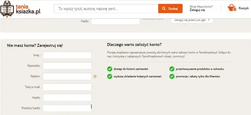
The best practice recommended by UX researchers and UI designers is to minimize the number of fields in the registration form.
The bad old days, in which you filled out over a dozen fields during registration, are fortunately a thing of the past.
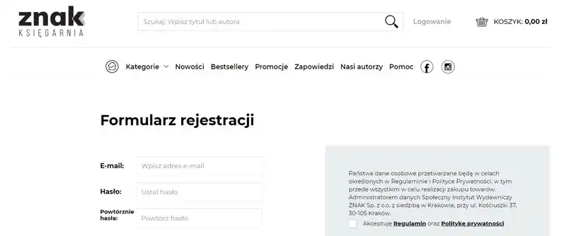
Currently, it's recommended to require customers to fill out no more than three fields, including name and surname, e-mail address, and password.
The simplicity of the form, the speed of filling it out, and minimal expectations are standards that customers desire from online stores.
Contrary to what you may think, the number of fields significantly impacts the conversion rate. It influences the sales volume, the sense of satisfaction, and the willingness to repeat the purchase. It is directly responsible for positive user experience and customer experience.
If you think that these claims are exaggerated, then we recommend you to read the article "Expedia on how one extra data field can cost $12m," which provides a pretty telling example of the impact of the number of fields in a form on financial performance. And you can find many more such examples, though perhaps less spectacular.
A crucial matter in the design of registration forms is to clearly and unambiguously inform the user about requirements before they start to enter data into fields.
In particular, this applies to the following:
- Diacritical marks
- Minimum and maximum password length
- Password format
- Address
- Contact data (mandatory and optional).
You should also remember the proper validation and report errors that could appear during data entry.
Regarding this aspect, the article "How to Report Errors in Forms: 10 Design Guidelines," written by Rachel Krause, a researcher associated with Nielsen Norman Group, provides handy recommendations.
She rightly notes that when designing a registration form, it is essential to remember to correctly:
- Highlight messages about errors; they should be easy to notice
- Label errors; they should be easy to understand
- Offer solutions to errors; hints should be available in a handy way to avoid the need to memorize them.
Furthermore, Rachel Krause recommends to:
- Use inline validation consistently and as often as possible
- Utilize colors to indicate errors and the correctness of entered data
- Use animations and icons
- Offer several types of error messages.
Registration in an online store. Summary
- Registration is an obstacle to a smooth and trouble-free purchasing process. It organically opposes it.
- E-Commerce customers should be more often and, in a more attractive way, informed about the benefits of registration in the online store. Running a store that has regular customers is much more effective.
- The resentment toward registering a new account has at least several causes, some of which should be taken into account during the design process.
- Perhaps one of the most problematic reasons is the necessity of entering a huge amount of data and setting up a password and login with very restrictive requirements.
- The need to remember many passwords and logins (in the user's memory and various devices) is very problematic from the standpoint of E-Commerce customers.
- The optimization of the purchasing process and offering the ability to buy as a Guest should not be the only solution to the problem of reluctance toward registration.
- The registration process should be as short and simple as possible and broken down into stages or done through social media accounts.
- The need to repeat entered information is a common design mistake.
- Minimizing fields in the registration form translates directly into an improved conversion rate and impacts financial results.
- You should pay special attention to the customer experience related to setting up a password and login.
- Balancing the store's customers' security and convenience is a feasible and recommended task.
- Minimizing the number of fields in a form and ensuring proper reporting of errors appearing during its completion influences the positive user experience of the online store's user.


