
Creating online stores at the design stage is a complex process requiring knowledge of cognitive psychology, E-Commerce platform requirements, Google requirements, and an understanding of the business processes that handle customer orders of the company for which you are designing the store.
From this article, you will learn what conversion is, what factors affect conversion in E-Commerce, what to pay attention to when improving conversion in E-Commerce, and what to improve in order to increase conversion. You will learn the design guidelines for the home page and product listing design.
So let's start from the beginning.
What is conversion?
Conversion rate (CR) is a term commonly used by online advertising specialists. Online store development increasingly focuses on conversion and positive user experience (UX) in its functional and aesthetic layers.
When the ratio of finalized transactions and visits is multiplied by 100%, we will obtain the conversion rate. In other words, we will find out what percentage of visitors make purchases in our store. The conversion rate also provides insight into how many customers we are losing and for what reasons.
Conversion in an online store – why is it important?
The scale of the conversion problem is directly proportional to the size of the store itself. Online stores typically achieve conversions of 1.5% to 2%. These values may vary slightly from industry to industry, but it is nevertheless a commonly observed trend in online store analytics.
Increasing the conversion rate by even fractions of a percent translates into increased store sales. The larger the online store, the greater the importance of conversion. Online stores that want to increase conversion rates optimize paid advertising (such as Google Ads) and SEO (visibility in free search results), although often the problem lies in the design of the website itself. Or rather, in the first impression the store makes.
How to improve conversion in an online store
The E-Commerce industry and online stores do not operate in a vacuum. The conversion rate is affected by a number of factors. Among the most important are page loading time, order processing time, price, available online payment methods, and delivery methods. Seasonal trends, the range of products, and the profiling of the store are no less important. Sources, quality, and quantity of acquired traffic also matter. Online stores that only analyze these issues will have trouble gaining a market advantage.
UX of an online store – how to design the online store?
An online store is not only an offer but also a graphic and functional design. The use of UX/UI knowledge has become essential in recent years for achieving conversion boosts. Implementing these solutions determines the purchase decision and the emotions and impressions that accompany the customer throughout the process. It influences how customers rate the online store, for example, in rating systems. Design and functionality fundamentally determine the desire to repeat purchases. Creating an online store without considering these issues simply misses the point.
Conversion rate optimization (CRO) of an online store
When we talk about conversion rate optimization (CRO), we mean the continuous process of aggregating data, analyzing it, and making changes after its analysis. An unreadable, unempathetic website design is the factor that most often lowers conversion. The lack of some functionalities (such as a limited selection of online payments) can also influence it.
Let's add to this incorrectly designed category pages, product listing pages, forms, inaccurate headlines, and product descriptions (microcopy). Let's expand the list of mistakes by including a dysfunctional product search and sorting engine, a shopping path that is too long and unreadable, and low-quality photos and videos. The result will be a store with little or no conversion.
Why is design important when it comes to designing online stores?
The conversion optimization process should begin by asking key questions. In particular, regarding the inclusion of customer experience (UX) in the design. It should come down to increasing the sense of security (e.g., with trustmarks) and seamless and quick product search, as well as obtaining comprehensive information about its key features on the product card.
Online stores and a good conversion rate
Online stores are increasingly turning to advanced methods to improve conversion (such as click, eye tracking, heat map, scroll map, and visit recording). They aren't always necessary. At the same time, they can indeed be extremely helpful. It is a good idea to start conversion optimization by thinking about the most fundamental issues. For instance, the problem of the first impression our online store makes on users.
E-Commerce and cognitive psychology
Customers of online stores make evaluations at lightning speed. Within a maximum of 50 milliseconds, they ascertain whether the store meets their expectations. They acquire confidence in whether the store they visit is the one they are looking for. This reaction is automatic and occurs out of consciousness. The customer will decide to abandon the store without analyzing anything. Their first impression will allow them to decide without feeling like they are missing an opportunity or a chance. Poorly designed online stores that make a terrible impression will struggle to perform well on the market.

Why does this happen? Because our cognitive system, to effectively process a huge amount of information, must rank, compare and select it quickly. Processing rules, referred to in cognitive psychology as heuristics provide effectiveness. Heuristics ensure that we can react quickly, although at the same time as simply as possible. The mind automatically sees the relationship between new information and already existing information.
The influence of psychological factors on the evaluation of an online store
Our experiences largely determine our current reactions, which form the basis for subsequent reactions in the future. Online stores are not just stores that offer products. They are also the sum of our experiences, emotions, and preferences. When visiting an unfamiliar store, we will automatically compare its appearance and performance with previously formed expectations.
A lazy mind in a store
According to the ELM (Elaboration Likelihood Model) theory, proposed by American psychologists Richard Petty and John Cacioppo, people aim to minimize cognitive effort. They don't like tedious, lengthy analyses. They prefer easy and quick evaluations of phenomena, people, objects, and situations. When shopping, we are particularly keen on using the developed cognitive scripts.
Why do we dislike certain online stores?
Our brains consume a significant amount of energy, so it would take additional energy to load them with even more cognitive processes. We have developed reflexes and automatic and unconscious reactions in the process of evolution. Thanks to them, we conserve the energy necessary for other life activities. Heuristics for making evaluations allow us to form conclusions based on simple characteristics. Instead of analyzing arguments (such as their validity and relevance), we prefer to focus on the credibility and the appeal of the person using them.
When we visit online stores, we minimize our cognitive effort. Online stores hoping to increase conversions must provide customers with a positive experience. That is understood very broadly.
Quick shopping
In his book "Thinking, Fast and Slow" Nobel laureate Daniel Kahneman described the concept of two systems that our mind uses every day. System 1 is automatic, unconscious, fast, and requires little energy. System 2 is energy-intensive, conscious, intentional, and time-consuming. In day-to-day activities, we tend to use the first system. It is much more efficient.
Cognitive mechanisms in fractions of seconds allow for evaluation and categorization. Thanks to these, we "know" if a newly met person threatens us if they are trustworthy, friendly, or similar to someone we already know. We "know" whether they are worth pursuing a relationship with thanks to automatic reactions. In fractions of seconds, we form attitudes that will affect our beliefs, emotions, and actions for a long time.
The primacy effect determines our future reactions. The first piece of information, the emotion aroused by it, and the developed attitude result in the fact that we will react similarly when we come across another from the same category. If we get the impression that a newly met person is dishonest, we will tend to attribute (attribution) dishonesty to them in the future, regardless of the facts.
Halo effect
Such cognitive distortions are referred to by cognitive psychology as the fundamental attribution error. Examples of this type of error are the halo effect (positive attribution) and the horn effect (negative attribution). Based on first impressions, we may incorrectly attribute positive or negative characteristics to people, objects, phenomena, and situations. Our beliefs are durable and relatively unchangeable. This is particularly true for negative attributions, which are difficult to change. Even if a piece of information appears that contradicts our beliefs, we will still remember our negative first impression.
Why is design important when it comes to designing online stores?
Similarly, our heuristics allow us to evaluate an online store in just 17 milliseconds. The creation of online stores must be based on an in-depth understanding that in such a short time, we will become confident that the store inspires our trust. Do we feel safe in it? Do we understand what it offers and how to make a purchase? We will be able to compare its design, color scheme, text layout and size, and usability to the template we have in our minds.
As users, we create stores, or rather images of stores, in our minds. Different for different industries. We imagine a store selling electronics and a store offering clothes differently. So creating stores is also the ability to anticipate and examine such automatic responses.
Visual complexity and prototypicality of a store
While creating online stores, we should also remember that our attention will be primarily on the main navigation menu, the store's search engine, the top half of the page (above the fold), and the way the content is displayed. Design, visual complexity, and prototypicality will be crucial. The prototypicality and exemplary nature of an online store is its similarity to the standards used by stores in a particular industry. The exemplary design refers as much to the website's layout and color scheme as to its functionality and information architecture.
What do customers expect from online stores?
Simplicity and convenience. That's the most straightforward answer. Online store customers prefer sites with low visual complexity. Clear, readable, intuitive, and harmonious. They respond equally positively to stores with high prototypicality, similar to solutions they are already seen. It takes just one unusually designed and key feature (such as navigation) for a customer to have trouble considering an online store convenient to use.
The role of the first impression in the success of an online store
The first impression, if positive, increases the likelihood of making a purchase and affects the conversion rate. How to evoke it? We should keep in mind that the whole page will not be responsible for the first impression but the top half of the visible part of the online store (above the fold) or the category subpage. Designed in a clear and intuitive way, it will prompt the customer to take a look at the entire site. The creation of stores starts with thinking about these issues already in the design phase. The design should be as simple as possible and should meet the expectations of the online store customer.
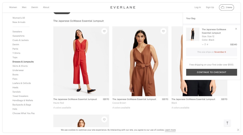
What to improve in an online store to increase conversion?
Design guidelines for the Home page and product list
Graphic design, in particular, adapting the layout to the industry is as important as highlighting the elements and information important to the customer. According to the famous Fitts' Law, formulated by psychologist Paul Fitts, the importance of a website element should be suggested by its size. For example, CTA (call to action) buttons and headlines in descriptions should be larger than other graphic and text elements.
Optimization of category pages and product list pages of online stores
The path to the desired product should be as short as possible, enabling orientation in the store's structure (breadcrumbs). It must also clearly indicate the differences between different product categories and the products in the category itself. It's worth remembering that we create stores that are, first and foremost, friendly to their customers.
Nowadays, the three clicks rule is losing its relevance. It is more important to optimize the navigation, which should be as simple and understandable as possible. It can't raise any doubts. The selection and navigation should involve a minimal amount of attention and time. Product lists should be clear and descriptive. Considering these issues when designing stores and optimizing their functionality and appearance is necessary.
Optimization of the language layer of online stores
Product descriptions are equally important in increasing the conversion rate when we create online stores – both in terms of the language and visual layer. The language of their description should be understandable, simple, and as specific as possible. We should organize the information in a way that is logical and makes sense to the customer. The description must be the result of this. It should be as exhaustive as possible, but at the same time, it should be concise. We create online stores to convey the most important information first. We should emphasize their significance with bold font.
Readability of an online store text
Listing product features enhances the readability of the description, and we can further improve it by using distinctive icons. The description should be 75 characters per line at most, and the line itself should be left-justified. Font size, typeface, and color are also responsible for the readability of the text. Saturated colors, with high contrast, are far less readable than shades of gray, which are more user-friendly when scanning website content. An easy-to-read, convenient online store must also meet the expectations of people with visual impairments.
The spacing used should support the readability of the text. Its size depends on the length of the text in the line, the size of the text block, the font family, and its size and color. Websites that consider these requirements are likely to achieve higher conversion rates.
Technological consistency of an online store
The very popular open-source solutions can affect the functioning of online stores on various devices. Designing a responsive online store requires checking the consistency and correctness of the different elements depending on the user's device (smartphone, tablet, desktop). On mobile devices, they can differ significantly in size, shape and even color compared to the initial design.
The attractiveness of an online store in the eyes of the user
Today, creating stores is simultaneously much easier than a decade ago and much more difficult than a few years ago. Not only because of the exponentially increasing competition but also because of the growing expectations of online store customers, who also see the attractiveness of the store in the purchasing process itself and the impression the store creates. Creating stores requires knowledge of pure programming, analytical tools, as well as the psychology of consumer behavior. It is also worth thinking about designing a special "about us" subpage.

