
Shopping Carts in online stores are one of the most crucial yet problematic elements.
It is not just a functionality created to store selected products until purchase.
It's a tool that should be useful for the store's customers, support sales, and combat the phenomenon of Abandoned Shopping Carts.
Abandoned Shopping Carts owe part of their bad reputation to faulty or imperfect designs.
Customers of online stores often deal with stores that simply don't consider the most current patterns and design recommendations. That can provide a better customer experience and patterns that fit their needs and expectations.
What's more, Shopping Cart pages are often designed without considering the experience and emotions of customers at a particular stage, at a particular moment in the path to purchase.
Ignoring the issue of User Experience in ecommerce, particularly on ecommerce websites, is, of course, a mistake (and one of the causes of Shopping Cart Abandonment), which currently has the most decisive impact on ecommerce sales results.
Today we will talk about optimizing the Shopping Cart and the best design patterns.
Did that pique your interest? If yes, then we invite you to read the article.
Functions of a typical Shopping Cart in an online store
Let's start by thinking about the role and function of Shopping Carts. Of course, the Shopping Cart acts in the online store as a container, storage for selected products. That is its explicit function.
The Shopping Cart often can serve as a checklist, especially when the store doesn't offer such a feature. That is its implicit, not obvious function.
Another implicit feature is the use of the Shopping Cart as a comparison tool.
Research conducted by the Nielsen Norman Group suggests that such behavior is quite common and frequent. And it matters when making a purchasing decision, choosing products, their variants, or configurations.
Moreover, the Shopping Cart should summarize the cost, quantity, and type of products. It should familiarize us with what we have chosen and intend to buy. It should also offer the option of modifying the order.
Does that sound obvious? Yes, but the devil, as usual, is in the details. And we will write about these details in a moment.
Meanwhile, let's turn our attention to another obvious fact of equal importance. Mistakes, incorrectly selected quantities, or, finally, abandoning a product in favor of another is widespread and a regular repertoire of behaviors and problems in ecommerce. Therefore, we should pay special attention to the design of functionalities that modify the order.
Let's not forget that besides providing a summary, the Shopping Cart should encourage further purchases, if only by recommending related products or products on special promotions or discounts.
At the end of the day, the Shopping Cart also needs to guide the customer to the next step. How the navigation is designed is crucial here.
It is also worth remembering that customers of online stores have a habit of repeatedly visiting and leaving the Shopping Cart page. And they do it for the reasons mentioned above.
Since the Shopping Cart page requires time to load, the cost of interacting with it is higher. The solution to this problem is to offer mini carts that minimize the working memory load of users.
Mini carts have become very popular recently. Is this functionality a solution to all problems?
What are the advantages and disadvantages of the Shopping Cart in the mini cart formula?
We are beginning to encounter Shopping Carts much more often in a mini cart formula, in the form of a preview that activates when the cursor hovers over an icon, a shopping cart label.
Differences between the Shopping Cart page and Mini Cart
Quick access to the Shopping Cart has its advantages but also creates several problems and design dilemmas that we must address.
First of all, the Shopping Cart in the form of a mini cart cannot be a substitute for the classic Shopping Cart displayed on a separate page. Why?
Because the expectations placed on the Shopping Cart are diverse, using it is not just about ensuring that everything in our order is in line with our wishes.
Customers of online stores use Shopping Carts to remember choices, compare products, and learn about additional costs. Alternatively, they configure and calculate the selected items and expenses.
In a nutshell, they use Shopping Carts for diverse tasks and different purposes. They will perceive the Shopping Cart as non-functional, inconvenient, and useless when unable to perform them.
Let's remember that the time spent on the Shopping Cart page is also used to analyze, compare, resolve dilemmas, and make purchasing decisions. Some products will be purchased, while others will have to wait for a more convenient time.

Calculations in terms of budget and the possibility of taking advantage of promotions (such as free delivery after exceeding a specific order amount) are very common.
These operations, dilemmas, and, finally, the choices made on the Shopping Cart page cannot be downplayed and considered incompatible with its purpose. We must remember that how we use a given functionality doesn't always coincide with its default function.
And let's remember that the preview of the Cart's contents doesn't encourage such analysis and actions. Therefore, the preview should be a supporting, optional functionality that cannot replace the traditional Shopping Cart page.

The speed that the mini cart provides is unquestionable. But its indisputable drawback is limited access to crucial information and functionalities.
The problematic nature of using a mini cart shows itself when the number of items added to the Cart increases. It is simply inconvenient to scroll through the list and compare and select products with it.
Unlike mini carts, the Shopping Cart page can provide users with complete product details.
Mini carts also raise another dilemma. They allow customers to get to the checkout faster, which is a welcome feature. Nonetheless, the limited ability to edit products added to the Shopping Cart can be a source of frustration, particularly if the confirmation step of the selection was intentionally omitted from the shopping cart system design.
Mini carts that deliberately impose pressure to make a purchase aren't a recommended pattern.
There is another advantage to offering dedicated Shopping Cart pages. They foster concentration and counteract – to some extent – the distraction of the customer. And this definitely supports a satisfying shopping experience.
How to design a converting online Shopping Cart?
We talked about the functions of a Shopping Cart. Now let's move on to the tips and tricks to help you design a well-converting cart for your ecommerce business.
A helpful article on Hotjar, "7 design ideas for a high-converting shopping cart," as the title suggests, recommends seven design ideas that are meant to increase the performance of your Shopping Cart page. Hotjar also provides very handy examples of shopping cart page designs that you may want to take a look at.
These ideas include the following:
1. Use the Shopping Cart icon to your advantage
The Shopping Cart icon may seem like a not big deal. However, it has some very crucial and practical features besides just taking a customer to a checkout page. That's why you should remember a couple of things during the design of the cart's icon.
Namely:
- Put the shopping cart icon in the upper right corner of the page
- Make sure that it displays the number of items contained in the cart
- Inform customers that they've added an item to the cart.
2. Highlight what's important to your customers
Depending on your online store's customer base, you should highlight the most essential elements of the Shopping Cart page. Appropriately expose those elements your customers deem the most necessary, such as order summary, shipping and delivery costs (especially if you offer free shipping), product images, and checkout button.
3. Design faster payment options
You should provide your customers with familiar and diverse payment options like PayPal, Apple Pay, Amazon Pay, and credit or debit cards. You can also consider offering the "Buy Now, Pay Later" option to make the checkout process faster and further improve the online shopping experience.
4. Add layers of authenticity to help customers check out with confidence
To increase the confidence and security of customers that visit your ecommerce website and thus increase the conversion rate of your Shopping Cart, ensure that you apply appropriate security measures and elements that boost the credibility of your online store.
To achieve that, you can use the following:
- Trust badges
- SSL certificates
- Legitimate payment gateways.
5. Be clear about shipping and delivery options
We mentioned this a couple of times in this article, but it won't hurt to repeat it, namely, display all types of fees and additional payments at an early stage of the checkout process. Showing all this information helps increase conversion and makes your checkout process much more user-friendly.
6. Include product recommendations
The Shopping Cart page is an ideal place for recommending products. Since customers are already buying or planning to buy something, you can try to convince them to buy more.
7. Be at the customer's service
It should go without saying that to offer the best user/customer experience, you should provide them with support, preferably 24/7, or at least ensure that all the necessary contact information is visible and easy to reach.
The dilemmas of users – Abandoned Shopping Cart
It may seem that there is nothing unobvious about Shopping Carts. Their function and typical way of working are well-known and shouldn't cause significant problems. And yet, it's precisely the opposite.
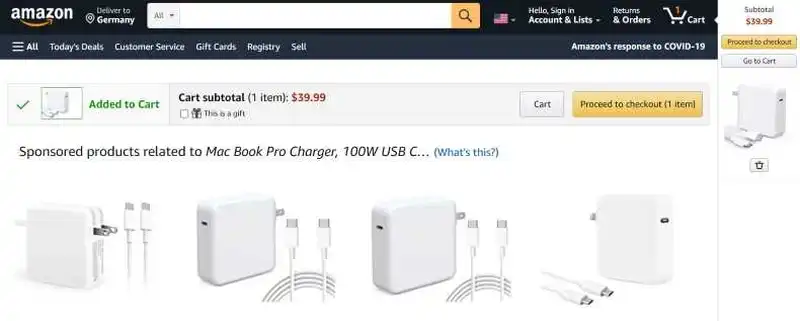
According to research by Nielsen Norman Group, which we will continue to refer to in this article, online shoppers very often feel confused if the store doesn't offer understandable feedback after placing a product in the Shopping Cart.
Customers mainly worry about whether the products were actually added to the Cart and whether they were added in the correct quantity. It is crucial to offer feedback and confirmation when a product's size, color, material, etc., can be chosen.
All variables the customer selected should be included in the confirmation so that they are confident that the system has correctly processed their preferences and choices.
The online store interface plays the most important role in providing a sense of control over the selection.
A universal experience of ecommerce customers is a surprise, disappointment, and frustration caused precisely by the inability to select the attributes of a product easily.
Past bad experiences, unfortunately, determine future choices and behaviors. A fair number of ecommerce customers feel anxious or abandon a purchase and leave the ecommerce site when a store's interface doesn't allow them to specify attributes of a product simply and seamlessly.
That is why feedback is a crucial function that provides proof that the product added to the Shopping Cart will meet the customer's preferences in every way.
The best design practice is to offer feedback right after adding a product to the Shopping Cart and repeating it on the Cart tab.
Feedback should primarily consist of a clear, contrasting presentation of the number of products in the Cart displayed on the Cart icon. If we want to make it more attractive and effective, it is also worth considering the use of overlays.
Overlays with feedback are fundamental in stores where customers like to compare products. Once they have made their choice, they want to make sure they are buying a product that they find more attractive.
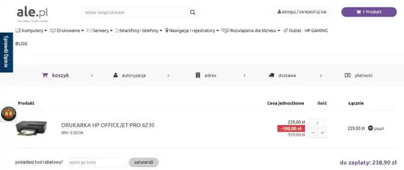
Therefore, the Shopping Cart page should include a thumbnail of the product, its full name, price, quantity, and all selected attributes. The product photo needs to correspond to the selected attribute.
The photo can't show a green T-shirt if the customer has chosen a red one. The correspondence of images to the choices made is an essential and welcome confirmation and feedback for ecommerce customers.
It is also the best practice to separate the product name from its selected attributes. The attributes should be listed and can't be combined with the name because their readability and comprehensibility are much lower in such a presentation variant.
Adding the selected attributes to the name of a product also increases the time needed to find and understand this information.
Customers often have to read names several times to make sure that the information is consistent with their choices.
Ecommerce customers usually expect the opposite. They want to see the product's name and attributes as two different sets of information.
How to provide information about shipping, delivery, and costs on the Shopping Cart page
Essential information that must be included on the Shopping Cart page is information on the shipping date and estimated delivery date.
The estimated delivery time supports sales and boosts trust in the store. It improves its credibility and shows the store as an organization that efficiently manages order fulfillment processes.
As a standard, we should also provide the shipping time. For example: "Shipping within 24 hours/We will ship your order today" is information that is extremely important for online store customers. We should place them on both the product and Shopping Cart pages.
The product's price with all additional charges (appropriately marked) should be clearly displayed on the Shopping Cart page.
The cost of the order should include the total amount and the individual amounts that constitute it. A bad practice, which can even be called a dark pattern, is hiding the individual amounts or revealing them just before initiating the payment process in an online store.

If additional charges cannot be listed in the Shopping Cart for various reasons, the customer should be informed of them in subsequent shopping steps.
The clear information about the additional fees and their types (e.g., tax, cost of special packaging) definitely increases the customer's sense of security, which can be easily shaken and damaged by hiding additional expenses.
How to present and list products that were added to the Shopping Cart?
The product list's presentation and organization are crucial for the purchasing decision. In particular, this is important for large orders involving significant quantities of products belonging to very different categories.
In this situation, products should be presented according to the category to which they belong.
A clear list consistent with customers' expectations and mental models enables much easier analysis and editing of the order.
The logical arrangement of products in the list also allows customers to make sure that their order is complete and that no product from any category is missing from the Cart.
It is also worth considering informing the customer about the dependencies that the use of the product entails. For example, whether its use doesn't require the purchase of additional accessories.
Not all customers are aware of such dependencies, so information about required add-ons must appear on the product page, in the Shopping Cart, and at the online store's checkout.
How to design the navigation on the Shopping Cart page in an online store?
Browsing through the list of products on the Shopping Cart page doesn't always mean that the customer wants to end shopping and proceed to checkout. Therefore, it is very important to design the online store's navigation properly – and add the "Continue shopping" link that allows customers to continue browsing the store.
The most crucial issue is to make the process of resuming purchases predictable.
Clicking on the continuation link should take the customer to the page they were viewing before going to the Cart.
This avoids customer confusion and suggests that shopping is a process with a clear purpose and is, in a good way, methodical.
It's worth remembering that customers of online stores fear not only confusion but also loss of time and energy, which can be caused by pressing the "Continue shopping" link and being redirected to, for example, the store's home page or the category page.
The return to where they left off and where they proceeded to the Shopping Cart page is an expected and anticipated action.
It would be like suddenly teleporting from one department to another in a stationary store, and no one would like that. Shopping is a process ruled by a certain logic and rarely based on chance.
While it is true that some customers visit online stores to explore the offerings and spontaneously browse through the various sections, this is an activity that is not a part of the shopping process in the strict sense.
More often than not, the result of such actions (researching is part of the shopping process) is an abandoned Shopping Cart. Activities performed in the store don't always serve to fulfill an order, to finalize a transaction. If you want to learn how to recover an abandoned Shopping Cart, check out our article on this topic.
In conclusion, transferring the store's customers back to where they were, allows them to regain control of the process and orient themselves. The "Continue shopping" button also can't take the customer back to previously completed tasks (such as editing product quantities).
The Shopping Cart in the online store, as we can see, performs a variety of functions that should be equally considered in the design process.
The optimization of the Shopping Cart in an online store. Summary
- A faulty website design is mainly responsible for abandoned Shopping Carts.
- Shopping Cart pages are often designed without considering the experiences, emotions, goals, and needs of customers at a particular point in the shopping path.
- The Shopping Cart serves as a container, storage of selected products, a checklist, and a tool for comparing products.
- Customers use Shopping Carts to remember choices, compare products, and configure and calculate selected items and costs.
- Mistakes, product abandonment, and abandoned Shopping Carts are widespread issues and are a regular repertoire of ecommerce behaviors.
- Customers repeatedly visit and leave the Shopping Cart page.
- The Shopping Cart in the form of a mini cart cannot be a substitute for the classic Shopping Cart displayed on a separate page.
- Customers often feel confused if the online store doesn't provide understandable feedback after adding a product to the Shopping Cart.
- The best design practice is offering feedback after adding a product to the Shopping Cart and repeating it on the Cart tab.
- The Shopping Cart page should include a thumbnail of the product, its full name, price, quantity, and all selected attributes.
- The photo of the product should correspond to the selected attribute.
- Essential information that must be included on the Shopping Cart page consists of the shipping date, estimated delivery date, cost, or the possibility of free delivery.
- The presentation and organization of the list of products are crucial for large orders involving significant quantities of products belonging to very different categories.
- It is essential to properly design the "Continue shopping" link, which significantly improves (e.g., doesn't encourage cart abandonment) and streamlines the shopping process.
- Transferring the store's customers back to where they were, allows them to regain control of the process and orient themselves.


