
We can make a mini story out of this. Look. The most important thing is to design an online store, right?
Though, wait a moment. Maybe we should start with why people shop online.
Or perhaps it's better to find out who shops online and what are the types of E-Commerce customers.
If you know this, you can start thinking about the UX of an online store and customers' expectations, right?
As you might've guessed, the story was created from the topics we've written about. Today we will add another piece of the puzzle to this image.
You already know what E-Commerce customers want. Then for the sake of order, we need to write about what E-Commerce customers don't want and what they don't like.
What should you completely avoid when designing an online store? What to pay attention to when performing, for example, a UX audit?
That's what you will learn from this article.
Mobile, you fool!
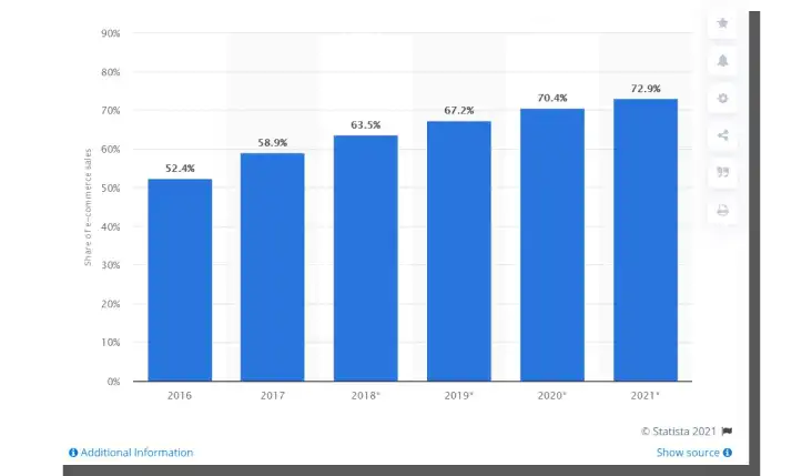
We are in 2023, and ignoring M-Commerce is a terrible idea. Among E-Commerce customers, you can find M-Commerce customers and vice versa.
An online store that is not mobile-friendly is just as disliked (if not more so) as a store that does not have a mobile variant at all.
Why? Because of a simple reason — you live in the mobile era. People perform increasingly more tasks on smartphones. Mobile devices serve us at work, for entertainment, and for performing daily activities such as shopping.
Some time ago, we wrote about the benefits, functions, advantages, and even the need to have a mobile version of a website in the article, "Are you hesitant to make a mobile version of your website? These arguments will persuade you."
Today, M-Commerce is not even a supplement to E-Commerce but a fully-fledged and independent sales channel.
What mobile online stores do customers like?
Online stores need to be responsive (we wrote about responsive design in the article "Key principles of RWD – Responsive Web Design"), fast (using, e.g., Google AMP framework), and they have to provide desirable user/customer experience (e.g., in terms of mobile payments).
They must also be designed with mobile device usage considerations in mind. Task-Oriented Design in Mobile Design plays a key role and is responsible for the success or failure of the online store in this sales channel.
Today, M-Commerce is simply a standard. The store that is not optimized in terms of the mobile channel is a source of frustration.
Authors of the following reports: "Future of e-Commerce: Uncovering Innovation," "The Future of E-Commerce," and "Global e-commerce trends and statistics," agree — mobile sales are no longer a curiosity. They grow, and customers expect them.
If you don't want to lose customers, then be mobile!
These are the facts, and it is better not to argue with them.
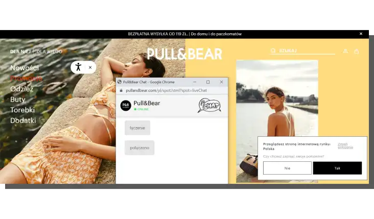
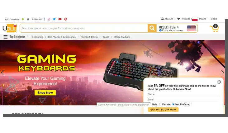
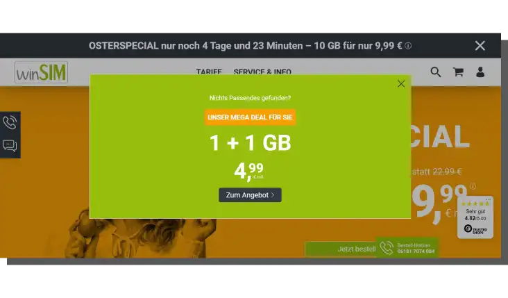
Pop-ups are serial killers!
While the need to accept cookies is understandable since it's a legal requirement, all other forms of pop-ups are a nightmare for every E-Commerce customer.
The ones displayed immediately (On Entry) are no less annoying than those shown with a slight delay (Time-based Pop-ups).
And the latter is not at all any worse than the ones displayed after a specific action is performed (Activity-based Pop-ups) or after scrolling a site (Scroll-based Pop-ups).
From the customer's perspective, all pop-ups are bad.
They are aggressive and tactless. They distract the — already very fragile — attention of Internet users. Conversion is important, but there are more optimal, friendly, and acceptable ways of collecting leads, advertising, and informing about discounts in E-Commerce.
Okay, the industry likes them because, despite everything, they're helpful, but if you need to use them, you must do it well or very well.
How? It's not the topic of today's article. That's why we recommend you to read, for example, the article "The Best Ecommerce Pop-up for 2021: 13 Clever Use Cases."
Beware! Unfortunately, it's not free from Pop-ups :) As you can see, the shoemaker's son always goes barefoot.
Automatic audio and video playback
Luckily, unlike Pop-ups, audio and audio-visual materials are rarely used.
However, occasionally when we visit a home page of an online store, we are "attacked" by unwanted content.
Unexpected stimuli are never a source of pleasant feelings. People react to them with fear. They become more cautious and more alert.
Remember, it's not just about the comfort of their ears and eyes.
Audio-visual materials also affect the loading speed, and it's an essential element of a positive, desirable customer/user experience.

Above all, a store that wants to make a good impression should do it through its usability and functionality.
Content is king, but sometimes every king must listen to the voice of the people.
Required registration and account creation
Admittedly, the ability to shop without registration is a standard today in E-Commerce. Still, sometimes users are forced to or too strongly encouraged to register.
From the customer's perspective, registration in an online store is tiring, annoying, and unnecessary. From the store owner's perspective, it is equally tiring, annoying, and vital.
And that's the whole problem. This activity should be not only optional but also very:
- Fast
- Simple
- Flawless
- Trouble-free (e.g., without entering additional data that users usually don't remember).
From the user experience perspective, it's a problem concerning the design of, among other things, forms.
We also recommend reading our article "Design of credit card forms."
The difficulty of contacting and finding contact details
Contact details and contact forms should be generally available and easy to find on the online store's website, but often they're not.
A customer that looks for contact details on a website resembles a customer of a stationary store who can't find a single living salesperson.
A salesperson that listens and answers questions and makes sense.
Communication accessibility of a store is the standard today which means that every store offers the following:
- Many contact channels (chat, contact form, hotline, social media, instant messaging)
- Numerous ways of contact (through phone, video, or in written form)
- Multiple message recipients (such as consultants, experts, department supervisors, or community leaders)
- Fluidity of contact within a given channel (doesn't make users wait in lines).
To be a third-in-line customer is not something that E-Commerce customers expect.
To put it bluntly, they hate when they need to wait and when the contact is disturbed, impossible, time-consuming, and often also costly.
Updates of information
The availability of products (offline and online), stock levels, estimated delivery times, information on the payment time, enabling delivery and pick up on a given date should be updated:
- Preferably in real-time
- Regularly enough to avoid misleading customers.
From the perspective of the online store customer, a purchase that can't be fulfilled according to specific conditions is a failed purchase. Often it's so problematic that it results in serious damage.
The frequency, precision, and diligence of the updates should be communicated and specially highlighted.
At the end of the day, users want to know, at least generally, how the store works, whether it resembles a Swiss watch or an Egyptian hourglass.
No return guarantee
Online shopping involves a certain risk. Often it stems from the discrepancy between the assumptions of the customer that they form while reading or viewing the product card and the product's real appearance, way of working, or utility.
The ability to return a product is, of course, a customer right, but in practice, it's respected with varying degrees of success.
Product return guarantee and reimbursement are a symbolic and actual expressions of the store's integrity.
Customers also have a habit of wanting to move the risk of unsuccessful transactions onto the store. If the customer is responsible for it, their willingness to purchase often shrinks to zero.
Instead, the desire to find a different store that is not afraid of reimbursement and offers returns at its expense grows.
Shopping without good search, sorting, and filtering results
They're actually impossible. For a simple reason.
Products that can't be found can't be bought.
What's more, as researchers from the NN Group assure, the product that can't be found usually is considered unavailable in the store's assortment.
Customers typically aren't willing to verify this belief. They won't write or call to ask, "Is it available?", "Is it unavailable?" or "When will it be available?" They'll just go and look for it in another store.
Search engines, sorting, and filtering functions should reflect how customers categorize products. With that said, the results they will receive in the process of searching, filtering, or sorting can have the following:
- Too wide range
- Too narrow range.
The lack of choice can be as undesirable and disliked as having "too much" choice. It's worth remembering that offering too many products often results in decision paralysis and abandoning the purchase.
We recommend here, the article "Paradoks wyboru – czy więcej znaczy lepiej? (The paradox of choice — does more mean better?). It takes a fascinating look at the problems of decision paralysis and the paradox of choice.
Search, filtering, and sorting tools should thus support the choice and provide helpful criteria to determine the best option from the customer's perspective.
Unfortunately, search tools often serve to indicate products that the store wants to sell first.
A newsletter is spam! Push notifications are evil!
Often the behavior of online stores resembles a stalker in love who urges users to buy at every opportunity or without any occasion. They never have enough, and they never give up. They send e-mails, text messages, and notifications.
Furthermore, stores very frequently use dark patterns, thanks to which they gain "consent" for sending various promotional materials.
Actions like that are not only annoying but also cast a shadow over the entire industry. They undermine the credibility of the online stores, lower trust, and arouse unnecessary hostility.
It's worth taking to heart wise words of Arushi Jaiswal, who, in the article "Dark patterns in UX: how designers should be responsible for their actions," writes that a good design of user experience aims to:
- Provide a smooth and pleasant interaction
- Serve the best interests of the user, the customer
- Most of all does not mislead or use deception.
The complex process of completing a transaction
1-click shopping is an ideal pursued by every store.
A complex, illogical, long, work-consuming, straining working memory and cognitive capacity (simply boring) purchasing process is one of the most annoying problems.
If the customer needs to:
- Fill out a bunch of form fields
- Make many choices
- Enter data that they don't want to enter
- Confirm their identity over and over
- Log in due to security measures
- Pay inhumanly slowly
Then they naturally lose interest in everything.
Security of the E-Commerce system
Psychologists call this type of relationship a love-hate relationship.
Overprotective online stores, who expect or demand their customers to constantly authenticate their identity, are often seen as ambivalent.
Naturally, customers want to feel safe in the online store. They want to feel and even expect it to ensure their best interests. Customers want to be sure that they don't risk and won't lose money, time, and energy, that they won't fall prey to scammers, etc.
It provides them with a sense of security. However, it's easy to overdo it and slip into overprotectiveness.
When faced with security measures, customers often feel less comfortable the more the store begins to treat them condescending and with suspicions. No one likes that.
Payment processing in an online store
Payment systems in online stores are a book-sized topic. They definitely deserve their own article.
Suffice it to say that often a reason for frustration, reluctance, and abandoning the shopping cart is the payment process.
What do customers find annoying about it? Many things, for example:
- Small amount of payment options (in this regard, more means better!)
- Hidden costs (e.g., additional fees for delivery, packaging, or taxes)
- The need for multiple authentications
- The need to enter sensitive data that are unnecessary from the perspective of the payment process
- Limitation of payment options in mobile stores.
As well as:
- The lack of security measures in the form of SSL certificates
- Long time of transaction confirmation, which is always a powerful stressor
- The need to switch to another site (bank's website)
- Payment systems errors
- The need to repeatedly confirm the choices made.
What do E-Commerce customers dislike in online stores? Summary
- Mobile devices serve us at work, for entertainment, and for performing daily activities such as shopping.
- The lack of a mobile application that is responsive, dedicated, and provides good impressions is increasingly upsetting E-Commerce customers.
- If you don't want to lose customers, then be mobile!
- Pop-ups annoy customers. Very much!
- Remember, Pop-ups are serial killers! Did you really think otherwise?
- They don't like auto-played jingles, melodies, videos, or animations.
- Seriously, they don't like creating accounts, and logging in also sucks. Shopping without registration is tolerable ;)
- Well, of course, they won't wait for you to graciously answer the phone!
- Customer support in the online store... So, where the hell do you have a contact form on this site?! They don't like this either. By the way, interfaces in E-Commerce are another book-sized topic.
- They are very much disturbed by the product cards that were updated last year.
- They want a return guarantee. If you don't provide it, they won't buy it.
- They can't imagine shopping without good search tools. Sorting and filtering should also work like a charm.
- A newsletter is spam! Push notifications are evil!
- Navigation in E-Commerce always can and should be better.
- How complex will be the process of completing the transaction? Because they don't like it, even when it's as complex as an amoeba. They value simplicity in the E-Commerce industry.
- Safe online shopping? The E-Commerce customer will appreciate it. It has to be safe, but don't overdo it, okay?
- Payments in the online store are a topic for another article. However, as a rule, payments and credit card forms are sometimes really annoying.
- You should follow E-Commerce trends because many new solutions reduce the customer's frustration.


