Let's start with a summary. We write regularly about interface design. Today we will address the problem of navigation design in mobile applications.
We will also discuss design problems related to the critical "Back" button.
So if you're looking for details on how to design navigation in M-Commerce, here they are!
We invite you to read the article.
What is navigation, and why is its design so important?
Before we provide a definition and elaborate on the issue of navigation and navigation menu, it's worth taking a particular note to heart. In the article "Usability: Navigation is More Important Than Search," Gerry McGovern observed that the more complex and elaborate a website is, the more critical the search quality is.
But even more critical is high-quality navigation in an online store. Moreover, according to McGovern, there is a direct correlation between navigation quality and search quality.
The better the navigation, the better the search results will be.
Why? Because clicking is always faster, simpler, and more natural than typing in key phrases with the hope that the result will be equivalent to a link. It's important not to treat these two solutions as competitors.
No one relies only on navigation or only on a search engine. It's always a process of interchangeably searching and navigating.
Alright, let's go back to the definition of navigation. What is navigation? Or rather, what is navigation in a web and/or mobile application? This is simply a structure (of interconnected) internal links.

These are connections between different pages based on thematic, logical, categorical, attributional, or other connections resulting from widespread ideas about the relationships of elements (mental models of users). That's what navigation is.
The most popular types of navigation include:
- vertical and horizontal (position criterion)
- hidden navigation (such as hamburger menu) and visible navigation (visibility criterion)
- textual (e.g., breadcrumbs) and iconic (the language of communication criterion)
- primary and secondary (relevance criterion)
- shallow and deep (complexity criterion).
What is M-Commerce?
M-Commerce is one of the E-Commerce branches in which mobile devices (tablet, phone, smartphone) play the most crucial role. Shopping through mobile sales channels is extremely popular around the world.
What does M-Commerce entail?
Mainly, it's about applications and extensive infrastructure designed to facilitate the consumer's purchase. It is demonstrated on applications, often dedicated to platforms such as Allegro, eBay, or Amazon. Thanks to them, we don't need a computer to make a purchase easily and conveniently. According to experts, sales through M-Commerce channels will reach more than 50% of all online transactions this year.
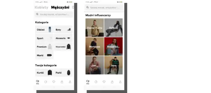
The main types of navigation in M-Commerce
Since we are on the subject of M-Commerce, the most popular types of navigation designed for mobile devices include:
- The Gesture-Based Navigation popularized by the Tinder app is typically used in applications where real-world actions are imitated (e.g., swiping, dragging).
- The Pictorial Circle Menu is usually used for branding purposes to highlight a brand's uniqueness.
- The Bottom Bar Menu provides easy access to crucial functions by locating the main navigation more optimally within reach of the thumb, which is the most frequently used finger for navigating mobile apps.
- The Top Tab Menu, similar to the Bottom Bar Menu, provides access to essential functions. In its appearance and functions, it resembles menus known from web applications designed for desktop devices.
- The Hamburger Menu is a compact navigation located in the upper corners of the application. When we tap the icon, the navigation unfolds. Its main advantage is that all less essential elements, thanks to their concealment, don't distract users.
- Full-Screen Flat Menu Navigation is recommended for applications used to share knowledge and information. Users can focus on their primary objective without being distracted. Navigation is streamlined by the "Back" button, usually located in the upper left corner.
Functions of the navigation in applications
Navigation in web/mobile applications introduces:
- hierarchy
- structure
- orientation
- order
- consistency
- rationality
- predictability.
It also provides guidance:
- on how to navigate the site
- in terms of possible objectives or actions.
It is mainly responsible for the following:
- user experience
- successful interaction
- usability
- sales volume
- conversions
- user flow
- speed, ease, and intuitiveness of achieving objectives
- the credibility of a mobile application
- users' sense of confidence
- switching categories, thematic ranges, and collections (this is especially important for e-commerce and online stores).
Principles of mobile navigation design
So what are the principles of navigation design for mobile devices? In the article published by the Interaction Design Foundation, "Six Simple Rules for Better Navigation UX," we can find guidelines whose most significant value is that they are general and universal. The authors from INF suggest:
- Be Clear
- Keep It Simple Stupid
- Make Things Obvious
- Rely on Recognition (rely on standards and common patterns, guaranteeing readability of functions, goals, and rules)
- Ensure Consistency (makes the navigation throughout the application predictable)
- Get the Tone Right (avoid condescending, ridiculing, and lecturing language)

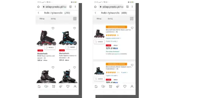
To optimize navigation in E-Commerce/M-Commerce, we need to take care of the following:
- Adapt searches to different types of E-Commerce/M-Commerce customers.
- Minimize the number of clicks leading to a product – the search engine and narrowing the categorization should help locate it and reduce the time spent on browsing the results.
- Apply labels, which organize the collection, hierarchize it, and give it structure and logic. In other words, categories help find the desired product faster.
- Shorten headlines and names, which should be reduced to the length necessary for their correct identification.
- Use symbols, icons, graphics, animations, and audiovisual elements, which are processed faster than verbal messages. Their use speeds up product search.
Mobile-friendly navigation
When making navigation more "UX friendly for mobile devices," it is worth keeping in mind the recommendations of Kathryn Whitenton, Director of Digital Strategy at Nielsen Norman Group.
In her article "Menu Design: Checklist of 15 UX Guidelines to Help Users," we can find as many as 15 very reasonable design recommendations.
How should we design mobile navigation, according to Whitenton? Let's list her recommendations, which complement the points discussed so far.
Above all, we should:
- Pay attention to the menu size and adjust it to the size of the screen on which it will be displayed.
- Place menus according to the conventions and habits of users, that is, where they are most often expected to be and where users look for them.
- Ensure the readability of the links – they should be highlighted so that it is obvious that they are "clickable."
- Visually highlight the menu accordingly.
- Enable users to orient themselves – the answer to the question "Where am I currently?" should be evident.
- Make sure the labels are easy to see – noticing them shouldn't be much of a problem.
- Speed up the process of reaching the objective by using a menu that is adjusted for the size and complexity of the online store's offer.
- Ensure the optimal size of links, which should be easy to click or tap on.
While slowly wrapping up the topic of navigation design problems, there is one more issue worth discussing, namely, the depth of the menu (especially important in mobile commerce).
Stephanie Lin, author of the article "The Rules for Modern Navigation," suggests that aiming for flat and shallow navigation (consisting of no more than 3 levels) should be the primary goal.
Lin has a clear view of this issue. And she writes, "In order to create a great navigation, the information architecture (IA) and hierarchy of the website must support it."
Flat navigation allows the user to access the deepest subpage with 1 or 2 clicks.
We can find a discussion about the last of the important pieces of our puzzle in the article "Show Me the Way to Go Anywhere - Navigation for Mobile Applications," which can also be found on the IDF website. And it addresses landmarks.
Landmarks as an essential element of navigation are too often omitted, so it is worth at least briefly mentioning them.
What is a landmark in a mobile application?
These are elements that enable instant, almost automatic, non-cognitive recognition of the current position in the application.
What elements do the authors have in mind? Typical landmarks in mobile applications include:
- banners, galleries, sliders
- icons indicating the home page
- logotypes
- headlines
- breadcrumbs
- search boxes marked with magnifying glass icons.
A landmark is an instantly recognizable object that allows the user to know exactly where they are within the application's structure.
When designing landmarks, it's crucial to maintain consistency (of forms, colors, proportions, location, and exposure) to ensure a consistent user experience for customers making purchases through mobile devices.
Now we know what to pay attention to during the navigation design process so we can move on to a more specific problem: mobile navigation design. And that's a tough nut to crack. You'll see for yourself soon enough.
Mobile navigation – general design patterns
If an E-Commerce customer expects to reach the product they're looking for in an online store quickly, then an M-Commerce client wants to get to it even faster.
A small screen, distracting context, various stimuli, tactility, and operation primarily with the thumb don't encourage long, search-oriented purchases.
The above issues make the ergonomics of the application, support of gestures, and interaction patterns the most significant problems.
Gestures are a crucial part of navigation and interaction design in mobile devices.

M-Commerce is all about completing a task quickly, efficiently, and seamlessly. This process usually consists of several stages:
- product search
- evaluation of an offer
- purchase in the most convenient way possible, preferably with one click.
To design the navigation of a mobile application that supports the fastest possible accomplishment of these tasks, it is necessary to apply proven design patterns to:
- ensure the optimal use of small space
- expose typical E-Commerce/M-Commerce icons (search box, shopping cart)
- provide appropriate contrast and font size
- use microcopy to make the purchase seem urgent.
- limit the number of options in the navigation menu (it's recommended to use a maximum of 8 elements at the top level of the structure)
- prioritize tasks
- provide a short, unambiguous, and specific form of labels in the navigation menu
- avoid navigation that requires scrolling
- take into account different screen sizes and adapt the design to their specifics, in particular, the navigation of an application
- support the execution of tasks with contextual links
- use the search engine as an essential element of navigation
- use landmarks
- display navigation on every screen (except checkout)
- ensure readability of labels (they should be easy to read without having to zoom in with gestures)
- use conventional patterns (in terms of color, icons, metaphors, and functions).
The article "Show Me the Way to Go Anywhere - Navigation for Mobile Applications" provides more mobile design patterns for E-Commerce.
It mentions, among other things, that when designing navigation for mobile applications, it's essential to consider the following:
- landmarks that help users consciously navigate the app
- navigation cues
- ensuring the highest level of content organization.
Signposts, icons, and labels should correspond to users' mental models. The discrepancy between the design of these elements and mental models can cause cognitive friction, so it's essential to have this in mind.
Usage patterns of mobile devices in M-Commerce
It's also helpful to know typical behaviors, mobile device usage patterns, and how to perform typical tasks.
From the article "Designing and Testing a Mobile eCommerce Navigation," summarizing the findings of the Bitovi agency, we learn that users:
- quickly scroll the page from top to bottom before making a purchasing decision
- they are worried about "choosing incorrectly" and being transferred to another page (fear stems from not knowing the consequences of such decisions)
- often return to the home page
- prefer to see an icon accompanied by a word than to see a word by itself
- like to browse and search in equal measure.
The recommendations that the authors make, based on their own research and observations, are even more interesting.
They suggest:
- To use additional interactions that allow users to familiarize themselves with the content only in special situations.
- Place icons that contain words wherever it's possible.
- Make sure that different ways of finding products are equally available.
- Ensure that data, statuses, and locations are easy to recover after an error occurs.
- Make sure that mobile E-commerce applications provide a seamless scan of the content.
- Ensure that the primary function of the navigation is to find products.
What is the function of the "Back" button in M-Commerce?
Have you ever wondered why navigating mobile apps can be uncomfortable, confusing, and frustrating? One of the reasons is most likely the "Back" button, which is sometimes the source of numerous cognitive frictions.
The problem is significant and widespread. How do we know that? From Baymard Institute research, covered in the article "4 Design Patterns That Violate Back Button Expectations – 59% of Sites Get It Wrong”.
What's going on with this button? Well, it's the most standard and commonly used button in navigation, which is as old as the Internet.
Mobile users transfer their desktop experience to the mobile environment. They have the same expectations (in this narrow aspect) for mobile applications.
As Baymard researchers warn, disregarding user expectations will result in shopping cart abandonment. To make matters even worse, the dysfunctional "Back" button evokes powerful negative emotions.
Users expect that the "Back" button:
- will take them back to the page they perceive as the previous one (the discrepancy between expectations, perceptions, beliefs, and results is the most critical)
- will work according to the user's logic, their understanding of the shopping path
- will work according to the logic of thematic consistency, not technical consistency (changing the view of the page doesn't always involve changing the URL. The "Back" button takes the user to the previous URL, which is a source of confusion.)
- will work similarly to how it works in web browsers
- won't result in an error.
In Baymard's research, the "Back" button was most often the source of problems in:
- accordion checkouts (often its use results in the loss of entered data)
- filtering and sorting functions (usually pressing "Back" removes the last filter applied)
- overlays and lightboxes (clicking "Back" doesn't take the user back to the product page but sends them back to the previous page)
- returning to the product list from the product page (resulting in wasted time, feeling helpless and unproductive).
Fortunately, the problem can be solved and should not cause significant problems for software development companies with the right technology stack. As the Baymard researchers suggest, the solution lies in the HTML5 History API. It has a function that allows us to trigger a URL change without reloading the page.
How to design navigation in M-Commerce Summary
- There is a direct correlation between the quality of navigation and the quality of search.
- The better the navigation, the better the search results will be.
- Navigation is a structure of (interconnected) internal links.
- Navigation is often based on thematic, logical, categorical, or attribute connections.
- Navigation provides hierarchy, structure, orientation, consistency, rationality, and predictability to the application.
- Navigation, among others, is responsible for user experience, the success of interactions, application usability, and sales volume.
- The optimization of E-Commerce/M-Commerce navigation involves, among other things, minimizing the number of clicks leading to a product, narrowing categorization to reduce listing time, browsing results, and clear labeling.
- When designing M-Commerce navigation, it is essential to pay attention to the size and location of menus and ensure that the interactivity of links is apparent.
- Typical landmarks in mobile apps include banners, icons, headlines, breadcrumbs, and search boxes.
- A landmark in a mobile app is the element of the app that allows users to recognize their current location in the app instantly.
- When designing landmarks, it's crucial to maintain consistency of forms, colors, proportions, location, and exposure.
- A small screen, distracting context, various stimuli, tactility, and operation primarily with the thumb are the most critical elements in M-Commerce.
- M-Commerce is all about completing a task quickly, efficiently, and seamlessly.
- M-Commerce navigation should correspond to the mental models of users.
- M-Commerce customers have specific behavioral patterns, e.g., quickly scrolling the page from top to bottom before making a purchase decision.
- Mobile users transfer their desktop experience to the mobile environment.
- One of the sources of frustration in M-Commerce is the "Back" button.
- Users expect the "Back" button to take them back to the page they perceive as the previous one.
- The divergence of expectations, perceptions, beliefs, and results is the most critical.
- According to Baymard's research, the "Back" button is often the source of problems in checkouts, filtering, and sorting functions, returning to the product list from the product page.