
The product page is one of the key elements in e-commerce. It's responsible for a complete product presentation and directly influences conversion rate and sales.
Admittedly, a product can be added to the shopping cart from a category or home page. However, most purchasing decisions are made on the product page.
The e-commerce path to purchase leads through product pages, and everything indicates that it will stay like this. Remember that the way the product is presented, the available and offered functionalities, and the impressions you create with them encourage or discourage the purchase.
Ultimately, a product presentation is a sales presentation that aims to encourage potential customers to buy from an online store.
What design patterns regarding product pages should be implemented? What to pay attention to? What should a standard product page contain? How to increase sales in e-commerce? How to achieve a successful product presentation?
Today, we'll find answers to these questions and show some e-commerce product presentation examples.
Enjoy!
Presenting a product to a customer: Two types of product presentation
Generally, product managers and sales teams use a product presentation to present a new or rebranded product to customers or the company's stakeholders. The presentation aims to describe elements such as company overview, product's operation, benefits, value proposition, unique selling proposition, and pain points that it will address. Naturally, these are only some of the elements a product presentation should have.
In short, the product presentation presents and discusses some key points regarding a product.
What is the difference between a regular product presentation and an e-commerce product presentation?
These two product presentations differ mainly in form. A regular product presentation, as the name suggests, is a brief product presentation slide deck that outlines the product's features and capabilities. It uses various visual aids to visualize the product's key benefits and other relevant matters and data. Many resources on the Internet can help you find a best-fitting presentation template.
In e-commerce, the product presentation takes the form of a product page and product listing pages. It focuses on highlighting the characteristics of multiple products in the case of product lists and individual ones in the case of product pages. The product presentation of digital products and products sold via online stores is crucial because of their intangible nature. That's why product pages are vital elements of e-commerce stores.
How to improve product presentation in your online store?
Product organization
Categories in online stores are crucial tools for organizing products in a way that is understandable to users. They improve user experience and enable users to find products much faster. Organizing products into seperate categories can create a feeling of order and cleanliness. You can use the card sorting method to develop effective categories to discover how users think and perceive products.
Strategic presentation
When presenting products in the store, you should pay attention to the role of the e-commerce home page. Some of your potential customers will start their journey there or look at it regardless of where they begin. The home page is a strategic place to put the bestsellers and featured product categories to incite online shoppers to buy. Moreover, it's a perfect place to inform customers about discounts and seasonal sales.
Additionally, you should use CTA buttons to guide users to product pages or other relevant places where they can satisfy their needs. You must ensure they're clearly visible and located where users can easily encounter them.
Visual design
The importance of attractive visual design shouldn't be underestimated. Users evaluate a website's aesthetics in milliseconds, and the first impression effect is essential here. The store's overall design should match the brand identity, and the elements of the product pages should be visible and readable. A visually organized product page can inspire users' trust and make them feel safe while shopping.
While designing the online store's appearance, it's important to remember the accessibility and offer high-contrast options so that users with impaired vision can still enjoy their e-commerce experience. Naturally, that isn't the only accessibility feature that should be implemented, and you should consider various options that not only relate to the visual design.
High-quality images
High-quality product photos are crucial for presenting the e-commerce offer. Users cannot rely on their physical senses and must use their eyes as tools. The photos shouldn't be made just in high resolution but also from multiple angles so customers know exactly what the product looks like. You can also put the offered product in some context, meaning with a background that will allow users to compare the size of the product in relation to other objects. Another good idea is to offer the option to zoom in on the photos so customers can see the texture better or other relevant details.
Product videos
Similar to product photos, videos can also help visualize the product. You can show online shoppers how the product works in real-life conditions, an excellent opportunity to showcase its capabilities and features. Videos also let customers understand better how the product looks and acts. For example, in the case of clothing, videos can show how the fabric looks on a model in motion and show details that can't be seen in a static image.
Videos help inspire trust and engage users by immersing them in the product experience. This allows them to make informed purchasing decisions.
SEO optimization
Product descriptions should be optimized for search engine optimization to improve their visibility in search engines. You should structure product descriptions using appropriate keywords and headings, making them easier to read. Moreover, using specific terms will attract users' attention when they see your product page in the search engine results.
Product presentation: Product page in online stores
A belief in the unique role of the product page in the purchasing process isn't just intuition. Researchers from the Baymard Institute comprehensively studied the role of this element. We recommend reading their report "Product Page Usability."
According to the results of this very impressive research, a statistical product page most frequently has issues with the following:
- Specification
- Information on delivery and returns
- Social proof (especially regarding user reviews and customer testimonials)
- Cross-selling
These very issues should be optimized first. However, the scope of presenting products in an online store is, of course, much broader.
When creating product pages, you should know they fulfill information, image, psychological, and sales functions.
And that a perfect product page takes a lot of work to create.
The product presentation in an online store combines the following elements:
- Aesthetic
- Usability
- Functionality
- Emotions, impressions, and feelings
These elements will help you create product presentations that are attractive and helpful.
If you have ever heard about the dilemma of Usability vs. Desirability, it's even more prominent in product page design.
The product page in an online store should be suggestive enough to be an aesthetic context for the product and reserved and tactful enough not to draw unnecessary attention to itself.
It should suggest quality and position and cooperate visually and functionally with the product. It should provide a properly designed shelf for it.
However, beware!
A template that contains almost exclusively fancy features will be uninteresting and interfere with sales. Product pages in e-commerce are tools that support sales. I think we don't have to mention that they also impress customers.
As a side note, we recommend a great article by researchers from NN Group, "Feature Richness and User Engagement." It perfectly shows the dangers of excess functions, mainly those that don't directly support shopping.
Balancing these two values (usability and desirability) is, to a large extent, a matter of the following:
- Needs and expectations of customers
- The character of the industry
- Nature of the product category
- The character of every single product (where it is placed on the scale "typical vs. original")
- Repeatability of the product page template
- Trends in the industry
- Channel
A product doesn't only have to be presented in the context that facilitates purchase but also in one that's visually attractive.
Although saying that the product page should be pretty is an exaggeration, expecting it to be aesthetic and in line with current design trends definitely is not.
The user, the customer of an online store, is similar to the customer of a stationary store. Users want to buy in spaces and contexts that are visually pleasant for them, although these contexts don't have to be excessively aesthetic.
The aesthetic of the product page is supposed to foster sales, and for it to do that, it has to balance usability and desirability skillfully.
But that's not all.
When designing the product page, you should focus on finding a balance and determine the line between the following:
- The amount of information necessary and the threshold beyond which the amount of information ceases to be helpful and becomes dysfunctional.
- To learn about a product's key features (clicks, scrolls), a number of actions are necessary, and some of these actions don't directly support sales.
- Simplicity and complexity of the template.
- Informational functionality and functional excess (a product page rich in content can be a slow-loading page, considerably lowering its desirability, usability, and functionality).
Furthermore, you should think about issues regarding the following:
- Availability of information
- Hierarchy of information
- Types of information (technical, marketing, generated by customers)
- Medium of information (photos, videos, animations, texts, audio tracks)
- The way of presenting information (unbiased description, engaging description, expert description, recommendation, leader opinion, customer, user opinions)
- Communicativeness of information
The goal of product pages is to:
- Facilitate and speed up the purchase
- Convince the user to buy
- Guarantee the comfort of purchase (e.g., related to financial safety)
- Ensure the customer that the description and presentation of the product are in line with real features
- Obtain maximal consistency between the status of the store and the status of the products offered in it
- Minimize misreading of messages available on the product page
- Educate the customer — especially concerning the issues related to purchasing terms, the way the product works (its utility), its compatibility, and quality (e.g., expressed through certificates or belonging to given classes, e.g., power consumption).
Product page design: The psychology behind the product page
Before we move on to the "hard features" and usability of the product page, we must also discuss issues related to perception, evaluation, feeling, and, thus, the psychological aspects of product page design.
The product page isn't only an electronic brochure, specification, or a substitute for customer support and advertising flyers.
It's a little bit of everything and should also fulfill the role of an active (or at least available through chat, form, or dedicated hotline) seller, expert, or opinion leader.
With this many tasks to complete, the product page will need to "require" from the user:
- Engagement
- Independence
- Action
- Goodwill
- The benefit of the doubt (ultimately, customers want to believe that they'll buy the product in this very place in a way that suits them)
The authors of the article "Interaction Cost," associated with Nielsen Norman Group, call the above enumeration the interaction cost.
The interaction cost is the sum of the effort (mental and physical) that the user needs to "invest" in the interaction with a website.
Product pages that are useful, friendly, and focused on strengthening a positive user experience should be designed to minimize these costs.
In particular, this means limiting the need to:
- Click
- Scroll
- Read
- Scan the content of the page
- Enter data
- Wait for the page to load or its fragment, or download materials (e.g., in the form of a PDF file)
- Remember.
It's worth remembering that, in most cases, customers won't be willing to spend additional time, energy, and work in an online store.
Users can react in two ways to the low usability, weak UX, and high interaction cost:
- By withdrawing from the purchase and abandoning the shopping cart.
- By buying with a sense of high risk.
Both variants are equally unprofitable for the seller. In the first one, they don't acquire the customer; in the second, they may obtain a customer that is:
- Misled
- Displeased
- Disappointed
- Willing to leave a negative rating or an unflattering comment
- Let down; they won't be willing to repeat the purchase in the future.
So, what should the product page have to minimize the risk of a high interaction cost and the possibility of a risky purchase or shopping cart abandonment?
What elements should appear on a standard product page?
The anatomy of a product page: Product page design
When looking at the product page, is it possible to distinguish elements that need to be on it and those that don't, but it's good to have them? Of course, it's no problem to point them out.
However, the universal template of the product page should be adapted each time. You should tailor it to the needs of potential and existing customers, a specific industry, product category, or even store.
Nevertheless, it's worth pointing out those elements without which an online store won't be fully effective.
The elementary functionalities of the product page include the following:
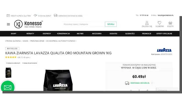
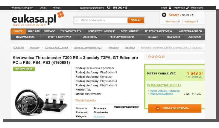
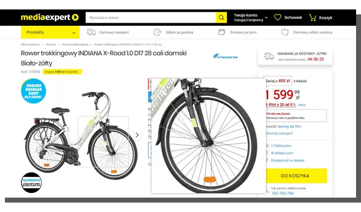
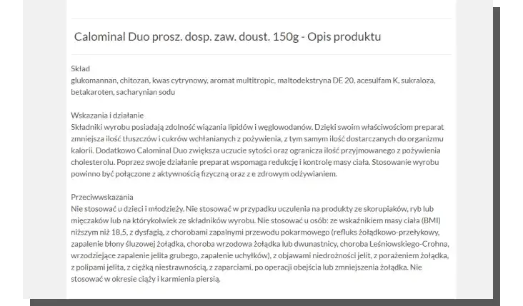
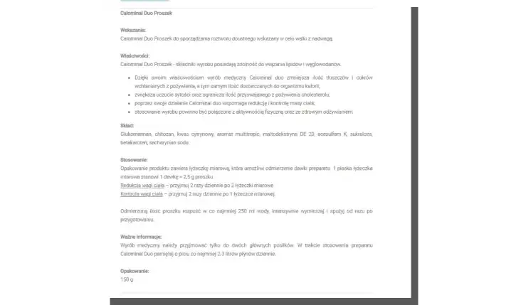
- Adequate label and product name (in line with mental models of customers)
- Description of product's features
- Gallery with photos of the product (visual aids)
- Variants of the product (colors, sizes, accessories)
- Information about the availability of the product (the stock level expressed in numbers)
- Terms of the delivery and returns
- Price (with additional costs)
- "Add to cart" buttons, including the selection of the amount
- CTA buttons
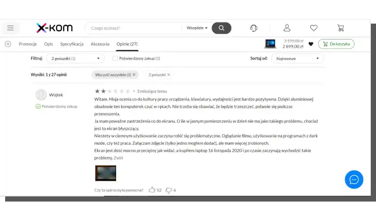
- Rating, reviews, recommendations, and testimonials from external sources
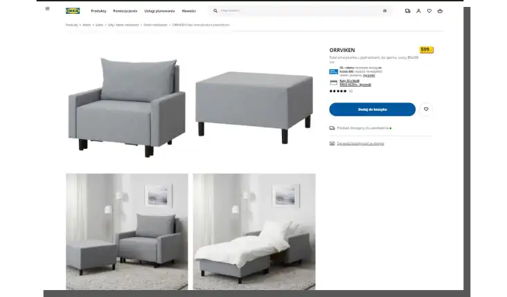
Because customers can't touch, use, try out, or inspect the product thoroughly in an online store, visual equivalents are vital, especially photos.
Regardless of the type of the product, product photos should be offered in the following ways:
- In macro and micro scales (in general and detail plans)
- In high resolution, quality (when talking about the quality of the photo showing a given product, we also have in mind staging and lighting)
- Showing many angels
- In the form of packshots with natural background
- With the option to smoothly zoom in
- With the best possible color reproduction and fabric texture from which the product is made
- In optimal amount (the gallery on the product page should contain at least three images)
Product photos, names of the products and their descriptions, and technical specifications should complement each other and be a consistent, comprehensive whole.
A description without a photo illustrating it is useless. Although photos without a description have higher usability, they still look like a naked actor in a period drama.
Whether customers expect this from online stores is a rhetorical question.
A visual and verbal message is also significant because of the sensitivity of customers to images and words.
Not everybody is a visual learner, just like not everyone has enough active imagination to visualize a product based on a description.
It's also worth taking care of the tone of product descriptions. You need to:
- Avoid elevated, sophisticated, poetic style.
- Favor a style indicating professionalism and knowledge, but you can't treat the customer condescendingly.
- Strive for maximal understandability of the description, explain terms, and avoid jargon.
- Aim to be concise, specific, and suggestive with a description that communicates a clear value proposition.
- Adapt the social distance to the customer (using less formal, direct, friendly messages should stem from research and extensive knowledge of the target audience).
- Use language that is as natural as possible but also grammatically and stylistically correct regarding punctuation.
- Ensure visual formatting of product description that facilitates scanning and finding the most crucial information.
Naturally, you can find many more functionalities on product pages.
Functionalities that supplement the product page include the following:
- Audio-visual educational materials
- "Add to the wishlist" button
- Addition animations
- Information on availability in stationary stores
- Related products
- Photos showing products in scale
- Chats with experts, department supervisors, opinion leaders
- FAQ pages
- "Compare" button
- "Calculate Installment" button
- "Check Availability at the Store" button
Supplementary product page elements can be further expanded to include:
- Virtual fitting rooms
- 360° product presentations
- Tools for customizing products (e.g., selection of colors, additional accessories)
- Amateur photos made by customers
- Calculators
- Functionalities that "drive" the need to buy (clocks counting down the promotion time, highlighted stock levels expressed in percentages or with numbers)
The goal of the product page is to encourage the customer to add the product to the shopping cart and proceed to the next step.
For this to happen, you must realize that every product page element is meant to answer the potential customer's questions while browsing the offer.
And most frequently customers ask, wonder whether the:
- Product will be adequate for their needs
- Product will be consistent in terms of use with the specification
- Store is credible, honest, and verified by a large number of customers
- Transaction will be safe
- Item will be timely delivered
- Product won't be damaged or spoiled during transport
- Store respects consumer rights and honors the terms of the offer
- Recommended products are really that good
- Whether they will be informed about the course of order processing.
The product page should provide detailed, specific, understandable, real, and convincing answers to the above questions (and several others arising from the nature of the industry, store, and products).
Product presentation: How to present products on product pages? Summary
- Product pages are one of the most crucial elements in online stores, allowing you to create effective product/sales presentations.
- A product page is responsible for conversion rate and sales.
- Product pages often have issues with specifications, information regarding delivery, returns, and social proof.
- Product pages' informational, image, psychological, and functional aspects should be considered when designing them.
- The presentation of the product should include elements such as aesthetics, usability, and the functionality of emotions and feelings.
- The product should be presented in a visually attractive context that facilitates purchasing.
- The aesthetic of the product page should skillfully balance between usability and desirability.
- When designing the product page, you should consider issues regarding the number of functionalities and the amount, availability, hierarchy, and types of information.
- The product page should also be an active seller, expert, and opinion leader.
- When using the product page, the customer pays interaction cost, the sum of the (mental and physical) effort the user needs to "invest" in the interaction with a website.
- Product pages should be designed with interaction cost in mind.
- The universal template of the product page should be adapted each time.
- You should tailor it to the customers' needs of a specific industry, product category, or store.
- The product Page's elementary functionalities include adequate labels and product names, product descriptions, and illustrative photos.
- The lack of the possibility to touch, use, and thoroughly inspect the product makes its photos and description vital.
- A visual and verbal message is significant because of the sensitivity of customers to images and words.
- The product page has two types of functionalities: elementary and supplementary.
- The product page helps customers answer their questions as they browse the offer.
- Product page design should provide comprehensive, specific, understandable, truthful, and convincing answers that persuade the customer to buy.


