
How to design an effective ecommerce home page? What kind of user experience drives sales on a home page?
What online store design principles should we use when creating a home page? What are the ecommerce website design patterns worth following?
Today, we'll answer these questions, examine the functions of an online store's homepage, and show some design examples.
I know what kind of question you are going to ask... Yes, these things are indeed important.
Do you want to know what all the fuss is about? Then, read this article.
Enjoy!
The problematic nature of home page design
According to many researchers, for instance, those associated with the Nielsen Norman Group, the home page has several specific functions.
The home page functions include the following:
- Representing/creating the business image
- Informing about the content
- Showing the path — it provides a kind of guide
- Explaining
- Being responsible for trust and credibility
- Encouraging purchases
The home page answers some important questions that users ask themselves (more or less consciously) when visiting an online store.
Questions asked by ecommerce customers:
- What category of stores does it belong to?
- What can I buy here?
- Where can I see the specific product/s?
- How do I buy the product?
- Why should I buy the product on this site?
The first question concerns the assortment and the store's status, such as exclusivity and credibility. The second question allows customers to ensure that the ecommerce store has the product they're looking for.
The answers to the following two questions — more detailed and technical — allow customers to initiate their search and understand whether the buying process will be compatible with their expectations.
The answer to the last question gives them confidence (although not yet certainty) that they've come to the ecommerce store they wanted to go to, to the store that offers sought-after products that the store attractively presents.
Although more and more traffic in online stores is taking place on product and category pages, this doesn't diminish the importance of the home page.
Especially since it's common for customers to "go back," they move from a landing page to the home page.
The path to purchase in ecommerce can be winding. Moreover, the ecommerce industry is constantly changing. We must admit that it responds to new customer behavior patterns very quickly.
The problematic nature of designing home pages also involves discovering a common denominator for the experiences occurring at different stages of the customer journey. Remember that the customer's path to purchase leads through the home page.
We recommend our articles on user journey and customer journey.
The optimization and design of the home page also answer the question of how to increase ecommerce sales. Many ecommerce store owners are asking themselves this very question.
What should the ecommerce home page look like?
The article "UX Guidelines for Ecommerce Homepages, Category Pages, and Product Listing Pages" provides some useful tips.
According to the NN Group authors, the home page should be:
- Easy to browse
- Friendly
- Offer exhaustive information
- Transparent
- Organized based on understandable and intuitive criteria.
As the research cited above shows, an equally essential issue is the readability of the home page.
Overly cluttered home pages make it difficult or even impossible to:
- Orient on the website
- Find information
- Navigate with a sense of purpose.
In turn, an excess of information, functions, capabilities, and offers creates a somewhat unexpected paradox. What paradox exactly?
Usually, ecommerce users are attracted by a large number of choices. Online stores that have an extensive assortment are seen as more attractive. It's a worldwide trend.
Unfortunately, the appeal comes with a hidden and unexpected price. Excessive choice can hinder decision-making and sometimes cause paralysis.
It's a situation in which a customer, when unable to handle a large amount of information, prefers to resign from shopping online rather than spend an unspecified amount of time exploring, comparing, evaluating, and choosing.
Balancing these two needs (unlimited offers and limited choice) isn't a simple thing to do. Resolving such dilemmas is what ecommerce sales and ecommerce business are all about.
Here, we should remember two other issues in NN Group's research.
An abundance of features on the ecommerce home page results in the following:
- Complicated interface that is difficult to use
- More problematic flow and experience of users (user flow UX)
- Longer decision-making time (Hick's law)
- Higher cognitive load
- Complicated path to purchase that is less useful and makes the online store more problematic (the ecommerce customer doesn't like these kinds of paths)
- Need to offer more hints, explanations, and instructions
- Greater chance of making an error
Fortunately, the situation isn't hopeless because people tend to find the most straightforward solutions.
Our limited ability to process information makes us look for the most straightforward solutions. The home page should offer such shortcuts.
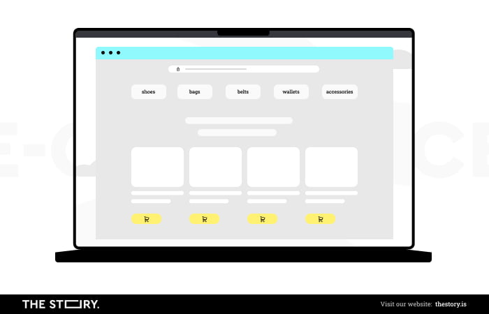
What the home page design should consist of?
A well-written page title
A page title is displayed in search engine results and is crucial for SEO optimization and ranking. Therefore, it needs to be thoughtfully written and eye-catching. Moreover, it often will be the first thing potential customers see, and it should attract their attention and concisely explain what they'll find behind the link.
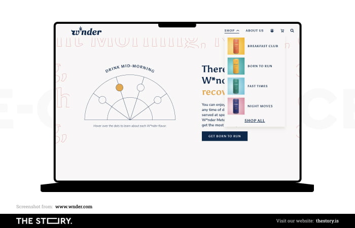
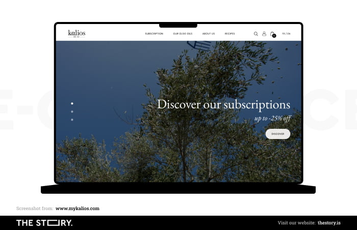
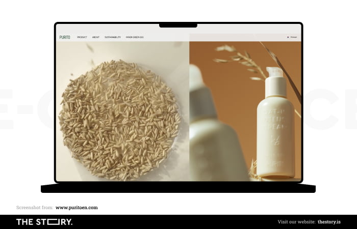
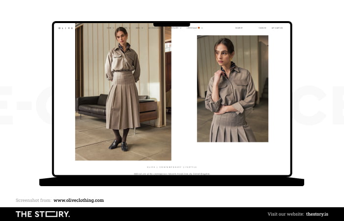
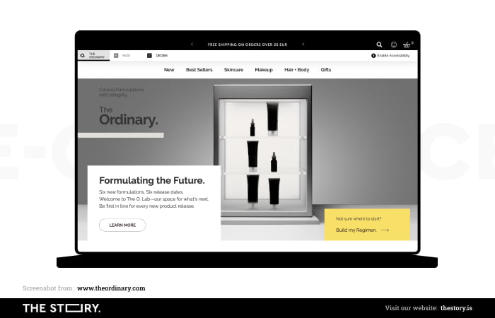
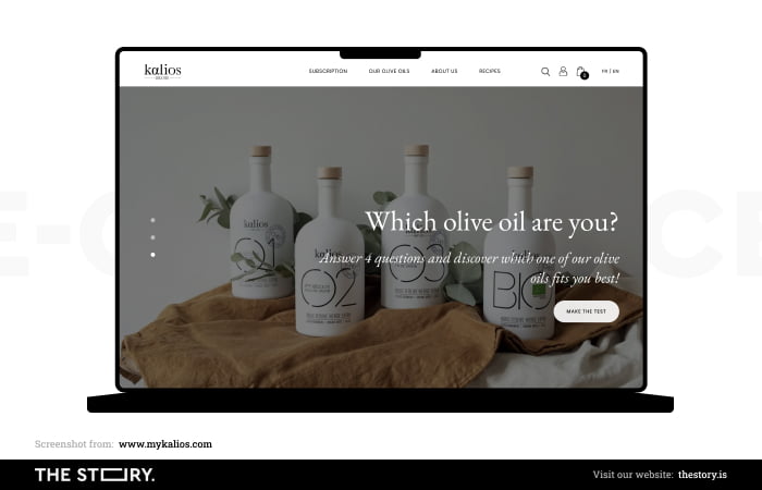
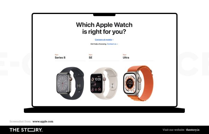
High-quality hero image
A high-quality hero image allows us to show online shoppers what products they can find in the store. Alternatively, if we don't want to use a singular photo, a carousel banner is a perfect choice to showcase the assortment of the online store.
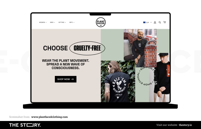
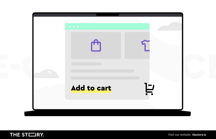
Easy-to-see call-to-action buttons
Place call-to-action buttons strategically to ensure the customer will be taken to where they need to be. Call to actions should be relevant to the offered products and indicate what the users will find when they click on them. Some examples of call-to-action buttons include "bestsellers," "featured products," "add to cart," and "buy now."
CTA buttons need to be visible because otherwise, they can't fulfill their role; that's why we should ensure they're located where users will easily encounter them.
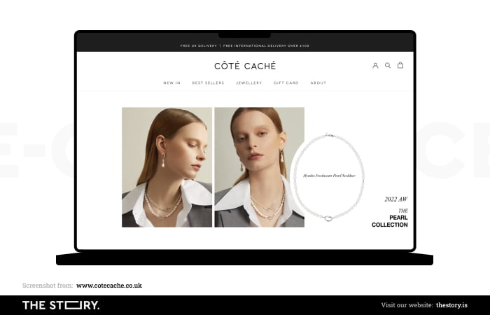
Product images
High-quality product images showcased on the home page enable us to foster trust and show the offered products from the best angle. Thanks to them, customers can quickly get to know the online store's offer and see whether it's the place where they will find what they're looking for.
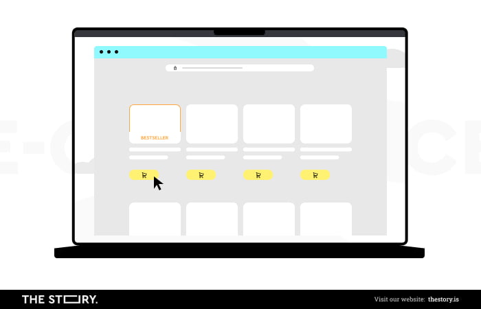
Bestsellers or featured category
The home page is also a fitting place to display best-selling and featured products. We can quickly show online shoppers interesting products that may catch their attention and inspire additional purchases.
A small reminder! The continuous process of UX optimization in ecommerce
The solution that will help us with the issue of processing information is optimizing the user experience of online stores.
It's circular, and the starting point is identifying customer segments and analyzing their needs and characteristics.
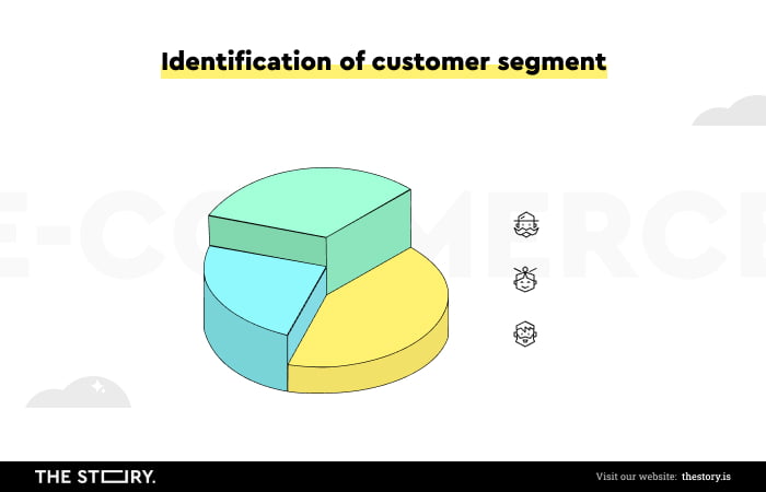
Thanks to this kind of fundament, that is, knowing who we will be selling to, we can begin designing variants of solutions adequate to needs. The next step is to measure the impact of each solution on crucial metrics (such as UX metrics).
It's not everything. After that, we need to determine which ecommerce solutions are more effective and which is the basis for their implementation. This process doesn't end; it needs to be repeated. And why is that?
The optimization of the home pages of online stores should be a process.
The home page optimization should be a string of recurring actions thanks to which it's possible to:
- Diagnose needs and changing expectations
- Monitor reactions
- React to them by implementing concrete design solutions
- Improve the user experience.
In other words, the continuity of optimization allows us to stay in touch with customers and meet their expectations.
These activities allow us to determine the importance, usability, and possible problems of individual home page elements.
It's also worth remembering that optimizing the home page, among other things, has tangible results, not just in terms of sales.
Optimization has an impact on the following:
- Lowering the cost of customer acquisition and customer service
- More spontaneous recommendations
- A feeling of satisfaction and desire to make repeat purchases
No one needs to be convinced that these factors are crucial.
Besides user experience optimization, search engine optimization also plays a crucial role in ecommerce website design and influences the amount of organic traffic our site gets.
The most critical elements on the ecommerce home page
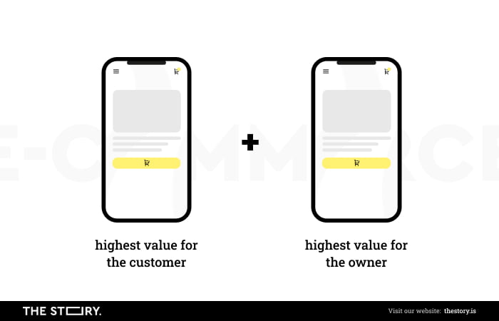
Of course, the most important elements have the highest value and are the most useful from the customer and store owners' perspectives. Expectations placed on them mainly concern the ease/difficulty with which they combine the two perspectives.
The key elements of the home page include the following:
- Menu and top navigation
- Search icon
- Wishlists
- Shopping cart icon
- Bars with offers
- Product categories created according to the following criteria: popularity, seasonality, relevance, recommendations, etc.
- Testimonials and trustmarks
- Forms and contact details
- CTA (call to action) and USP (unique selling proposition)
- Configurations (such as size)
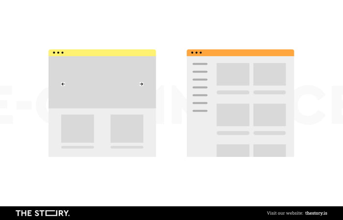
The elements mentioned above are often arranged and grouped according to the principle of an Inverted Pyramid.
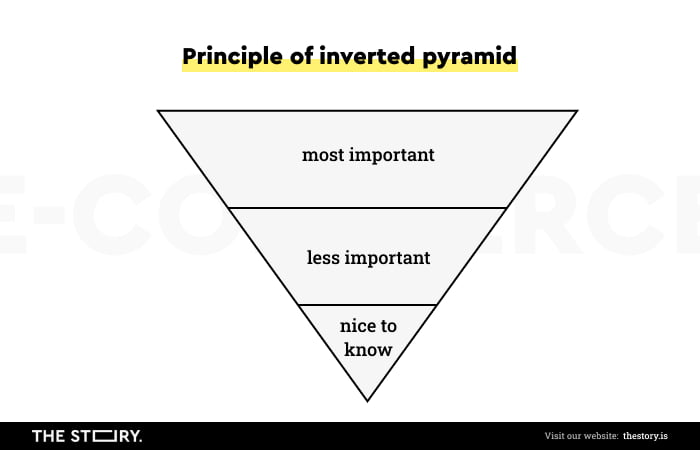
According to this principle, the top part of the screen (above the fold) must provide essential information and functionalities for most customers. A little reminder here: the lower an element is located, the fewer people will reach it and use it.
For example, the most general division in clothing stores is by gender (female/male), sometimes supplemented by age criteria (adults/children). Only after this selection the customer has the opportunity to perform more detailed actions.
So, the home page is intended to initiate the buying process and guide the customer to the desired product category, among other things.
UX guidelines for the ecommerce home page
We can divide UX guidelines into those referring to:
- Independent and forced user behavior
- Users' impressions
- Customers' objectives and tasks
- Customers' experiences, perceptions, expectations, and habits
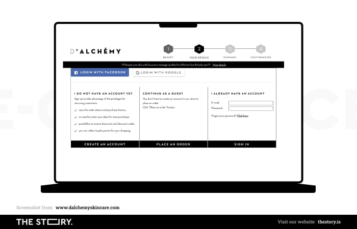
In the first group, we'll find recommendations such as different buying variants (without registration, as a customer, etc.). Forcing time-consuming and work-intensive behavior is strongly discouraged.
It's worth making customers' impressions positive with, for example, high-quality photos that show products (but also illustrate categories) in a diverse way. The overview photos are just as important as those showing details.
Supporting goals and objectives also means understanding that in ecommerce, impulse purchases are less popular than rational purchases, for which customers are (more or less) prepared.
Social proof, a compelling CTA, and a well-formulated offer influence the purchase decision, so we should also communicate them on the home page.
Presenting a product in an online store also means placing it in a favorable context.
Navigation is a complex problem that requires a separate article to discuss properly. It affects many elements of online stores, such as the sales funnel.
For now, we'll mention one of the most important recommendations: using the design conventions that customers are used to.
In ecommerce, the most common one is horizontal navigation. And its use is strongly recommended.
The loading speed of the home page is responsible for the first impression effect and feelings toward its usability, reliability, and security.
Latency, measured in milliseconds, significantly decreases the conversion rate. Redundant or unnecessary audiovisual content, "clutter," server inefficiency, poor code quality, and poor widget performance also considerably impact the customer experience.
Therefore, it's also worth optimizing the home page for loading speed.
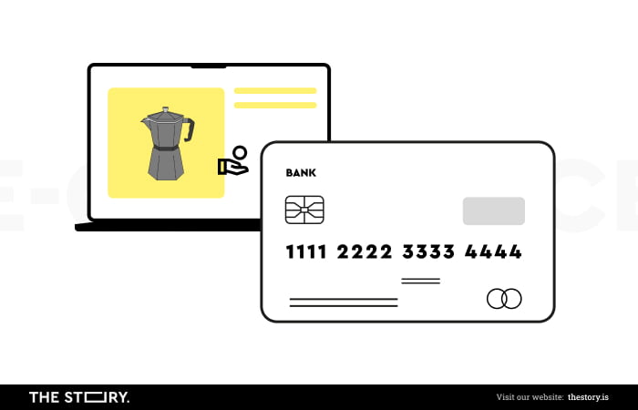
Fostering credibility and trust in the online store
According to the "Reasons for Abandonment During Checkout" study conducted by the Baymard Institute, low trust and poor store credibility are responsible for 17% of shopping cart abandonment in ecommerce.
This is a considerable number. The store's home page establishes its credibility and trust.
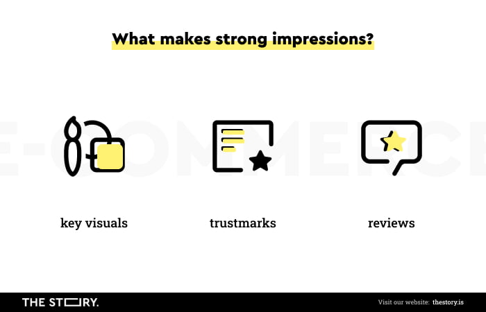
The strongest impressions are evoked by the following:
- Graphics, design (its visual appeal, industry relevance, and compliance with design trends)
- Trustmarks — certificates, awards, ratings — in particular, ratings issued by independent institutions
- User reviews made using external rating and recommendation systems
It's also essential to inspire trust and credibility in the following matters:
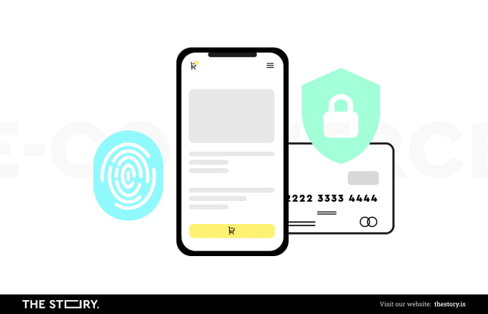
- Payment security
- Speed and method of delivery and returns
- Respecting consumer rights (e.g., the right to withdraw from a purchase)
- Quality of the products and the order fulfillment process
We should also communicate this information on the home page.
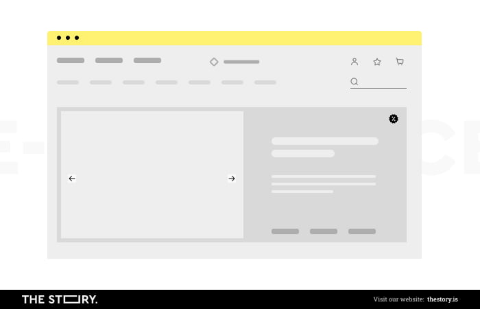
The design of the above fold on the home page
Above the fold is the part of the page that is visible after ecommerce websites load and doesn't require scrolling. It's the most diverse, functional, and challenging (in terms of web design and optimization) element of the home page, especially for mobile phones, since the screen size limits the available space.
The above-the-fold space encompasses the following elements:
- Navigation menu
- Search bars and icons
- Shopping cart/wishlist icons
- Icons and labels of the most important categories
- Hero shots — used to present value proposition, calls to action, inform about current promotions, sales, and news
- Icons and labels reinforcing the unique selling proposition (e.g., return guarantees, support services)
The number of categories must also result from our cognitive capacity—their excess results in confusion and a sense of randomness. In turn, an insufficient number may suggest that the store doesn't sell a particular product.
The positioning of categories in the above-the-fold section aims to show the most representative products, not the whole assortment.
The icons of categories in this part of the page should allow customers to understand where to start looking for a product.
And this brings us to another significant problem.
Narrowing down the choices on the ecommerce home page
Customers usually want to buy a specific product model or purchase the best model in a particular category.
Beware!
Identifying such a product is a task for the customer and the store, which should offer search, filtering, and sorting tools to make the decision easier.
The search bar should be easy to find. In fact, it should always be in a fixed position.
However, it must be more than just a soulless tool. We want to see in it a helpful assistant who is involved in the process of delivering the best results.
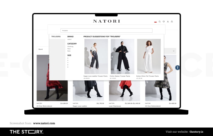
Improving search engines pays off, as users who use them in online stores end up finalizing the purchase more often. Some studies show this tendency can be as much as three times stronger.
Limiting choices or guiding interest avoids decision paralysis. The optimal choice is between up to three options.
As a general rule, the store should minimize the amount of doubt by reducing the number of offers and indicating the differences between products, also by offering the option of comparison.
Naturally, this is a challenging task to accomplish when offering a vast assortment.
Tips for ecommerce site design
Let's summarize what we said so far about home page design. Here are some tips worth considering when designing an ecommerce platform.
Follow the brand identity
We should ensure that brand identity is communicated consistently throughout the site. During the design process, we should select the brand colors and visual style we want to express, which will also tell our customers what kind of products we're offering.
Design a clear visual hierarchy
Organize the visual hierarchy to lead the user's eye to the crucial elements of website design. We can achieve that by properly managing the above-the-fold space and appropriately using white space.
Be wary of unnecessary clutter
We should be careful with the use of various fonts, their colors, and sizes. They should be limited to a few and match the rest of the website design. They should offer high contrast so that users with impaired vision can still enjoy online shopping. We should refrain from using unnecessary elements that will only distract the online shopper from achieving their goals, and this doesn't regard only home pages but also product pages.
Use familiar design conventions
Using familiar design conventions will make online store users feel safe and welcome on our ecommerce platform. We should use standardized icons and symbols so our potential customers will feel safe and comfortable in the online store.
Don't overuse pop-up windows
Pop-up windows are a particularly annoying feature of an online business or a store. No matter what information they contain, users feel frustrated when seeing them, especially if they prevent them from acting. Most of the time, they will be closed immediately, which makes them pointless. That's why we should carefully consider where and in what form to use pop-up windows if necessary.
Don't forget about mobile devices
Many studies show that mobile devices' role in ecommerce is growing steadily. Many online store customers browse the store's offers on smartphones. Therefore, it's essential to adapt our online business to the requirements of mobile phones so that we offer consistent user experience across platforms.
Offer accessibility options
This tip applies to the ecommerce home page and the ecommerce website as a whole. It's crucial to provide accessibility features such as contrasting colors, alternate text, descriptive links, or keyboard navigation. Thanks to them, we won't limit ourselves to customers without disabilities. We can find various tools on the Internet that will aid us with checking whether our store offers sufficient accessibility.
UX guidelines for an ecommerce home page. Summary
- The home page represents and is responsible for the business image, informs about the content, and shows the path.
- In addition, it's a guide responsible for the trust and credibility of the store.
- It also narrows the choice, directing and concretizing the search.
- The home page should answer the important questions the users ask themselves while browsing through it.
- The problematic nature of designing home pages is also a matter of finding common characteristics of experiences in terms of different stages of the customer journey.
- According to the authors from NN Group, the home page should be easy to browse, friendly, offer exhaustive information, and be clear.
- It should also be organized based on understandable and intuitive criteria.
- Overly cluttered home pages make navigation significantly more difficult.
- Usually, ecommerce users are attracted by the large selection, and online stores offering it are seen as more attractive.
- Unfortunately, an excess of choice hinders decision-making and causes decision paralysis.
- The solution that will help us balance these two needs is to optimize the user experience of online stores.
- The optimization of home pages should be a recurring and continuous process.
- Thanks to the optimization, we can determine the importance, usability, and possible problems of individual home page elements.
- The most critical elements of the home page are often arranged and grouped according to the principle of an Inverted Pyramid.
- By directing interest, we can avoid decision paralysis.
- The optimal choice is between up to three options.
- The online store should offer search, filtering, and sorting tools to facilitate decision-making.
- The store should minimize doubts by reducing the number of offers and indicating the differences between products.
- According to the research conducted by Baymard Institute, low trust, and poor store credibility are responsible for 17% of shopping cart abandonment in ecommerce.
- Crucial elements of home page design include high-quality images, eye-catching titles, visible CTA buttons, featured products and bestsellers categories, and product images.


