
Does it sell, or does it not? That is the question! But wait a minute, why does it not sell? Can it sell better or more? Of course, it can!
Then how to improve the User Experience of an online store? How to optimize product pages in terms of UX?
Today, we will address this problem. We will point out guidelines that will allow you to better fit into the expectations of customers of online stores. OK, let's begin.
What is the User Experience in E-Commerce all about?
What do users expect from the online store? The answer seems intuitive and simple. It's about sales. It's about improving the impressions experienced by the potential customer of the online store. It's about making access to the products easier, speeding up the purchasing process, and increasing credibility and trust.

Seemingly, it's all true. It seems right — all the more so because the statistical online stores don't have time to make a positive impact. The mythical 15 seconds the average user spends on the given website is a really short time.
It's challenging to present photos of products and their descriptions and expose prices and essential benefits in the online store. Most stores are dealing with this to varying degrees of success.
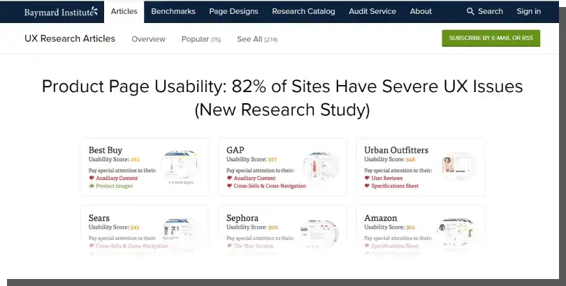
If research by Baymard Institute specialists is to be believed (and their reports and analyses seem very convincing), online stores still need to refine their UX. Let's not panic. Even the biggest players on the market have problems with usability and UX design.
Naturally, this doesn't mean there are no examples of big, global brands that can be model examples. Just as it doesn't mean no well-designed online stores are operating on a local or regional scale. That's obviously, not true.
So, what does it really look like? As authors from Baymard observe: "The average e-commerce site has 24 structural usability issues with their overall product page design and features — and just 18% of e-commerce sites have an overall "acceptable" or "good" product page UX performance."
The findings from Baymard Institute complement the results discussed in the article "How Customers Decide Whether to Buy from Your Website." Authors from Harvard Business Review state that the average conversion rate in E-Commerce is lower than 4%. That said, the situation looks the most unfavorable for mobile devices, mainly smartphones.
Are you condemned to such weak results? Is this a norm, or is it a neglect of issues related to the user experience in the online store? Good news. No, you are not destined to achieve similar results. However, we need to admit that, to a large extent, the stores themselves are responsible for such effects because they underestimate the benefits of UX audits and the optimization of product pages regarding their usability.
The authors of the abovementioned article very aptly observed that the most apparent changes (such as layout, typography, photos, or color scheme changes) bring measurable benefits. And they will be appreciated by every potential customer. And all because of understanding what really decides about the purchase in the case of the given type of product.
It turns out that the theory presented by cognitive psychologist Steven Sloman about the two systems of reasoning (deliberative and associative modes) works well with the optimization of the online store. While thinking in the deliberative mode, people rely primarily on logic, information, facts, formal principles, and rules. While in the associative mode, they use intuition, associations, and experiences more often.
Which mode will take control during shopping in online stores depends on previous experiences, the general level of trust, and also on the nature of the product.
However, remember that user experience is a complex matter.
Online purchases involve more significant risks. That said, according to a study conducted by authors from the Harvard Business Review, rational factors don't play a more significant role than associative factors. Their suggestion is simple.
You should start improving your online store with the most simple things. Focus on the nature of the product, its separate elements (e.g., fine-tuning the shopping cart), and the needs of the target group.
Believe it or not but it's hard to find an author or a researcher who wouldn't endorse this statement.
What should a product page contain? UX guidelines for an online store
Improvement of user experience is one of the most important strategies for optimizing product pages or the online store in general. It translates objectively on the sales and conversion increase.
Improvement of user experience involves primarily providing users with solutions that speed up the purchase and make it safer and more convenient.
Taking care of the crucial issues in the online store is necessary to achieve goals. Above all, you should improve the impressions related to the following:
- Technical quality and exposition of photos (especially in terms of high resolution, various and illustrative shots, and a sense of plans — macro and details)
- The number of photos (most users expect at least 3 different pictures of the product in the gallery)
- Contextual nature of the photos (e.g., referring to lifestyle, reference group, social status, identity)
- Descriptions that should be focused on the benefits rather than functions
- Honest presentation of the final cost — including all kinds of taxes and delivery costs
- Balanced visual and verbal messages in the online store
- Ability to evaluate the product before ordering.
You should pay special attention to the last point. As a rule, products come in two variants. Namely:
- Search Products
- Experience Products.
You can read more about this distinction here. The distinction is helpful because it allows you to evaluate products regarding risk, safety, and predictability of ordering them.
Search Products are easier to compare, evaluate and express their quality with objective metrics. And this can be done before the product arrives at the home of the buyer.
Experience Products can be evaluated and considered bad, good, adequate, or unnecessary after the purchase. After their use and confronting their features with needs.
Jeans are an example of a product that can be evaluated only after trying it on, after checking if they match with already possessed clothes. Comparing two pairs of jeans in the online store makes little sense. If they don't differ in terms of size or material, you can't find out more about them.
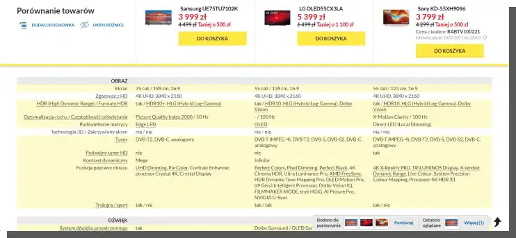
It's a different story if you want to compare, for example, smartphones. Their objective features (e.g., the amount of available memory, processor speed, and screen size) allow you to evaluate them before the purchase. With elementary knowledge about these parameters, you will be sure that the smartphone with a newer processor and more memory will work faster and more reliably.
What conclusion can be drawn from this? The type of the product (offering experiences or searched) should determine how it is presented in the online store. In the article "How to Design Product Pages that Increase Online Sales," you can find fascinating recommendations and design guidelines.
Authors suggest that for the Search Products whose usability and quality are easier to estimate before the purchase, you should:
- Provide comprehensive descriptions of attributes, features, uses, benefits, size, and compatibility
- Highlight functions
- Give the option to compare and evaluate — all kinds of supporting materials (e.g., charts, benchmarks, certificates, recommendations of independent institutions and experts) should serve this purpose.
In turn, products whose evaluation depends on experience should be presented through:
- Language, which should be dominated by a conversational style (imitating a conversation with a customer) and expressive terms
- Appropriately arranged photo shoots whose authenticity is high and the ability to identify with other — model — users of the product is easy
- Videos and animations highlighting the sensual, impressionable, and emotional qualities of products
- Close-ups of details indicating the most important features.
UX for E-Commerce, according to specialists from the Nielsen Norman Group
The article "UX Guidelines for Ecommerce Product Pages," written by Katie Sherwin, a researcher associated with NN Group, is a source of practical recommendations and guidelines regarding optimizing product pages.
Sherwin starts from a very basic premise. Product pages primarily fulfill the following functions:
- Informative
- Sales
- Educational
- Overview (creating the representation of a product, e.g., 3D photos)
- Communicative (e.g., chat or info line).
Product pages are also marked by two critical moments:
- They don't allow the user to decide whether the product fulfills their expectations or to what extent it does — the purchase is risky
- They can be a source of mistaken purchases caused by incorrect or incomplete product descriptions.
Product pages must be equipped with solutions and functions to fulfill their tasks, which can be divided into three groups. According to their necessity, the following elements can be distinguished:
- Must-Have
- Nice-to-Have
- Fancy features.
Must-Have elements include the following:
- Descriptive name of the product
- Photos (also enlarged, in scale)
- Comprehensive information about the price
- Description of product's features (e.g., detailed specifications)
- Regularly and often updated availability status
- Information about delivery and returns that is also regularly and often updated by the online store.
Nice-to-Have elements supporting the purchasing process include the following:
- Rating systems and opinions of experts
- Animations, shots, and videos
- Zoom-in photo function
- Recommendations of similar or the same products
- Option to create a wishlist.
The last group includes the following:
- Virtual fitting rooms, augmented reality
- Ability to organize (filter, segregate) reviews, opinions, and ratings
- Subscription, recurring purchase systems
- Step-by-step instructional materials.
The primary goal of the above functionalities and information is to provide the customer with tools and data, allowing them to make sure that they found the correct product. Correct in terms of:
- Category (e.g., printers)
- Type (e.g., laser printers, black and white)
- Series (e.g., HP LaserJet Pro)
- Segment (e.g., cheap laser printers).
A very important purchasing motivator is the sense of safety, trust, and predictability of the purchase, returns, complaints, or exchange. That's why it's crucial to provide information in the following ways:
- Unambiguous
- Accessible (free of technical/legal jargon)
- Understandable
- Specific
- Exhaustive
- Simple and short.
Photos play a significant role in transmitting information regarding appearance, function, way of working, dimensions, and compatibility, which, besides aesthetic function and evoking desire, should also provide information about features.
Social proof and other socially validated proofs of integrity (in the form of publications and negative reviews) are effective sales tools supporting the entire purchasing process.
Sherwin writes, "Shoppers have come to expect robust reviews that include positive and negative comments, and that are quick to skim through. We still consistently observe users that want to skip to the negative reviews first, in order to see "what's the worst this product might be."
For the user, management of reputation and ratings should mean the ability to segregate evaluations and comments, for example, by positive/negative criteria.
User Experience in E-Commerce. Summary
- The majority of the stores don't manage to present products properly.
- Even the product pages of the biggest online stores are still sometimes underdeveloped in terms of UX. User Experience in E-Commerce is still underestimated.
- The average conversion rates in the E-Commerce industry are very low.
- Basic optimization activities can improve them.
- UX in E-Commerce often uses knowledge from psychology, such as the two systems of reasoning (deliberative and associative modes).
- Rational factors don't play a bigger role than associative factors.
- You start the improvement from the simplest things. And focus on the nature of the product. This belief is shared by various authors, regardless of their approach.
- The optimization in terms of UX primarily consists of implementing solutions that speed up the purchase and make it safer and more convenient.
- Products come in two variants: Search Products and Experience Products.
- Search Products are easier to compare, evaluate and express their quality with objective metrics.
- Experience products can be evaluated only after use and confronting their features with needs.
- The product type should determine how it is presented in the online store.
- According to Katie Sherwin's approach, the following types of products can be distinguished on product pages: Must-Have, Nice-to-Have, and Fancy Features.
- A very important purchasing motivator is the sense of safety, trust, and predictability of the purchase, returns, complaints, or exchange.
- Social proofs and socially validated proofs of integrity are effective sales tools and essential elements of the purchasing process.


