
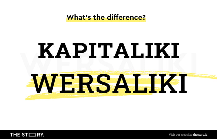
What is All caps (all capitals)? We can't confuse it with Small caps! All caps styling is simply writing a word or a sentence using uppercase letters. CAPITAL LETTERS.
All caps. Some people like it, and some people don't. Some appreciate its visual appeal, while others find it pretentious and coarse. Some value it for its usefulness, while others use it only according to the language rules they formulate their message in.
All right, let's move beyond the domain of subjective evaluations and look at their role, functions, advantages, and limitations in UX design. And let's ask the most obvious question: How is All caps different from Small caps? Is All caps useful?

Types of capitalization
Before we discuss the use of All caps and how it differs from Small caps, we should mention how the capitalization of words influences readability and comprehension.
In short, capitalization means writing words with their first letter in uppercase and the remaining letters in lowercase (in British English, you can encounter the spelling capitalisation, upper case, and lower case).
In the article "Writing styles for a better UI and UX," Pieter Heyman presents three types of capitalization. Namely the following:
Title case:
- Is typically used for headlines and titles and involves capitalizing major words (important words) and leaving minor words in lowercase
- Provides a visual rhythm
- It is professional and established
- Gives the words a feeling of importance and formality
- Stands out.
Sentence case:
- We only capitalize the first word of a sentence
- Is easier to read
- Sounds more casual and friendly
- Thanks to it, it is easier to see proper names (like names of products, brands).
All Caps:
- Makes the text more challenging to read and scan
- Can seem like we shout at a user
- Slows down the readability
- Stands out, especially in user interfaces
- Would be a good option for reading seperate words and not sentences.
In this article, we will focus more on the use of All caps and Small caps, but it can't hurt to keep the above writing styles in mind.
Small caps and All caps, how do they differ?
All caps can be easily mistaken (at least to the untrained eyes of non-specialists) with Small capitals. But the difference is significant and certainly not cosmetic.
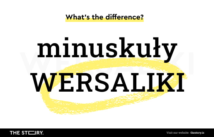
All caps equals capital letters. Small caps look like smaller versions of capital letters, but they aren't; if they do, they're fake Small caps.
Small capitals retain lowercase letters' size (height, width, light). Capitals are capital letters with all the consequences, about which I will write in a moment. Small caps in the graphic sense can be used wherever using All caps can be risky and can result in the message being perceived as harassing.
Small capitals, unlike Capitals, aren't available in every font family. Although this size can be achieved in most fonts, it will be apparent to the trained eyes of designers that these aren't true Small capitals.
Without going into details, let's say that true Small capitals are specially designed, not adjusted. False Small capitals are usually created using Capitals. The difference may not be visible to everyone, but it will be felt. Although we won't necessarily be able to verbalize what it consists of. False Small capitals create blocks of text that are heavier and less readable.
When do we use All caps? Examples of using All caps
It's impossible to move on to design issues if we don't discuss, even briefly, the problems of linguistic standards and language errors. And spelling words in uppercase and lowercase is a part of that.
Why? For a simple reason.
The visual sense (distinction) must go hand in hand with the correct spelling. And if we don't want to write according to the rules, then we need to find a good argument for such a decision.
Linguistic correctness is an important issue; neglecting it could ruin our good image. It can expose us to mockery and make us the object of jokes.
Okay, so in short, when is it appropriate to use Capitals or a capital letter?
We use capital letters in the following cases (it's not a complete list):
- For the first letter of sentences or when a previous sentence ends with a punctuation mark
- When writing the first person pronoun "I"
- For the first word, when we quote a complete sentence
- We use it for proper nouns such as names, surnames, and nicknames
- As well as for names of newspapers, programs, blogs, fonts, languages, brands, companies
- When we want to express emotions (such as respect and admiration)
- When we want to honor something or someone.
Capitals provide information. They are a clue and have emotional, social, psychological, and linguistic meanings. As mentioned, they signal a beginning of a sentence or an appearance of a proper noun. They organize the text and sometimes (CAUTION!), sometimes, that is, conditionally make it easier to read and understand. Capitals are also used to achieve a readability effect.
And while we're on the topic of readability, it's worth noting that we can talk about it and achieve it in two ways. In the English language, we have two words that describe it.
Namely:
- Readability – meaning the readability of larger blocks of text (e.g., paragraphs, columns), which supports ease and speed of reading. And in a strict sense, it refers to this process.
- Legibility – is the distinction of individual characters, which is closer to the process of content scanning that occurs when using web or mobile applications.
The problem of using Capitals is, of course, a result of context, purpose, medium (web application users read only about 30% of the words they see on a screen), and which type of readability is more important to us in a given context.

All caps in titles and beyond, or what do we use capital letters for?
We often use Capitals not only at the beginning of sentences and names but for graphic or marketing reasons. Sometimes, we use them for emotional reasons (e.g., in headlines, titles in the press), and then entire words are written in capitals. But there's more! Whole sentences could be written in them. For what reason? To catch our attention, to suggest the importance of content so that a reader doesn't miss it. All caps shouts at us, "Look, buy!".
We can also justify the use of capitals when we want to express:
- Strong emotion or attitude, for example, respect, admiration, or disapproval
- Warning
- Obligation or prohibition
- Information
- Advice or help
- Promise of something
- Rarity
- Establish a hierarchy to reflect the role and function of something/someone
- Give someone/something status, prestige, relevance, or uniqueness.
So, as we can see from the above list, Capitals have a significant psychological and social function. They're useful, which is why they're overused in verbal-visual messages. They are a permanent part of the design.
Capitals direct how people perceive, react, evoke emotions, and draw the attention of web application users.
It's impossible to overlook them or treat them with indifference. Unfortunately, everything comes at a price, and in the case of All caps, this means that we have to think about its effect.
In the design sense (ESPECIALLY IN THE CASE OF USABILITY, User Experience), it's a bit of a problem that needs solving. Its use can't be "arbitrary and frivolous," as in the above sentence, because in its case, as with any strong emotional message, it's easy to overdo it.
All caps in UX Design
We encounter it in many contexts. On websites, in headlines, in titles, in names, on CTA buttons, in slogans, in tab names, in menus, and in links.
We can see All caps not only on the Internet but also very often on the covers of books and CDs, on the front pages of newspapers, billboards, posters, and bulletin boards.
Basically, we can meet them wherever a sender of such a message seeks our attention.
So are there rules and conventions for the use of All caps? Are there positive standards and those that aren't recommended under any circumstances? Is All caps a problem in UX design? Yes. Yes. Yes.
Let's start with the most basic statement, namely that the process of reading consists of recognizing entire words. When reading or scanning a text, we don't look for or read individual, specific letters.
Will a text written in All caps be more readable? It may seem so. But it won't be! And its readability will decrease with its length. Design should take into account how a user perceives a text.
The mix of these two styles will be the most user-friendly. Linguistic norms aren't based on the whims of linguists but have their justification in visual perception and the economy of reading. Long sentences written in All caps make both reading and scanning difficult.
That's why we should highlight short or even very short portions of a text (preferably single words). Long sentences will be unreadable and frustrating. Such content written in an enlarged font may be perceived as disrespectful and intrusive.
The Internet norm (netiquette) makes it clear that a word written in All caps means shouting and aggression and has strong emotional overtones, not necessarily pleasant.
The more sensitive issue the text deals with (e.g., providing sensitive data, payments, performing unpopular actions), the more carefully All caps should be used.
Their emotional overtones will far outweigh the effect of readability or the effect of standing out in such situations. "SEND," when read on a contact form button, may seem too firm, bossy, or arrogant than the standard "Send."
We should firmly avoid using All caps in instructional texts, in contracts, and in persuasive or sales texts. Although its use may seem desirable and obvious there, its presence won't always be met with understanding and a positive response from users.
The more elaborate the content of pages, the more complex its formatting is (layout), and the less justification there is for using All caps.
Why is a text written in All caps difficult to read?
The answer to this question may seem obvious. The article "Using Capital Letters" provides a few reasons explaining why, usually, people find it harder to read text written using only uppercase letters.
These reasons include the following:
- In the case of native English speakers, children first learn how to read and write small letters. This knowledge can be especially important when designing products for kids.
- As mentioned, an uppercase letter generally signifies the start of a sentence or an appearance of a proper noun.
- Capital letters are, in most cases, wider than small letters, and due to that, they take up more space, causing our eyes to travel further than intended.
- Words that are written in uppercase letters have no "shape." Capital letters have the same height, small letters go up and down, and their height and "shape" differs. This property partially allows us to read faster because we recognize the "shape" of each word. For example, SEPTEMBER and OCTOBER have the same shape, while September and October have different ones.
That's why we need to carefully think through the use of All caps so that we can make our texts easier to read and scan through and not harder.
The use of All caps. When to use words written only in capital letters?
It's always a matter of feeling, experience, and awareness of possible effects and reactions (both desirable and undesirable).
We can use All caps in the following cases (with caution, of course):
- Titles and headlines
- Menus
- Text written vertically
- Navigation elements of a site
- Labels of buttons
- Microcopy (e.g., in greetings, farewells, alerts).

On what does the use of All caps depends?
To a large extent, it depends on the following:
- Font family, typeface, and font size
- Meaning of the enlarged word and the content, the meaning of the larger part of a text to which the word highlighted in All caps refers
- Font color and background color
- Place and location of a text block
- Space, light, and page layout
- Emotional overtones of the word and the context in which All caps is to be used
- The function of the word highlighted in All caps (expressive, informative, phatic, performative)
- Strength of the effect we want to achieve
- Credibility – All caps is sometimes used to create the impression of something significant or unusual. Unfortunately, it's easy to obtain an opposite impression (e.g., b2b commercial offers in which All caps is abused arouse distrust and are perceived as unreliable)
- Style of text and writing (e.g., formal vs. informal)
- The tone of text (e.g., serious vs. light)
- Grammatical mood (e.g., indicative, imperative, subjunctive).
Summary, or All CAPS IN TITLES, HEADLINES, and beyond
All caps can sometimes be beneficial in UX design (e.g., navigation can be more straightforward with it), but it also requires sensible and thoughtful use.
By arousing strong emotions, distinguishing text, directing perception, giving importance, and amplifying meaning and overtones, All caps helps increase the usability of web and mobile applications.
It visually organizes the textual layer and establishes a hierarchy of the importance of various elements of a verbal message. It supports intuitive browsing and the use of applications. But – CAUTION! – it's a double-edged sword!
The design and use of All caps is primarily determined by the context of a message (the proximity of other texts, graphics), the function (of a word highlighted with them, but also the functional context), the purpose, and the meaning of words.
So let's use it cautiously and in moderation.


