
Credit card forms are perhaps the most critical elements in E-Commerce and M-Commerce.
We don't know about you, but entering credit card data into a form makes us usually feel like unprepared students during an exam.
How should credit card forms be designed? What to pay attention to when designing payment forms in an online store?
We'll answer the above questions in just a moment.
Form design or why entering this damned data is so difficult?
Finding a public enemy number one in E-Commerce is not really challenging. Forms occupy this place. Nobody likes them. Nobody is into registering, filling out boring fields, and sharing data; they don't improve anybody's mood. Everybody wants to avoid interacting with them.
Although they're not particularly work-consuming, credit card fields are at the top of the list of things users hate to do while shopping online.

Ironically, although there are just a few of them, they're corrected most frequently, and people repeatedly make mistakes while filling them out. Why is that?
While designing forms, particularly credit card forms, you should remember the clue from the book by Luke Wroblewski, "Web Form Design: Filling in the Blanks."
Every question you ask in the form involves the need for its analysis, understanding, formulating an answer, entering the answer and independently checking it, and undergoing verification (validation).
Forms engage users' working memory and require them to focus and be more accurate. However, that's not all. It's not only about cognitive effort.
There are more causes of the reluctance toward forms. This reluctance most often comes from the following:
- Low credibility of the store
- Low credibility of the form — unprofessional design, non-compliant with design conventions to which users are accustomed
- Low trust in online payments as such
- Fear of cybercrimes
- Fear of frustration and waste of time, unsuccessful purchase, and performing work in vain — a self-fulfilling prophecy
- Fear of anxiety regarding sharing financial data
- Fear of making a mistake — losing money
- Unwillingness to look for the card and interrupt the purchase process
- The need to check the card balance — making sure the money is there
- Influence of context — especially when the payment is made on mobile devices (mobile payments).
As you can see, the reluctance users feel during online shopping and while filling out credit card forms has a source in their emotions, reasonable fears, and experiences, but also in predicted costs, they don't want to or can't incur.
Of course, here we're thinking about cognitive costs, not financial ones. Costs associated with short-term memory load. Using credit card forms is simultaneously convenient and risky.
Let's get back to our question. Why filling out credit card forms is so problematic and error-prone?
We've shown you how the problem looks from the users' perspective. Now we need to focus on the form design itself. And it's pretty complex. In a moment, we'll take a closer look at it.
Why is payment form design so difficult?
Although unique, credit card forms are a part of the general category of forms. And forms, "since always," are one of the most critical problems regarding issues in user experience.
Here, it's worth briefly discussing the most critical issues regarding form design. You can find a synthetic presentation of the problem in the article by the author affiliated with Nielsen Norman Group, Kathryn Whitenton, "Website Forms Usability: Top 10 Recommendations."
The form is one of the essential elements of the interface, and for users of web and mobile applications, it's one of the key tools for interaction and achieving goals.
An adequately designed form makes the interaction fast, seamless, convenient, and satisfactory.
For it to become such, it's necessary to do the following:
- Maximally shorten the form (the fewer fields, the higher the conversion — it's worth remembering that)
- Group fields and their labels
- Use one column with fields
- Use readable logic of the layout of forms, consistent with widespread knowledge, expectations
- Use the rule of "the most common, simple fields first"
- Avoid placeholder text
- Adjust the graphic design of form fields to the type of entered data
- Highlight required and optional fields
- Use comprehensible explanations, instructions, hints, and messages about errors
- Avoid the use of functions such as "reset"/"cancel" (you can read more about it in the article "Reset and Cancel Buttons").
An excellent supplementation of the above guidelines is the patterns recommended by the authors of the article "Designing Usable Web Forms – Empirical Evaluation of Web Form Improvement Guidelines Web."
In terms of the content of the form, they additionally suggest to:
- Use the format of answers that is compatible with users' habits
- Highlight required fields with a color or a symbol (e.g.,*).
Regarding the form layout, they recommend to:
- Prioritize the speed of filling out the form over the amount of acquired data
- Adjust the size of input fields to the expected length of the answer.
When thinking about the types of input data, it's best to:
- Minimize the number of made mistakes regarding problematic questions by using a drop-down menu
- Use checkboxes instead of a list for multiple-choice elements.
Error handling should be focused on the following:
- A nice and devoid of condescending tone explanation of the problem to the user
- Informing about errors after filling out the form and sending it
- Communicativeness achieved by appropriate language, color scheme, and icons
- Avoiding duplication of actions (e.g., sending) — to achieve that, buttons should be deactivated after sending the form
- Informing about the correct sending of the form — the confirmation should include appreciation and information indicating further steps.
If you think that's all that can be said on the subject of form design, then unfortunately, you're wrong.
To exhaust the issue (at least generally), we have to return to Luke Wroblewski once again. In the presentation "Even Apart Web Forms," he adds other elements to the puzzle called form design.

He astutely observes that the primary goal of every form is its completion. The design is supposed to help achieve this goal. That's why it should contain the following:
- Information on scope, progress, and status
- Ability to visually scan the form
- Suggesting correct input data
- "Save," "Continue," and "Send" functions should be highlighted more because they're paramount from the perspective of the purpose of the form
- "Reset," "Cancel," and "Return" functions are secondary actions and should be used rarely or preferably not at all
- Categorization and clear division of categories by placing them on separate pages.
With this background in the subject of form design, you can move on to another unique problem of credit card form design.
How to design a credit card form?
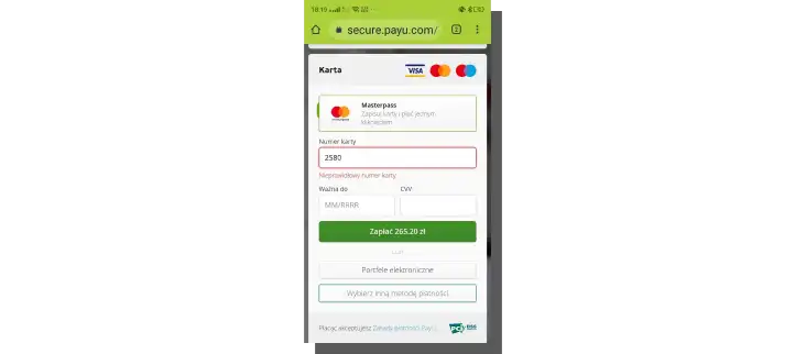
Standard credit card numbers range from 12 to 16 digits. And this is so troublesome that almost one in four users make a mistake while entering this data.
This data comes from research performed by Baymard Institute and published in the article "The 'Credit Card Number' Field Must Allow and Auto-Format Spaces (80% Don't)."
These results apply to the US market and American users, but it would be safe to assume that the situation looks similar in most markets. At the end of the day, people primarily use cards from the same providers (VISA, MasterCard) that are formatted similarly.
Perhaps the most surprising finding of this research is the awareness of user behavior during data entry.
Users tend to mimic the formatting of the data embossed and printed on the card.
They enter the credit card number in the form of four blocks. What does it mean regarding the problem of credit card form design?
Naturally, it means that the design of the form should allow the user to:
- Use spaces
- Implement a rule for automatic formatting of spaces — input data should be automatically formatted to contain spaces after every fourth digit
- Have information about the acceptable format of entered data — as a single sequence of digits, as blocks of numbers divided by spaces, or as blocks of digits separated by dashes
- Enter data without limitations regarding the formatting (in this variant, formatting is done in the back end, which translates to better user impressions).
This simple solution considerably reduces the number of mistakes. According to the authors of the abovementioned article, "it lifts input accuracy and lowers abandonment rates."
The fewer mistakes during card verification, the fewer shopping cart abandonments.
The data entered in the cardholder's name field should also be formatted similarly. The system should automatically format the name and surname on cards, usually written in all caps.
All of this provides visual consistency between the pattern on the card and the data entered into the form. It ensures users that they don't need to perform any additional actions.
Another fascinating discovery is the prediction of a failure, that is, an error, resulting in the user having to re-enter all the data instead of checking only the data that is the source of the error.
The increased stress, fear, and pessimism make users repeatedly and meticulously check the input data.
Credit card form is seen as a stressful and unfriendly tool. And this is a common problem.
According to the results from Baymard, as many as 80% of the studied websites don't help users enter and check the correctness of the credit card number.
Another design problem is to make the credit card form as universal as possible. It should support all credit card formats available on the market.
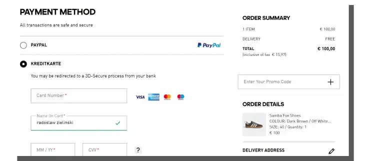
A standard credit card form includes the following required fields:
- Card expiration date (in the format month/year)
- Cardholder's name (printed on the card)
- Card verification value (CVV)
- Card number (16-digit).
Remember that every additional field or information that needs to be entered into the form increases the users' cognitive load. The obligation to fill it out is of little importance here.
To decide whether to fill out the field or leave it empty, the user needs to take the time to do so. They need to perform certain work. Engage their attention and memory.
Hence, for example, indicating the provider of the card is an unnecessary action because this information is included in the card number. It should be automatically detected.
How to reduce the cognitive load of credit card forms?
We've written about cognitive load and cognitive friction in the article "Warning! Cognitive Friction." We don't want to repeat ourselves, so let's get straight to the point. To make it easier for users to fill out forms and to speed up the process of entering data, you should do the following:
- Maintain precision, consistency, and correctness of microcopy
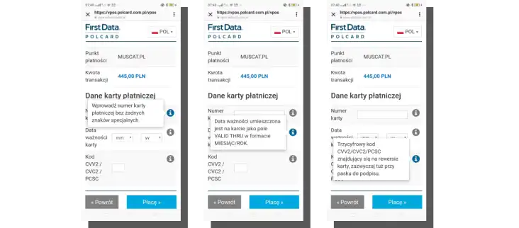
- Provide unambiguous and helpful instructions, messages, and hints
- Display messages next to the appropriate field
- Inform the user about expectations and requirements.
The issue of cognitive load and errors is directly related to their detection, communication, and correction. And here, we arrive at a crucial issue related to the validation of credit card forms.
Masking the input data is a way to deal with the cognitive load. Input mask involves informing the user that the data will be automatically formatted to adjust them to the system's requirements.
In other words, it's a function that relieves users of the need to adapt to the requirements. Automation of entry of spaces allows users to quickly enter the credit card number and check its correctness, as well as reduce the working memory load.
What is the validation of credit card forms?
Let's start with a definition. Form validation is nothing more than the process of checking whether the data entered by the user is correct — following the system's requirements. The validation can be performed in two ways:
- After the entering of data — After Submit Validation
- During the entering of data — Inline Validation
Both solutions have their advantages and disadvantages as well as supporters and critics. According to the previously cited results of the Baymard Institute's research, inline validation made users do the following:
- Quickly perform tasks
- Make fewer errors
- Less focus on the form (forms with inline validation are easier to process visually).
Correcting errors as they happen or looking for them after the task is done? There is no conclusive answer to this question. Naturally, A/B tests can help resolve this dilemma by indicating the more beneficial solution for a given industry, market segment, etc.
Validation of errors in the form can also be divided by the criterion of the source of the error. The following can be the source:
- Users
- System (validation on the server side).
Errors made by users have various causes, which we've written about already. Mistakes regarding data formatting are the most common ones. Server-side validation often includes mistakes regarding the following:
- Loss of connection to the server
- Timed-out, etc.
Credit card form design also means taking care of appropriate communication of errors.
What are adaptive error messages?
Designing a form that will not be a source of errors is probably impossible. It's better to quickly and effectively react to errors than count on the "infallibility" of users.
Adaptive error messages help achieve this goal. These are messages whose content adapts to the type of error or the reason for the error. Their goal is to provide users with specific and helpful instructions that will allow them to correct their mistakes quickly.
Adaptive error messages:
- Dynamically change
- Adapt to a situation
- Contain a specific instruction
- Reduce cognitive frictions
- Provide hints and explanations — minimize stress and increase a sense of control over the form
- Make the process more rational.
How to design credit card forms to increase the sense of safety?
Using credit card forms involves risk. It's a situation that causes more or less discomfort. Uncertainty regarding whether the form works properly, whether it is safe, or whether the data won't be used for other purposes is the inseparable element of this process.

So how can you increase the sense of safety and credibility of the form? Above all, you should:
- Inform about implemented security measures (e.g., SSL certificate)
- Ensure a professional and modern layout
- Always leave the form visible
- Avoid redirects to other sites
- Highlight logotypes of card providers to suggest the automatic card recognition
- Use icons and symbols that confirm the correctness of the data, completion of a stage, and achievement of the desired state.
Credit Card Form Design. Summary
- Almost one in four users make a mistake when entering their credit card number.
- Every question in the form involves the need for its analysis, understanding, formulating an answer, entering the answer and independently checking it, and undergoing verification (validation).
- Additional fields in the form are a source of additional cognitive load.
- Forms engage users' working memory and require them to focus and be more accurate.
- The reluctance users feel while filling out credit card forms has a source in their emotions, reasonable fears, and experiences.
- An adequately designed form makes the interaction fast, seamless, convenient, and satisfactory.
- According to Wroblewski, the primary goal of every form is its completion.
- Users tend to mimic the formatting of data printed on the card.
- The fewer mistakes during card verification, the fewer shopping cart abandonments, and the higher the conversion rate.
- Credit card form is seen as a stressful and unfriendly tool.
- Masking the input data is a way to deal with the cognitive load.
- Input mask involves informing the user that the data will be automatically formatted and adjusted to the system's requirements.
- Form validation is the process of checking whether the data entered by the user follow the system's requirements.
- Adaptive error messages are messages whose content adapts to the type and cause of the error.
- The goal of adaptive error messages is to provide users with specific and helpful instructions that will allow them to correct their mistakes quickly.
- Uncertainty regarding whether the form works properly, whether it is safe, or whether the data won't be used for other purposes is the inseparable element of the process aimed at secure online shopping.
- Credit card form design should also strive to reduce stress and increase the sense of security and improve credibility.


