Designing Breadcrumbs, Breadcrumbs trails, or Breadcrumb links in web and mobile applications is an issue we will discuss today. What are Breadcrumbs? Why are they important for the positive, good User Experience? How to design them to increase the engagement of mobile and desktop users?
The subject sounds food-related, but don't let this endearing name fool you.
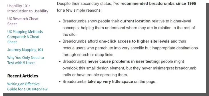
Researchers from Nielsen Norman Group have recommended Breadcrumbs since 1995!
It's not surprising; this is a serious matter. It is about an essential element of the interface, navigation, and user interaction with an application.
Well, let's move on to the details!
Let's talk about Breadcrumbs (Breadcrumb trails)
Let's start with an example. A Breadcrumb trail can look like this:
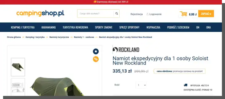
Allegro > Sports & Tourism > Gym & Fitness > Strength Training > Dumbbells
Now, let's move on to the definition of Breadcrumbs. Or rather, to the fairy tale about Hansel and Gretel, who figured out that by dropping small pieces of bread on the path (creating a Breadcrumb trail), they would be able to get back home thanks to them.
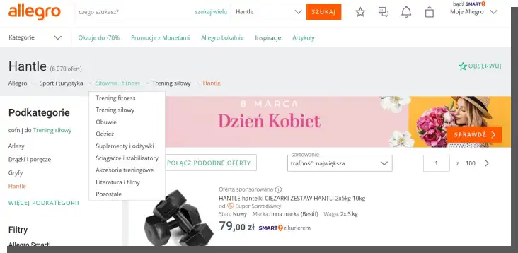
In Allegro's Breadcrumbs navigation, all subsequent levels of resources are visible: "home page, category, subcategory," which, in online stores, makes it easier for the user to understand where they are on a particular page.
In addition, when we hover the cursor over a Breadcrumb link, we can see a full list of categories where with a single click, we can switch to another category to change or narrow our search. In other words, Breadcrumb links take the user to the corresponding subpage.
In the world of applications, Breadcrumbs navigation (or Breadcrumb navigation) is intended to serve the same function, hence the name.
The Breadcrumbs navigation is designed to help users with the following:
- Orientation in the structure of an application
- Understanding the relationship between its elements
- Understanding the website's hierarchy and categorization criteria
- Quick transitions between levels/categories
- Avoiding cognitive friction
- Reducing the involvement of working memory – we don't have to remember the entire path we took – Breadcrumbs are a handy word map.
What are Breadcrumbs (Breadcrumb trails)? Let's refer to the definition proposed in the article "Breadcrumbs: 11 Design Guidelines for Desktop and Mobile," published on the Nielsen Norman Group blog. According to NN Group specialists, Breadcrumbs are a list of links representing the current site and its "ancestors."
Breadcrumbs are usually created following the logic of narrowing categories, narrowing the subject scope to which the content of the subpage refers.
In other words, the Breadcrumb trail can be described as a path composed of text links that simultaneously allow users to go back to each previous page that they visited and see the current page they're on.
The names of the category labels should sound as understandable as possible and be in line with common perceptions.
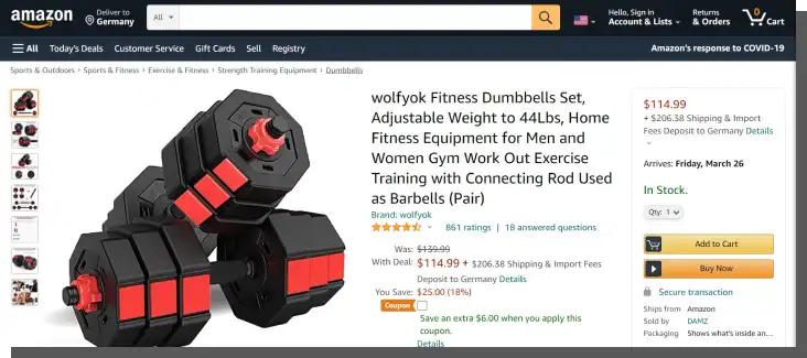
"Dumbbells" can be considered recreational equipment, but this will contradict the common perception of the category to which they should be classified. Being a signpost, they must suggest directions and goals that people want to achieve.
And when looking for dumbbells on Allegro, first we will think about sport, then the gym, muscle training, and the equipment used for this. Although we use the gym in our leisure time, we do not primarily associate it with recreation.
A sense of categorization is significant for online stores and products that can be considered representatives of different categories.
For example, a bicycle can be classified as a means of transportation, sports equipment, recreational equipment, or a two-wheeled vehicle. In the above example from Allegro, in the case of bicycles, the Breadcrumb path looks as follows:
Allegro > Sport & Tourism > Bikes & Accessories > Bikes > Road Bikes
Allegro > Children > Bikes and Vehicles > Balance Bikes
Such a division seems adequate and useful rather than more detailed, sophisticated, and, in the bad sense of the word, original. However, bikes are more often associated with sport and tourism than two-wheeled vehicles or urban vehicles.
Moreover, the benefits of applying a Breadcrumb trail, in this case, include intuitive switching between multiple categories allowing the user to narrow down search results and the ability to discover new areas of the site quickly.
Designing Breadcrumbs also requires a strong feel for language stemming from an awareness of how objects, phenomena, and attributes are perceived in a given society.
The implementation of Breadcrumbs can be done in three variants:
- Path-based or history-based Breadcrumbs navigation (in this variant, the breadcrumbs navigation has a similar function to the "Next" and "Back" buttons)
- Location-based Breadcrumbs navigation or hierarchy-based Breadcrumbs navigation
- Attribute-based Breadcrumbs navigation.
By implementing the path-based Breadcrumbs, we provide the user with the history of previously viewed subpages in the Breadcrumbs navigation, allowing them to switch between them efficiently. Additionally, they can see the steps that led them to the current page.
In this case, we deal with a dynamic Breadcrumbs navigation which performs a similar function to the "Next" and "Back" buttons. Additionally, the user can see where in the site architecture they are and move to a higher-level page.
In the second, location-based variant (hierarchy-based Breadcrumbs), in the Breadcrumbs navigation, we reflect the site's hierarchy in the form of links arranged from the home page to increasingly more nested catalogs. The implementation of location-based and hierarchy-based Breadcrumbs for this type of navigation finds application in many online stores.
In turn, attribute-based Breadcrumbs allow users to search within search results for products that meet specific characteristics (attributes); they organize the current page. It's especially useful in, e.g., E-Commerce, where Breadcrumbs contain information that categorizes the search results.
In the case of large platforms, attribute-based Breadcrumbs appear after applying filters by the user, allowing them to easily navigate through search results (e.g., sweaters, color: brown, material: wool, size: M).
Of course, each of these variants is about precisely the same thing – navigating quickly and reaching the goals. It's about supporting user orientation and effective, seamless, satisfying, convenient, and fast interaction.
Breadcrumbs can also be compared to a keyboard shortcut.
What are the main advantages of Breadcrumbs navigation?
Discussions on the benefits of Breadcrumbs have been going on for years amid heightened excitement. To use or not to use? Are they beneficial or harmful? And so on. If you feel like pondering this problem, I recommend this article as a start.
In our humble opinion, like any solution, they have their advantages and disadvantages. However, there are fewer disadvantages and more advantages. That's why we write about Breadcrumbs – they are convenient and effective, and both desktop and mobile users expect to see them.
Breadcrumbs provide the following:
- Additional and clear breadcrumbs navigation (a bit like a spare wheel in a car)
- The economy of work – instead of clicking the Back button and skipping unwanted subpages, we immediately get to the right, desired one
- Visual appeal (they are considered subtle, discreet, and elegant)
- Short-term memory support – mnemonics
- Lower the bounce rate
- Clearly separate pages
- Encourage browsing
- Improve user's ability to navigate
- Structure the Information Architecture
- Introduce a sense of order, logic, inference, conclusion
- Speed up the execution of tasks
- Standardization – Google uses Breadcrumbs in search results
- They are handy and minimalistic – Breadcrumb trails take up little space and are very discreet and aesthetically pleasing.
It is difficult to consider the above advantages of Breadcrumbs as unimportant, secondary, or of no business use.
Breadcrumb trails directly affect interactions, impressions, feelings, attitudes, and evaluations that an app evokes in us.
After all, navigating the application and feeling in control of the goal and the means to get there is significant for business. An application that offers a positive User Experience is highly competitive. It generates a lot of traffic, sales, and a good conversion rate.
Web Design – Breadcrumbs in web applications
In the article "Help Users Retrace Their Steps with Breadcrumbs," we can find some very useful design patterns to keep in mind when designing web applications.
The authors suggest that, first and foremost, we should take care of the following:
- Accurate and logical labels for subpages that, in a short, intuitive way, reflect the content of the page and create a meaningful context
- The order of displaying labels (from left to right), according to the order in which the subpages are arranged in the website hierarchy
- Separating navigation elements using the symbol (>)
- Linking all elements of the structure except for the last one, which is the current page the user is on
- Providing the ability to navigate through the individual Breadcrumbs using the Tab key.
We should apply these recommendations systematically to achieve the highest possible level of consistency.
We should supplement the above recommendations. It is worth remembering the following:
- Subpage label separators should suggest with their shape the movement (e.g., arrows pointing to the right, right angle quotation marks)
- The (>) symbol also helps indicate the connection between higher-level pages and lower-level pages
- Labels should be as short and unambiguous as possible
- Breadcrumb titles should be in line with page titles
- Breadcrumb trails cannot be an alternative to the conventional primary navigation menu or global navigation bar but should complement it and be a secondary navigation scheme.
It's also worth remembering that Breadcrumbs are extremely useful when a website visitor arrives not on a home page or landing page but on one of the many subpages.
In such a situation, they need to quickly:
- Understand where they are
- Define their goals
- Learn about their capabilities
- Find the mode of action that suits them best in interacting with a particular application
- Estimate the usability of an application
- Evaluate the benefits they will enjoy while interacting with the app.
Designing Breadcrumbs for mobile applications
Task-oriented interaction, much smaller screen space, variable, highly determining context, reduced concentration, and tactility make Breadcrumbs on mobile devices particularly significant.

They also pose a major design challenge, as the number of mistakes made on mobiles and tablets is much higher than on desktops.
The size of the Breadcrumbs and the spacing between them, particularly in deep structure applications, can be a big problem. An intermediate solution is, of course, the practice of a drop-down menu, but this, in turn, is not good for readability.
When designing mobile Breadcrumbs (for mobile apps), we should also:
- Give a clear visual clue or suggest the "clickability" of the Breadcrumbs (the lack of clues can provoke experimental taps to see if the element is interactive, which in turn can be a source of frustration)
- Use conventional separators (known from web applications), which indirectly suggest the interactivity of elements separated by them
- Consider the length of the Breadcrumbs navigation due to limited horizontal space – it should be more of an overview than an accurate representation of the site structure breadcrumbs visible
- Avoid Breadcrumbs wrapping onto multiple lines, especially on mobile where space is most valuable
- Expose the user's current location because the usually visible primary navigation could be hidden
- Display only the parent category or parent subcategory to which the current location belongs (in mobile online stores, this enables better categorization of products)
- Omit the home page wherever possible – this allows us to shorten Breadcrumbs and fit them in 1 horizontal line.
Since mobile devices don't offer too much space, it's vital to consider the above guidelines if we want to offer better Breadcrumbs and, thus, a better user experience on mobile.
Designing Breadcrumbs – other design patterns
Although desktop and mobile devices have their peculiarities, there are patterns in Breadcrumbs' design that are worth following regardless of the type of application.
Recommended solutions include the following:
- Use of conventional separators (">" or ":" - although increasingly, Breadcrumbs are being designed as buttons, graphic elements in the full sense of the word rather than consecutive words)
- Displaying Breadcrumbs at the top of the page, above the content (they are expected and sought after there because of the visual convention that has become popular)
- Use of contrast as a distinguishing indicator, informing about the interactivity of the element
- Use of bolding to highlight the last element
- Lack of Breadcrumbs navigation on the home page
- Avoid drop-down menus
- Use of ellipses for labels with long names.
Note that it is unnecessary to use Breadcrumbs in the case of single-level sites because they do not need a logical hierarchy. Usually, the primary navigation menu is enough in such cases because no child pages are connected to parent pages.
Is Breadcrumbs navigation SEO friendly?
The Google browser likes Breadcrumbs and considers them a helpful tool for navigating websites on a desktop computer or mobile sites. Breadcrumbs make it easier for users to navigate a site and quickly find a page that interests them. They also help the Googlebot understand the site's structure (site hierarchy) and relations between individual subpages.
Breadcrumbs can also be displayed in Google search results in the form of a hierarchical list of subpages. Breadcrumbs can be used to improve the quality of displayed results in Internet search engines through structured data. Thanks to the addition of appropriate tags in the website's code, engines can read information about the site's hierarchy and display it in search results.
We need to use appropriate HTML tags to add Breadcrumbs to structured data. Usually, Schema.org's "BreadcrumbList" tag is used for this purpose. This tag allows us to precisely define the navigational structure and use it in structured data.
Below is a sample code written in Python that generates HTML code using Schema.org's "BreadcrumbList":
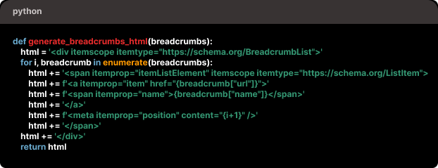
Using Breadcrumbs in structured data of a website enables us to more precisely determine the site hierarchy and improve the results displayed in browsers.
In summary, the Breadcrumbs navigation should be included in structured data, and it would be a mistake not to use this potential.
On another note, Breadcrumbs pages reinforce the internal linking of a website, making it easier for users to navigate and quickly and more smoothly access different sections of a website.
Moreover, better internal linking on desktop and mobile sites may increase their chances of appearing in search results and positively influence the positioning of a site in search engines.
Designing Breadcrumbs (Breadcrumb trails) for desktop and mobile. Summary
- Attention! Researchers from Nielsen Norman Group have recommended Breadcrumbs navigation since 1995! They recommended it before it was cool!
- What are Breadcrumbs? Breadcrumbs (Breadcrumb links) are navigational elements designed to help users navigate the structure of an application, among other things. They also allow us to show the user's location.
- Breadcrumbs are usually created following the logic of narrowing categories, narrowing the subject scope to which the content of the subpage refers.
- The names of the category labels should sound as understandable as possible and be in line with common perceptions.
- We can distinguish the following types of Breadcrumbs: path-based, hierarchy-based, location-based, attribute-based, and history-based breadcrumbs.
- Breadcrumbs should not be an alternative for effective primary navigation menus.
- Breadcrumbs directly affect interactions, impressions, feelings, attitudes, and evaluations that an app evokes in us.
- Breadcrumbs reduce the bounce rate and are a good navigational aid that encourages browsing.
- The seamlessness of navigating an application, the sense of control over the goal, and the means to get there directly impact sales volume, conversion rate, and competitiveness.
- An application that offers well-designed Breadcrumbs and thus provides a positive User Experience is highly competitive.
- Breadcrumbs are extremely useful when a user arrives not on the home page but on one of the many subpages and needs to figure out their location and determine their goals very quickly, among other things.
- Thanks to Breadcrumbs, the Googlebot understands the hierarchy of a desktop or mobile site.
- While designing mobile Breadcrumbs, we should be primarily concerned with clear visual cues that suggest "clickability."
- Breadcrumbs should be displayed in a simplified, overview form in mobile applications.