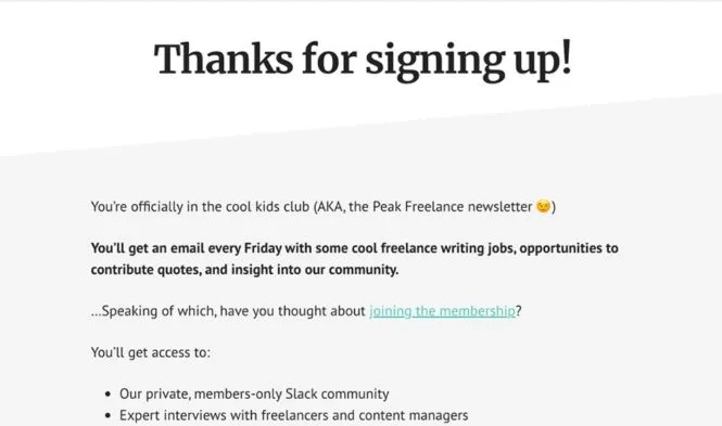
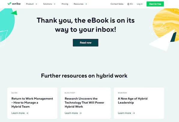
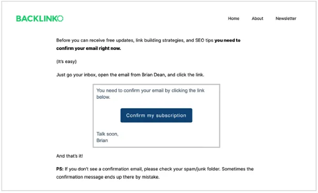
Thanks for, e.g., shopping, expressed on a Thank You Page allows you to strengthen the engagement and loyalty of the customer.
Simultaneously, it intensifies the belief that the online store not only has a great offer and works perfectly but also cares about communication and relationships.
Even the most straightforward landing page used to acquire leads should include a thank-you message refined in various aspects.
A Thank You Page should be a standard and something very obvious.
Unfortunately, in reality, thanks for shopping through a separate Thank You Page (in a refined form) is still more a wishful than observable ideal during online shopping.
Kindness and gratitude are just one of the aspects that should guide designers in creating a Thank You Page.
There are other reasons behind the need to treat this type of page in a special way.
That's why we'll look at some important questions in this article.
A Thank You Page — what is it? Where and when to use it? How to design a Thank You Page?
What kind of user experience should you offer on Thank You Pages?
What elements of a Thank You Page are essential, and what potential hides behind them?
Regarding usability, marketing, loyalty, engagement, experience, spontaneous recommendation, ratings, and opinions.
Remember that a Thank You Page is too important to treat as a necessity that is not worth much time.
It's a grievous mistake that may result in a waste of many opportunities.
Thus, don't waste a chance to learn something practical.
We cordially invite you to read the article!
What is a Thank You Page?
The name of this page reveals its meaning, function, and content.
As you might easily guess, the Thank You Page is a page displayed to the user after completing a given task, achieving a goal.
Every significant (from the perspective of the interests of the user, but very often also of business owners) process-finalizing interaction with the system should be "closed" with the Thank You Page.
Users (e.g., of online stores, SaaS services) most often can see the Thank You Page after the following:
- Filling out a form (contact form)
- Making a payment
- Subscribing
- Subscribing for a newsletter
- Downloading an e-book
- Giving consent
- Making a reservation
- Sharing
- Registering.
As a rule, none of these goals shouldn't be treated preferentially.
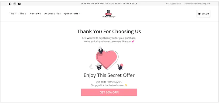
They shouldn't be marginalized or considered insignificant enough to warrant a Thank You Page, which should be immediately displayed when the process is completed, and the goal is achieved.
The Thank You Page shouldn't be downplayed for many reasons, including the fact that it performs complex functions.
The Thank You Page, in the most obvious sense, is used to:
- Express respect to the user
- Voice a positive attitude, appreciate the work, commitment, and time devoted by the user
- Express appreciation
- Build the image of a cultural, sympathetic, and respectful company that values a good relationship with users.
The Thank You Page, in the less obvious sense, is used to:
- Inform users about the end of the process, about achieving a goal
- Inform users about the successful completion of the process
- Maintain engagement, start a new process, and indicate a new goal
- Build relationships
- Maintain the interest of users
- Inspire, hint, suggest and propose
- Influence users' emotions — the way of expressing thanks can be very different, from formal, cold, and causal to very creative, humorous, light, and hilarious
- Indicate next usage scenarios (e.g., recommending a product through social media)
- Reintroduce users to the sales funnel
- Highlight the change of user's status and options and benefits involved — for example, the change from Guest status to Registered status, from User to Customer
- Create new "navigational openings" — the Thank You Page is simultaneously the end of the path and the beginning of a new navigational route
- Give a special role to the users/customer — for example, by making them an ambassador of the brand, who, by sharing, recommends, advertises, supports, and evangelizes
- Reward users, offer them special offers
- Last but not least — gather feedback from users — achieve research and cognitive goals.
It's also worth being aware and emphasizing to who you're actually showing the Thank You Page.
A customer/user who completed a desirable action (e.g., converted), and achieved their goal, is a user who is:
- "Hot" — suggesting, inspiring, and recommending next steps; these actions are addressed to a sufficiently involved person who won't be reacting to such a message as to a typical cold calling or cold mailing, which are perceived as pushy, annoying, undesirable and unnecessary
- Much easier to direct than a user who is at earlier stages of the process
- Much more open to listening to propositions of subsequent offers, values, goals, tasks, and possibilities.
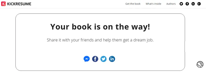
To summarize this part of our discussion, it's worth quoting the remark made in the article "How to Create a Perfect Thank You Page (27+ Examples)."
As its authors accurately observe, the Thank You Page is very useful for business because it can help obtain new and maintain existing customers.
Through a properly designed Thank You Page, it's possible to increase sales volume, engagement, and user retention.
Types of Thank You Pages
Generally speaking and referring to a complexity criterion and content of the Thank You Page, several variants of such pages can be distinguished.
The Thank You Page can be:
- Complex regarding the content and structure
- Simple, minimalistic, and reduced to ordinary, frugal thanks
- A page that supplements other functions, for example, confirmation of subscription, purchase, registration, or reservation
- Independent or can be reduced in form and content to a pop-up
- Universal, unchanging, used in every usage scenario and after finishing every stage
- A dedicated page, diversified in terms of purpose, place in the structure of the website, stage of the process, the significance of the action performed, and logic of the subsequent steps, activities
- A page encouraging to use offered functionalities, CTA, recommendations, or a page that is just a message that is supposed to be taken as a notification and — just click the "x" button.
In and of itself, none of the above solutions or design conventions are good or bad.
A given variant, type, or solution can be more or less useful as long as you:
- Concretely define your business goals
- Determine what user experience you want to offer
- What behavior from the business perspective is desirable and expected
- What emotional or psychological effects you want to achieve
- What image the organization wants to create in customer/user awareness.
In general, the vital task of the Thank You Page is to ensure the appropriate level of comfort to the user in the following dimensions:
- Information
- Navigation
- Communication
- Actions and further possibilities
- Emotions
- Credibility and trust.
In other words, the user should, thanks to the page, know what they did, what to do next, how they can do it, and with what effect.
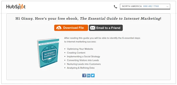
The Thank You Page should also provide the following:
- Justification
- Arguments
- Motivators.
The Thank You Page should be free of distractions, elements that divert attention, extend navigational decision-making, that make the user unable to define a new goal and perform another action as soon as possible.
To achieve this, the Thank You Page should contain specific elements.
How to make a Thank You Page?
A multifunctional Thank You Page should, first and foremost, have thanks.
Thanks are usually expressed verbally, but a far more recommended design pattern is to supplement this message with the following:
- Graphical elements
- Animated elements
- Audio-visual elements
- Auditory elements
- Interactive elements.
The Thank You Page should contain the following:
- Sincere, authentically expressed, or even creative thanks that aren't painfully conventional, typical, and devoid of individual characteristics
- Thanks should indicate their reason (what are you thanking for), goal (why are you thanking), the addressee (who you are thanking), and be oriented on building relationships and bonds with the user/customer
- Message in form, content tailored to the addressee and what the thanks are about - individualize the message, formulate thanks differently in the case of purchase, registration, subscription
- Content dedicated and related to the history and knowledge of the customer — if the customer makes another purchase, the content of thanks should be different from those for the first purchase.
The tone of the content of the thanks should also be tailored to the following:
- Addressee (individual or business customer)
- The level of familiarization and social distance (e.g., age and gender imply different forms of expressing respect)
- Reasons for thanks — e.g., the purchase volume can be a good variable for the individual approach to the content of thanks
- Types of offers, products, and services — various products and services have different statuses. They are differently perceived, meaning their buyers have different approaches to them and themselves (e.g., legal services require more distance, formality, seriousness, and conventionality than games or purchasing a VOD service).
The most frequently used elements on the Thank You Page include the following:
- Actual thanks
- Information confirming the achievement of the goal, execution of the action
- Instructions on further steps
- CTA
- Purchasing, content, functional recommendations
- Illustrative, visual, and audio-visual elements
- Buttons for sharing
- Buttons for rating systems
- Buttons for recommendations, invitations
- Survey forms
- Discount codes
- F.A.Q. section
- Section with social proof.
The configuration of elements and the level of complexity of the Thank You Page depends, as we've mentioned, on the business goals and expectations of users of a given site, app, and customers of a given company.
You also need to consider the user experience that should be at least satisfactory.
UX of a Thank You Page — what experiences should be offered on Thank You Pages?
Keywords that should be included on Thank You Pages include comfort, convenience, and instructiveness.
But remember that the user can't feel forced to perform additional actions.
The Thank You Page is supposed to be used to voice thanks, and additional functionalities and interface elements should be offered tactfully and in a balanced manner.
This hierarchy of importance should be kept; otherwise, the thanks won't sound like thanks.
They will instead be perceived as an excuse for pushy commercial activities which contradicts the fundamental value of the Thank You Page.
Which is the relationship with the user, not the sales volume.
However, on the other hand, reducing the Thank You Page to mere thanks is problematic because users:
- Can feel disoriented when they won't see a CTA button or navigation
- Can assume that the website has nothing else to offer, and they may take this impression on faith and not want to take action to confirm or refute it
- Can feel that the site is impractical and is a duplication of the information offered in other channels.
The Thank You Page should provide the following to users:
- Cognitive comfort, thanks to which the user will know what they're supposed to do in the next steps
- Emotional comfort, with it the user will feel that they're important to the company, that they're approached with a certain kind of reciprocity
- Behavioral comfort — thanks to which the user knows what to do.
The instructional nature of the Thank You Page should be expressed primarily in the content that:
- Summarizes previous actions (e.g., a purchase)
- Informs (e.g., about the amount, frequency, and regularity of mailing)
- Suggests (e.g., indicates possibilities of additional purchases, e.g., cross-selling)
- Provides credibility (e.g., opinions of customers).
In other words, the user should have a clear view of the situation and the possibilities they have in such a situation.
![A thank you page on [x]cube LABS](https://d3du32kqsjijk3.cloudfront.net/en/media/uploads/2023/06/28/thank_you_page_6.webp)
Furthermore, the Thank You Page is an excellent opportunity for branding activities. Mainly it provides the opportunity to build the brand's image and express its personality.
The Thank You Page allows you to present the core of the company, especially its:
- Values that the organization wants to make a reality, expressed in its approach to users and actions
- Brand personality — who the company is (to what archetype it refers), what it represents
- Scope of the offer along with added values, for example, expressed in the after-sales service
- Approach of the brand to itself and the customer — openness, flexibility, understanding, gratitude, honesty.
With that said, you should exercise restraint in the amount of content and functionalities offered on this site. The amount of text shouldn't exceed several lines.
![Another example of a thank you page on [x]cube LABS](https://d3du32kqsjijk3.cloudfront.net/en/media/uploads/2023/06/28/thank_you_page_7.webp)
The Thank You Page expresses gratitude, which needs to be concise because of its nature, and simultaneously it should offer additional "help."
Let us put it into a more structural language. The Thank You Page should say to the user: "Thank you! What else can we help you with? Here are things we can offer you."
How to design a Thank You Page? Summary
- The Thank You Page is a page displayed to the user after completing a given task, achieving a goal (e.g., completing an order or receiving a lead).
- The Thank You Page allows you to strengthen customer engagement and loyalty (e.g., online stores).
- Kindness and gratitude are just one of the aspects that should guide designers in creating the Thank You Page.
- Every significant and process-finalizing interaction with the system should be "closed" with the Thank You Page.
- The Thank You Page is primarily used to express respect to the user, express a positive attitude, appreciate the work, engagement, and time devoted by the user, express gratitude, and build the image.
- The Thank You Page helps to acquire new and maintain existing customers.
- Thanks to the Thank You Page, the user should know what they did, what they can do next (e.g., recommend the product on social media), how they can do it, and with what effect.
- The recommended design pattern is to supplement the thanks with graphic, animated, audio-visual, auditory, and interactive elements.
- The Thank You Page (e.g., in E-Commerce) should be customer-oriented. It should provide users with cognitive, emotional, and behavioral comfort.
- The Thank You Page allows you to build the image, express the brand personality, and convey the brand values that are important to the customer.


