Landing pages are used in many industries (we won't probably hear the question – "Landing page, what is it?" in any of them anymore). The landing pages are often used by companies in the financial, insurance, training, education, and consulting industries.
We can find examples of these by searching for workout plans, diets, games, drugs and supplements, cosmetics, books, and even housing. The IT industry is also very keen on using landing pages.
A landing page or the one-man show page
The utility of the landing page is very extensive. But before we discuss its functions and the goals it allows us to achieve, let's provide a definition. The landing page is characterized by simplicity, minimalism, and a lack of menus. It contains a limited and necessary amount of content and functionalities.
A landing page is created to achieve a single goal. All its crucial elements (headline, CTA button, form, hero shot, microcopy, landing page mockup) are meant to achieve it. Anything unnecessary, disturbing, distracting, or arousing unnecessary curiosity should not be on it.
We can compare the landing page to a soloist, a star of a one-man show. It is the total opposite of corporate websites. How to create a landing page? Before we answer this question, we must learn about the uses and functions it offers.
Goals and functions of landing pages
Landing pages are often used for acquiring leads, presenting services and products, and making exchanges. They are increasingly using the psychological rule of reciprocity. What does it refer to?
To a sense of gratitude and the need to return the gift, help, or access. The mechanism has been well described in social psychology and has been used in advertising and promotion for a very long time. All sorts of samples, bonuses, and gifts are meant to arouse in the recipient the need to return the favor.
And the landing page works perfectly for this.
The Landing page – acquiring leads
The rule is simple. Do you want to get a free sample, a free guide, an ebook, a discount code, an access (trial), a fragment, or even a landing page creator or how-to guide like "How to make a landing page in fifteen minutes"? Fill out our form, and leave your details. We know fully well that it will only take a moment, and we succumb to this temptation.
In return for an attractive offer, we will sign up for a newsletter and subscription and consent to the use of our data for marketing purposes. Therefore, no one should be surprised that the conversion rate of landing pages can reach a value of several to several dozen percent.
Wide application of the landing page
The landing page allows us to sell effectively and buy seamlessly. It helps attract new users, participants (for contests, games, programs, webinars, training, and conferences), testers (of product prototypes), respondents, viewers, listeners, and business partners.
Measurable effectiveness
What is most important, thanks to its focus on a single objective, it allows us to reach very specifically profiled audiences. Measuring reactions to a specific message and interactions with particular elements of a page (such as a form) is much simpler and more useful.
It isn't surprising that landing pages are very successful because of this.
Landing pages mean more straightforward analysis and optimization
A multi-element landing page is easier to optimize and analyze results from systems that track the behavior of Internet users. A lower amount of data, factors, information, features, functionalities, and opportunities to perform actions translate into a higher "cognitive control" of the page.
In the case of landing pages, there are simply far fewer reasons for the behavior of page users. It is easier to distinguish correlations from cause-and-effect relationships. It is also easier to grasp the relationships between individual behaviors and the solutions used (such as color scheme, location, and ergonomics).
It's easier to perform A/B tests, as well as to make changes in its structure, appearance, and functionalities. The optimization of the landing page is much less time- and work-consuming.
It is worth pointing out the crucial elements and actions that translate into effectiveness, which we can easily monitor. These are:
- Clicks on CTA buttons (Call To Action)
- Clicks on interactive phone numbers in mobile versions of landing pages
- Clicks that launch videos, audio, and presentations
- Filling out forms
- Ticking checkboxes – marketing, telecommunications, commercial consents
Types of landing pages
Although the most popular variant of the landing page is the page for generating leads, we shouldn't forget about click-through pages. Their role is to encourage users to explore the pages where the complete offer is available. The function of click-through pages is to assure the customer that the company has a particular product or model and provides a specific service. We can summarize them in the following way.
"We ensure that we are able to meet customer expectations within a very narrow range. We offer what they are specifically looking for. But we can also offer much more." The formula behind these kinds of pages thus boils down to the declaration of a guarantee, "we have X, but we also have A, B, C, and even Y and Z." The click-through page is, therefore, only bait, a sample of the entire offer.
Characteristics of a well-designed landing page
A well-designed landing page is unambiguous. It does not raise doubts. The user knows why they're on it, what they can gain from it, and what action they must perform to gain benefit.
"I'm sure it's for me." "I'm sure I'll benefit from it." "And I'm sure I'll gain the benefit in just a moment. I just need to perform one action." It is possible to summarize the feeling that should accompany the user using such pages through such sentences.
This type of assurance is necessary for a landing page to work effectively as a sales, informational, and engaging tool that allows us to establish a business relationship.
Types of traffic sources on landing pages
This brings us to perhaps one of the most important issues, namely, the relationship between the traffic source and the landing page.
The source of traffic on the page can be a text campaign in Google's search engine (such as AdWords), a display campaign on its partners' websites, or a campaign on social media platforms (such as Facebook Ads).
But also a mailing campaign, text messages with a link received on a mobile phone (SMS Advertising), messages received in instant messaging (e.g., Messenger Ads), links embedded in articles, PR materials, news published on blogs, industry websites, and on the Search Engine Results Page.
The principle of consistency determines the effectiveness of the campaign
One of the most crucial rules for the effectiveness of a landing page is its compatibility with the source. Understood in a very broad sense. We should ensure the consistency of the following:
- Category – if the source is, for example, a forum for fishing rod manufacturers, the landing page cannot sell food for aquarium fish. Although it is a related product, it is not a direct and obvious connection. Such a connection will be a particular model of rod or matching accessories.
- Logic – each source provides a certain context, a cognitive framework. If it implies that the product or service belongs to the low-cost category, budget products, or services, then the landing page cannot offer the purchase of a much more expensive and exclusive product. Such a situation raises objections and is a classic example of cognitive dissonance.
- Emotion – if the tone of the source is humorous, the tone of the landing page should be as well. After announcing an incredible concert, would you want to buy a ticket on a page that in no way maintains the induced atmosphere of joy and celebration of music?
- Target audience – context clearly suggests gender, age, lifestyle, or place of residence. Then the landing page must not disrupt these expectations either. Although women are most likely to buy ties, the advice from this advertising anecdote does not always apply. Let's not forget about it when creating a campaign.
- Promise and its fulfillment – if the meta description, visible in the search engine, shows that shipping is always free, the landing page cannot dispute it, for example, by making free shipping dependent on the number of products ordered, order price, or distance.
- Types of customers – a redirection from an industry forum to a landing page offering a product for an individual customer is more likely to increase the Bounce Rate.
- Conditions for the availability and necessary actions to achieve the objective – very often, ads convince us that we are one click away from buying a product or ordering a service. However, in practice, it turns out that it took 12 clicks to reach the objective. These kinds of disappointments cause intense frustration, which can end in the abandonment of the website.
Awareness of the consistency of the source and landing page translates into specific design decisions, advertising campaign results, and company image. So let's discuss the most significant elements of a landing page, their functions, and how to design them.
Simplicity above all
When creating a landing page, it is worth sticking to the principle – less is more. Less is more and better. Fewer fields in forms, characters, and words in the headline and microcopy. Fewer photos, illustrations, graphics, and videos.
Fewer columns (two at most), fewer links. One CTA (Call To Action), one objective. One way to achieve it. The message must be unambiguous, specific, short, and convincing. Creators of advertising campaigns, in particular, should take this advice to heart.
Impressive "page landing" – it is not just about simplicity but also about appearance
However, restricting ourselves to the bare minimum does not mean that we create a visually unattractive site. On the contrary, the impressions made by a landing page affect the conversion rate.
A simple design cannot be devoid of aesthetic value. However, we should note that aesthetic values are intended to assist in achieving the objective. Any embellishments that are unnecessary from this point of view should be abandoned.
Photography in the lead role – hero shot for the page
In a technical sense, the photo must have high resolution, correct color saturation, and not be pixelated, blurred, or overexposed.
Black and white, grayscale photos can be used only in industries, products, and services that justify their use (for example, in the funeral industry).
However, the photo should have a positive emotional appeal even in a "sad" industry like this. For example, it should convey concern, compassion, care, and a sense of security.
Photo as a guideline and a social proof
The photograph should show people whose gazes are focused on the form. When we see emotions on people's faces and meaningful looks, we automatically follow such visual cues and consider them very important.
So the line of the gaze of the people in the photo should coincide with the line of the form, and the CTA button should be in the field of their gaze. The gaze is an example of effective social proof.
When choosing the main photograph (hero shot) from stock or preferably creating it, keep in mind that it is not just a decoration. It's not an element that is meant only to fill the empty space. It is a medium that carries information, emotions, attitudes, and desires.
Finding a verbal equivalent for one curious, lust-filled gaze is difficult. Even if we could use more words than we should in the headline. The photo should "speak" - "I want it," "it is very good," "I must have it."
Attributes and descriptions of the photo
It is also worth remembering the ALT attribute and describing the photo according to the requirements of Google's robots. Robots need unique descriptions of images and graphics (data) to assign them to the appropriate category and include them in graphical search results.
The description should be unique, at the same time factual, and include a keyword. It is also worth remembering that the photo will be presented in a specific context, surrounded by other images and graphics. The user must have a sense of the consistency of contexts.
Clicking on a picture of a mixer, presented among pictures of other mixers, triggers the expectation of moving to a page offering them.
CTA – Call To Action
The CTA button is one of the essential elements of a landing page. Its size, location, color scheme, and clarity decisively have a crucial impact on the effectiveness of the landing page.
Focal point
It should be large enough and have high contrast to stand out from the other elements. To put it in slightly more theoretical language, it should be the focal point of the entire site.
The element that attracts the most attention. If the CTA button can be overlooked and mistaken for another element, it is poorly designed.
The optimal placement of the CTA button
The CTA button should be placed above the fold. According to eye-tracking research and the page content scanning pattern (F-Pattern), it is best to put it on the right side, at the end of the lower horizontal "roof" of the letter F.
Thanks to this, we immediately familiarize the user with its location. We also give them the opportunity to immediately find out what will happen when they click on it. Certainty should be guaranteed by an appropriately chosen word in the imperative mode or in the form of expressing the will.
Feel for language
When creating a microcopy for a landing page, it's good to pay attention to the language subtleties and to study the understanding of imperatives. In colloquial and formal language, there are many strong collocations (fixed word combinations) that should not be ignored. While linguistic correctness should be a priority, it is not always advisable.
For example, according to a statistical user, are reports "received" or "downloaded"? According to established word combinations, you can receive a reward, a code, or a voucher. On the Internet, files, and therefore reports saved in a file such as PDF, are definitely "downloaded."
While the CTA "receive the report" sounds like an incentive to receive a gift, it can also raise unnecessary questions: where, from whom, when? "Download the report" is much more unambiguous and in line with the linguistic use. The choice of variant is best motivated with reference to data from A/B tests.
Imperatives and desires
Using imperatives (e.g., sign in, download, fill in) is not the only way to formulate a CTA. Call to Action can also be expressed with words expressing need or desire. Which form is more effective?
We don't know ;) An imperative will prove more effective in one case, while a softer-sounding phrase will be better in another.
A headline and everything is clear!
This is another pillar supporting an effective landing page. How it is worded will determine whether the user will read the rest of the description. Short as a slogan, intriguing as the title of a spy novel.
That's what a good headline should be like, but at the same time, it doesn't have to be just like that. It must inform in a concrete way about the benefit while not being overly original (a headline is not an advertising slogan!).
The unique role of the headline
The headlines are meant to convey the Unique Selling Proposition (USP) of the offer in a captivating, engaging way.
For example, if a device can do something faster, cheaper, or safer, the headline is a great way to communicate it.
If according to many customers, a product has some unique feature, the headline is the best tool to share this opinion.
How to write a headline?
Technically speaking, a good headline should be no longer than 160 characters. We can convey much information and data within such a limit. We should express it in simple, understandable language familiar to the user.
If the headline alone is insufficient to convey all the essential information, we can supplement it with a subheadline, which can be a little longer. However, instead of providing descriptions, it is better to inform about the features using bullet points.
A verb or an adjective?
Devices that perform work are best described with action verbs. In turn, products that serve to satisfy aesthetic needs are better described with adjectives.
At the same time, in either case, we should avoid abstract, non-concrete terms. Even the "best food in town" isn't the best if it isn't recommended by 99% of locals and 98% of restaurant guests.
Infamous forms
Perhaps the most daunting element of a landing page is an elaborate, unfriendly form that demands too much of the user.
One field to complete is a challenge. Two fields are a big obstacle. Three is the limit, after which frustration and the desire to give up increase exponentially.
The issue is quite self-explanatory; the fewer fields in the form, the better. No marketing objective is worth the consequences of the frustration that one redundant field in a form can cause.
Creator of the landing page, understand!
Users don't like to enter data into forms. They treat them with distrust. Even more so, the more sensitive data you require from them. The problem is not only the data that has to be reluctantly shared and typed in but also the checkboxes that have to be ticked, most often without reading what a particular consent refers to.
Social Proof or a lot of people has to be right
One of the marketing methods eagerly used on landing pages is social proof. Humans are imitative and conformist creatures. This means that we easily succumb to group pressure and involuntarily begin to behave in a similar way to most people.
If thousands of people have downloaded an e-book, that means it is worth downloading. After all, we don't want to be inferior, uninformed, or miss an opportunity.
If thousands of people have reviewed a product positively, it is worth buying.
If many prestigious companies also use it, it means that the best have tested it. If it's recommended by people similar to us, that means it's something for us, too.
If it is recommended by institutions or organizations, if it has received awards, if it has certificates. And so on.
Social proof works, and it's easy to smuggle it onto a landing page in the form of trustmarks (such as logos, seals, emblems, symbols, and signs).
Trustmarks increase the sense of security, inspire trust, and persuade users to perform the desired action on the page.
Technical issues
Landing pages, because of their simplicity, create a temptation to use heavy image files and even heavier video and audio files. However, it is worth remembering that the page’s loading speed is its most significant advantage. Another issue is that the rendering time of a landing page is directly proportional to the amount of the bounce rate.
Beware, pay attention to the distance
The speed at which a page loads depends on the distance between the Internet user and the server. That's why it's essential to precisely determine users' geolocation and adjust the page's loading speed according to it.
Safety Certificate
Security is an equally important issue. Even the smallest, most inconspicuous site should have an SSL certificate, giving users a sense of security when entering data into a form.
B2B sales with a landing page
We can treat leads acquired through the landing page as a signal of interest. They can also be used to probe needs and build business relationships.
The ability to make mutually attractive exchanges makes this form extremely effective in B2B relationships.
By having personalized in terms of function, role, competence, and therefore needs:
- guides
- reports
- market forecasts
- benchmarks
- technological analyses
- legal advice
- case studies
- training materials
- information brochures
we can establish business relationships more effectively. What's more, with the help of a landing page (by using a subscription to a newsletter, for example), we can build a lasting relationship based on competence and authority.
Useful Content
Content that is attractive to the customer is content that answers the key questions the customer asks themselves before making a purchase decision. It can resolve dilemmas, dispel doubts, and effectively persuade.
The decision-making process in the case of a business customer is much more complex. Therefore, it is necessary to adapt the materials offered on the landing pages in terms of their usefulness in the decision-making process for each person involved.
Advise people, not companies
Landing pages are not so much meant to be a collection of information as active advisors, trusted and respected. They aren't meant to answer the question of what the company needs but to provide answers that individual decision-makers need to make the best choice from their perspective.
Landing page – examples
Impraise.com – a landing page serving as an invitation
Impraise.com's simple and unambiguous landing page is based on the rule of reciprocity. All users need to do is provide their first name, last name, and business e-mail, and they can already download helpful material, in this case, a guide aimed at the HR industry.
The minimal number of fields in the form and checkboxes with necessary consent is undoubtedly a significant advantage of this page. The landing page is compatible with the design system of the parent website, thus creating a consistent message.
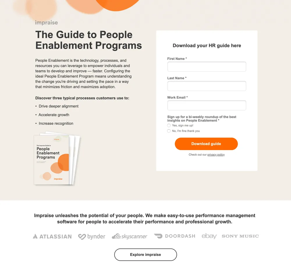
A simple, informative headline and a short, succinct description of the benefits sound compelling. Although we aren't dealing here with a typical CTA, we have a USP (Unique Selling Proposition) expressed clearly in three points.
We are encouraged not so much to buy or to use but to discover the possibilities of the offered system. Impraise.com's landing page is an excellent example of how a potential customer can be encouraged to try the tool concisely but suggestively. Tactfully used trustmarks (logos of commonly known brands) complete the effect of an elegant invitation.
Intercom.com – a landing page based on social proof
A form limited to the bare minimum – one field. A strong headline that appeals to two powerful incentives and needs. Novelty and quality. Indication of a model user.
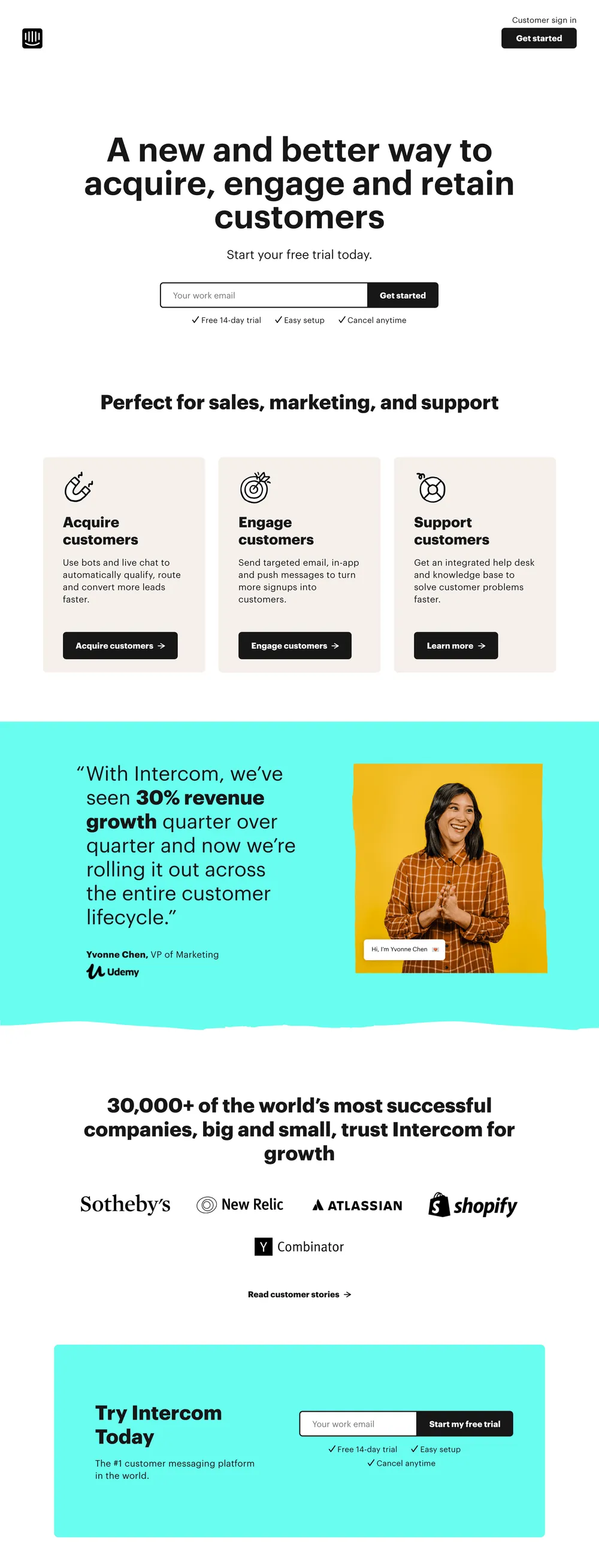
The information in the area below the fold gave us all the essential information and addressed the most critical issues. We know what Intercom is, what it is like, who it will be ideal for, and what you need to do to gain access to the trial version.
Further down the page, we can find an elaboration of the advantages. Thanks to Intercom.com's solutions, we will attract and engage customers and support them. The benefits sound appealing, but are they real? Of course.
We can find proof in the opinion of VP of Marketing Yvonne Chen from Udemy.com, who doesn't make empty praise but speaks openly about the 30% increase in revenue. We must also compliment the presentation of her person.
She is dressed casually, friendly, and unpretentiously greets us in a speech bubble. She gives the impression of a laid-back, warm, and positive person. Such an emotional message should not be underestimated. She just makes a very positive impression. She instills confidence and strengthens the repeatability of this part of the page.
The only drawback of this part of the landing page is the misalignment of her sight and field of view. She is looking off the page, and she should be looking either straight at us or, preferably, at her testimonial.
If you think this is an isolated example of a good landing page, then please look at this. Here is further evidence. Status and size expressed by number (30 000). Still don't believe it? Then, what about trustmarks (logos) of famous brands?
They are impressive, aren't they? Then do it! Try out Intercom.com today. You don't even have to scroll to the top of the page because we've also repeated the contact form at the end of the page.
Well, good job Intercom.com!
MediaValet.com – a landing page designed with consistency
With so much information, minimal design is a very good choice. The landing page makes an excellent first impression, mainly due to the prominence of the headline and its expansion.
Note that the focal point is on the left side of the page so that the elaborate form doesn't seem unfriendly at all. On the contrary, it makes a good impression.
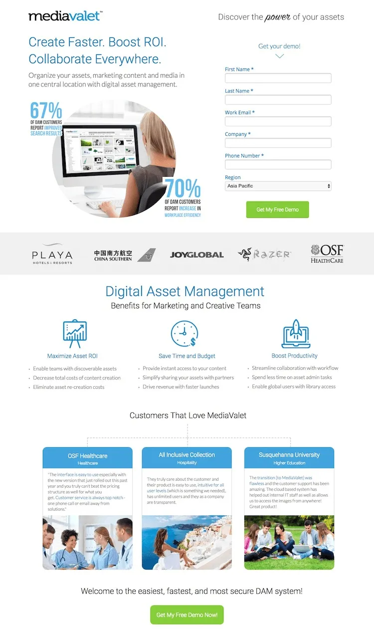
Although perhaps a bit too long, the headline was cleverly broken into three sentences using imperatives and arguments of profit. Create faster. Boost ROI. Collaborate everywhere. The elaboration of the headline, appropriately concise, familiarizes us with what this means in practice.
Further down the page, we can see trustmarks (probably making a very good impression on the target group). The idea of a three-element argument is developed in the form of three main benefits, which are presented with clear icons and descriptions.
Again, it's based on the three arguments and presented with bullet points. The sense of order, coherence, and consistency has not been neglected in the rest of the page.
The MediaValet.com landing page goes further and uses three examples to present its model customers. Who wouldn't want to press the CTA button after such a precise and elegant presentation?
Shopify.com – a landing page based on trust and one strong argument
More than a million users worldwide can't be wrong. And this is absolutely true. With this number of customers, Shopify.com doesn't have to provide a detailed presentation of its values. If a million companies do not convince you, then no other argument will convince you.
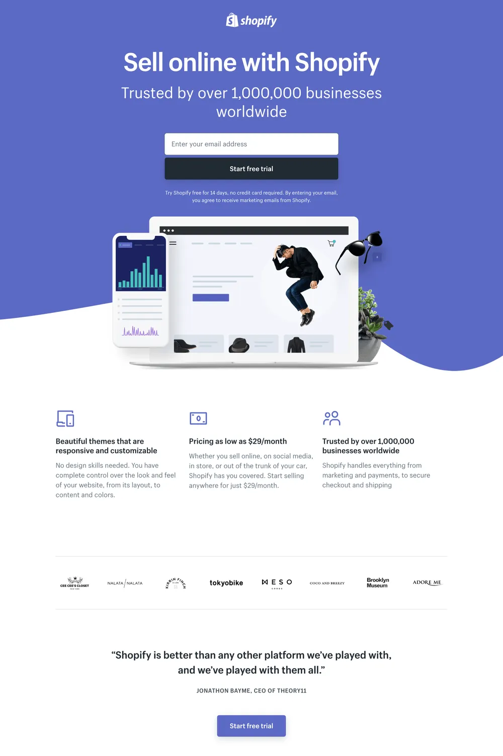
That's how it works. Sometimes it's better to use one powerful argument and let it resonate than to use additional cannonade of minor ones that don't contribute anything.
Thanks to this, it is possible to create a landing page that is short and minimalistic, with a single form field with a non-intrusive but precise CTA.
If the headline has persuaded you, we'll add just for the record what we offer. Capabilities, price, and trust. These are the three pillars that have made us a great platform. Who uses our services? Companies, you know.
Perhaps the only drawback of this site is the unnecessary testimonial by the CEO of Theory11. It contributes little and expresses arrogance and excessive self-confidence in this context.
Vivonet.com – a landing page that reduces doubts
Vivonet is a dedicated food service POS management system. It is used exclusively to meet business needs. At first glance, Vivonet's landing page may seem cluttered with text. A large amount of text may look like a mistake.
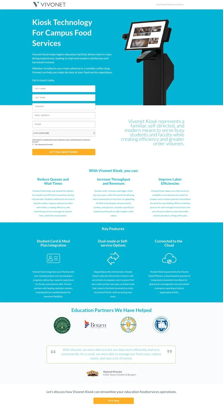
The elaborate descriptions were introduced here on purpose. They contain a series of crucial information that a potential customer wants to know right away. They don't want to learn about them at a meeting, not from a brochure or an offer, but from such a page. Don't believe it? Then ask someone in the food service industry, especially working with business customers.
Hence, such attention to the capabilities offered by the system and its key features. The extensive description helps to reduce doubts and shows opportunities and benefits. Don't such arguments convince you? Then take a look at the CTA – Let's talk.
In this industry, sales are not made with one click. To have a meeting or a conversation, you need to inspire trust in the eyes of the potential customer. You need to instill confidence and convince them with factual arguments. You are supposed to show that you know the food service industry as well as they do. You know what they expect, what they are afraid of, and what constitutes added value for them.
Zendesk.com – a landing page based on a feeling of belonging
You know us, you know we are good. Do you want to see something extra? Then provide your name, surname, and business e-mail. Simple? Very. And, at the same time, effective. Because it is based on curiosity, trust, and exclusive access to attractive content and features.
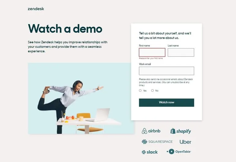
Trials, demos, and any opportunity to try a product without commitment are very popular and mutually beneficial. They are often accessible from the corporate website, but they are also tricky to highlight there, so we can use landing pages for this purpose.
Most importantly, the demos do not require special justification. We know very well what a demo is and what to expect from it. If the product arouses at least minimal curiosity, we will be happy to use the demo version.
Just as we already have a great understanding of the functions of landing pages. Companies gain potential customers through them, and users gain opportunities and materials.
The curiosity that Zendesk arouses is illustrated here very convincingly through a photo, showing how casual, enjoyable, and fun using this tool can be. How much fun can you have while trying out a product? It's not a boring lesson. It's a fun adventure. This approach works on potential customers of this company.
There is a reason why logos of such and not other companies were used. Are they famous? Of course. Liked? Yes. Popular? Yes. Fashionable? Also yes. But, most importantly, together, they form a family of products associated with pleasure, satisfaction, and convenience.
If you like them, you'll love us too. We play in the same league; we belong to the same group. The appeal of belonging to a group is one of the strongest motivators of human behavior, whether it's a corporate website or a landing page.
And that's why Zendesk's landing page can be devoid of additional argumentation.