
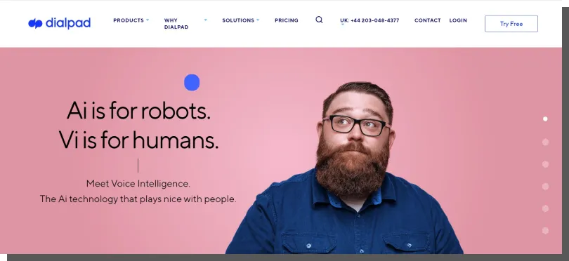
Does it bore you? Or does it intimidate you with its seriousness? Excites you? Or when you look at it, you feel something pleasant. Does it irritate you? Is it uninteresting? Really? Calm down! It's not what you think! ;-) I am asking you about the website of your company. You can also look at it in the above way.
Not only can you, but you even need to! So, what do you think? What do users feel when they visit your website? Why do I ask about that? Why should you think about it? It's a book-size topic. Let's start from the beginning.
Designing a good First Impression
In the trade press or on company blogs, you can often read articles, guides, and case studies regarding designing (e.g., online store design, design of landing pages), technical issues (e.g., Page Experience), and how to design a specific subpage (e.g., product page, 404 page). However, they rarely talk about the first reactions of users to a website (whether it is an ecommerce site or a business one) and the emotional responses it evokes. And even more rarely talk about the issues of designing a good First Impression.
Thus, since I've noticed this gap, I will discuss this topic today. It's 2023, and omitting issues related to user experience is simply unforgivable. And they appear much quicker than you may think.
First impressions first or how to make a good First Impression
In the collective consciousness, the First Impression is often referred to in the form, for example, of proverbs. "Fine feathers make fine birds."

Most people are aware of this effect's importance (particularly in digital marketing) and try not to fight mechanisms that guide the perception and evaluations of others. And very rightly so. That's how people work, and you need to turn this phenomenon to your advantage. And this can be done by learning about how it works.
When you understand the elements which evoke the strongest emotions, you will be able to control the following:
- Message (information)
- Image (of a brand, product, or company)
- Users' and customers' behaviors.
The mechanism, effect of the First Impression works. Obviously! Yes, also on the Internet. While using websites, web, and mobile applications. In fact, why wouldn't it work and make its presence known? A satisfied user is pretty much a satisfied future customer.
The ability to evoke positive impressions and strong emotions is essential for market success. An advertisement, product design, or appropriately used language (e.g., advertising slogan) can be an emotional attractor. This can include beautiful brand ambassadors. Or... Visually attractive website or web application. The First Impression is a feeling, a sensation, or a sense of satisfaction, and it is a situation in which a user is pleasantly surprised. Their expectations were fulfilled to a higher degree than they expected.
First Impression also directly influences equally important business and online sales issues, such as Conversion Rates or even more significant Bounce Rates. I'm talking about credibility, trust, and sympathy.
Although trust in the offline world usually appears as an effect of a longer process, it is exceptionally spontaneous and direct in the online world. And it's fast.
Trust is a belief (more or less rational), a conviction (more or less "sensible") that something — in your case, a website — will work according to your expectations. And if its appearance undermines this belief and "disrespects" the given benefit of the doubt, then even the most rational, specific, and measurable facts will not be able to change the user's attitude. The damage has been done. "It's easy to be wise after the event."
The First Impression is supposed to be a reward for the benefit of the doubt. The more so because the user's experience of the site begins with their expectations, knowledge, previous experiences, and perceptions regarding the industry, company, product, or service.
When users visit the site, they do it with a set of assumptions (suppositions) regarding the following:
- Information
- Expectations
- Biases
- Stereotypes
- Perceptions
- Standards and evaluations
- Emotions.
Well, that's how it works. Right? Consider for a moment whether the same emotions accompany every purchase. In what emotional state do people buy toys for a child? In what state of mind are they when buying a sports car? What emotions accompany them when buying a flat? And what emotions do they feel when buying a pizza, especially when hungry? ;) What are the implications of this? What does it have to do with website design or creating web applications? Everything!
A website evokes a First Impression in 50 milliseconds
The experience of the website user begins before visiting it, but it is strongly connected to the First Impression Effect that occurs after just 50 milliseconds. People don't need a lot to form an opinion, right? The website evokes the First Impression exactly this quickly and automatically.
Users almost immediately gain confidence and decide whether the site is:
- To their liking or not
- Compliant or non-compliant with industry benchmarks
- Typical or original
- Adequate/inadequate to the industry, products, or services
- Evoking trust, distance, or cautiousness
- Credible or unreliable
- Compliant with expectations
- Evoking sympathy or antipathy
- Aesthetic, pretty or unaesthetic, ugly.
50 milliseconds which already have some legends and myths around themselves within UX, do not always lead to abandoning the website. The Good First Impression is not so ruthless. The average familiarization time for a newly discovered website is about 8 seconds. Nevertheless, the First Impression Effect plays a significant role when it comes to attitudes toward the site.
That's why beyond the purely aesthetic issues, which I will write about more later, the site needs to be able to "answer" a couple of fundamental questions the user "asks." They will spend these few milliseconds finding out whether they visited a website they think they did.
And their dilemma will be settled by scanning it and looking for information about whether:
- It is the site of the industry they're looking for
- It offers products and services they are searching for
- These are products and services they have in mind
- It is right for them in terms of quality, price, prestige, or status
- It has more to offer
- And how it convinces them to buy (e.g., push versus pull).
Ignoring the role and effects of the First Impression the website evokes is very disadvantageous for the company, brand, and product. Dismissing its role with a shoulder shrug is all the more damaging because the First Impression Effect has been thoroughly studied in psychology.
The First Impression — definition
The beginning of the study of the First Impression Effect dates back to the mid-1940s. The discoverer of this phenomenon and its first theorist was Solomon Asch, who discovered that people make positive and negative judgments based on a small amount of data. They do it in various aspects of life, during a job interview, a first date, a company meeting, etc.
In the following years, the phenomenon was attempted to be explained by various models and within different scientific paradigms (e.g., Implicit Personality Theory), but as to its existence and importance, there was, and still is today, a general consensus among cognitive psychologists, perceptual psychologists, and social psychologists.

In the subsequent decades, related phenomena and effects were discovered. For instance, the discovery of the Halo Effect revealed that people make assumptions about other people's personality traits based on their external appearance. Assumptions also have an automatic character and aren't always conscious, and first impressions are hard to change. People tend to assign positive traits to attractive people (to children as well). They think they're more intelligent, wise, hardworking, honest, and generally better. What's more, people also assign negative traits to unattractive individuals.
The Continuum model of impression formation, developed in the 1990s, supplemented these findings with the time dimension and revealed that they cover a much wider range than previously believed. Based on a small, superficially known set of features, a set of unrelated characteristics (such as a smile), people can infer traits related to emotions, behaviors, morals, and intellectual capabilities.
The First Impression Effect in Human-Computer Interaction (HCI)
With the development of a new field of knowledge, namely the study of human-computer interaction (HCI), it turned out that this effect also appears during contact between a human and a device, a digital product. During interaction with such devices as desktop computers and mobile devices, people react similarly to how they respond to people.
In both cases, it's about reducing the necessary effort to achieve an objective. For example, it can be the evaluation of the site's helpfulness. That's why people don't read or analyze websites. They scan them. Due to that, it's also important to direct users' attention through, e.g., call-to-action buttons and white space.
Only when the first impressions and experiences, gathered in seconds, initially assure users that the website is worth exploring thoroughly can they stay on it.
It also turned out that the mechanism known from the Halo Effect is also present in evaluations of interfaces. During first contact, the aesthetic is more important than their effectiveness. Instrumental features (related to functionality) of interfaces are less critical than non-instrumental features (related to the appearance, aesthetic, and pleasure they evoke).
That's just the way it is. Aesthetics raise stronger emotions during the first contact with the site. The more positive and satisfying they are, the more the site will be considered useful, even if it will not fulfill all the functional expectations. People do say that it's easier to forgive someone who's pretty.
The website that was seen as more attractive in the first 50 milliseconds will be evaluated as more useful. Its flaws will be downplayed, and advantages exaggerated.
All these findings naturally can encourage you to ask yourself a question of what to do to make a good First Impression. How to design a website properly?
What do people pay attention to in the first seconds or how to design a website?
The answer to the above question shouldn't surprise anybody. Graphical, as less "cognitively costly," attract much more attention than text that requires more cognitive effort.
The written word also "loses" the competition over the user's attention with functional elements.
The most important elements impacting the positive or negative First Impression include the following:
- Color scheme (the number of colors, their harmony, contrast, and adequateness to the industry)
- Navigation (above all, its visual readability, comprehensibility, and flexibility)
- Aesthetic convention (e.g., corporate style, agency style, modern style, classic style)
- Blocks of text (seen as visual elements, especially their "weight," readability, role, and location in relation to other elements)
- Typography (typeface and size of fonts)
- The attractiveness of the design (evaluated as effective or boring, attracting attention or neutral, "pleasant to the eye" or irritating)
- Layout (structure, symmetry, a sense of order, the so-called Clean Design)
- Simplicity of the design (evaluated as positive and desirable)
- Trustmarks (a company's logo and logotype, symbols, and signs)
- Hero shot (static, animated, or audio-visual)
- Other elements (such as load speed, visual hierarchy, or whether the website was desktop/mobile optimized).
General guidelines or designing a good First Impression
The best summary of the above list may read like that: "While interacting with websites, we are all visual learners." Even though in the "offline life," visual aspects do not play a primary role for us.
This inevitably must happen when visiting a website. Websites are, to a large extent, a visual message; hence people are "sentenced" to evaluate their credibility, attractiveness, and usability through aesthetic criteria, at least in the first 50 milliseconds. A good Impression is based on an evaluation of visual appeal.
The key to success is to take care of the high technical, compositional, information, visual, and aesthetic quality of photos and graphics that attract attention. But not only that.
Recommendations of researchers from Nielsen Norman Group
With the development of research methods (e.g., eye-tracking), it has been possible to unquestionably discover patterns of scanning websites in the first seconds of exploring them. The most popular one, discovered by researchers from Nielsen Norman Group, is the "F pattern," that is, a pattern in which users begin the scanning from the top left, then shift their gaze downward before moving to the right. As a result, they draw the letter F on the website with their gaze, hence the name of the pattern.
According to the researchers from NNG, a refined, consistent, and well thought out in terms of design website is for users, who visit it for the first time, a clear sign that they are:
- Treated seriously and respectfully
- With priority and empathy
- As partners and professionals.
Thanks to ensuring themselves that the attitude of the company is positive, they gain confidence and want to explore further. The website is treated by both B2C and B2B customers as a company representative; thus, its impeccability (also in the sense of being error-free) and effectiveness (but not flashiness) are priority features that arouse strong positive emotions.
An interesting summary of the above findings is the recommendations of the researchers from Nielsen Norman Group included in the report "B2B Website Usability for Converting Users into Leads and Customers. 3rd Edition." While analyzing several hundred B2B websites, researchers formulated 4 recommendations regarding the company's attitude toward the customer.
According to them, the most important indicators of a company's credibility in the context of websites include the following:
- External appearance evoking a positive First Impression
- Ease of use which can be achieved with a clear and simple design and well-thought-out information structure
- Easy access to key, essential, and specific information regarding the company (its identity, values, and goals), offer, product descriptions, and prices
- The visual and emotional tone of the website that's adequate for the needs and perceptions of the customer.
The emotional tone of a website
Available measures (both design and research measures) don't force website designers to rely on intuition and speculations. They don't have to follow their own preferences. They can use theoretical knowledge and research tools.
They can control the following:
- Attention
- And user emotions.
Thanks to them, they can evoke a range of emotions. From excitement and curiosity through calmness and relaxation to agitation and motivation. The worst sin of the website is its emotional neutrality.
Websites that don't arouse emotions are equally ineffective and detrimental as websites that evoke intense negative emotions. Sparking opposition, disappointment, and frustration.
The emotional tone of the website is an emotional context that should correspond to the emotions aroused by:
- Industry
- Company
- Brand
- Product or service
- Goals and benefits regarding the purchase and use.
In other words, website designers can calculate, predict, and test design variants by being aware of the role of emotions. Above all, they can study the First Impression, which will be evoked by the design in question. Before I move on to the discussion of research and tests of the First Impression, I want to tell you about a fascinating approach to emotions and design that enables you to design websites with more precision and adequacy to the emotional goals you may want to achieve.
Three levels of visual design
The forerunner of emotion-oriented design is psychologist and cognitive scientist Donald A. Norman who presented his approach in the book "Emotional Design: Why We Love (or Hate) Everyday Things."
Norman's concept is based on a commonly known and acceptable idea in psychology. Emotions precede and guide thoughts and behavior. They are much more primal, quicker, and maybe not necessarily more effective, but they "decide" whether the website in question piques your interest. Hence, Norman proposes distinguishing 3 levels of human functioning and adjusting projects according to their nature.
Visceral level
It's automatic, independent, and the most intuitive and impulsive. It's connected to the most primal human nature. At the same time, it's universal, free from cultural influence and cultural frames of prohibitions and precepts. While designing in this spirit, you should aim to evoke the simplest, strongest, and most common emotions. You should provoke emotions shared by many despite their background, age, income, gender, or education. A website created with consideration of these needs will excite; however, the level of security offered by it may be perceived as low.

Behavioral level
Designing in this spirit allows you to focus on functions, actions, effects, usability, practicality, effectiveness, and reliability. It's the level closest to user experience (UX) oriented design. A website created with consideration of these issues will be clear and will have simple and intuitive navigation. In short, it will evoke respect and radiate calmness.
Predictability, convenience, and simplicity arouse positive emotions, but the websites designed in this spirit can be perceived as too traditional and devoid of rapacity. They will offer a high level of security and a lower level of excitement.
Reflective level
This is the level most dependent on cultural issues, fashion, trends, patterns, and norms. It requires consideration, experience, and sophistication. It is as exquisite as it is sublime. It puts much higher demands on the recipient, the user. It expects an effort from them but simultaneously "returns the favor" with satisfaction that comes from the sense of elitism and belonging. A website designed in this spirit can seem exciting and safe, but at the same time, it may be perceived as unapproachable and unachievable.
Each of the 3 levels can be used as an emotional signpost. That is handy, for example, in branding. It can be a helpful tool, inspiration, or a signpost suggesting what role the website fulfills for the user, which emotions it is meant to offer, and what identity it has to present. In other words, using this distinction allows you to select and filter the target audience and increase brand recognition.
Designing a good First Impression boils down to the selection of goals and means as well as the examination of responses to those means. Dedicated research serves this very purpose.
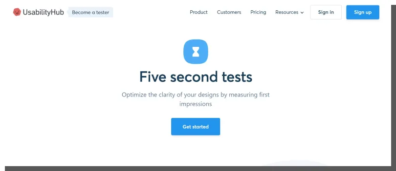
First Impression website review — Five Second Tests
Everyone judges a book by its cover. People primarily evaluate the appearance of the website. They are guided by simplified ways of drawing conclusions. They know what to think about the website just after 50 milliseconds. And there's nothing wrong with that. However, neglecting the issue of studying user reactions to your site is undoubtedly detrimental. All the more so because a special research method was created for this very purpose, the so-called Five Second Tests.
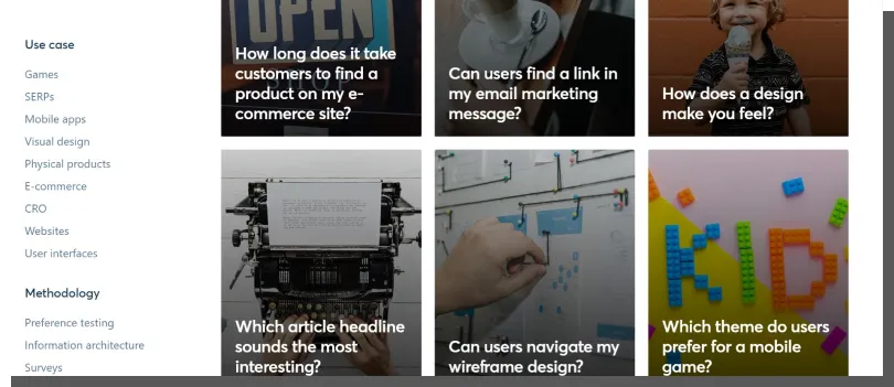
This type of testing is a research method that allows you to determine the emotional reaction and the impressions created by a brief exposure to the design of the site (e.g., homepage design, product page design). They enable you to primarily determine the feelings and, to a lesser extent, diagnose information included on the site.
For example, they allow you to obtain answers to the following questions:
- Is the site trustworthy and credible?
- What emotions it evokes: positive, negative, or neutral?
- Which elements are memorable and arouse an emotional reaction?
- What is the website's nature, and what is it used for?
- To what extent is information visually exposed and visible?
Questions and instructions communicated before the study can, but don't have to suggest to the respondents the context, issues, and elements to which they should pay more attention. For example, the answers may be spontaneous or implied by a list of characteristics expressed by adjectives (describing the website's appearance). Five Second Tests also allow you to compare variants of the site. They are a tool that enables you to check the website's variants and reduce the risk of a bad First Impression.


