
Buying products online can be pleasant and educational, especially when you will treat this activity as a particular mnemonic. And I did so when I searched for a watch in an online store.
Searching for a product in a store, especially an online one, can be tiring. In particular, when the product page, for example, doesn't answer the buyer's questions.
I started looking at product pages differently after reading the following article, "B2B Website Usability for Converting Users into Leads and Customers. 3rd Edition," by Nielsen Norman Group. Why?
Because looking for products in online stores isn't always easy.
It may seem like the superiority of an online store over a stationary one manifest in that the potential customer can find the product they're looking for much faster.
Is this always the case? Unfortunately, no. Not every online store makes shopping easier for customers. Typing the phrase "product page template" into a browser doesn't yield much.
There is no shortage of guides about best UX practices on the Internet (in E-Commerce or regarding what the product page should look like). However, the most worthwhile ones result from a reliable methodology and ambitiously selected sample.
Nielsen Norman Group doesn't need an introduction, but their great report certainly deserves a recommendation. The recommendations included in it, regarding, among others, the design of a product page, are an invaluable source of knowledge and inspiration.
As you read, you'll see that this is not just a gibble-gabble found in many E-Commerce guides.
With a printed checklist at hand, you won't miss anything. I've created the "30 guidelines for good UX" based on the abovementioned report.
Authors on several dozen pages discussed issues regarding the design of product pages on B2B platforms. Their tips, remarks, and recommendations were based on solid, cross-sectional research material. That made it better to understand the needs of a business customer.
I have selected for you the essence of NN Group's recommendations. You can safely use them when designing product pages, researching, or talking to customers.
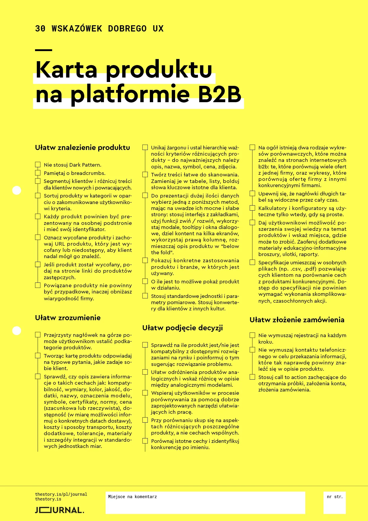
Download: Product page on B2B platform. 30 guidelines for good UX (checklist in PDF format).
Let's do the shopping!
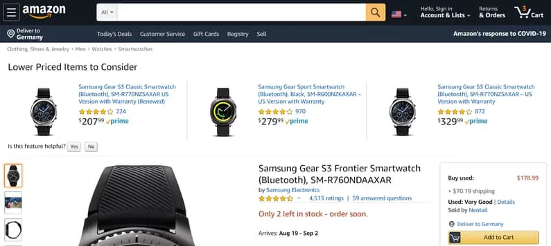
Since I knew what model of watch I wanted to buy (Samsung Gear S3 Frontier Smartwatch), finding its product page was extremely simple. On the category page, the model I was looking for visibly differed. The product's name, photo, and the amount of customer ratings indicated that the product category page referred to the watch with the features I was looking for.
I reached the information I lacked — in perhaps the best-designed online store in the world — such as price and product's condition, "new/used" by moving to the product page. And you know what, I think that it was a deliberate play by Amazon.
1. Don't use Dark Patterns.
Although, in most cases, Amazon is seen as a model example of an online store, it also has its flaws. Information on the condition of the presented product appears only in the form of a bolded CTA "Buy used." You really don't have to be oversensitive to find such information insufficient.
People with a vision impairment, of which I am one myself, may unknowingly purchase a used product, convinced that they're buying a new one, especially if they don't regularly buy on Amazon and aren't familiar with its practices. In particular, if they aren't aware that in an online store, they should also be cautious and take into account the dishonesty of the seller.
2. Remember about Breadcrumbs.
Unobtrusive and pretty discreet — Back to results — allows users to return to search results and move to another product page without trouble. Here it's worth praising Amazon for the consistent and understandable use of two types of navigational menus — based on localization and attributes. It always uses them appropriately. In the online store, with such thoughtful navigation, it's tough to get lost.
3. Segment customers and differentiate content for new and returning customers.
I quietly hoped that my product page would give me a chance to see the opinions and recommendations of people with similar traits to mine. Not this time! The customer segmentation on selected product pages (Amazon mom) described in the trade press will most likely be developed and become available not only to Amazon Prime users. I'll look forward to it because it's a cool solution. Probably even more convincing to me than the product description.
4. Sort products in the category based on communicated criteria.
When users reach product pages, they should feel that the product belongs to the category they expect. If I had chosen to sort from the lowest to the highest price, my watch should have been the first result displayed. And that's true; it was, I checked. Everything works as it should. The product page of my watch doesn't undermine my expectations and habits in any way.
5. Every product should be presented on a separate subpage with its own ID.
Amazon fulfills both requirements and easily enables the user to distinguish products already at the level of the ID itself, which in my case consisted of the name of manufacturer (Samsung), model (Gear S3), category (Smartwatch), a significant differentiating function (Bluetooth) and alphanumeric designation (SM-R760NDAAXAR). With such detailed product identification, it's impossible to mistake it for another. And that's very good because I don't like to be wrong. The product page should be filled with unique information, even if the product belongs to a line or series of products.
6. Mark withdrawn products and keep the URL of the withdrawn or unavailable product so the customer can still find it.
If my watch was unavailable, I could easily find it through the search function "Availability" and include products no longer available for sale, "Include Out of Stock." Why do I need such an option? Because I also treat an online store as a trusted source of knowledge, comparing an unavailable product with an available one allows me to choose and perhaps buy a currently available one. A product page, even a historical one, is still a useful product page. You should keep this in mind.
7. If the product was withdrawn, provide a link on the page to substitute products.
An extensive recommendation system allows users to reach an analog product easily and quickly. On a product page of an unavailable item, users can view sponsored products related to the unavailable product, "Sponsored products related to this item," the highest ranked ones "4 stars and above," and related to their recent searches "Inspired by your recent shopping trends." And thanks to that, they know what to do. Besides, users expect that on Amazon, finding a product is simply effortless.
8. Related products shouldn't be random; otherwise, you lower the company's credibility.
In the case of Amazon's recommendations, the randomness of propositions is hard to imagine. The level of tailoring of offers is very satisfying. I often used these propositions, which often turned out to be much more tailored to my needs.
The alternative product often proved to be more attractive in terms of price but not only. It may be the most undiscovered by customers feature of online stores. Customers are used to looking for a specific product in an online store, and maybe it's better to look at the entire category instead of only looking for a particular item.
9. A clear header at the top will help users determine subcategories of products.
Product pages on Amazon are designed with attention to detail. Navigating the structure of categories, subcategories, and products doesn't cause any problems. If you're looking for a given product, for example, a smartwatch for men, then the header will clearly and literally remind you of this. You receive this information before you look at the photo.
10. While creating a product page, answer the customer's typical questions.
My example probably doesn't exhaust all the possibilities and is not a complete list of questions a young man can ask when visiting an online store looking for a watch, but let's try it.
I wonder how to charge it? Wirelessly. Ok. Can I pay with it? Yes. Is it compatible with Android? Yes, it is. With iOS as well, which wasn't of interest to me, but it's nice to know. Is it waterproof? Yes.
Admittedly, I learned about the battery life from the specification, but it wasn't time-consuming or difficult. Information about the product available on the card didn't "answer" only one of my questions: Does Samsung Gear S3 support my favorite application MapMyRun? It does, but I found it only on the MapMyRun website. As you can see, even in this case, Amazon's online store can be an example of best practices.
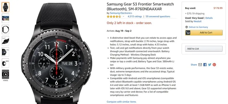
11. Check if the description contains information about the following features: compatibility, dimensions, color, quality, accessories, names, model designations, symbols, certificates, norms, price (estimated and actual), availability (if possible, inform about specific delivery dates), costs and methods of transport, tolerance, materials, and integration details in standard units of measurement.
The product page unambiguously determined all the abovementioned features. The most important one for me was the availability (the stock status was given) and delivery time (estimated time was provided).
Maybe I'm not a very inquisitive customer, but the convincing product page, product description, scope, and depth of information were enough for me to make the purchasing decision and ensure that I bought the watch that was in line with my expectations. By the way, to buy a product from an online store, users don't need a lot of information. They need information that is given in an attractive way and meets the expectations established for E-Commerce.
12. Avoid jargon and establish a hierarchy of importance of criteria that differentiate products — the essential ones include description, name, symbol, price, and photos.
Although a description on a product page and in a specification in a PDF file operates with technical language, it's not unapproachable or incomprehensible. Key elements allow me without trouble to distinguish the selected watch from the Samsung Gear S3 Classic. By reading, viewing, and without special attention to the features, they can be distinguished. Descriptions and presentations of both watches have more differences than shared features.
13. Create content that is easy to scan. Turn it into tables, lists, and bold keywords that are essential for the customer.
The advantage of Amazon, with a relatively considerable amount of information presented on a product page, is clarity. Scanning isn't challenging. Bulleted descriptions, arranged by the relevance of information, concise, communicative style — all this supports easy access to crucial data.
14. For the presentation of large amounts of data, choose one of the following methods, keeping in mind their strengths and weaknesses: use an interface with tabs, use the collapse/expand function, use models, tooltips, and dialog boxes, split content across multiple screens, use the right column, and place product descriptions below the fold.
Unfortunately, from below the fold, you won't learn any details. You can only find crucial sales information such as the product's name, availability, price, and estimated delivery time. Access to more technical information requires scrolling.
15. Show specific uses of the product and industries in which it's used.
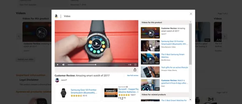
While in texts, the typical uses of the watch are only suggested, in the videos attached to the product page, you can see a presentation of all its functions and ways of using it during daily activities, in the day-to-day, private, or professional settings. And that's very good, this kind of information is better to watch than read.
16. If possible, show the product in action.
As I've mentioned in the previous point, it's only possible to see the operation of the product in a video. In the photos, it's presented from the aesthetic side, not functional. This isn't necessarily a shortcoming. One brilliantly executed video gets the job done and provides a clear idea about the capabilities of this watch. In this case, photos of the product reinforce the need to have it, and the video justifies it.
17. Use standard units and measurement parameters. Use converters for customers belonging to different cultures.
Unfortunately, the watch's size was provided in inches, and you can look in vain for the centimeter counterparts. The unit converter is also unavailable on the product page. In the case of the watch, it's not crucial information. Ultimately, the watch's size can be estimated from photos (also those sent by customers). However, in the case of products with bigger dimensions that with their size need to fit a given context, the lack of this information is severe negligence.
Photos of the product, especially with a unique size, should show it, among others, compared with typical items which dimensions the customers are familiar with. When it comes to the watch, it can be a mobile phone or a pen. An E-Commerce store like Amazon should take care of such details. For me, it's an essential matter because always in such situations, I think, "If your store can't be bothered to be meticulous, then I can't be bothered to make a mistake and buy sight unseen."
18. Check to what extent the product is compatible, or not, with available solutions on the market and inform about it while suggesting a solution to the problem.
It's nice that Samsung exhaustively informs about compatibility with the system of its biggest competitor. Simultaneously emphasizes that it's not fully compatible and some device functions may not work together. The perfect solution to this problem is to use products from Samsung, and to be precise, Galaxy smartphones.
19. Make it easy to distinguish similar products and indicate differences between these models in the description.
Although the Samsung Gear S3 line includes three variants — frontier, classic, and sport — this information can be obtained only by browsing recommended products. In the description of my watch, other options weren't mentioned even once. The differences between them weren't indicated — either aesthetic or functional. And I must admit that this is not a product page I expect from Amazon. E-Commerce, in the case of the market leader, should be exemplary.
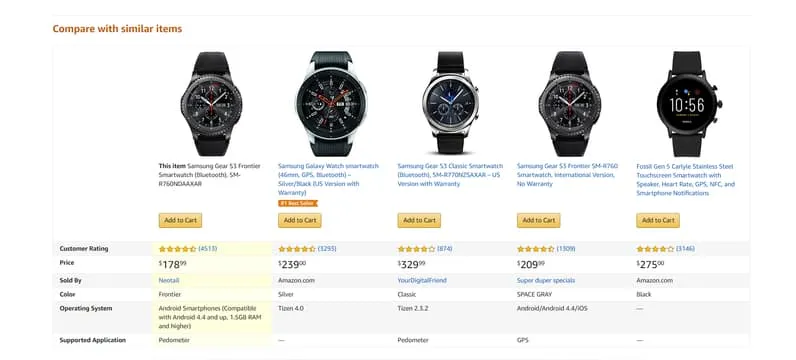
20. Support users in the process of comparing through well-designed tools that make their work easier.
The ability to satisfactorily compare all the variants is probably the weakest feature of this product page. Although there is a table with the basic parameters of four watches, it doesn't contribute much. Photos show the difference in the design, and the table informs about features, ratings, color, and operation systems. And nothing more. Unfortunately. No product is the same; in this case, it seems like an insufficiently justified belief.
21. While comparing, focus on differentiating aspects and not shared attributes.
The product page and the table indicated differences, but without comment or explanation, these differences don't tell the customer much about real distinctions. What is the difference between Tizen 4.0 and Tizen 2.3.2? The product with the 4.0 system is cheaper by 94.99$, although the numbering suggests it should be a better system and thus more expensive.
22. Compare significant features and identify the competition by name.
Amazon.com being a multi-brand store, will understandably tend to avoid product comparisons. Indicating a pair of competitors and creating rankings is rather hard to imagine; that's why customer ratings fulfill the comparison function. However, arithmetic averages and different numbers of evaluators of a given product aren't reliable indicators of the assessment of your store if you happen to be a seller using this platform.
23. Generally, you can find two types of comparison charts on B2B websites; those that compare many offers from one company and those that compare the offer of one organization with other competitive companies.
I found neither :) Probably for the same reasons as those described in the previous section.
24. Make sure that the headers of long tables are visible at all times.
The available tables were short enough, so the problem of headers solved itself.
25. Calculators and configurators are helpful only when they're simple.
It's hard to say to what extent the measurement converter would be simple, but it can be assumed that Amazon would rise to the challenge as long as it would have realized earlier that it was not there and that it could be helpful. Product pages equipped with one would win over customers and not only myself. Although, admittedly, a converter is not absolutely necessary.
26. Give the user the ability to expand their knowledge about products and indicate places where they can do it. Offer additional educational materials like brochures, flyers, or reports.
The product page was enriched with two PDF files — User Manual and Specification Sheet. Although helpful, providing insight into the operation of the watch, they have a common flaw — they open in separate windows. They obscure the product page. Opening them in separate tabs is possible, of course, but it requires using the right mouse button and selecting "Open link in new tab."
27. Put specifications in separate files (e.g., .csv, .pdf), allowing the customer to compare the features with competitive products. Access to specifications shouldn't require performing complicated and time-consuming actions.
This condition was fulfilled. Specifications provide additional information beyond those presented on the product page.
28. Don't force registration at every step.
In this aspect, Amazon maintains necessary moderation and respects its customers. Nevertheless, it doesn't allow users to buy without creating an account. The situation looks similar with "add to cart" buttons, but I'll return to this in a moment.
29. Don't force making a phone call to provide information that should be in the product description.
In the case of this recommendation, we are dealing with the opposite situation. Finding a phone number through which the customer could get an opinion about the product is challenging.
30. Use Call-to-Actions, encouraging customers to receive a sample, create an account, and place an order.
You can encounter typical "add to cart" buttons in places where — for the sake of convenience — you should find them. Their size, location, and color don't allow users to miss them, although simultaneously, they're discrete and friendly. A potential customer certainly doesn't feel nagged by them. Product pages with a CTA button designed like this should be desired in most stores.
By combining business (analysis of the page) with pleasure (purchase), I became a happy owner of the watch. I owe my watch to Samsung and Amazon. I drew my knowledge from the report "B2B Website Usability for Converting Users into Leads and Customers. 3rd Edition."
Researchers from Nielsen Norman Group did an excellent job. They analyzed 293 websites. They conducted the study using 5 complementary methodologies — Focus Groups, User Testing, Longitudinal Diary Studies, Site Visits, and Heuristic Design Reviews.
They surveyed 54 people in 12 focus group sessions. In each session, people with similar work responsibilities participated. In turn, 63 people took part in individual interviews. The Longitudinal Diary Studies involved 7 subjects who kept diaries for 14 days in which they filled out surveys each time they made purchases as part of their work responsibilities.
7 Site Visits were conducted, allowing the researchers to observe the respondents in their natural work environment. Heuristic Design Reviews covered 48 websites based on 10 usability heuristics and research guidelines.
A total of 94 people — 44 men and 50 women — participated in the study.
These 30 tips are a proprietary compilation of the Nielsen Norman Group report.


