
The time has come for filtering. We wrote about product sorting already.
Together with the product search function, they form the big three functionalities without which no online store can effectively and successfully compete.
Searching, sorting, and filtering products in e-commerce is like looking for a needle in a haystack with a metal detector and a magnet.
Filtering, sorting, and searching are engaging, work- and time-consuming, and potentially frustrating tasks.
But they can sometimes be a source of great satisfaction if we quickly find what we seek thanks to these tools. After all, getting to the product page is getting to the destination. Well, almost; we still have to pay at the checkout, unfortunately :)
However, filtering must be appropriately designed for this to happen. How do we make it a useful tool that supports a positive user experience?
Today, we're writing about these issues — about product filtering design in e-commerce.
Product filtering in e-commerce. Why should we offer this feature?
We live in a world where we must choose between dozens, hundreds, and often thousands of products.
The ability to filter products allows us to narrow down the options and select a collection that meets our expectations in important ways.
With such a vast number of products, shopping without filtering would be a nightmare and, in many cases, result in shopping cart abandonment. Why?
An excess of options can result in decision paralysis, which filtering counteracts. In addition, it allows the online store user to take control of the selection and purchase process.
Product filtering is our ally in the "fight against quantity and variety."
It also has an educational function. Please don't be surprised. I've caught myself not knowing everything about the product I want to buy several times. Don't you believe me? Here is the proof!
How many types of collars can a men's shirt have? I'll give you a hint: There are 15 types of collars! Do you know what a reverse collar looks like? I've never heard of such a thing! If you still don't believe it, take a look at Zalando.
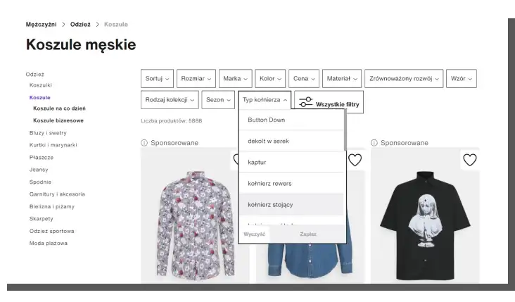
I learned this thanks to their filters.
Therefore, filtering products can save us from making a wrong purchase. By raising awareness of product features and attributes, we promote more rational and thoughtful purchases.
If the psychological arguments don't convince you, I recommend looking at Buyakilt.com's store results, described in the article "Buyakilt.com Improved Customer Experience To Improve Multiple Metrics."
They clearly show that filtering affects user experience, sales, and conversion. In this case, the store's revenue increased by 76% and conversion by 26%.
These are substantial values that must be considered. We're certainly not talking about a cosmetic or incidental influence.
We already know why filtering is essential, but what is filtering? This question is not meaningless, as this function is often confused with sorting, a completely different activity structuring a set of results.
What is product filtering, and why should we distinguish it from sorting?
Filtering is a tool for finding products based on specified criteria. Sorting, on the other hand, organizes a collection according to a particular parameter, such as alphabetical order or price.
In other words, filtering reduces the number of results, while sorting products only determines their order in display.
The article "Defining Helpful Filter Categories and Values for Better UX" by Kate Moran, a researcher affiliated with the Nielsen Norman Group, provides a more detailed and precise discussion of the filter function.
To be precise, filters have two components: category and value. A category indicates an aspect or attribute of a product, while a value indicates either the intensity of an attribute or its variant.
At the same time, category shouldn't be confused with value. Online store customers should also understand the differences between categories without problems. Appropriate filter labeling plays a significant role in this.
Labeling should be free of jargon and as easy to understand as possible.
The online store should explain the meaning of labels if they must include technical terms and symbols.
Explanations, like labels, should be written in simple, accessible language (so-called Real World Language). In a descriptive and preferably contextual manner.
Explanations should clarify to the store's customers in an accessible way the importance and value of a particular attribute and the benefits they will receive.
How to create product filters?
Let's start with a remark made by Christian Holst, one of the founders of the Baymard Institute. In his article "The Current State Of E-Commerce Filtering," he notes that various factors often lower filtering efficiency.
The factors lowering filtering efficiency include the following:
- Lack of essential categories for the customer
- Filters that don't fit the category (offering universal filters is strongly discouraged)
- Confusing logic of the applied filtering
- The location of this functionality
- The way filters are offered, presented
- Overlooking context of use, compatibility with other products
- The lack of thematic filters (such as those for seasonal products)
Filters' inadequacy is a common problem in online stores. From the customer's perspective, only accurately defined product filtering makes sense.
Replicated, universal filtering, applied to products as diverse as washing machines and clothes, is of little use.
Kate Moran of Nielsen Norman Group points out (in the article cited above) that offering dedicated filtering for each product category is also a measure that increases competitiveness.
It's recommended for smaller stores looking to gain customers by providing a better user experience on the online store.
It's also worth noting the result of a comparative study conducted by the Baymard Institute: Only 16% of the largest U.S. online stores provide their customers with an appropriate filtering experience.
Christian Holst writes that a good impression evoked by filtering requires presenting this functionality in a way that is easy to understand and interact with. Ensuring that the filtering logic aligns with user expectations is also essential.
Here, we arrive at the problem of creating filters, which can be boiled down to two dimensions: visual and functional.
The first refers to the location and visual presentation of the filter tool. The second addresses the problem of categorizing, labeling, and selecting products.
The article "Best Practices for Designing Faceted Search Filters" provides some good advice for dealing with the second problem. Its author, Greg Nudelman, points out that there are generally two ways to select the value of a given category.
Two ways of selecting values for filters:
- Drill-Down
- Parallel Selection
Although it sounds enigmatic, it's about something straightforward: whether the filter will be a link or a checkbox.
They mainly differ in terms of usability. Links allow us to assign a single value to a single filter, while checkboxes don't have such limitations.
Links in the filters work well when we want to select a general category (such as cameras). By using checkboxes, store customers can apply multiple filter values simultaneously.
Greg Nudelman rightly points out that the two forms complement each other very well, and there is no reason to favor one.
Prioritizing categories and filter values is also essential when designing the functional dimension.
Researchers at Nielsen Norman Group suggest that general categories should be placed at the top of the list, gradually progressing to more specific ones.
We should do the same with values and create a hierarchy using the criterion of significance and popularity.
In general, filtering should be:
- Organized.
- Logical.
- Consistent with the mental models and cognitive patterns of product buyers.
The basis for creating filters must be research that answers critical questions.
UX research regarding filters should answer the following questions:
- What features are most important to customers when choosing a product?
- What importance do customers assign to the product attributes and features?
- What words do they use to describe a given feature or attribute?
- What labels do they prefer, understand?
- What values for filters do they use most often?
Types of product filters
Let's briefly examine the types of product filters and the benefits they provide.
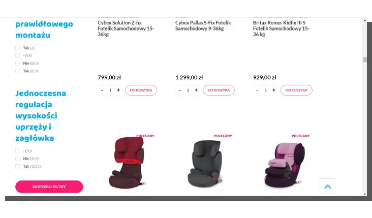
Price filters
The price filter shouldn't be confused with price sorting, as they have different functions. Users can use the price filter to specify a precise price range of products they want to browse, helping them stay within their set budget.
Providing an option to choose a price range makes it easier for online shoppers to select products that match their needs. They don't have to waste time looking at products they can't afford or don't want to buy.
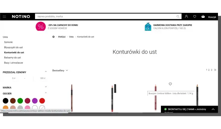
Color filters
The color filter enables online store customers to select a specific product color. This filter speeds up their decision-making process by displaying only the colors they're interested in. They don't need to wonder whether the product they seek comes in their desired color because the filter does that job for them.
Size filters
The size filter is handy, especially in clothing stores, where customers can look at products that fit their size. Naturally, it's not the only example of its use; the size filter can also help display serving sizes on restaurant websites or in stores that sell mattresses.
Brand filters
If our store offers products from various brands, the brand filter will help our customers browse products of the brand they're most interested in. It allows shoppers to narrow their search results and cuts the time spent looking for a particular product brand. Moreover, this product filter benefits customers for whom brand loyalty is important.
Promotion filters
The promotion filter lets shoppers view products currently on sale or have other discounts (e.g., quantity discounts). This filter can encourage customers to purchase products if they were browsing and initially didn't have the need to buy.
Category-specific filters
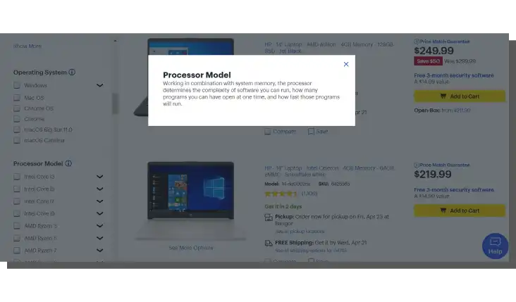
Category-specific filters contain aspects unique to a given category of products. For example, for monitors, it might be the resolution filter, or for e-book readers, it can be the e-book format filter (a filter that displays e-book readers according to the file format they support).
This filter allows online shoppers who have a concrete idea of what they're looking for to find the desired product with specific characteristics.
Now, we can discuss the visual aspect of filtering.
How to present product filters?
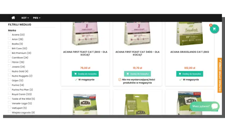
Filtering is usually presented in online stores as bars. Grouped filters have advantages, especially when they are constantly visible, even while scrolling the page.
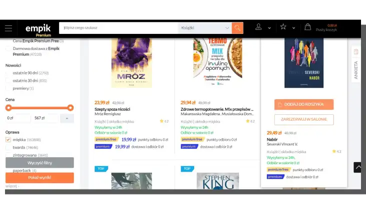
Product filtering must constantly be available and highlighted clearly and unambiguously.
Half-jokingly, half-seriously, filters are supposed to look like filters.
It's essential to offer the possibility to select the filter value using a checkbox. This method is more readable than visualizing the choice with a bold label.
Equally important is the ability to select multiple filters at the same time. Here, the question of the number of values and how to present them arises. We'll answer it in a moment.
Let's refer again to Christian Holst's subsequent article, "7 Product Filtering Implementations That Make Macy's Best-in-Class."
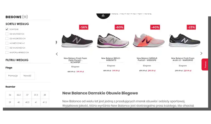
Based on research conducted by his alma mater, Holst suggests that we split long lists of values and offer up to 10 values at a time. At the same time, it should be made clear that the customer has more choices after clicking the label more/expand.
A changing list of products and a readable indication of the number of products that meet the criteria should communicate the selection of filters.
Displaying the number of products is essential information for the customer, as it suggests the collection size. And this indirectly indicates the time and work the customer will still have to do to finally reach their destination.
A good design pattern worth using is to display the number of products next to the selection field of a given filter value. However, the data should correspond to the current stock.
Displaying unavailable products is counterproductive from the customer's point of view. It overloads their working memory, frustrates and disrupts their purchasing decision-making process.
Out-of-stock inventory will be helpful if we offer to purchase a product on demand or an option to inform about its availability.
Are these all the design recommendations? Definitely not.
When designing filtering for the online store, we should also consider offering users the ability to:
- Automatically refresh results after a selection is made.
- Undo selections also by using the Back button.
- Reset choices in individual filters.
- Use thematic filters.
Where to put the product filtering function?
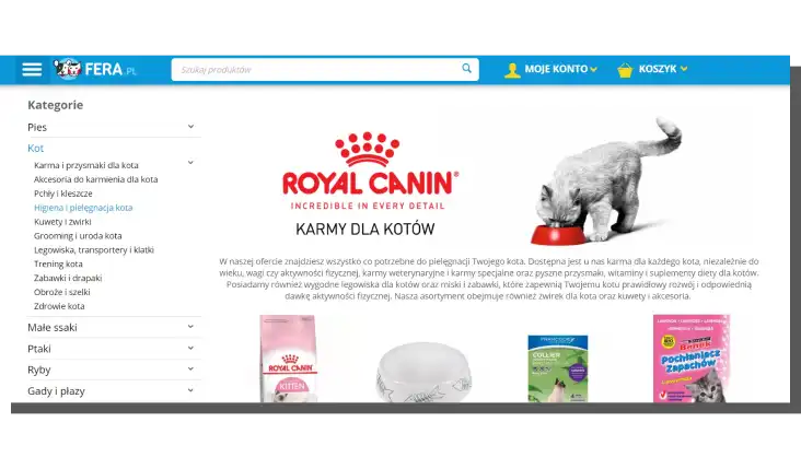
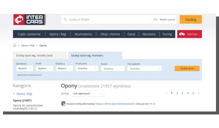
The placement of filtering has lived to see two design conventions. It can be located at the top of the page, just above the list or the product grid. It then occupies the entire or almost the whole width of the page. We can also find it on the left side of the store.
Both variants have their supporters and opponents. Both are useful for good reasons and have their limitations.
For example, the product filtering available on the left side of the screen is a much older pattern. It's more established, familiar, and safe. It's easy to find and use. It's a discreet solution associated with a toolbox.
In contrast, placing filters in a central position at the top suggests their higher importance. They're highlighted and more easily accessible in this position.
There is no shortage of voices saying that if the filtering at the top isn't also visible while scrolling the page, it can be easily missed.
Exceptionally, few online stores choose to use both design patterns simultaneously.
In such a variant, the filters available on the left are often more general, and those at the top are for less popular categories.
However, we should remember that the two options should be linked together if we use them.
The visuals should suggest that they're one tool serving the same purpose — finding products in the store.
It's also essential to keep both options fully available at all times, regardless of users' activities on the site.
How to design product filtering in an online store. Summary
- Filtering, searching, and sorting products in online stores is an engaging, work- and time-consuming, potentially frustrating task.
- Filters allow us to narrow down the range of possibilities and find a collection that meets our expectations in important ways.
- Having too many choices can result in decision paralysis, which filtering counteracts.
- Product filtering allows the online store customer to take control of the selection and purchase process.
- Using product filtering in the store encourages more rational and informed shopping.
- Filtering is a tool for finding products based on specified criteria.
- Sorting organizes the collection according to a specific parameter and determines the order in which the filtering results are displayed.
- Product filters have two components: category and value.
- The lack of essential categories for the customer, inadequacy, unclear logic, and location of the filtering tool often lower the filtering efficiency.
- Providing dedicated filtering for each product category is a measure that increases competitiveness.
- The product filtering process should be organized and follow product buyers' mental models and cognitive patterns.
- Product filters in e-commerce must be accessible at all times and should be highlighted clearly and unambiguously.
- Long lists of product filtering values should be split.
- Displaying the number of products next to the selection field of a given filter value suggests the collection size and, indirectly, the time and work required to achieve the objective.
- The placement of filtering has lived to see two design conventions.
- Product filters are usually located on the top or left side of the page.


