Whew! Finally, the shopping is done! We did it!
But can we be sure that everything went well? That we will not lose money? Can we trust this store?
Are we sure that fulfilling a customer's order is as important to them as it is to us? And so on.
Let's spare ourselves the enumeration of further examples of dilemmas and concerns. We have all, at least once, experienced similar worries. These are very typical reactions of online store customers. They should not surprise us. Online shopping always involves a smaller or bigger sense of uncertainty.
The appropriate design of an order summary page and order confirmation page helps to extinguish such reactions. Thanks to these two messages, information, and functionalities, the E-Commerce customer receives essential feedback.
How to design a positive User Experience in E-Commerce for order confirmation? What design patterns are recommended for designers of these online store elements?
We will talk about these very issues in a moment.
We invite you to read the article!
Order confirmation and order summary in an online store
The summary and confirmation of the order are the final stages of the Path to Purchase, the final moments of using the online store. They are often treated as a necessary evil and do not get the attention their design deserves.
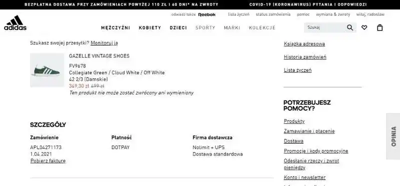
In reality, they are an excellent, natural, obvious, anticipated, and expected opportunity to:
- Establish
- Build
- And maintain (especially when purchases are recurring) relationships with customers.
The order summary allows users to ultimately make sure there was no mistake in the product selection process, for example, regarding the size, color, or variant of a particular product.
One of the critical functions of the order summary page is to allow the customer to review, edit and ultimately accept the order.
The summary also has a vital preventive function. It helps prevent errors that, when discovered later, can cause many problems for customers and the online store.
Summary pages significantly impact the number of technical staff necessary to handle various issues. They influence the number of consultants, hotline employees, customer service departments, and complaints departments. In a nutshell, their proper design can reduce the cost of maintaining an online store.
We should also remember that the summary page is essential to the entire process, preventing the need to backtrack. And this happens when this page is not offered. Customers are forced to use the "Back" button.
From a psychological perspective, any activity associated with regression, with repetition, is perceived as cognitively more costly, more unfriendly, and more difficult. Even if, in reality, they are not.
Summary of the order being the next step, progress in the process does not arouse such feelings.
The same is true of the order confirmation, proof of the transaction. It reassures, informs, and shows conditions. It is a receipt that can serve as evidence in all kinds of disputes and ambiguities.
It is helpful in psychological, legal, and procedural sense (the order number is commonly used for diagnosing and resolving issues or obtaining information).
The summary and order confirmation function as feedback. Therefore they are essential.
How to improve customer satisfaction through order confirmation?
The article "How Order Confirmation Emails Can Help You Delight Your Customers" provides some guidance in this regard.
It includes steps we can take to improve our customers' satisfaction after placing an order in the online store.
Assure customers
Ensure that our customers know as soon as possible that their order was processed and that everything went well.
Lay fundaments for starting a long-term relationship with the customers
Our online business needs to build lasting relationships with the users of the online store. That's why sending confirmation emails and providing order summary pages can help us start a relationship with them.
Minimize the need for contacting the customer support team
If we include all the necessary information in our order confirmation, customers won't feel the need to contact customer service, and thus we will make them feel more satisfied with the entire order fulfillment process.
What is the role of feedback in E-Commerce?
If humanity did not know feedback, it would have to invent it immediately! For its own sake. Otherwise, the human race would face destruction, not caused by an alien civilization but by ourselves.
Does that sound overly apocalyptic? Does it seem exaggerated? It is not. Definitely.
However, if you don't take our word for it, here is the evidence. Let's hear what the psychology of communication has to say about feedback.
Feedback - what is it?
First of all, we live in a world of feedback. It surrounds us on every side. The first examples that come to mind are from the E-Commerce domain, such as comments, opinions, and ratings. These are all feedback.
These are examples of expressing reactions and giving feedback. It is no different in popular social media. On them, we use like/dislike buttons and similar functions on a regular basis.
Feedback has taken root in business, in the relationship of superiors with employees, and is omnipresent in communication with customers, partners, and co-workers. Feedback is also present in education and has an important corrective, stabilizing, and motivational function.
The main task of feedback is to eliminate undesirable behaviors and reactions and skillfully trigger desirable behaviors and responses from the perspective of the sender and receiver of the feedback.
In the case of E-Commerce, it is all about providing a customer with the following:
- Cognitive comfort (offering complete information regarding the scope and status of the order)
- Emotional comfort (offering a sense of security and reassurance).
Positive feedback
This is what offering a summary and confirmation of an order in an online store is intended to be. It is an opportunity and a tool that creates a bond between the sender and receiver.
Feedback allows us to win over customers and gain their sympathy, kindness, and even gratitude.
It is widely known that a customer who likes a store and who feels gratitude is a customer who is:
- More likely to buy
- More loyal
- Much more likely to make spontaneous and positive recommendations.
From the store's point of view, constructive feedback is used to:
- Induce a positive E-Commerce user experience, customer experience
- Strengthen customer loyalty
- Improve the order processing process
- Reduce costs related to the number and availability of consultants
- Strengthen trust and credibility
- Build the image and reputation of the store.
And here, we reach the key problem.
How to create and give feedback to customers of online stores?
Incorrectly, incompetently expressed, and delivered feedback is detrimental to the store. Positive customer relations are a problem simultaneously concerning the form, content, and medium of feedback.
Terrible feedback can ruin the best relationships. Positive feedback can motivate future purchases.
Characteristics of constructive, positive feedback in E-Commerce
Let's start with the most fundamental issue: the need to receive feedback because whether it is wanted or unwanted determines its effectiveness. In the case of E-Commerce, we can assume without risk of making a mistake that feedback is desired and expected.
Announce the feedback
Feedback should be announced. We should inform the customer that they will receive a summary and confirmation of the order. The announcement should be made immediately, just as we should send the summary and confirmation without delay.
Appropriate timing is crucial in terms of the dynamics of the buying process, emerging impressions, reactions, evaluations, attitudes, and emotions.
Speed of providing information
Immediacy is an indicator of store performance. It suggests the importance of these messages and allows us to cognitively and emotionally close the buying process. Delay, postponing – in the era of immediacy counted not in days, hours, or minutes, but in seconds – works to the detriment of the online store.
We also recommend our article on the role of speed in E-Commerce, from which it is pretty clear that time is one of the most essential "currencies" of online stores.
The faster the processes are activated and completed, the better the user experience.
The immediacy of the response causes the store to improve its competitiveness, build a positive image, and strengthen retention. It is perceived as convenient and customer-friendly.
Moreover, speed of execution is also essential from a purely organizational point of view.
Order corrections, possible problems, complaints, and any negative issues should be clarified and resolved as soon as possible.
This makes it possible to avoid many situations affecting the store's order processing efficiency.
The tone of the message
When constructing the message – in the verbal and linguistic sense – we should remember to match the tone of the message and style to the competence and linguistic needs of its audience.
In general, we should avoid overly formal, stiff, aloof, technical, and filled with jargon language.
Just as it is not advisable to use the exact opposite language, that is, language that is too informal, filled with slang, colloquial, or overly friendly.
FUKO technique
Constructive feedback regarding the order summary and confirmation can be created using the FUKO technique. Its name is a Polish acronym consisting of the words Fakty (Facts), Uczucia (Emotions), Konsekwencje (Consequences), and Oczekiwania (Expectations).
Feedback, therefore, should refer to facts and operate with them. However, it should take into account the emotions, reactions, and interpretations that come with them. It should express feedback's emotional – not just technical or purely reporting – function.
Remember that it is an opportunity to build relationships with customers. Hence the content and delivery of the message must be associated with positive emotional responses.
Feedback about the order summary and confirmation must also include consequences, meaning it must inform the customer about the next steps, events, changes, and dates.
Order summary in an online store panel
The order summary is a typical and conventional stage of the ordering process and a fixed, desirable, and expected element of an online store.
At the same time, it cannot only serve to end the process by forcing a confirmation but should actually serve the customers in the first place.

For this to happen, customers, users of online stores must be able to see all the information they need to make a decision:
- That is conscious
- Does not arouse the sense of uncertainty, risk, dissonance, ambiguity
- That is final and binding.
The summary page should dispel any doubts about the characteristics and attributes of products and details of the offer – especially regarding terms, deadlines, and delivery methods. But not only.
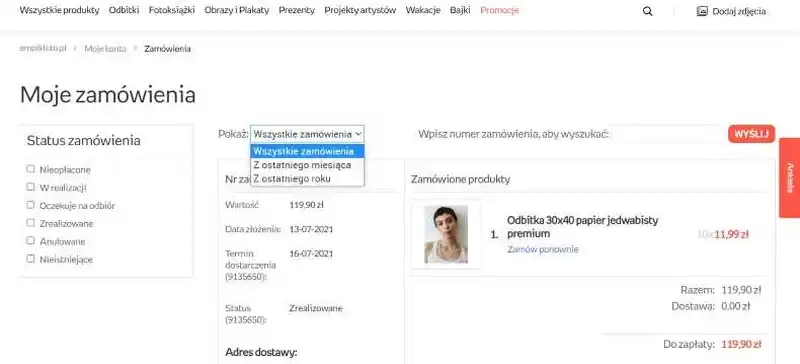
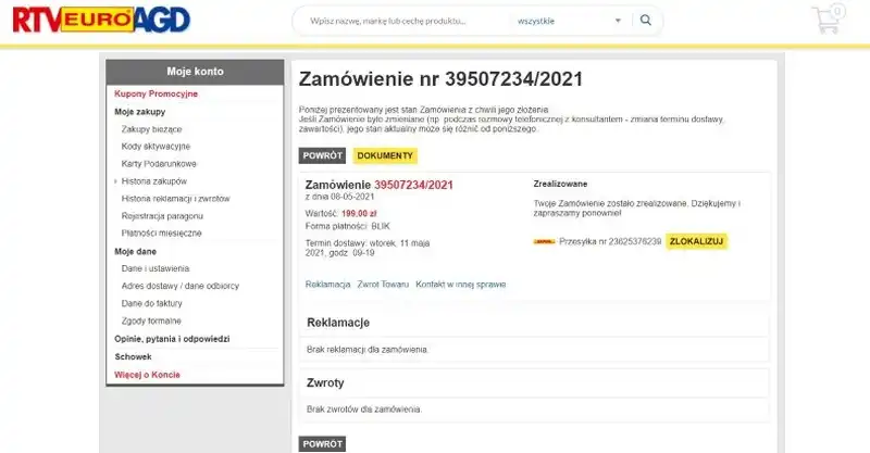
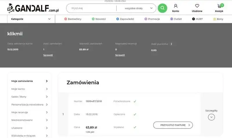
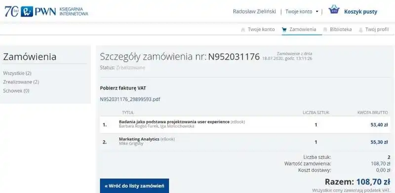
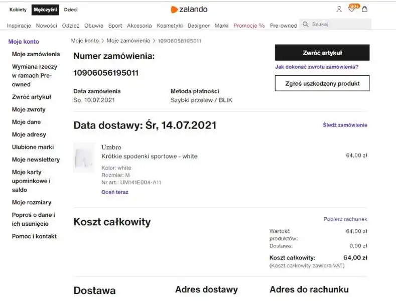
The buyer's order confirmation details should include the following:
- All products that are supposed to be shipped. With specifications on their size, weight, quantity, personalization, packaging, and measures aimed at ensuring their safety during transport
- Full costs
- Customer's shipping address
- Invoice data
- Payment method
- Transaction status
- Order number
- Estimated delivery date/time
- Links to pages describing return, privacy, and complaint policies
- Links that allow users to edit the order
- A message informing the customer that their order has been sent to their email address.
The completeness of this data is an important issue. Any omissions are not only a deviation from convention, the prevailing standard in E-Commerce, and the expectations built upon them. They also may cause the perception that the order may still be incomplete.
Messages formulated in the summary should be final, unambiguous, and conclusive.
This means that they should be the reason for making the final decision (about the purchase or abandonment) and the feeling that the customer has bought what they intended to buy.
The situation of uncertainty, of dilemmas, is very undesirable. Customers tend to avoid them. They do not want to expose themselves to negative emotions.
It is also good to avoid creating distance and obstacles for reading the order summary.
And this happens when users, in order to see the details, have to click on a dedicated link that takes them to a separate page.
Often online stores intentionally separate the thank you page from the summary page. Unfortunately, this is not a solution worth recommending and using.
Thank you page and summary page
Combining the thank you page and summary page is advised because dividing these two pieces of information is unnecessary. A thank you page has a lot in common with a summary page. The only thing that differentiates them is the "thank you" part.
This can be best seen in the article "What is a Thank You Page?" which includes the structure of a thank you page.
Among others, it includes the following information:
The thank you message
This is the mentioned "difference" that is simply a nice addition to the order confirmation as a whole. While thanking the customer or making a purchase, we should use a nice and friendly tone. Including this type of message can help us strengthen customer loyalty.
Order summary
A thank you page should include an order summary; thus, splitting both pieces of information is unnecessary. We can thank our customers on the order confirmation or order summary page.
Additional offers or promotions
As mentioned, we can take advantage of the customer's attention and include cross-selling opportunities in the order summary. Again, the thank you page and confirmation page fulfill the same function.
Social Sharing
The thank you page and confirmation page can also help us improve the engagement of users in terms of social media activity, so we should take a moment to promote the social media channels where they can follow our venture.
Designing an Order in E-Commerce. Confirmation of the order by email
Confirming an order through a separate channel, through email, may seem redundant or impractical. However, again referring to psychology, it has its justification.
Confirmation through an external system always increases credibility and inspires more confidence. It is a form of two-step verification, something that we are accustomed to as users of digital products.
When we register, we enter the password twice, and the same goes for establishing PINs or other security measures. This procedure affects our comfort and gives us the feeling that everything went alright and the process went according to our expectations.
However, remember that confirmation emails cannot be a pro forma action. It should contain specific information that was previously presented in the summary.
It shows the scope and compliance of the order. In terms of minimally necessary content, such information is sufficient. But nothing prevents us from enriching the order confirmation with additional elements.
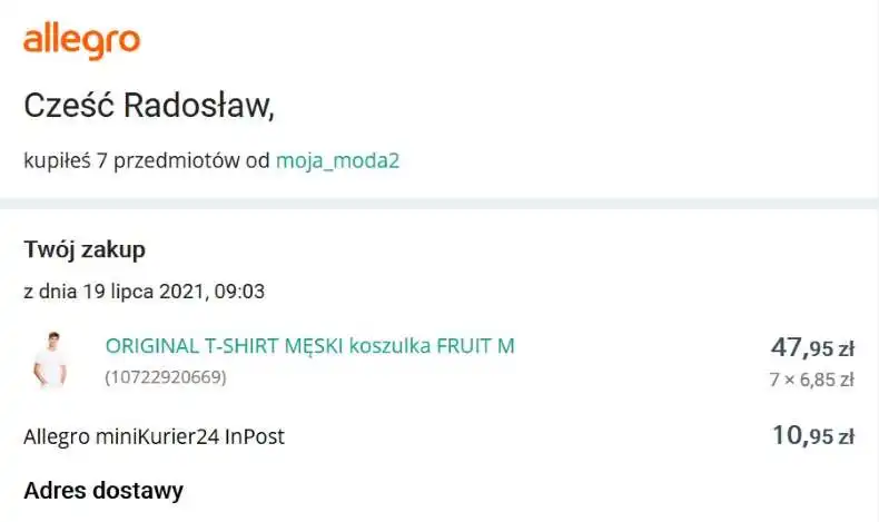
The order confirmation, in addition to the standard information answering the questions: "Where?", "When?", "What?", "For how much?" and "In what quantity?" was something ordered and paid for, should also include relationship-building messages.
A very good solution is to offer discounts to sustain purchase engagement. We should also consider recommending new products from related categories, showing trends or possible solutions.
We can also include information on how to contact customer service, where to find complaint forms or other important contact details.
With that said, the recommendations should be relevant and related to the order. Randomness and lack of an understandable connection are always perceived more or less negatively by E-Commerce customers.
The article on HubSpot, "How to Send Effective Order Confirmation Emails [Examples + Template]," provides very handy best practices on what the confirmation email should look like and what it should contain.
Namely, it includes the following best practices:
- Make the order confirmation mobile-friendly
- Ensure that it's concise and easy to scan
- Provide information on how to contact customer support
- Include information regarding what are the next steps the customer can take and what to expect
- Give details regarding the delivery and shipping method and time, and order number
- Recommend additional purchasing opportunities, such as complementary products.
If you want to see order confirmation email examples, we highly recommend the article above.
What's more, Richard White, in the article on the Omnisend blog, draws attention to a particular element of confirmation emails that can be easily overlooked. We are talking about the subject line of the said emails.
He states that the subject of the order confirmation email should encourage shoppers to open and thus read it.
He suggests the following subject lines:
- Thank you for your order
- Your [Brand Name] order confirmation [#12345]
- Order received – [Brand Name] order #12345
- Great news! We've got your order #12345
- Your [Brand Name] order has been received [#12345].
What is the ideal time to send order confirmation emails?
Richard White answers this question decisively. We should send such an email immediately.
Why?
Because it helps us, among others, support additional purchases and calm our customers. If the order confirmation is delayed, customers can feel anxious and worried and start sending messages to the customer support team asking about the order.
Obviously, we don't want that as it adds additional and unnecessary workload to our team. Moreover, it may also discourage customers from purchasing again in our store.
That's why we should ensure that the order confirmation is sent immediately, and we can do that by automating this process.
Designing a summary and order confirmation. Summary
- Online shopping always involves more or less risk.
- Order summary and order confirmation – the final stages of the Path to Purchase – should serve to minimize negative emotions and feelings.
- Summary and order confirmation are natural excuses for establishing, building, and maintaining customer relationships.
- The order summary allows users to review, edit, and approve the order.
- It allows users to ultimately make sure there was no mistake in the product selection process.
- The order confirmation, proof of the transaction, is a receipt that can serve as evidence in all kinds of disputes and ambiguities.
- Summary, as a functionality, affects the number of personnel. It influences the number of consultants, hotline employees, customer service departments, and complaints departments.
- The summary and order confirmation function as feedback.
- The main task of feedback is to eliminate undesirable behaviors and reactions.
- Feedback is also used to trigger desirable behaviors and reactions from the perspective of the sender and receiver of the feedback.
- Positive feedback helps create a bond between the sender and receiver.
- It helps to win the sympathy and gratitude of customers.
- Constructive feedback is used in E-Commerce to achieve a positive UX, strengthen customer loyalty, and improve the order processing process.
- Positive customer relations are a problem simultaneously concerning the form, content, and medium of feedback.
- We should inform the customer immediately that they will receive a summary and confirmation of the order.
- A store that sends feedback instantly is perceived as convenient and customer-friendly.
- Feedback should be tailored to the competence and language needs of the audience.
- It should operate with facts and take into account the emotions, reactions, and interpretations that come with them.
- The order summary and order form for the customer is a conventional, desired, and expected step in the ordering process.
- The summary page should dispel any doubts about the characteristics and attributes of the products as well as delivery terms, expected delivery date, and delivery methods.
- Messages formulated in the summary should be final, unambiguous, and conclusive.
- Confirmation through an external system always increases credibility and inspires more confidence.
- The order confirmation should also include relationship-building messages.


