It's not a secret for anybody, even laypeople, in terms of development and interface design, that the world of mobile applications is dominated by two platforms — Google Android and Apple iOS.
Both operating systems created an array of standards, norms, patterns, solutions, and expectations that must be met to develop a high-quality app that will successfully pass the verification and publication process.
Both systems have their characteristics and clear advantages and disadvantages.
Even if you are a fan of either platform, denying small advantages to a competing platform will express bias and extreme subjectivity.
Although the design of mobile applications for Android and iOS is generally similar, it differs significantly in detail.
The app design for Android and iOS is governed by its peculiarities, which we'll discuss today.
UX of mobile applications — designed with Android and iOS in mind — can seem like solving identical problems, but in reality, it's a matter of solving issues more characteristic of a given system.
Because every system, collection of norms, and standards is a source of desirable solutions (positive aspects) and many problems (negative aspects), Android and iOS are a source of both positive and negative aspects.
Are you ready? So, without further ado, we invite you to read the article!
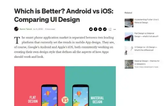
Designing mobile applications for Android
Mobile apps have very different requirements, although they can be used to perform similar business processes stemming from business analysis. That's one thing.
Secondly, they have developed particular interaction patterns, languages, and design approaches based on the technological conditions of the parent operating system, their own design concepts, market competition, and platforms.
They include standards, recommendations, and requirements and offer ready-made components, styles, tools, technologies, and ecosystems.
They constitute separate design worlds that try to answer all problems, challenges (e.g., connected to the characteristics of mobile devices), needs, and expectations related to the usability of mobile applications.
So, how do they differ? What design guidelines do design teams need to consider when designing a mobile application for launch on a given platform or operating system of a given device?
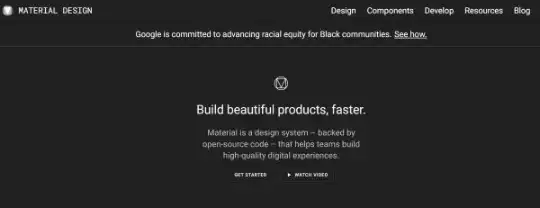
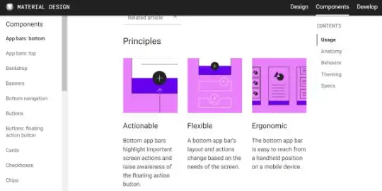
The Android platform is associated with a dedicated design language with a very nice and promising name, Material Design.
What is Material Design? What functions does it have? How does Material Design help create better Android apps?
The article "Material Design for Android" provides an overview of patterns and API interfaces and a definition of Material Design. According to the article, material design is a comprehensive guide that supports the visual design process (movement, user interactions) on platforms and devices using the Android operating system.
Material Design is a:
- Specific philosophy and approach to design
- Design language, visual style
- Guide indicating design patterns
- Library of components, styles, themes, and widgets
- Collection of rules that designers and programmers use to develop mobile apps.
We can say that Material Design serves quality. Creating an Android app according to its guidelines usually allows you to meet platform requirements and fully contributes to increasing the satisfaction of a mobile app user.
In the article published on the Interaction Design Foundation website, "What is Material Design?," Material Design is defined as a language supporting onscreen touch thanks to functions rich in cues and natural movements that mimic objects from the real world.
Material Design is characterized as a tool thanks to which UI/UX designers can improve and enhance impressions of mobile application users with 3D visual effects and animations.
The purpose is to offer the appearance and behavior of design elements (especially interfaces) expected by future users of Android apps in line with existing knowledge, experiences, perceptions, requirements, and expectations.
The authors of the abovementioned article add that mimicking the real world reduces users' cognitive load by carefully paying attention to the layout, visual language, and pattern library, maximizing predictability, and eliminating ambiguity.
A distinctive feature of Material Design is that it guarantees high realism of interfaces and offers users control (including cognitive control) over components that mimic objects known from the real world with their appearance and behavior.
The unique philosophy of designing in the spirit and with the help of Material Design components can be boiled down to the following:
- Mimicking laws of the physical world — objects in an app should behave like real objects
- Avoiding behaviors contrary to these laws (e.g., disappearance or autonomous movement)
- Maintaining user experience consistency — mobile applications should look and work per prevailing conventions and user expectations
Furthermore, Material Design:
- Is firmly rooted in the classical approach to typography
- And in thinking in terms of grids, spaces, scales, colors, and visual hierarchies.
Even more importantly, its tools help create apps (especially their interfaces and navigation) quickly, in a standardized (but not devoid of individualism) manner.
Its ease of use stems from many tools, libraries, components, tutorials, and clear, specific design guidelines regarding all application elements. Its appearance, aesthetic, functionality, usability, and pleasure its users feel.
Designing mobile applications for iOS according to HIG guidelines
It shouldn't be surprising that Apple's platform also developed its own solutions, a system, language, and a collection of patterns, components, styles, and ideas.
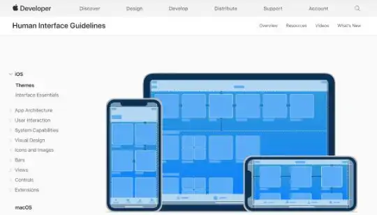
Apple's HIG provides design guidelines for mobile devices as well as other form factors, such as iPads, tvOS, visionOS, and other devices. Furthermore, it offers multiple developer guides that can help you get started.
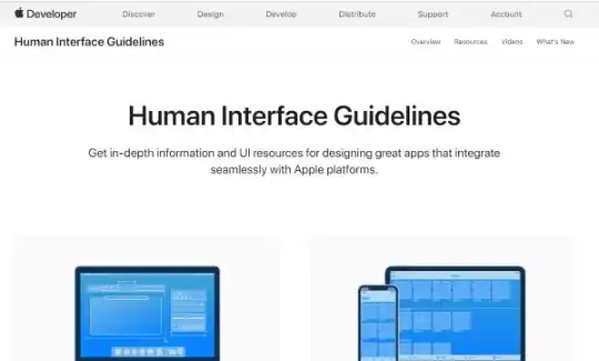
In Human Interface Guidelines, specifically the iOS Design Themes section, you can learn about this unique approach to design and the distinctive features that characterize (or should characterize) the designs of mobile applications dedicated to this platform.
The distinguishing feature of Human Interface Guidelines is the three values, goals, and attributes that every team that designs applications for Apple's system uses.
Three values of HIG:
- Clarity should characterize the text regardless of its size, color, or context, and it should emphasize its role and interactivity in a subtle yet clear way.
- Deference should be expressed in reducing the number of frames, gradients, and shadows, highlighting the crucial content.
- Depth, a realistically reflected visual hierarchy, which helps better suggest the function, role, and meaning of a given element.
Moreover, designing according to Human Interface Guidelines should be oriented toward obtaining, using, and providing the following:
- Aesthetic integrity
- Consistency
- Direct manipulation
- Feedback
- Metaphors
- User control
Aesthetic integrity involves using aesthetic and visual effects to highlight a given function or suggest an app's behavior.
An application in which consistency is a value and goal offers user interface elements (e.g., buttons available in the component repository UIKit) that are well-known and expected by users.
Using gestures and directly manipulating application elements enables increased engagement and a better understanding of how things work and the results of actions.
Feedback is naturally related to activities and using gestures. It's used to suggest functions and indicates the option of interacting with an element and suggesting results.
In turn, metaphors allow users to learn how things work faster and provide cognitive control.
Metaphors are rooted in well-known experiences from the real world and enable you to achieve greater comfort of interaction.
This lets you understand that a human, a mobile application user, controls the process and results.
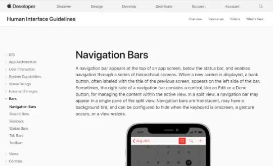
The distinguishing feature of mobile apps designed for the iOS platform is also a navigation that has three variants:
- Hierarchical navigation
- Flat navigation
- Navigation based on content or experience
In the first case, it's about making individual selections on individual screens until reaching a goal.
Flat navigation allows users to navigate between multiple categories. Navigation based on experience or content enables them to move freely within available app content.
Regardless of the type of navigation or configuration of these types, it's essential to maintain the following:
- Logic of navigation
- Predictability of navigation
Differences and similarities between Human Interface Guidelines and Material Design
As we've written in the introduction, the differences between both approaches, philosophies, and collections of guidelines are best seen in the details.
Development, testing, typical functions, and the use of native attributes of a mobile device in both variants won't differ.
General user experience principles (offering a maximally positive experience and app usability) are precisely the same in the design of mobile applications (Mobile UX Design) for both platforms.
For example, Hick's Law, the principles developed in task-oriented design, which we wrote about in the article "Quick Task! Task-Oriented Design in Mobile Design" — and several others — will have precisely the same purpose and role to play in the case of applications designed for Google's platform as for Apple's platform.
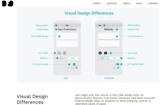
The most visible differences between iOS and Android can be seen in the following:
- Style of the interface — iOS is flat, and the Android's style is based on shadows
- System fonts — San Francisco (iOS) and Roboto (Android)
- Size, dimension, and hierarchy of headlines that are much more suggestive and clear in mobile applications written for Android
- Placement of titles — center alignment (iOS) and left alignment (Android)
- Styles of buttons
- Size of interface elements — in iOS, they're designed, described, and expressed in points, while in Android, values are expressed in Dp (Density Independent Pixel)
- Optimal screen sizes — on the iOS platform, it's 375 points, and on Android, 360 Dp
- Placement of the "Back" button in the top left corner for mobile applications on iOS and at the bottom in case of applications made for Android

Of course, this is a very demonstrative set of differences. To summarize them in a more general way, it should be said that the differences are mainly seen in patterns, standards, and design requirements regarding the following:
- Cards
- Navigational bars
- Icons
- Dialog boxes
Both platforms (Android and iOS) also have common features, which allow for a consistent and positive user experience for users of both variants of a given mobile app.
Similarities between mobile applications created based on Material Design and Human Interface Guidelines are seen primarily in the maintaining of the following:
- Same meanings of interface elements (e.g., search icons)
- Standard layout — top/bottom for navigation elements and middle for content
- Results of gestures — taps, scrolling, dragging, and pinching in both versions of mobile applications have the same effect
Designing mobile applications for Android and iOS. Summary
- To a large extent, the process of developing mobile applications is dictated by Google's Android and Apple's iOS.
- Both platforms have created many standards, norms, design principles, patterns, solutions, and expectations that must be met in the mobile application development process for an application to successfully pass the verification and publication process (e.g., in the App Store and Google Play).
- Designing mobile applications for Android and iOS differs primarily in details regarding navigation, aesthetics, size, and forms of elements.
- Android and iOS developed separate—vastly different—approaches, patterns, styles, philosophies, languages, and design approaches to creating mobile applications in which usability (UX) is equally essential as individuality.
- A mobile app designed for Android should meet requirements determined in Material Design.
- Material Design is simultaneously an approach to design, design language, visual style, guide, library, and collection of rules that designers and programmers use to create user-friendly interfaces, among other things.
- A distinctive feature of Material Design is that it guarantees high realism of interfaces and offers users control (including cognitive control) over components that mimic objects known from the real world with their appearance and behavior. Thanks to this, the mobile application is understandable and easy to use.
- With Material Design, fast and standardized design of mobile applications is possible.
- Human Interface Guidelines were based on clarity, deference, and depth.
- Creating an application in accordance with the Human Interface Guidelines should aim to achieve aesthetic integrity and consistency. It should also offer direct manipulation and feedback, use metaphors, and guarantee full user control and a user-friendly interface.
- Precisely, the same UX knowledge is used when designing mobile applications.
- The differences in design patterns are best seen in the requirements regarding the design of cards, navigation bars, icons, and dialog boxes, i.e., the elements that are the core of the design that distinguish any mobile application.
- Both platforms also have common features, thanks to which it's possible to provide a consistent and positive user experience to users who use both variants of a given app.
- Today, programming for mobile platforms is a task in which development, technologies, solutions, and functionalities are oriented towards maximizing user satisfaction, offering a system that allows you to create an application that is maximally useful, attractive, and meets a range of expectations of its users.