The satisfaction you experience while using mobile devices sometimes has its source in how the content is presented.
Sometimes, the source is how a user interface is designed. Not so rarely; the source is the orientation and position of the screen itself.
Watching movies and chatting can be examples of this.
Most users prefer watching movies, especially feature films, in a landscape mode, which is more natural and convenient for this type of activity.
Chatting, where a user is much more active, is more comfortable in portrait mode.
Orientation has a considerable significance for user experience, especially when its change is so easy on mobile devices.
Portrait/Vertical mode and Landscape/Horizontal mode are offered on mobile devices as a standard function.
The question, however, is whether all mobile apps are designed to be used comfortably in both modes.
Is designing for both modes, orientations also standard?
Naturally, these questions provoke another. Should all applications be designed in both modes? After all, you know from experience that not every app goes from portrait orientation to landscape orientation when you turn your mobile device. Why does it happen?
In which situations is offering both modes a good design pattern? What are the advantages of both modes? What is the difference between portrait and landscape orientation?
In short, if you want to know how smartphone screens and their orientation influence the UX of mobile applications, then be sure to read our article.
Enjoy!
What is the difference between portrait mode and landscape mode? Or how to design screens?
It should be clear as day. Everybody knows what a screen looks like. Therefore, defining portrait and landscape modes doesn't make sense. You only need to know what these orientations look like and that they originate from terms like portrait photography and landscape photography.
It is worth noting at the outset that the mobile device's rotation from a vertical position to a horizontal one, from portrait mode to landscape mode, can have at least two reasons.
Reasons for changing orientation:
- Engagement resulting from curiosity and interest in the content, offer, and functionalities and being immersed in the process.
- Frustration that stems, for example, from imperfections in a photo in portrait format or from overlapping or merging text with a photo.
Alright, let's move on to indicating differences between these modes.
Because of the difference between vertical and horizontal orientation and proportions between height and width, the screens of mobile devices appear and act differently.
Additionally, they force users to differently:
- Perceive content (especially in the case of photos, infographics, and text)
- Interact with the interface, not just in terms of navigation but also micro-moments and operation with gestures (in particular multi-touch gestures)
- Achieve goals
- Learn how to use an app
- Present and enter data to an app or by an app
- Operate the phone.
The enabled auto-rotate function causes many problems with mobile apps if they aren't designed to be used comfortably in both modes.
From the UX designer's perspective, designing screens in horizontal and vertical orientations causes equally fundamental problems.
Screen design usually concerns:
- Whether the content and data are presented in a responsive way — whether the character, form, content, layout, or screen positioning are adapted to the capabilities and limitations of the given mode on various devices.
- Design of interface, navigation, forms, and entering data into them.
- Design of the layout in which usability, functionality, accessibility, and readability need to overlap with visual attractiveness and flexibility.
- Design of user flow and user journey.
- Design of user experience: the ability to switch seamlessly between these modes allows users to choose a more attractive one in a given context.
Offering an actual choice is always a desirable value.
Portrait orientation seems to be more natural for a user of a mobile device.
Admittedly, it allows them to use the device with just one hand, but it's now always an ideal solution for presenting content and offering functionalities.
Landscape vs. Portrait: what are the differences between these two modes?
Namely:
- Portrait mode is much less spacious and often used to show details (just like portrait images focus on showing facial features).
- Landscape mode introduces greater distance and provides a sense of space availability (similar to a landscape image, hence the landscape name).
- Portrait orientation elevates while providing less context for content.
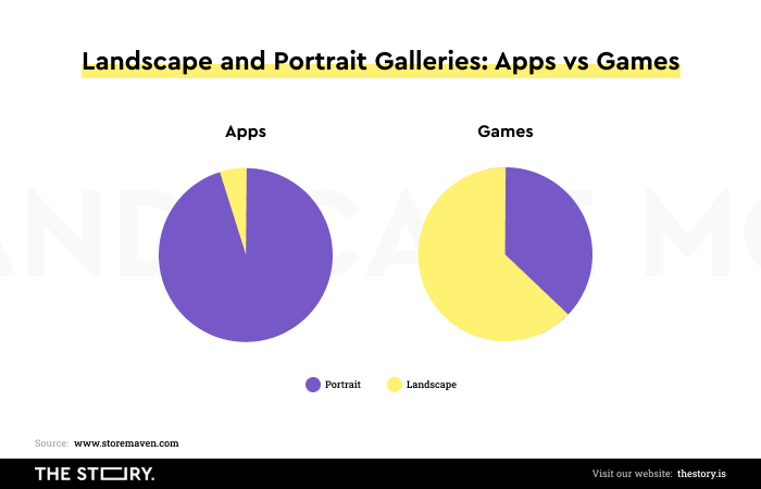
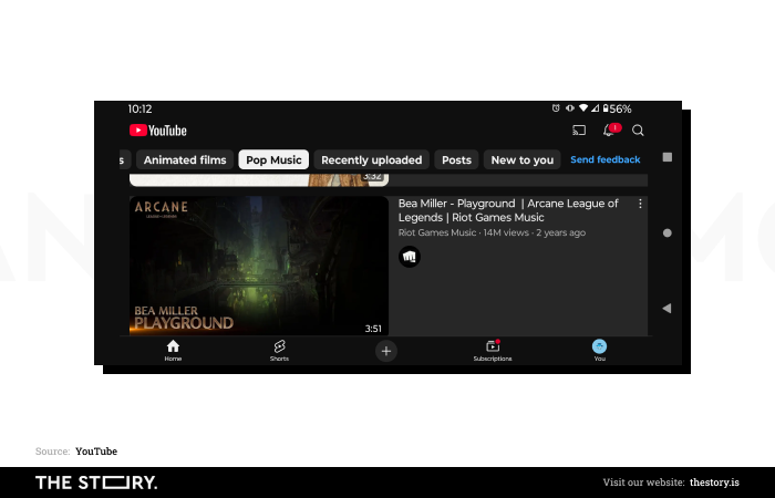
- Landscape orientation conveys much more information, and it's more natural for presenting content that changes over time (e.g., animations, videos, games).
- Portrait mode works better in situations where a user is forced to navigate, determine distance, and indicate points (e.g., in Google Maps).
- Landscape mode performs better when it's necessary to simultaneously use more functionalities or buttons that have crucial significance for a user (e.g., in games).
- Portrait orientation provides a better tactile experience for a user and is more recommended for reading (most books are printed in vertical orientation).
- Landscape orientation ensures a better visual experience and is more recommended for tracking movement (it's safe to assume that almost 100% of cinema screens are in landscape orientation).
Understandably, both modes also cause many design problems, which are primarily related to application usability and satisfactory user experience.
The Human Interface Guidelines contain very practical notes regarding problems that appear with the change in the orientation of the mobile device.
Guidelines prepared by Apple (iOS) recommend the following:
- Maintain clarity in any size of the screen — mainly, it's about the readability of the text and sharpness of images that should be ensured without the need to perform additional actions.
- Maintain consistency — interface elements should look the same in any mode.
- Place the most important elements at the top half of the screen.
- Pay attention to the change in text size; it should be adapted to the device's mode, size, and diagonal.
You can find a very fascinating and practical supplement to these guidelines proposed by Apple in two articles by Amy Schade, an author associated with Nielsen Norman Group, "Big Pictures on Small Screens: Remove, Resize or Reorganize" and "Small Pictures on Big Screens: Scaling Up from Mobile to Desktop."
Admittedly, both articles discuss designing pictures for mobile and desktop devices (iOS and Android). Still, some of Amy Schade's comments can also be used and are adequate for issues that appear during the design of vertical and horizontal orientations.
After all, image orientation by itself is a crucial element of design since different image formats can be used for different contexts (e.g., landscape images for hero shots or a portrait photo for an article).
Creating mobile applications also requires being aware of the following:
- Pictures that present well on big screens, on smaller ones may have to be scrolled.
- Combining pictures with text causes problems with their readability depending on the scale.
- Appropriate cropping and scaling are necessary if you want to ensure the maximal readability of pictures and text.
- Text placement should be individually designed each time to ensure its maximal readability on various screen sizes.
- Pictures that fit small screens don't always present well on bigger ones.
- Images that are cropped or scaled incorrectly may lose quality, readability, and communicativeness.
- Placement and relations with other design elements can be disrupted depending on the size of the screen.
While most evident in the differences between desktops and mobile phones, the issues mentioned by the NN Group researcher are also observable — with all proportions — in the differences between portrait and landscape modes.
It's about the same thing — maintaining the quality, functionality, usability, and attractiveness of the design in any size.
How the context of use and users influence orientation design in mobile applications
The orientation of a mobile device has considerable significance, especially if you look at its design problem from the perspective of the context of phone and app use, as well as the technical parameters of a particular device and who uses an application, phone, or screen.
For example, application design for children needs to consider their cognitive and fine motor skills capabilities, which in children, especially younger ones, are much less developed than in adults and teenagers.
Application design for seniors needs to account for limitations stemming from age. For children and seniors, screens in a horizontal orientation are often much more natural and comfortable because they provide them with more stability and control over the device.
It is also worth remembering that the preference regarding the mode, the orientation of the device is also determined by the context, the situation in which the user uses the smartphone or mobile application in which they look at the screens.
The portrait orientation is far more often preferred in motion. Large blocks of text are definitely faster, easier, and more comfortable to read in landscape orientation, in a state of rest.
The location of buttons (e.g., used to regulate the volume or take a photo) on a given mobile device is a variable that should be considered. The size of the device, its handiness, and its weight also matter.
The engagement, the role of the second hand used to operate the mobile device (e.g., to navigate in m-commerce), to interact with the mobile application interface grows with the screen diagonal size and the mobile device's weight.
The technical parameters of the display screen (e.g., readability and brightness of the screen in bright sunlight) also play a significant role.
The screen's readability in sunlight can influence the desire to change the display mode. Mobile applications should be designed with such situations and needs in mind.
Design patterns in mobile application orientation design (categories of orientation design)
Avi Itzkovitch's article "Designing For Device Orientation: From Portrait To Landscape" discusses the four most important mobile application orientation design patterns. Itzkovitch's comment mainly focuses on the location and layout of an application interface.
Itzkovitch distinguishes the following variants of the interface change that happens during the landscape-portrait transition:
- Fluid in which layout, placement, and the way icons work don't change; they only adapt their position and size to the new screen size.
- Extended in which the layout, placement, and number of icons change depending on the screen size.
- Complementary in which, after a change of orientation, additional data and functionalities that weren't accessible in the previous mode are displayed.
- Continuous in which access to additional functionalities is provided by turning the device.
Of course, the choice of a particular pattern depends on the platform, type of app, functionality, tasks, and user preferences.
Indicating a universal design solution is not impossible but simply wrong. Particular design solutions should stem from UX research, interface benchmarking, or usability testing.
The accessibility of mobile applications in portrait and landscape modes
Designing both modes — portrait and landscape — also has significance if you want to make the mobile application as accessible as possible.
While creating the application, remember that eye diseases and diseases that impair vision exclude many users.
Conditions that impair vision simply require designers to ensure that their designs provide accessible interfaces for this user group as well.
The situation looks the same when you look at motor skills. Manual dexterity limitations also mean that one mode may be favored over the other.
A mobile application that provides as much accessibility as possible is an application in which both modes are optimized in terms of readability, smooth navigation, and ease of use of all the typical gestures for mobile applications, among others.
Although in some types of applications, a given mode may seem more natural (e.g., landscape orientation on steaming platforms), offering just one mode is an obvious design mistake.
It's impossible to imagine creating an application only in one default landscape format.
The justification for designing both modes is so obvious that it can sometimes be a source of some surprise.
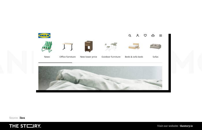
For instance, offering both modes makes sense not only in applications for entertainment but also in m-commerce. Why?
Portrait and landscape modes in m-commerce
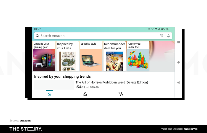
Edward Scott, associated with Baymard Institute, discusses in great depth in the article "Mobile UX: Scale Product Images Proportionally in Landscape Mode (52% of Sites Don't)" the impact of changing the orientation and scaling of product images on sales and user experience of m-commerce customers.
According to the institute's research, half of the customers using the mobile versions of online stores feel the need to switch from portrait to landscape orientation when the former does not offer a sufficiently viewable, clear, and sharp product photo.
Mobile store designs rarely take into account such needs as the need to achieve a goal (purchase) with their help.
The stakes are high because Edward Scott says that as much as 56% of m-commerce customers display the product page to look at its pictures.
According to Baymard's results, pictures of products in m-commerce have a fundamental significance in making a purchasing decision. Product photos are also among the most commonly used content on online store websites.
Considering behaviors, expectations, habits, and needs, an extremely important issue in the context of design, creating portrait orientation and landscape orientation, is to take care of the scaling of photos.
Unfortunately, mobile apps of online stores rarely offer scaled photos proportional to landscape orientation and screen size.
It's obviously harmful because it doesn't provide the expected utility of the images. As we've mentioned, these are the main arguments that are taken into account when making the purchasing decision.
Photos that don't fit the screen cause frustration, which occurs, for example, when attempts to enlarge an image in portrait orientation reduce its readability or aren't feasible at all.
Let's mention another Baymard Institute result. As many as 40% of mobile online store apps don't support touch gestures. Pinching doesn't result in an enlarged product image.
In contrast, as many as 52% of apps don't scale images proportionally in landscape mode. They don't go out of their way to meet the needs of users.
This directly means problems with the mobile app's usability and user experience. A low conversion rate and sales volume shouldn't be surprising.
Visual evaluation of the product is critical (the screen's orientation plays a significant role in it). A picture that allows users to make it in a simple way is very desirable.
Portrait mode vs. Landscape mode in mobile design. Summary
- Orientation, designing mobile apps for both display modes — portrait and landscape — is of paramount importance for a positive user experience.
- Orientation of the screen in a mobile application also influences the conversion rate and often impacts the sales volume.
- Portrait/Vertical mode and Landscape/Horizontal mode are offered on mobile devices as a standard function.
- Often, the change in mode—from portrait to landscape and vice versa—has two causes: positive (engagement) and negative (user frustration).
- Both portrait and landscape orientations force a mobile app user to perceive content, interact with the interface, and achieve goals in a completely different way.
- The Human Interface Guidelines contain very practical notes regarding problems that appear with the change in the orientation of the mobile device.
- Apple (iOS) recommends maintaining clarity at any screen size, maintaining consistency, and paying attention to text size changes.
- While designing with the orientation of a mobile application in mind (Mobile UX Design), it is worth remembering that pictures that look good on large screens may need to be scrolled on small screens.
- Combining pictures with text causes problems with their readability depending on the scale.
- Appropriate cropping and scaling are necessary if you want to ensure the maximal readability of pictures and text.
- Pictures that fit small screens don't always present well on bigger ones.
- The orientation of a mobile device is extremely important if you look at its design problems from the perspective of the context of the use of the phone and apps and who uses them.
- Preferences regarding the mode, the orientation of the device (e.g., landscape orientation) are also determined by the context in which the user uses the phone or mobile application.
- Engagement, the role of the second hand used to interact with the mobile application interface, increases with the phone's size and weight.
- The screen's readability in sunlight can influence the desire to change the display mode.
- Designing simultaneously for both modes is also important if you want to make the mobile app as accessible as possible.
- The design of the application requires an understanding of the reasons for the change in orientation and the benefits it brings to users.
- The mobile app, which ensures the greatest possible accessibility for every type of user, is an app in which both modes are optimized for readability and smooth navigation, among other things.
- Designing a mobile app requires taking into account the ease of use of all the gestures typical for mobile apps.
- Developing a mobile app should include offering both modes. Preferring only one mode (usually portrait orientation) is an obvious design error.
- The screen in the mobile application should be used in both modes so that the mobile application can meet a variety of user expectations.
- According to a study by Baymard Institute, half of the customers using mobile online stores feel the need to switch from portrait to landscape orientation.
- The reason is mainly due to imperfect and unreadable photos of the product.
- Pictures of products in m-commerce have a fundamental significance when making a purchasing decision.
- Product photos are also among the most commonly used content and information on online store websites.
- The m-commerce mobile app should be designed primarily to make useful product images accessible. Users without seamless access to them very often choose not to buy, even if they're at an advanced stage of the purchase path.
- Ensuring they're displayed correctly in every mobile device orientation improves conversion rates and sales volume.
- Image orientation is also crucial in design since photos (landscape photography, portrait photography) can have different use cases.