How to design applications for children? Why are apps aimed at children so troublesome? What to look out for in the design process?
We will try to answer these questions in this article.
Civilization trends – children in the world of mobile and web applications
Applications for children – for learning, supporting creativity, and playing – are a big, if not very big, challenge for designers.
Children are very demanding and diverse users. Manufacturers of toys, games, educational aids, and even authors of fairy tales are well aware of this.
For some time now, UX/UI specialists have also been grappling with the problem of designing attractive products for children. They face the major challenge of designing applications that are attractive and secure, and that are ethically unambiguous.
Data and reports don't lie. The number of children using mobile phones is growing every year.
The age at which children begin to have regular contact with mobile devices and computers is decreasing.
The amount of time they spend in front of screens is growing.
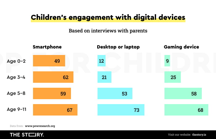
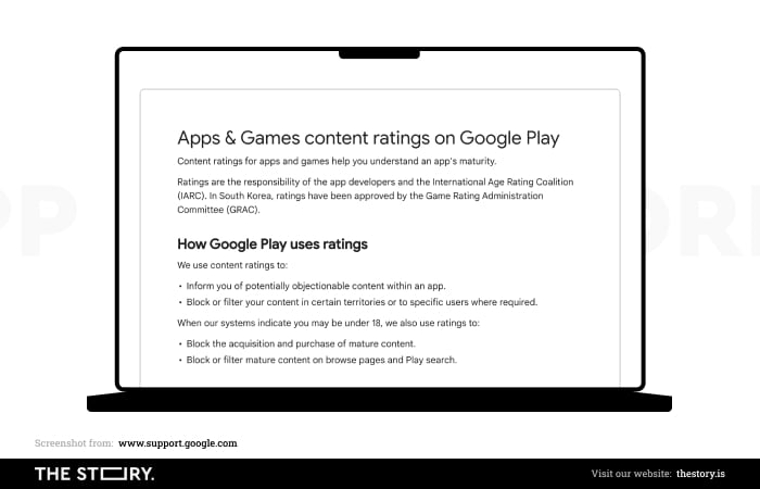
Three-year-old children playing with phones is no longer a marginal phenomenon. The number of available apps in the Google Play store is also growing steadily.
Likewise, apps for children on mobile devices, installed by the operator or manufacturer, have become standard. In a nutshell, apps and games are available to children from the moment they purchase a device.
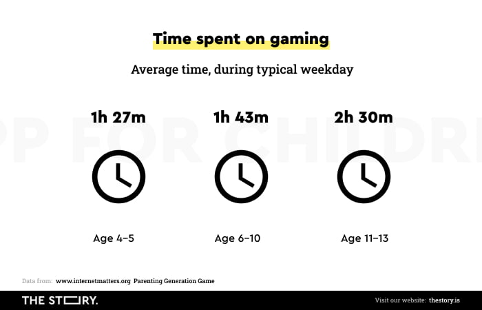
Children are becoming an important target audience for digital products. At the same time, they are a category that is as homogeneous as it is diverse.
Children as users of applications
Compared to adults, children are:
- Much more focused on having fun than on doing activities with apps.
- More impatient, they expect immediate change and gratification after performing an action.
- Less aware of technological limitations and the resulting operations and conventions of systems behavior.
- More prone to confusion and frustration when dealing with interfaces that aren't adapted to their intellectual and physical abilities.
- Less proficient at scrolling pages, they prefer screens that don't require scrolling.
- Much more dependent on experience, they prefer interfaces based on metaphors and patterns they already know (skeuomorphic design is recommended for the youngest).
- Susceptible to advertisements, they don't distinguish them from other messages.
- More likely to develop addictions to digital products.
- Vulnerable to cybercrime.
- Dependent on instructions, they need clear and specific instructions, an explanation of the purpose of playing, and how to play (use the app), preferably in the form of an audio.
- Much more sensitive to errors that occur; for the youngest children, the idea of error is completely incomprehensible.
However, if we take a closer look at children, we will discover that they differ quite much.
Can we design universal applications for children?
Children use phones and computers as their toys. With them, they satisfy the need to play and explore the world. But can we be sure that the category of "children" is an accurate descriptor?
To what extent does it reflect reality? To what extent do these common needs of children allow the creation of an app that ignores the child's age and the limitations that come with it?
The category of "children" intuitively seems conventional. We call a three-year-old and a six-year-old a child; it's true. But we can't definitely say that they are children with similar abilities, needs, ways of communication, and behaviors.
Parents know it, counselors know it. Swiss psychologist Jean Piaget, who devoted much of his research work to child development, also knew the difference.

Familiarizing ourselves, even vaguely, with Piaget's findings is extremely helpful when creating digital products for the youngest. It offers very practical tips that help understand the peculiarities of a child's development stages and the intellectual, emotional, and manual capabilities associated with it.
Development of children – the theory of Jean Piaget
Perhaps the most valuable lesson from Piaget is the more profound awareness of the stages that occur in children's development. Based on observations, he discovered that all children go through 4 phases of development.
In each phase, they acquire the same skills, make typical mistakes, and have the same limitations. They behave in very similar ways and have identical needs.
Each phase is a stage of adaptation to the environment.
When interacting with the world – people, objects – children use cognitive schemes that become more complex as they grow older.
Initially, the schemes involve sensorimotor skills and experiences. In the course of development, children assimilate and make use of further schemes.
For example, they are starting to categorize, compare, deduce, and understand symbolic meanings.
Until about the age of 2, children are in the "sensorimotor stage." Next, between the ages of 2 and 6, they experience a "preoperational stage." After it comes the "concrete operations stage," which lasts until the age of about 12. The final stage is the "formal operational stage" and lasts until adulthood.
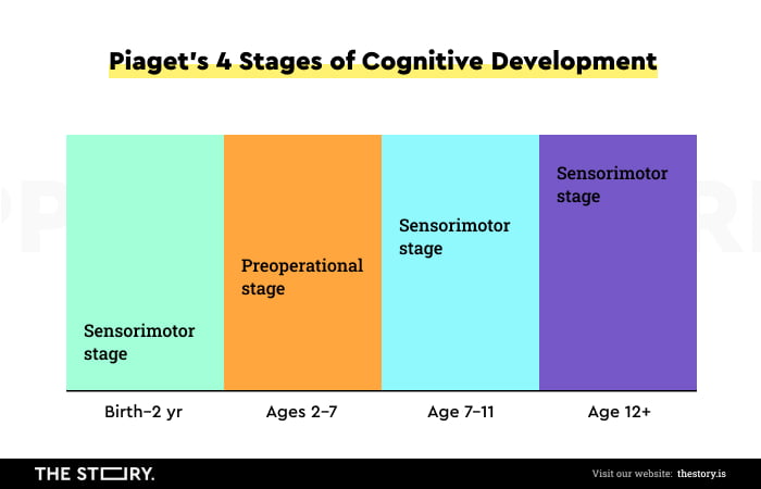
Each of the four stages is an entirely separate world. For example, motor skills consist of:
- skills involving big muscle groups (such as jumping)
- making precise movements with hands and fingers
- motor coordination.
A young person in the sensorimotor stage will focus on touching the phone. In the next one, they will be able to pick it up, but only at about the beginning of the third development stage will they be able to use the phone and the applications installed on it on their own.
Of course, all of this describes the typical/regular development of a child. Each child develops at its own pace, and deviation from these rules is possible and even quite common. Nevertheless, regularities are a developmental fact that mobile application designers must take into account.
The development of children and application design
As NN Group researchers note in the article "Design for Kids Based on Their Stage of Physical Development," the physical development of motor skills and coordination affects children's ability to interact with devices. It changes their attitudes and expectations and affects children's level of involvement in interaction with a device or an app.
In the course of development, children's needs change, mainly due to changing cognitive (development of intelligence, knowledge gain, speech and language development) and motor abilities. And these are crucial issues from the perspective of designing apps for children.
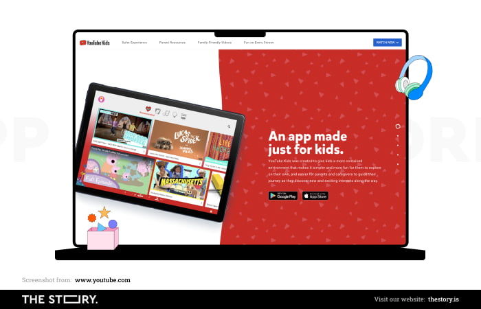
By knowing the characteristics of a particular development stage, we can tailor the application's interface, color scheme, layout, typography, content, and functionality to meet the needs of kids.
For a child, the development stage itself is a more significant limitation than technology.
It is also worth keeping in mind that children in a given stage are independent to varying degrees – both physically and intellectually.
While Piaget's findings are very helpful, from a design, market segmentation, and tailoring point of view, it is worth using a little more precise division.
How to design applications for children between the ages of 3 and 5
A child at this age is in the "preoperational stage."
They usually already know the basic colors, numbers, and letters of the alphabet. They can count (usually up to 10), play very simple games, and draw. Their language skills are improving. The range of vocabulary and speech structures are becoming more complex. But it's rare for children of this age to be able to read.
Children focus on only one aspect in this stage and overlook the others. They can't fully understand the course of processes. They usually exhibit a top-down approach. They can't think logically yet, but they can distinguish between fiction and reality.
They mainly draw "conclusions" based on past observations. They're slowly acquiring the ability to predict the near future.
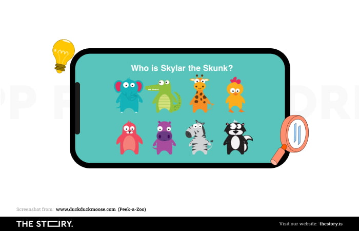
Their short-term memory is very limited, as is their ability to focus attention. They get distracted quickly, but at the same time, they are incredibly open-minded and eager to learn.
Applications for children under the age of six should therefore be as simple as possible and must not require children to make complicated gestures or use peripheral devices.
A simple, adequately large, high-contrast, full-screen menu should ensure comfortable interaction. A very effective way to engage children at this development stage is to add auditory elements – in the form of simple jingles, melodies, alerts, or phrases.
Capabilities of children between the ages of 3 and 5
Physical abilities (fine motor skills, gestures): very limited
Cognitive abilities: significantly limited
Independent operation: significantly limited
Preferred devices: with tactile screens
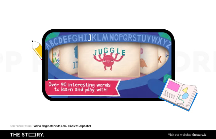
How to design applications for children between the ages of 6 and 8
A child at this development stage already has much greater motor and intellectual capabilities.
They can usually already read single words and simple sentences. They can group and compare elements according to simple division criteria. They have much better orientation in space and can determine location using the categories of up-down and right-left.
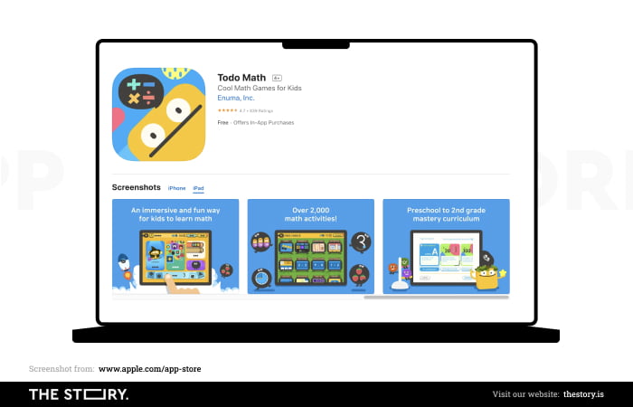
They also enjoy following storylines and can focus their attention on longer and more complex narrative forms.
They are characterized by great openness, curiosity, and willingness to experiment. Their movements and gestures are much more precise, skilled, and easy to perform.
At the same time, they have considerable attention deficits. Children at this age are often lost in thought, distracted, and forget about activities in progress.
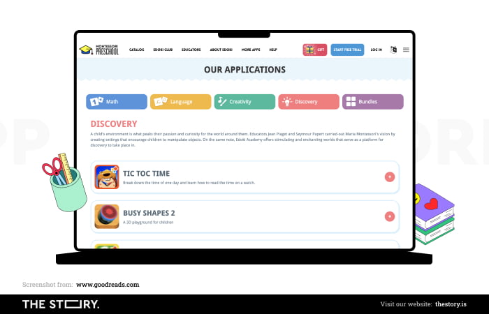
Apps aimed at children of this age can combine educational and entertainment elements. Their level of complexity may be much higher.
The independence of the device and application operation helps create solutions that support curiosity and passion for exploration. Simple gamification elements are often used in this product segment because tasks, results, competition, and achievements are strong motivators for children.
Capabilities of children between the ages of 6 and 8
Physical abilities (fine motor skills, gestures): relatively unrestricted
Cognitive abilities: partially developed
Independent operation: partially developed
Preferred devices: with tactile screens
How to design applications for children between the ages of 8 and 12
Developed small motor skills, expanded cognitive abilities, much better concentration, increasing use of logical reasoning, more conscious preferences, and high susceptibility to peer group influence are among the most important characteristics of children from this development stage.
Users in this age range are very technologically independent. They are also already quite competent as users of the Internet, mobile phones, computers, and apps.
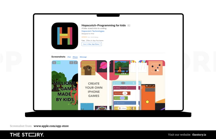
Their capabilities are still not equal to adults, but this doesn't result in dependence (e.g., help with operation, installation, error resolution) on older people. Children can usually correct their mistakes on their own. They understand them much better and can combat them.
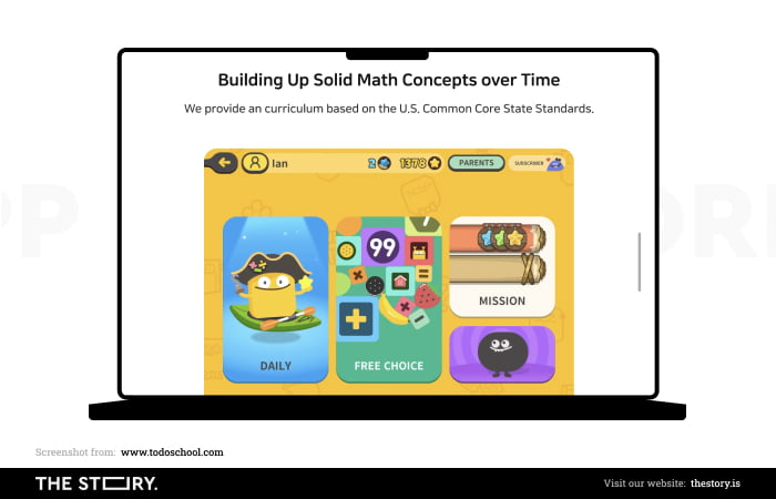
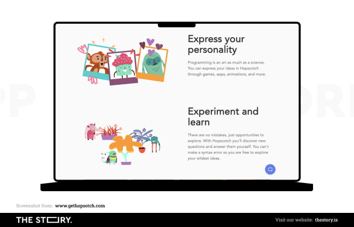
Applications dedicated to children in this range can be much more complex and specialized, combining different functions (such as educational and entertainment).
Children can develop their passions, interests, and talents precisely with the help of dedicated applications. They are also often used as teaching aids.
Capabilities of children between the ages of 8 and 12
Physical abilities (fine motor skills, gestures): fully developed
Cognitive abilities: developed
Independent operation: full
Preferred devices: phones, tablets, laptops, computers, and most control devices (e.g., mouse, keyboard, pad).
How to design applications for children with gamification elements?
Gamification, among other things, is a way of making digital products more attractive.
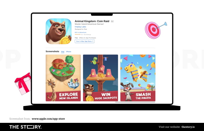
Incorporating elements of competition and motivation into the logic of their operation into their functionalities makes the application much more attractive.
Ludic needs (games, playing) are very natural for children. The older they are, the idea of a game and the rules of each game are easier for them to understand.
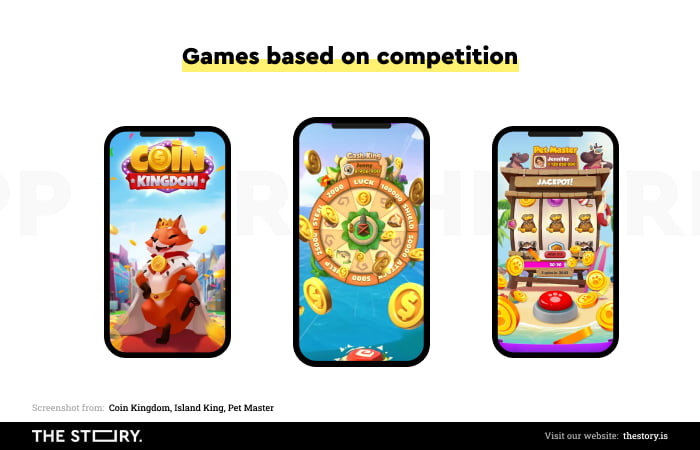
Primarily, gamification appeals to the need to compete, hierarchize and surpass. Rankings, tasks, missions, goals, levels, points, tables, challenges, and statuses are all tools that increase engagement.
Children's susceptibility to them increases with age. These mechanisms can be used to counteract boredom and decreased concentration.
It is worth remembering that children, as they grow older, have a better ability to focus and devote themselves to one action, one activity.
Applications for children. Summary
- Children prefer interfaces that are uncomplicated and easy to use. An application aimed at children should, above all, meet this requirement.
- The less developed the child's motor skills, the easier it should be to move or tap a target (e.g., a button, avatar, icon, or drawing).
- With age, the tap's strength and the movement's precision improve (they become weaker, executed with greater sensitivity, and more accurate).
- Mobile applications for children must accommodate the changing size of children's hands and fingers and fine motor skills.
- The design of applications for children must consider that tactile targets for the youngest children should be at least four times larger than those designed for adults.
- Until about 9 years of age, children prefer tapping, swiping, and dragging.
- The younger the children are, the more they prefer touchscreens and tactile interaction.
- Children usually acquire the ability to read around the age of 7, but even older children prefer auditory interaction and communication.
- Children like interaction – they engage in impactful, attractive, and exciting activities.
- It is recommended to use sans-serif typefaces for better readability, with a size of at least 14 points.
- The younger the user of the app, the smaller the number of elements displayed on the screen should be.
- The choice of complex color designs is suggested for older children.
- We should tailor applications to the capabilities and needs of a particular user.
- Parents should be able to configure and supervise the application according to their preferences regarding content and security (parent mode and kid mode)
- Applications for children should first be designed in terms of reducing cognitive load.
- We should adapt applications for juniors to the physical capabilities of children of a certain age.


