How to design mobile applications? Today, we'll look for an answer to this question. We'll also take a closer look at the character of mobile devices. We'll consider the uniqueness of experiences created by these devices. And we'll learn about a very useful approach — Task-Oriented Design.
Please read this article because it's worth it. Enjoy!
The characteristic of mobile devices and application development
In the most general sense, the development of a mobile application should have as its basis the awareness of the dissimilarity of mobile devices. The issues may seem obvious, right? Perhaps, however...
We can still encounter applications that appear to be stripped-down and limited versions of desktop solutions. And they should be an independent version, dedicated and resulting from the complexity and nature of devices on which the applications are to be used.
So how do mobile phones differ from computers? Generally speaking, they differ in physical parameters, ways of use, functionalities, and experiences.
Let's list the most important ones.
Physical and technological differences:
- Screen size
- Computing power
- Size of the available memory
- Power supply
- Internet connection
- Operating systems.
It's clear as day. A smartphone is not the same as a computer. However, there is a "but." The awareness of different experiences when using a mobile phone or a desktop computer is not so widespread and apparent. And they're fundamental.
Mobile devices aren't a miniature version of desktop computers but a separate category that requires a different approach to usability, user experience, design, research, development, and technology.
Differences in use:
- Mobile vs. Relatively static
- High context vs. Low context
- Personal vs. Private
- Handy vs. Available in a specified place
- Microtasking vs. Macrotasking
- Local vs. Global
- Inconsistent nature of interactions vs. Relatively stable nature of interactions
- Short-term nature of interactions vs. Long-term ones
- Impulsive vs. Intentional.
We use mobile devices in various contexts, and these contexts make it necessary for a mobile application to be adapted to them.
We treat mobile phones as very personal devices with which we have a stronger emotional bond than with computers.
We perform simpler tasks on them that last shorter and require less effort and less attention. Usually, our interactions are more impulsive, emotional, and dependent on context. The scope of usability of mobile phones and computers also significantly differs.
The functional differences regard the following:
- Available screen space
- Telecommunication, GPS, and biometric functions
- Operation — Tactility vs. Peripheral devices.
Mobile devices and mobile applications have their characteristic functions and evoke in us completely different feelings, impressions, emotions, attitudes, and expectations. They're a source of different habits and experiences.
Differences in experiences:
- Broad and diverse set of stimuli vs. Narrower and more homogeneous set of stimuli
- Scattered attention vs. Focused attention
- Wide scope of multitasking vs. Narrow scope of multitasking
- Essential manual dexterity vs. Desirable manual dexterity
- Less sense of security vs. Sense of security reinforced by years of experience, technology, the superiority of computers in terms of protection and security of Internet use
- Task-oriented approach to the use vs. Non-task-oriented approach to the use.
How to design mobile applications to meet the expectations of users?
When using mobile phones, we're primarily exposed to the undesired influence of the environment. Increased unpredictability of this influence, volatility, and diversity make the task performed with mobile devices more hectic, chaotic, and stressful.
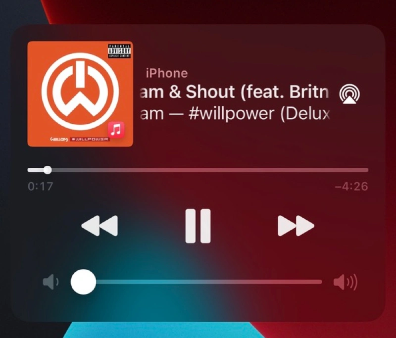
We expect their result to be immediate, flawless, and satisfactory. The process of initiating tasks — because of the context and reaction of our brain to conditions — also should be maximally simple, intuitive, and trouble-free.
We use mobile phones most often for the following:
- Internet browsing
- Listening to music, podcasts
- Communicating
- Reading books, articles
- Playing games
- Watching movies
- Taking photos
- Shopping
- Controlling devices — Internet of Things
- Managing finance.
And here, we arrive at an apparent conclusion. The design of mobile applications is a separate field. It's not just about adapting the desktop design to other sizes and resolutions but a separate way of increasing the usability and value of a solution.
The user experience of a mobile user and desktop user differ just like coca cola differs from the sparkling water.
Mobile application design — what's it all about?
The design of a mobile application, design of the interface of a mobile application must primarily consider the needs and expectations of users. What does this mean in practice? For instance, it means that users prefer the following:
- Quick and simple interactions
- Universal and useful solutions — regardless of the platform, browser, brand, manufacturer, model, or parameters of a mobile phone
- Solutions using the potential of mobile devices
- Applications ensuring a high level of security — of personal data, privacy, protection against unfortunate, undesirable actions
- Apps designed in line with design conventions and norms
- Applications that are fully functional — that aren't a simplified version of the desktop variant
- Apps that are visually and functionally attractive.
Moreover, they expect a diverse experience tailored to their needs, functions, and contexts. What does this mean in practice? Primarily, this means we should design applications focusing on tasks and micro-interactions the user will perform.
The usability of a mobile application is all about the ease of performing the most basic tasks.
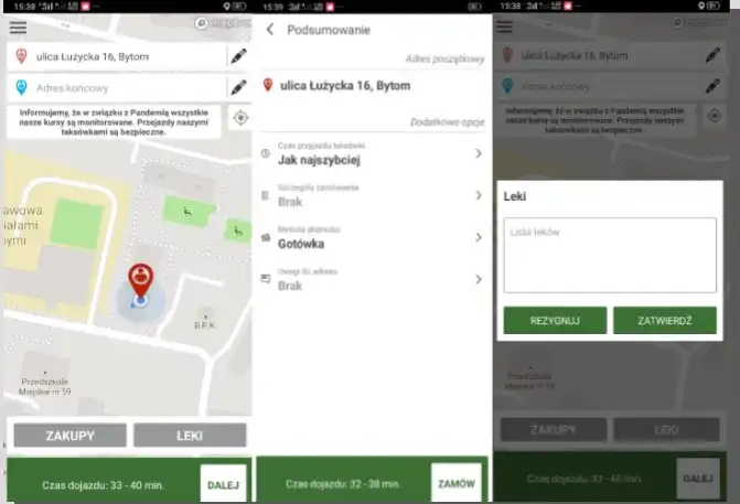
It's about adapting functions, way of working, layout, color scheme, and information architecture to the nature of the use. And it's, as we mentioned, unique in terms of attention, short-term memory, duration, and way of interaction (tactility, operation with a thumb, gestures).
Task-Oriented Design (Task-Oriented Approach) in mobile application design
In the design theory and practice, the Task-Oriented approach didn't appear along with mobile devices. It's much older and has often been discussed in fields that study systems.
The essence of this approach is precisely determining the goals the user wants to achieve. It's a starting point.
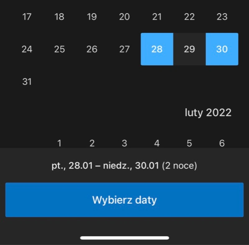
The next step is to divide the process of goal achievement into individual tasks, especially it's necessary to determine their relations and dependencies. So, designing goals is designing tasks that make their achievement possible. And a complex task should be divided. The division supports convenience and simplification of work.
Paying attention to the conditions of the system, rather than the identicality of goals, makes tasks more tailored to the limitations and capabilities of the system, which ensures their greater optimality.
In other words, the same goal on two different operating systems (e.g., Android and iOS) should be designed with consideration of their differences and specifications.
Of course, it's not just about IT systems but also about types of devices. Smartwatches are a different collection of design problems than smartphones, and these, in contrast, significantly differ from tablets. And so on.
Although the goal can be identical on each of these devices and operating systems, tasks that make it achievable should differ. It's about the difference stemming from the fastest and simplest way of obtaining the goal. Naturally, it should be achieved thanks to (and not despite) the character of the operating system and device.
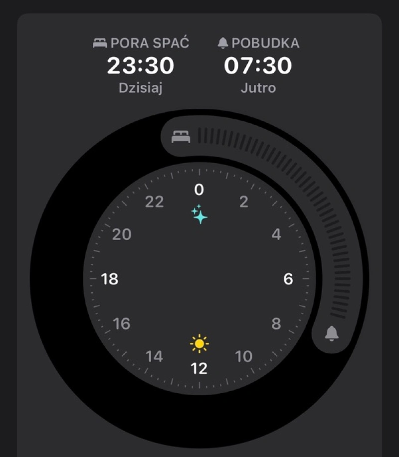
Here, we want to emphasize that Task-Oriented Design isn't a different name for Responsive Design. Task-Oriented Design is a broader concept and doesn't come down to adapting the appearance of an application to various screen diagonal sizes and resolutions. Its essence is the creation of maximally useful functionalities.
Task-Oriented Design focuses on delivering solutions that are the functional, visual, and aesthetic answers to crucial questions, such as:
- In what context/s will users be?
- What stimuli will affect them?
- What limitations and possibilities will they feel?
- What activities will they perform in a given context?
- What goals do they want to achieve by completing a given task?
- What values motivate them to obtain the goal?
- What way of interaction with the device/app do they prefer when performing a task?
How to design mobile applications in the spirit of Task-Oriented Design?
Smartphone users focus on individual tasks and micro-interactions that last no longer than a few seconds. Tasks that need more focus and engage more working memory and attention will be perceived as burdening, inconvenient, difficult, and frustrating.
To those interested in deepening their knowledge about this topic, we recommend the article "Smartphones and Cognition: A Review of Research Exploring the Links between Mobile Technology Habits and Cognitive Functioning."
Task-Oriented Design strongly emphasizes maximal usability, convenience, and adapting the interface to perform tasks quickly and seamlessly.
Minimalism, reducing the content on the screen to a bare minimum, is a crucial principle.
Functionalities should also be reduced. A multifunctional application isn't a useful application — it's worth remembering that. It's also worth adapting functionalities to the capabilities of devices.
Minimization also means reducing expectations toward the user (e.g., in terms of data input), minimization of tasks (e.g., scrolling of screens), and also simplifying gestures. It's worth remembering that a screen that doesn't need to be scrolled is seen as reliable and friendly.
A tactile way of interaction, often with a thumb and gestures, requires a different approach to interface and button design.

Smartphone screens are small and vulnerable to accidental mistakes during navigation. The placement of buttons should stem from their importance and frequency of use.
The most popular buttons, buttons of the most frequently used functions, are usually placed in the center of the screen. Only one function should be assigned for each screen.
Correct execution of a task requires not only fast access to function keys but also optimal path. We should achieve a goal after a maximum of 4 clicks. The impression of the application's speed is supported by the ability to resume activities from the place of the last action.
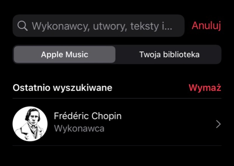
Furthermore, the sequence of tasks leading to a goal should be logical and in line with the experience and expectations of the user.
Appropriate communication with the user, as well as offering feedback, using icons, symbols, and signs rooted in the reality of the user, also support the quick performance of tasks. They're familiar, understandable, and almost obvious to them.
Mobile application interface design — Task-Oriented Design. Summary
- Mobile application design should take into account the character of mobile devices.
- Applications should be designed as individual and dedicated tools adapted to the complexity and nature of the devices on which they will be used.
- Mobile devices differ from desktop computers in physical parameters, ways of use, functions, and experiences they provide.
- Mobile devices are used in much more complex contexts.
- We treat mobile phones as very personal devices with which we have a strong emotional bond. We perform simpler tasks on them that last shorter and require less effort and less attention.
- Usually, we interact with mobile application interfaces in an impulsive, emotional, context-driven manner.
- Mobile devices are a source of different habits and experiences.
- The unpredictability, volatility, and diversity of the impact of the context of use make tasks performed with mobile devices hectic, chaotic, and more stressful.
- Mobile application design should primarily consider the needs and expectations of users.
- When designing mobile apps, we should focus on tasks and micro-interactions that the user will perform.
- The usability of a mobile application is all about the ease of performing the most basic tasks.
- Task-Oriented Design focuses on delivering solutions that are the functional, visual, and aesthetic answers to crucial design questions.
- Task-Oriented Design places a strong emphasis on maximal usability, convenience, and adapting the interface to perform tasks quickly and seamlessly.
- Correct execution of a task requires not only fast access to function keys but also optimal path.


