
When reading subject-specific literature, it could be summed up that the authors of the articles agree: in the website and mobile application design, color matters — more than you would like to accept.
Color is an essential element of UX/UI design. However, it is impossible not to notice that there have been many myths and misconceptions concerning the role, influence, and significance of colors and the impact of colors, hues, palettes, color combinations, and schemes.
Colors evoke emotions not only in the designers but also in customers and users. Colors affect the assessment, behavior, reactions, motivations, memory, and ratings of digital products.
Finally, colors, or more generally aesthetics and the sense of beauty, affect the way you react and use specific objects and tools, including websites and mobile applications.
One of the most popularized assertions of perceptual psychology claims that attractive things work better.
Or at least they influence such conviction. And colors significantly contribute to it.
All the above theoretical, but to a large extent empirically proven, statements raise a number of questions that primarily focus on practical issues.
Such as, for example, what website background color will influence its users the most. What background color to choose to achieve the best sales results and improve conversion?
In this article, you can find the results of very interesting studies which shed a whole new light on the issue of the effect of website colors on users.
The published research results suggest that the issue of the website background color is certainly not clear-cut.
Definitely, it is not decided once and for all in favor of the classic combination of white background and black fonts because everything depends.
Without further ado, enjoy the reading!
Website background color: the issue of colors in UX/UI design
Color has always been important for UX and UI design. Color and user experience design have always gone hand in hand.
You don’t need thorough psychological research to have a minimum awareness that colors affect us, convey meaning, and are reserved for certain activities, situations and contexts.
We use colors for various purposes and with mixed results. We think about colors, and we are susceptible to their impact. Colors affect our mood and are an important point of reference.
In a website, colors play informative, warning, appellative, and indicative functions. They are the source of pleasure but also of unpleasant states.
Colors for creating websites evoke associations, emotions, and stronger or weaker reactions.
We respond emotionally, intellectually, and also physically (viscerally) to them.
It’s been said, and truly that the choice of colors for a website is one of the most important building blocks of digital products.
Using colors, you can arouse attention, create mood, and suggest importance, status, role, function, and position.
Through colors in web and mobile applications, you can create a visual hierarchy, support interaction, and navigation, and suggest actions and their results.
Website colors and colors, as such, are fraught with meaning and socio-cultural functions. They have become permanent synonyms for values.
They speak to us in a language that our hearts and minds equally understand. Therefore, they are an essential component of every application and digital product.
Brands use these cultural meanings, stakes, and roles for their own purposes, suggesting their attributes, features, functions, goals, and values using color combinations.
With color, they try to express their identity, personality, and uniqueness.
In the field of User Experience, website color serves the above purpose and also plays a vital role in terms of the following:
- Accessibility
- Usability
- Desirability.
For example, color blindness is a widespread phenomenon affecting a few percent of people.
And it presents a challenge for digital product designers who must select color schemes to make a product accessible also for people with such limitations.
And color perception disorders, in turn, are frequent phenomena in many chronic diseases. We discussed it in the article “Color vision disorders in UI users. Interface accessibility to persons suffering from common diseases.”
Also, in this case, colors and their combinations can promote user satisfaction, improve the quality of product interactions or significantly reduce it if they are not selected with the knowledge of what visual limitations are caused by a specific chronic disease.
According to the studies cited in the article “Why Color Matters,” a color palette for a website is an important factor for the following:
- Making purchasing decisions
- Making a subconscious judgment about a product and its attributes, features, advantages, and disadvantages
- Building brand awareness (in particular, its recognizability)
- Remembering: colors promote remembering
- Encouraging to become familiar with the message
- Fostering learning and understanding
- Highlighting, accenting, giving meaning, suggesting, and evoking a predictable emotional response
- Stimulation, calling for action, and preventing the sense of monotony and boredom.
The combination of dominant and secondary colors greatly influences the target group's purchasing decisions and the user’s impressions, especially in the first few seconds of application use.
How an application looks is obviously as important as how it works. In addition, the proper color selection affects how the application’s operation is perceived and evaluated.
Consider the example of dark mode, which is more and more frequently offered in digital products. We discussed its significance in the article “Dark Mode.”

Of course, the problem of selecting a color scheme that will most effectively implement business (sales, image, and strategic) objectives is not a simple matter.
Especially when you consider that website colors must meet a number of expectations related to branding, marketing, design, usability, and image.
From the design perspective, several dilemmas must be settled when designing an application. For example, the selection of background color for your application.
More generally, it is the issue of white space.
How to choose a website background color?
The selection of a web or mobile application user interface background is always difficult because it involves the issue of the website readability, easiness of scanning, accessibility, use cases, and contexts of the application use.
Important variables are, of course, the content and target users. In particular, their age, digital skills, previous experience with digital products, and limitations.
Naturally, website content readability is a key issue because it is responsible for User Experience and the sense of comfort and satisfaction.
It affects how content is understood, remembered, and received and how the users react to it.
Background, white, dark, or chromatic, is of great significance for the reception of the website content but also affects its:
- Responsiveness: how the website looks on various devices with different diagonals and resolutions
- Readability in multiple contexts and situations
- Speed of content perception and navigation smoothness
- Scannability.
As a rule, it is customary that the selection of background color should follow the content principle.
If verbal content predominates on the page, requiring reading or header and paragraph scanning, a light or simply white background is a better solution.
For pages with graphics, photos, animation, and video content, the background can be dark but not completely black.
An equally vital variable to be considered with such a basic choice is interface complexity.
This is mainly expressed in the number, structure, size, and relationships between buttons, hyperlinks, sliders, and any other elements with which the user interacts.
According to popular belief, websites and applications with complex interfaces should have a light background.
The less complex and extended the interface, the darker the background color can be.
When deciding on a given color scheme, bear in mind the design recommendations contained in the Material Design manual, specifically in the “Applying color to UI” tab.
In their guidelines, the authors quite rightly observe that key considerations for the selection of color (also, the application background color) are the following:
- Consistency
- Distinctness
- Intentionality
- Transparency, i.e., the possibility to see and distinguish all basic elements ensured by colors.
A once-applied color scheme should be used consistently in the entire user interface.
In addition, according to the authors, color should create a distinction between elements based on a clear contrast and should be applied purposefully.
This means a conscious communication of the desired meanings using the relationships between elements and employing visual hierarchy.
Text readability also depends on a few other issues:
- The contrast between font and background colors
- Font size
- Interline spacing used
- Text formatting
- Text highlighting
- The method of coding relationships between elements using color
- Number of colors used
- Appropriate use of white space.
It is also important to keep in mind the distinction between the issues of Readability and Legibility.
Readability describes how easy it is for the users to read individual words and text blocks.
While Legibility refers to the speed with which the users are able to distinguish letters in a specific typeface.
However, the most convincing design pattern, based on perception research, is the one formulated in the article “The impact of web page text-background colour combinations on readability, retention, aesthetics and behavioural intention.”
Its authors, Richard H. Hall and Patrick Hanna observe that in the case of commercial websites where aesthetic factors and buyers’ behavior are important, chromatic (color) combinations of text and background should be used.
Chromatic colors increase the likelihood of website reception as visually pleasing and stimulating to buy.
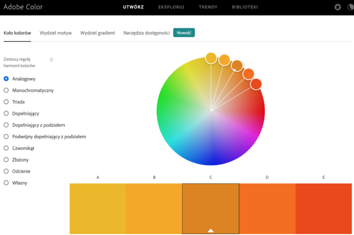
However, when using it, you should consistently adhere to the 60-30-10 rule, which enables you to create designs that are both visually attractive and coloristically balanced.
According to the rule, 60% of the palette should be a dominant color, 30% should be the secondary color, and the remaining 10% should be an accent color.
An important variable is also the relationships between colors and, perhaps the most important, the issue of white space.
Obviously, you can find innumerable examples of websites where the above design guidelines are violated.
Because as we will discuss later on, although website readability is essential, it is not the only value to be realized.
What is White Space on a website?
The concept of white space, sometimes used interchangeably with the term negative space, refers to white, actively blank space between the design elements (e.g., typography, images, icons, and buttons).
Naturally, the name “white space” is a bit misleading because the space being described by it does not necessarily have to be white. It can be any color.
The appropriate use of negative space makes the application interface much more friendly and promotes smooth navigation.

There are two types of negative space:
- Macrospace: the space between the main elements and the space between each part
- Microspace: the space between various user interface elements but definitely smaller.
From pure design, usability, and user needs-oriented perspective, negative space is crucial for:
- Website readability (e.g., promotes detail readability)
- Establishing of clear visual hierarchy
- Layout harmony, symmetry, clarity, rhythm, and balance
- Design lightness and aesthetics
- Communicativeness and comprehensibility of information
- Highlighting of elements significant from the usability and business perspective
- Communicating differences and relationships.
However, be aware that readability and high contrast are not the only expectations of today’s web application users.
Color psychology: the effect of background color on the application user perception
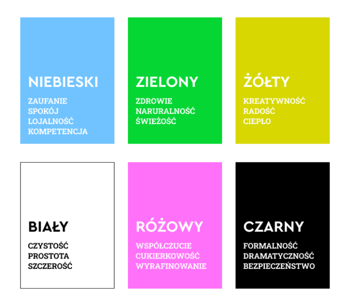
What is the meaning of colors? How to select colors? How do the designers utilize color psychology, color perception, and individual colors?
The keyword that very often appears in the context of the interface background color selection is “contrast.”
But, as Hall and Hanna cited above observe, it is generally true that strong contrast results in higher text readability.
Unfortunately, an issue rarely raised is that the relationship between the website text and background color combination and readability is not so obvious at all.
According to the authors, colors are used on websites for much broader goals than just to maximize readability.
Colors improve website aesthetics and affect the user’s emotions.
This leads us to the key issue of the effect of colors on perception discussed in the article “The impact of colour on Website appeal and users’ cognitive processes.”
Its authors, Nathalie Bonnardel, Annie Piolata, and Ludovic Le Bigot, have made the issue of the appeal of applications to users, frequently marginalized by focusing on functionality, the starting point of their studies.
Focusing exclusively on website functionality may result in a negative first impression with numerous (short- and long-term) consequences.
The user can leave the website or abandon the cart based solely on negative feelings and can tell others about their negative emotions.
Colors are significant for those reactions.
To answer the question of what emotions colors evoke in the users, the French authors conducted two experimental studies.
In the first one, they examined homepage colors preferred by designers and users.
Based on preliminary results, they selected three colors (blue, orange, and gray) used in the second study investigating color in relation to the entire website.
The researchers used both subjective and objective metrics to measure the impact of colors, analyzing user ratings and their navigation within the website and the information they remembered.
According to the research hypotheses, website users react differently depending on the explored page color, and webpage colors affect user behavior and cognitive processes.
Three data types were analyzed: data related to website navigation to collect specific information, the information remembered and retrieved by the users, and user ratings.
According to the French authors, the importance of visual perception for Human-Computer Interaction remains largely uninvestigated, and a lot indicates that ignoring the emotions evoked by colors can impact many issues.
For example, it can influence the conversion rate, sales volume, customer loyalty, and their inclination to spontaneously recommend and give positive ratings.
In their opinion, the dominant approach in which ergonomics issues have been put first in design should be reconsidered.
In addition to focusing on the users’ cognitive abilities and perceptual and motor skills, the designers should pay more attention to the emotions evoked by the system interactions.
The meaning of color and color psychology and its findings can help you achieve this goal. In particular, if you want to create websites evoking desired emotions.
Also, the HCI sciences increasingly investigate system interactions on three levels: knowledge, operation, and emotional reactions.
Usability has become only one of the system features, and the designs must also meet the need for fun, pleasure, and aesthetics.
Studies show that apart from functional features, interactive systems, and interface elements must be perceived as communicating emotions.
All the more so that the first user impressions are construed within 50 milliseconds and tend to stabilize over time.
They enable the users to create an aesthetic impression about the website, which affects their subsequent navigation.
Color can potentially affect your perception, emotional reactions, and behavioral intentions.
The literature on the subject frequently distinguishes between utilitarian emotions and aesthetic emotions. These two types of emotions result from the evaluation of environmental information but have different functions.
Utilitarian emotions, such as anger or fear, perform an adaptive function. Aesthetic emotions are not related to the need to satisfy life's needs.
Both types of emotions differ significantly in terms of agitation experienced and behavior orientation.
According to the authors, emotions should be considered information processing systems.
Cognition allows you to interpret the world and give it meaning, while emotions have a more evaluating character, attributing positive and negative values to the environment.
What’s more, emotions and affections influence cognitive functioning.
For example, positive emotions:
- Stimulate thought processes
- Boost creativity
- Facilitate performing difficult tasks
- Have a positive effect on the flexibility of thinking and perception
- Increase tolerance to difficulties and imperfections.
According to color psychology, attractive systems are perceived as better functioning and lead to better performance and user results.
Aesthetic emotions, providing well-being, play an important part in determining the length of website visits, the character of information, and the extent to which the information is remembered.
The results of the second study revealed that colors determine the manner of web application-user interactions. The significance of color is indisputable.
The researchers also found that the sense of color harmony and website colors have an impact during navigation and also following the navigation in complex activities such as creating written texts containing the information obtained from the website.
Therefore, the choice of website background cannot be dictated merely by the desire to provide better readability. It must also take into account the emotional reactions the background color can evoke, especially if the designers want to go beyond the conventional white or dark background scheme.
Website: its background colors and the effect on the user perception
Richard H. Hall and Patrick Hanna cited above, devoted their entire article to discussing the impact of the website background and text color combination on readability, retention, aesthetics, and behavioral intentions.
To what conclusions did the analyses and studies lead them? Is the website color important?
The problem with the opinions expressed on the issue of background, contrast, and color schemes is, to a large extent, entangled in something that could be called “research debt.”
Namely, a large part of the studies of readability comes from the period when displays were less effective in terms of luminance and luminance contrast, which has proved to be an important factor influencing the readability of font and background color combinations.
More recent research has determined that readability is also influenced by the following:
- Display type and technology (e.g., LCD)
- Context: mainly ambient brightness
- And, above all, color combination.
Studies have shown a general tendency that manifested itself in all color combinations. The higher the luminance contrast, the better the readability test results.
A very important conclusion with practical relevance is also one regarding a frequent mistake made by the authors discussing the issue of the relationship between background, color schemes, and readability.
Authors often mistake hue contrast for luminance contrast. Luminance is the “brightness” of color. Colors vary in terms of hue and luminance.
The issue of readability is further complicated by more variables, including the following:
- Color differences resulting from the browser and operating system effect
- Font type
- Color combinations: especially from the perspective of their aesthetic impact, aesthetic pleasure, and aesthetic emotions they evoke
- General color preferences: colors with short wavelengths (blues and greens) are considered more pleasant than colors with long wavelengths (reds and yellows).
Apart from the review of the selected literature on the subject, the biggest asset of the article by Richard H. Hall and Patrick Hanna is the discussion of their own studies, which, taking into account all methodological reservations (the participants were students), enabled the authors to draw some practical conclusions.
These are the following:
- On websites where retention and readability are the main focus, it is recommended to use a combination of black (font) and white (background)
- Keep in mind user habits: if a given color combination is a strong convention in a particular context, violating it should be avoided
- Readability affects the perception of a website as professional; therefore, special attention should be paid to it on websites where professionalism is an important part of the image
- On commercial websites whose main purpose is sales, aesthetic factors, and buyer behavior are highly correlated; therefore, consider using chromatic (color) text and background combinations.
The effect of website background color on the user perception. Summary
- Colors and their combinations evoke customer and user emotions and strongly affect the assessment, behavior, reactions, motivations, memory, and ratings of digital products.
- Colors affect whether the users consider a given application aesthetic attractive and pleasurable.
- The users believe that attractive things work better, even if, in the functional sense, they are not much different from less visually appealing products.
- Colors arouse attention and suggest importance, status, role, function, position, and action.
- In web and mobile applications, colors enable you to create a visual hierarchy, support desirable interactions and navigation smoothness as well as suggest actions and their results.
- Color also plays an extremely important role in the issues of Accessibility, Usability, and Desirability.
- A combination of dominant and secondary colors greatly impacts the user's impression.
- The selection of the application user interface background involves the issue of website readability, easiness of scanning, accessibility, use cases, and contexts of the application use.
- The selection of background color should follow the content principle. If verbal content predominates on the page, requiring reading or header and paragraph scanning, a light or simply white background is a better solution.
- The less complex and extended the interface, the darker the background color can be.
- Chromatic colors increase the likelihood of website reception as visually pleasing and stimulating to buy. Therefore, it is good to be aware of what attracts the customer's attention the most and what the favorite color palette is.
- Empirical studies (mainly related to color psychology and expressed in the color wheel) show that the relationship between the text and background colors is not obvious.
- Focusing on website functionality may result in a negative first impression which has numerous consequences.
- Website users react differently depending on the explored page color. Webpage colors affect user behavior and cognitive processes.
- Usability has become only one of the system features, and the designs must also meet the need for fun, pleasure, and aesthetics.
- Website colors have an impact during navigation and also following the navigation, and every average customer is susceptible to them. Colors evoke certain emotions and quite often constitute a “business card” (e.g., of online stores). Therefore, when selecting background colors, remember what color psychology and color theory have to say about their impact.


