We have been wondering how to improve product pages in e-commerce for some time. Previously, we described patterns worth considering when designing an online store.
Today, we'll discuss optimizing the user experience on an online store's home page, category page, and product listing page and show some design examples.
These are the key areas where fatal mistakes are made, and they are essential to the effectiveness and competitiveness of online stores. Therefore, this issue is crucial.
Are you interested? We hope so! In any case, we invite you to read it.
User experience in e-commerce
According to Business Insider analysis and data, e-commerce in Poland was driven by the Sunday trading ban in 2019. In 2020, e-commerce grew because of the pandemic.
Thanks to these trends, Poland had nearly 45,000 online stores in 2020. It's a tremendous amount.
The e-commerce market situation in Poland is just an example; there are around 26.5 million online stores worldwide, and the USA accounts for 14 million (as of 2023).
What does that mean? It means a problem. Not just for online store owners, who are facing more competition. It's also a problem for users and customers who receive more offers.
And, as we all know, once a certain threshold is crossed and a situation of excess occurs, we're faced with an oversupply.
The offer, price, speed of order processing, convenient shipping methods, and safe and easy payment attract customers. It's true. However, other factors are increasingly encouraging people to buy.

The more critical factor is how website visitors interact with a store's interface, how they experience the path to purchase, and what user flow the store can guarantee.
The method of purchasing, speed, and ease of buying determine success. The online shopping experience is supposed to be effortless and satisfying in many ways.
The buying process can't be a source of uncertainty, frustration, or cognitive friction. We should remember that the usability of an online store means matching the functionality, aesthetics (visual appeal), and accessibility to customers' expectations, habits, and needs.
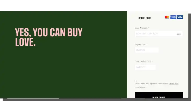
Looking at the e-commerce user experience from the usability and UX optimization side, we can distinguish four critical elements. In addition to the home page, these are the pages that make up the so-called path to purchase. In this path, some people distinguish the shopping cart and payment process separately:
- Category page and product listing
- Single product page
- Shopping cart and payment pages
The importance of these pages stems from the following:
- Generated traffic
- Increased conversion rate
- Generated sales
- Improved credibility and trust
- Enhanced loyalty
- Induced recommendations and ratings
- Sense of security
The e-commerce sales volume is also affected by the following:
- Length and intuitiveness of the purchasing process
- Quantity, adequacy, and structure of categories
- Microcopy
- Location and type of menu
- Search engine, sorting, and filtering results
- Relevance of category labels, subcategories, and product names
- Regular UX audits, A/B tests, usability testing (and other research methods)
Therefore, e-commerce is a huge "debtor" to user experience. Competing in e-commerce is challenging without regular, multi-dimensional, multi-faceted research and optimization work, especially since the benefits of applying UX research and patterns are becoming more widely recognized.
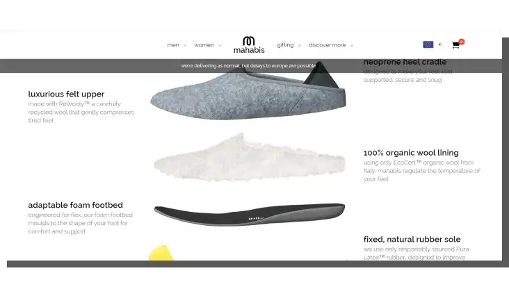
So, how do we design the home page, category, and product listing pages?
Home page design in e-commerce
"Home pages are the most valuable properties in the world. Every year, companies and individuals spend millions of dollars on a space that doesn't even exceed a square foot. A home page is the face of your company turned to the world."
This is how Jakob Nielsen wrote about home pages 20 years ago. Admittedly, he meant it in the general sense, but this statement is even more true in e-commerce.
The article "Top 10 Guidelines for Homepage Usability" contains many valuable comments that are still relevant and useful.
Alright, skeptics. Maybe the words of the NN Group founder sound slightly exaggerated, I agree, but this is just a matter of rhetoric, not facts. Right?
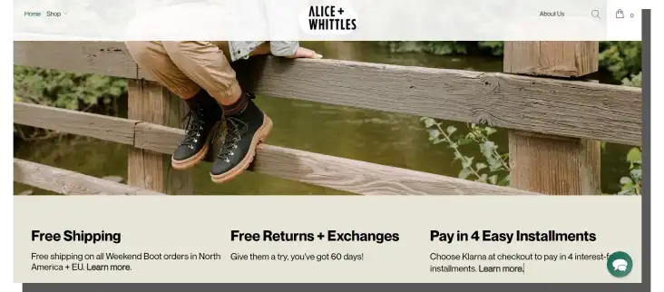
Nielsen's insightful remarks still hold. They're even highly relevant. The role of UX (user experience) on company websites and online stores has become crucial.
Today, no online store that wants to grow or maintain its position can ignore user experience optimization.
The relevance and importance of home pages in e-commerce are emphasized not only by NN Group researchers. Their role is recognized by designers and analysts but also by customers themselves. We can arrange their tips, insights, and recommendations into an interesting list.
The e-commerce home page has the following functions:
- Informational function (shows the profile, range of offers, availability of products, method of operation, and paths to reach)
- Positioning (in terms of SEO) and branding function (in a marketing sense)
- Sales function (it's a kind of lure)
- Image and representational function (it's responsible for the first impression effect)
- Introductory function (announces and highlights the content such as main product categories, bestsellers, and currently promoted products)
- Engagement reinforcement function
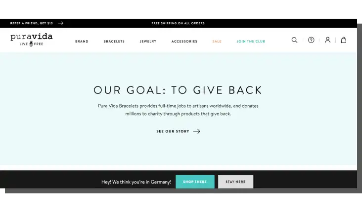
The e-commerce home page should have the following characteristics:
- Regular updates
- Clear, transparent, and minimalistic design in the good sense of the word
- Guarantee the desired user flow
- Be logical, in line with the design conventions prevailing in e-commerce, and a given industry
- Easy to navigate
- Simple
- User-friendly and useful
- Provide fast loading
All of that sounds right, although it's not very specific.
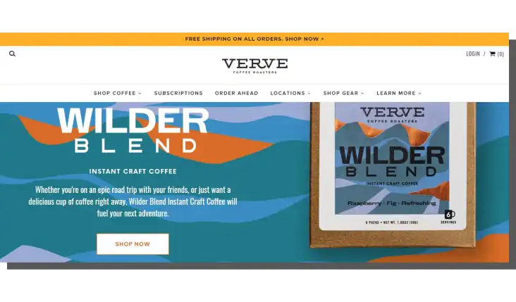
How to achieve such effects on the home page of an online store?
Let's start with the location of some key elements.
Best practices regarding the location of home page elements:
- Navigation at the top or left side of a page
- Special offers at the top-left side of a page
- Search bar in the top-right corner
- The value proposition on the main banner in the middle of a page
In terms of the presentation of elements or functions, it's essential to:
- Increase the accessibility of categories; place them not only in the menu (this is especially recommended in mobile applications).
- Adjust the size and typeface fonts — slogans, headlines, and labels should be described in appropriately large text, contrasted with the background color.
- Highlight special offers by using color, shape, and size of elements and text (e.g., CTA).
- Reduce the number of categories — the optimal number is 7, and there should be no more than 12.
- Personalize the offer for regular and returning customers — it should be tailored to purchase history and preferences.
- Clearly communicate terms and conditions, rules, policies, and methods of operation (e.g., regarding returns, costs, time, and method of shipment).
- Use high-quality images for most of the main categories. They should be consistent in technical sense and presentation. They should be proprietary and not from a manufacturer, therefore varying wildly in aesthetics, quality, and presentation.
- Follow the rule "most important products first," which means placing them above the scroll line (above the fold).
We recommend reading NN Group's article "Scrolling and Attention," which clarifies that users don't like to scroll through pages and delve into their content. What they're looking for should be given to them immediately and directly.
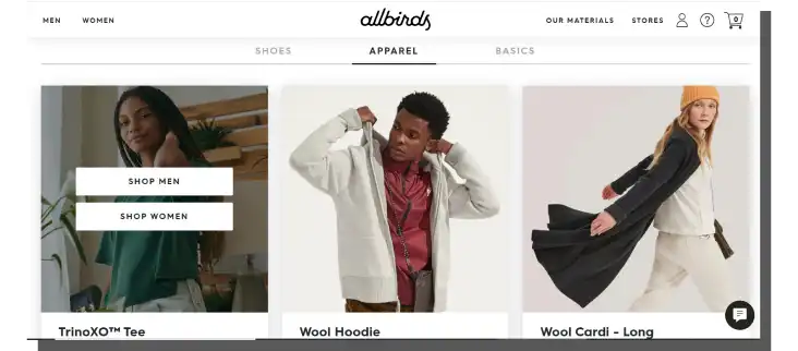
When designing navigation and searching, we should pay special attention to the following:
- The number of clicks leading to the destination — their number should be small, and the path should be as simple, logical, and intuitive as possible.
- The supporting hints and auto-complete function.
- Adapting the menu type to the nature of the store (complexity and number of products) — in the case of very complex, large platforms, megamenu works quite well.
- Matching search engines and filtering to customers' needs (which should be learned directly through research).
- Adequate and comprehensible navigation labels — the division into categories must be understandable and not raise doubts about what products we find by clicking on a link with a given label.
And here's a little warning!
If we don't find a product in the category where we were looking for it, we'll sooner assume that it isn't in the online store instead of looking for it in other categories.
We should also remember that people often use the search box when they know exactly what they want to find (such as a specific model). If they're looking for a product in a particular category whose features have yet to convince them, they're more likely to use the navigation within the category.
Interesting additions to these design guidelines are the recommendations featured in the article "UX Guidelines for Ecommerce Home Pages, Category Pages, and Product Listing Pages." Its author, Aurora Harley, points out, among other things, that an excess of information and elements on the home page severely limits its usefulness and communicativeness.
Her advice is simple.
According to Aurora Harley, the home page must first and foremost inform, present the product offerings, and allow users to start shopping. This is its overall goal, and the entire design thinking should be oriented around it.
Pages overloaded with information, seeking to put a large amount of it in a small space, lose their persuasive function. Instead of giving the impression of a place capable of meeting shopping needs, they give the impression of a place that hinders shopping by overstimulating a customer.
It's also essential to recall Harley's very valid point — the visual mess, the excess, is often associated with poor quality.
So, the home page doesn't have to give the impression of being rich in products but of being relevant to the needs.
After all, customers rarely buy all the TVs, shirts, shoes, or drinks available in a store.
Okay, now we know how to design home pages, but shopping in online stores often doesn't start there. When we click on ads, we are usually immediately redirected to category pages. How should they be designed?
Category page design
Category pages are crucial sales tools. While home pages initiate sales, category pages make it happen. However, to have such a chance, it's essential to indicate their location.
First and foremost, a category landing page should be labeled very clearly and unambiguously.
Users of category pages need to know precisely where they are, which part of the store they are in, what options they have, and how they can achieve their goals (such as browsing products).
For this purpose, we should take care of the following:
- The readability of breadcrumbs
- Labels
- Headers
- Banners that clearly show the location
- An indication, verbal or visual, of the scope of a given category
Determining the scope is important because of the nature of category pages, which collectively present similar products. The TV category suggests that we visit a page with different types of TVs. The more specific category, however, is a matter of knowing store customers' preferences and perceptions of collections.
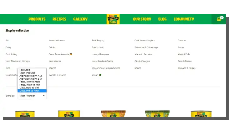
After all, TVs can be categorized by brand, diagonal, and technology (e.g., OLED). That's why the general category pages should quickly and clearly redirect to the product listing pages, where we will find offers specified according to the imposed criteria.
Product listing page design in e-commerce
We should remember that product listing pages are increasingly replacing category pages (also known as category landing pages). The reason seems clear: they shorten the path to purchase.
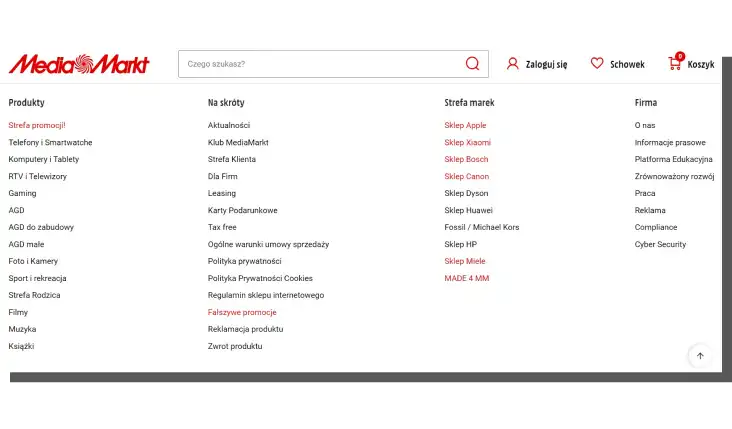
And here it's worth going back again to Aurora Harley's article. She writes, "The most successful mergers of category and listing pages were those that highlighted available subcategories separately from other filters, most often above the product listings. At the same time, offering filters so we can further narrow our search for a product with specific characteristics."
One of the more common design mistakes we find on these types of pages is leaving a customer without help.
The essential role of category and product landing pages should be to act as a helpful assistant for a user. An assistant responding to the following questions:
- What to find?
- Where to find it?
- How to find it?
- Why is it worth finding it?
We should provide hints and information in category descriptions, descriptions of individual filters, headers, product descriptions, and CTA buttons. This allows the customer to make decisions that narrow the choice (making it easier and faster).
To make our product pages more attractive, we can leverage social proof, such as star ratings. This will help us keep the online shopper on our page instead of prompting them to look for reviews on other websites.
While discussing the selection problem, we must examine how the product listings are presented. The number of columns and rows available is a tough nut to crack. Single-column layouts are standard, containing from a dozen to even several dozens of items. But grid-like configurations are not at all uncommon. They usually have three columns and a few rows.
Which of the options is more effective? There is no universal answer to this question. It all depends on the industry, quantity, type, nature of products, shopping habits, etc.
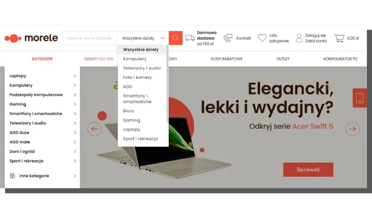
Some stores solve this problem by allowing online shoppers to change the view to a more optimal one and specify the number of items displayed.
Other problems in designing category and product listing pages
However, these are not all the design problems that must be solved when creating category and product listing pages.
Other issues include the following:
- Availability of convenient and anticipated filtering.
- Clearly indicating the difference between filtering (determines quantity) and sorting (determines order).
- The problem of the relevance of the results that filtering should provide — the number of available filters doesn't always translate into the quality of filtering.
- Consistency of product images — aesthetically, referring to quality, format, number of product views, methods of presentation, and style.
How information is presented matters. The online store should:
- Adapt the criteria, features, and information to the categories and subcategories (the category "TVs" raises different questions than the category "OLED TVs").
- Provide means of comparison — readability of similarities and differences should be a priority.
- Operate with product names that avoid alphanumeric designations; instead, we should use the language of features, attributes, and parameters.
- Use only the most relevant information for the customer about the product (regarding its adequacy, usability, and cost [including operational]).
- Maintain consistency in the presentation of information — each product should be described according to the same set of features, and the information should be provided in the same order and sequence.
Let's return one last time to Aurora Harley's article, which also discusses the problem of how to differentiate products.
We can differentiate products with the help of the following:
- Names
- Photos that clearly highlight the difference
- Indicating the range of product variants — size, color, compatibility
- Price display, discount rates, and deferred or installment payment options
E-commerce clients expect the store to present a product adequately to their needs and to provide as seamless as possible insight into its attributes and features.
The usability of an e-commerce website and user experience in e-commerce today means adapting the store's functionality to meet its customers' particular needs. Customers are increasingly prioritizing experience over price.
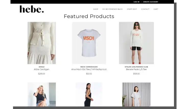
The shortened path to the list of products (now shortened from the home page and category pages, but also positions in search engine results) and the ability to effectively filter, sort, and compare selected products translates into higher customer satisfaction.
UX in e-commerce is often a method of making tasks faster and easier.
Let's summarize what a product listing page should contain.
Elements of a product listing page:
- Category name — lets online shoppers know where they are.
- Product images — photos that show how products look like.
- Prices — show how much products cost; it's worth displaying the price in more than one currency.
- Product descriptions — provide essential information about products and their features.
- Facets (faceted search) — a list of specific attributes that allow customers to narrow down the list of products and find what they need.
- Sorting — allows shoppers to sort products according to alphabetical order, price, or rating.
- Breadcrumbs — similar to the category name, breadcrumbs allow users to orient themselves on a site and provide an additional navigation option.
These are all the fundamental elements of product listing page design that our e-commerce website should have to provide the best user experience.
Best practices for product listing page design
Below, we present some best practices that will make our product listing page design stand out from the competition.
Make your product listing pages interactive and visually appealing
Our product listing page needs to stand out and engage the online shopper. To achieve this, we need to design interactive elements and visually appealing graphics that will keep our customers interested in our products.
We can enhance the user experience by carefully choosing the color palette, fonts, and layout or by adding helpful e-commerce widgets such as Google Reviews, sales notifications, mini-carts, product videos, etc.
Simplify searching
We emphasized the role of searching a couple of times in this article, but that's because it's a crucial functionality. It's essential to provide faceted search to enable customers to customize their searches according to their precise needs. Moreover, this will also help them to make purchasing decisions faster.
We should also ensure that customers find products where they expect them to be. Otherwise, they might assume the product is unavailable and leave the store.
Make product descriptions informative
Product descriptions should contain basic information about a product's features and purpose and provide customers with its benefits.
A typical product description should include product specifications, technical information, a sizing chart for clothes, and comparisons of similar products.
Provide customer reviews
Customer reviews provide social proof that increases the credibility of our products and sways customer opinions. They can be a deciding factor in making the decision to buy. Also, customers are more willing to purchase products proven and tested by others.
Make use of the live chat option
Providing the live chat option on product pages can be beneficial in addressing customers' questions as soon as they appear. It can make our communication with shoppers more efficient.
To help customers, we can provide an example of additional questions as prompts to start the conversation. Other than that, users should have complete control.
Personalize the user experience
By analyzing customers' previous shopping history and browsing patterns, we can personalize the experience to their needs. We can provide product recommendations on product pages to entice customers to buy more or offer complimentary products.
Additionally, based on the collected data, we can design targeted promotions that will be aimed at the specific needs of online shoppers.
Optimize SEO to rank higher in search results
SEO rankings are crucial for online store owners because potential customers usually find their way to the store through search results. To meet SEO recommendations, we should optimize headers, keywords, internal links, and descriptions.
Thanks to such activities, we can rank higher in search engines and attract more organic traffic.
Design guidelines for a home page, category page, and product listing page in e-commerce. Summary
- The offer, price, speed of order processing, convenient shipping methods, and safe and easy payment attract customers.
- It is increasingly important how the user interacts with the online store interface.
- The speed and ease of buying determine success.
- In e-commerce, we can distinguish the four most critical elements: the home page, the category and product listing page, the product page, and the checkout and payment page.
- Above all, the home page should be clear, transparent, and minimalistic in the good sense of the word.
- An excess of information and elements on the home page severely limits its usefulness and communicativeness.
- The home page must first and foremost inform, present the product offerings, and allow users to start shopping.
- Home pages initiate sales; category pages make it happen.
- Product listing pages increasingly replace category pages.
- The most successful combinations of category pages and product listing pages highlight subcategories that are relevant to the user.
- The primary role of category and product listing pages should be to act as a helpful assistant for a user.
- E-commerce clients expect the store to present a product that meets their needs and provide as seamless as possible insight into its attributes and features. This is why the design of product pages is so important.
- The shortened path to the list of products, filtering, sorting, and comparing selected products translates into higher customer satisfaction.
- When designing product listing pages, we should remember the best practices.


