
This is our problem today — how to design a price list. And to be more precise, we'll deal with the problem of designing a B2B Pricing Page. It's a serious problem that influences sales like no other.
Hence, it's easier to ask, "How to design a price list on a B2B website?" than come up with an answer.
Don't worry; we can do it!
While reading this article, you won't just learn about our suggestions, observations, or experiences. We'll also tell you about interesting recommendations of researchers from Nielsen Norman Group and show some Pricing Page examples.
One of the chapters from their perfect report, "B2B Website Usability for Converting Users into Leads and Customers. 3rd Edition," is dedicated to presenting prices on B2B websites.
So if you don't know but want to find out, then keep reading. Enjoy!
Why do companies and users need a Pricing Page?
This question seems rhetorical; however, it's not entirely for several reasons. First of all, you won't find a price list on every B2B website. Secondly, they're often available only on customer account panels. Thirdly, in some industries, both customers and sellers don't like "rigid prices." They prefer to negotiate them.
So, in unique situations, a separate page with a price list can end up not being used, or it will discourage customers if there's no option to negotiate or customize an order. In other situations, it's a great sales tool.
From the user's perspective, a Pricing Page allows them to confront their expectations and capabilities with an offer.
It also enables them to make the following comparisons:
- Internal (between offered bundles, special offers, modules, etc.)
- External (between offers of other companies).
Thanks to that, users gain the following:
- Market understanding
- Control over the selection process that is full and not requiring effort
- Feeling of accessibility
- Perception about the attractiveness, conditions, and scale of an offer.
Transparent Pricing
From the company's perspective, the matter is a bit more complex because creating a price list and making it public is always more or less risky. For example, it may result in dumping (price discrimination) by the competition.
Or an undesirable reputation of a company that is expensive, cheap, or dishonest may stick to you. It's simply dangerous. Especially when a company doesn't have traits with which it's associated.
Reversing such beliefs and turning them to your advantage is expensive, tedious, and lengthy, and it doesn't always end with a happy ending.
Reasons for hiding prices
One of the more serious reasons for hiding prices is also the character and scale of the business. Just as one of the features of the B2B industry is a specific hierarchy of importance.
Companies, especially large ones, even though they don't underestimate prices; they pay more attention to the value they gain by buying something. Due to that, the phenomenon of customizing a B2B price list is common and expected.
Moreover, some orders, purchases are so complex that presenting them as a universal, simple, and affordable price list is impossible.
The value of signed contracts, their duration, rank, and the responsibility behind them mean that they're negotiated and signed in an entirely different way. The business culture prevailing in a given industry also has its significance.
Thus, while creating a website that includes a Pricing Page, you need to account for the nature of an industry (formal and informal norms prevailing in it), the size and potential of a company, and the needs of its clients.
So, are there companies or industries where a Pricing Page is simply unnecessary? It may seem so until you realize that a price list doesn't only have an informative function. It also has important psychological and persuasive functions. We'll return to that in a moment.
Benefits of revealing prices
Even if a price list will be treated demonstratively, it's still essential for making a decision. It allows clients to familiarize themselves with an offer, position themselves and positively approach the company. The word "approach" is crucial here.
A company with a price list on a website is seen as more credible (a desirable trait that increases sales), user-friendly, accessible, and helpful.
It's also a signal indicating that the price represents a certain value. A price list is an indicator of a company's integrity; it increases trust in it. Hiding prices arouses distrust and suspicion. Customers, users want to feel informed; they like to have problem-free access to crucial information, and the price is undoubtedly one of those.
Making it difficult for them to access essential information is self-detrimental. And this is not just our opinion but also that of researchers from Nielsen Norman Group, who studied a few hundred B2B websites, conducted several dozen studies, and they strongly believe in this thesis.
However, before we move on to creating a price list, a Pricing Page, we must determine all typical obstacles that can encourage customers to buy. Their determination will be helpful in, among other things:
- Establishing a price (designing B2B prices is more of a process than a one-time action resulting from calculations)
- Creating a FAQ list (Frequently Asked Questions)
- Defining terms of purchase of products and services.
Fear, Uncertainty, Doubt (FUD)
Speaking of the dilemma — to have a price list or not to have a price list? — it's also worth paying attention to yet another problem.
The lack of a price list may be an excellent base for FUD activities, that is, actions that deliberately evoke negative feelings.
Even if we eliminate the possibility of unfair competition activities, the absence of a price list can be a source of unnecessary, harmful speculations, fears, doubts, and beliefs.
People are very economical in terms of their cognitive actions. They will be quick to attribute a trait such as expensive or cheap, but they won't send an inquiry to verify such a conviction.
All the more so that the appearance of a website (the first impression effect) will be enough for them to determine whether a company is too expensive or cheap. Whether it is credible or arouses caution. If you add the lack of a price list to these negative feelings, you have a ready recipe for a sales flop.
Fear, uncertainty, and doubts are very negative emotions that strongly discourage the purchase of products or using a service.
Customers don't like to risk or lose. And as you might know from social psychology, the human need to maintain a state of possession (aversion to loss) is stronger than the need for profit.
That's why it's necessary to create a list of all possible factors causing negative emotions.
Prices and lists of prices arouse many questions that a Pricing Page should answer. Its primary function is to reduce fear, uncertainty, and doubts. Unless you want the customers to be afraid to ask about costs because they already think you are too expensive. Or maybe you want them to stay uncertain whether they can buy everything they need with their budget. Or you want them to doubt if you can beat the price of another company that they discovered just now.
Price — definition, function
You probably rarely wonder about what a price is. There are a lot of definitions, but you should be only interested in those that allow you to design a Pricing Page better. So, let us present some of those.
We will let Warren Buffett speak; he has long been convinced that price is the cost of the value we want to acquire. It's true! However, it's also true that the value needs to be higher than the price.
If that happens, the purchase is a matter of time. It's also true that products and services are never expensive or cheap; they become like this after comparison, after putting them in context.
The above findings are crucial for Pricing Page design. But we'll tell you more about it in a moment. Let's go back to discussing prices.
When you encounter a price, you react to it automatically, and almost right from the start, you can determine (in most cases) whether it's high, low, or just right. You create a reference price, a perception of how much something should cost.
A reference price is significant because it creates a reference point. One of the methods for dealing with the phenomenon of a reference price is price anchoring.
Price anchoring or anchoring heuristic
Context and comparison determine whether something is expensive, cheap, or just right. The same product can be sold in two different places, and depending on the status of the place and pricing context, it will be considered expensive or cheap. Don't you believe us? Here is a simple example.
A 0.33 ml bottle of water for $15, is that a lot or not? It may seem like a lot. However, it will be very expensive in a poorly stocked store and very cheap if you buy it in an exclusive bar where it will be the cheapest item on the menu.
To change a perception of a price, you don't need some special marketing tricks. All that it takes is a change of one piece of information. In this case, it is the status of the place you're making a purchase in low status versus a very high one.
Your expectations and perceptions immediately change. The first piece of information changes the customer's attitude, and by manipulating it, you can change their attitude toward a price, also on a B2B Pricing Page.
This first piece of information is called an Anchor because it influences the subsequent prices. This practice has been used for a long time, and you can encounter it in both online and stationary stores, on B2C Pricing Pages and B2B Pricing Pages.
How to lower prices without changing their amount
You can increase the attractiveness of a price and improve your pricing strategy with a few techniques.
The most popular ones include the following:
- Dividing a price into components, communicated in subsequent steps
- Offering installment payments
- Presenting daily, monthly, and annual fees or in the form of a different comparison
- Comparing it with a higher price
- Redirecting the attention from numerical values to values related to quality, functions, and benefits
- Using full numbers
- Avoiding the use of currency symbols (e.g., 12 instead of 12 USD).
Anchoring and the above techniques are often used on websites with a B2B Pricing Page because of their effectiveness. Their use, in many cases, makes it possible to increase sales effectiveness from a few to several percent.
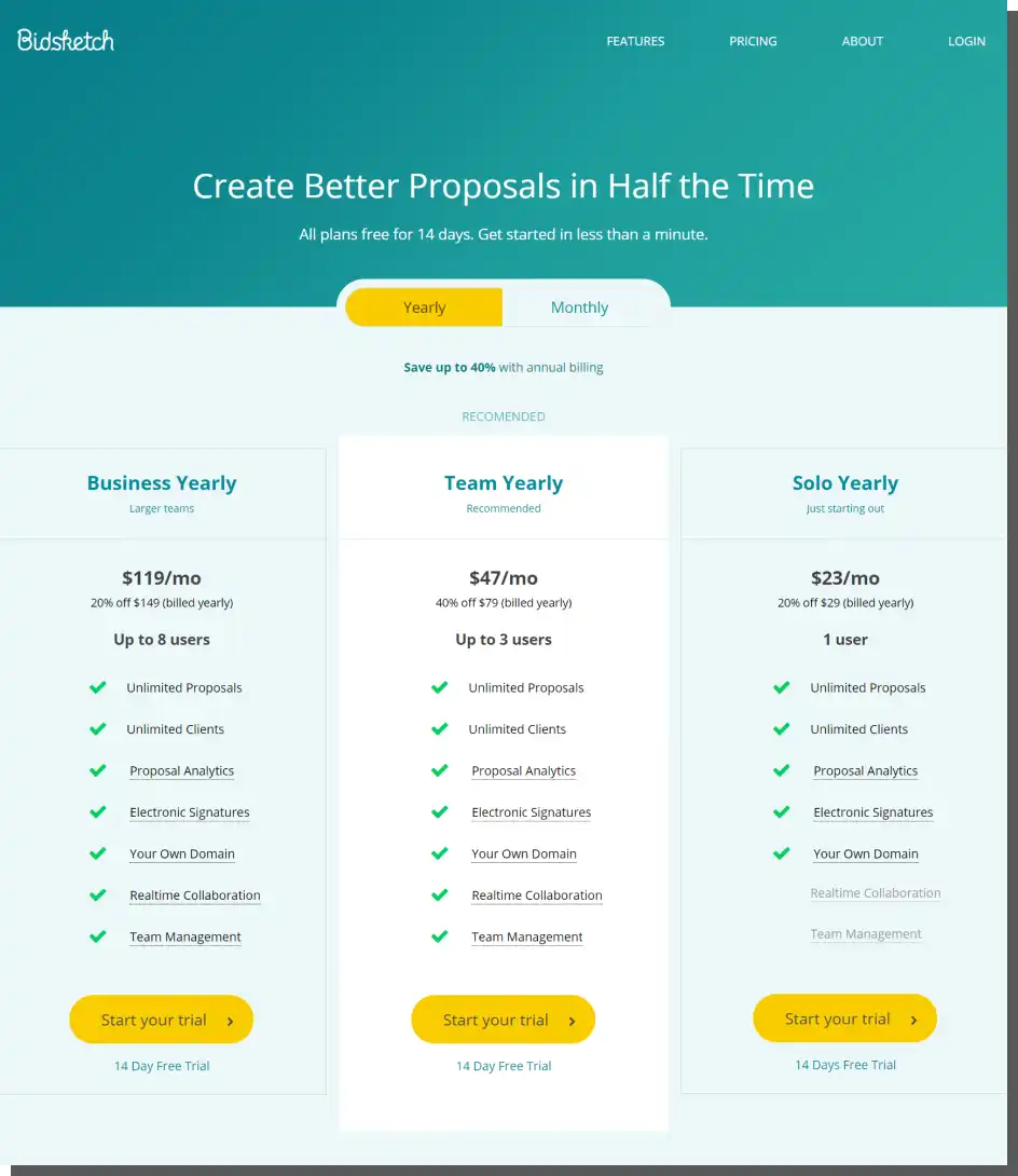
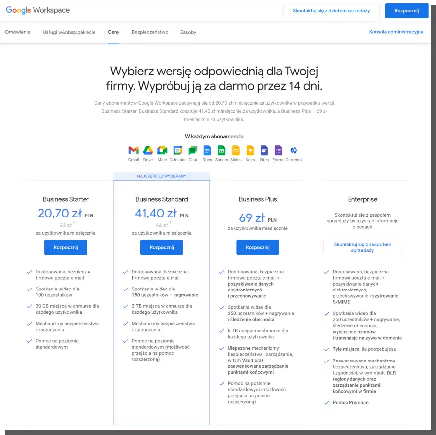
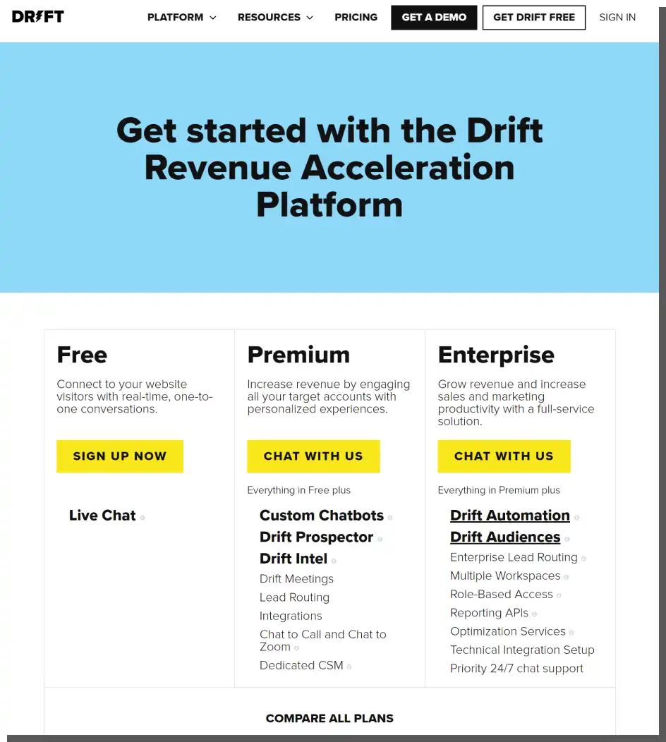
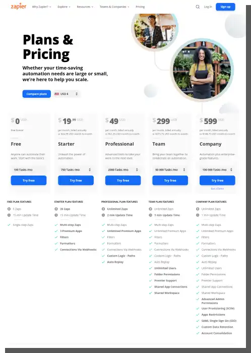
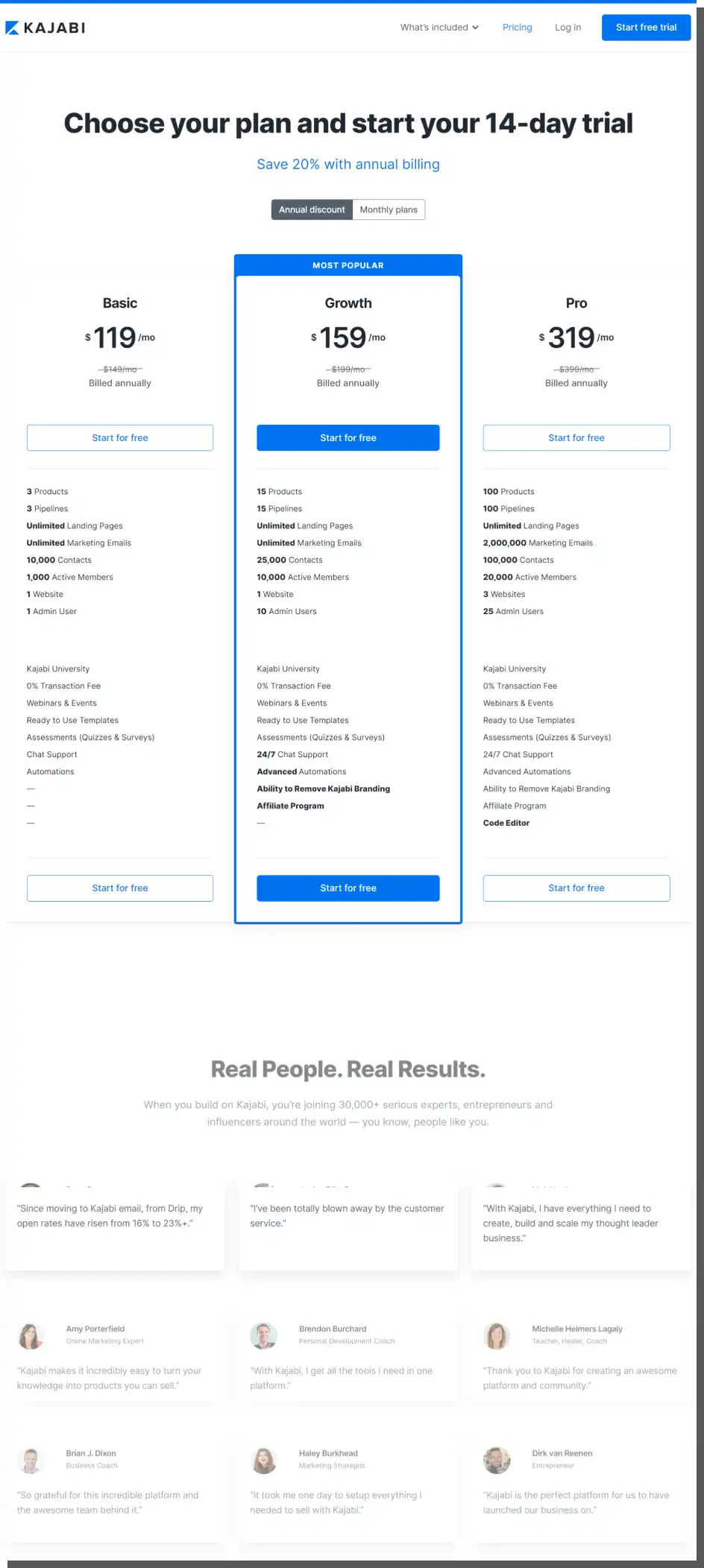
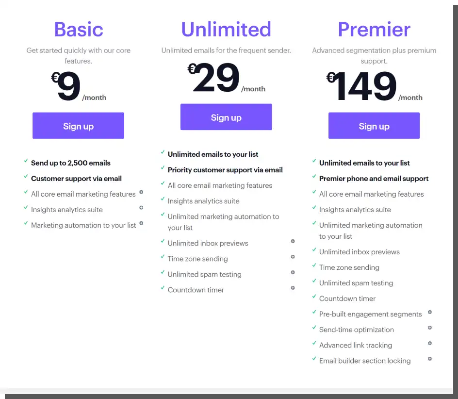
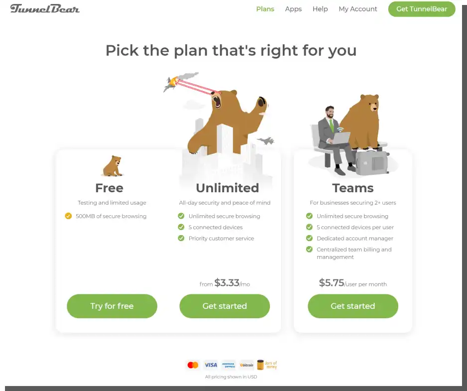
Typical elements of a Pricing Page
Although the design of a B2B Pricing Page is always a matter of individual needs and goals, you should include a few typical elements that will increase its effectiveness.
Namely, the following:
- Cards and tables
- Names of pricing plans, product categories, and services
- Illustrations, icons, and symbols of pricing plans, product categories, and services
- A list of functions, traits, and properties
- Marking, highlighting a pricing plan which is "recommended," "top-selling," "popular"
- CTA buttons
- FAQ
- Credibility indicators (e.g., testimonials)
- Calculators, configurators.
Each of these elements plays a significant role in sales and is a separate collection of design problems. So, let's take a look at them. Here we present a handful of our recommendations, best practices, and advice, enriched by knowledge from reading the Nielsen Norman Group report.
The design of Call To Action (CTA) buttons
Their size and content are the biggest problems. As a rule, these buttons should be big enough to stand out visually. They should differ in size and color and simultaneously be small enough not to evoke negative impressions in the user.
The intrusively large CTA buttons are seen as aggressive and arouse reluctance. In extreme situations, they can even prompt the user to leave a site. The contrast should be clear and tactful.
The problem of their content largely boils down to the following:
- Persuasive potential
- Logic and understandability.
The action that the button persuades the user to perform should align with the result of the said action. The button "Buy now" should initiate the purchasing process. "Try for free" should start the process of creating an account; it should result in gaining access to the tested tool. The text on a CTA should be as simple, unambiguous, understandable, and obvious as possible.
Names of the compared pricing plans, product categories, and services
The primary function of names is distinguishing, giving identity, building an image, or suggesting the use, traits, functions, capabilities, character, and content. In price lists, names are often mainly used to show distinctiveness, fragmentation of an offer, and differentiation.
Unfortunately, a widespread mistake is using abstract names which don't properly communicate differences. For example, what is the difference between a "Standard package" and an "Economical package"?
You can see the difference only after comparing their content, but it should be suggested with a name. The name of a package is supposed to speed up the decision-making process, not prolong it. It is supposed to make it easier, not harder.
Therefore, when naming the different variants, it's better to use names that indicate the following:
- Typical ways of use (e.g., individual vs. teams)
- Typical usage situations (e.g., at home vs. in the office)
- Typical users (e.g., SMEs vs. corporations)
- Common problems (e.g., for minor home repairs vs. use for special conditions).
In other words, the name should suggest the following:
- Target audience of the offer
- Capabilities of the offer
- Results of the offer.
Frequently Asked Questions (FAQ)
Let's repeat it again. Every purchase is a source of fear, uncertainty, and doubt. It arouses many questions requiring immediate answers.
That's why every B2B Pricing Page should have a section for Frequently Asked Questions to counteract the appearance of negative emotions and attitudes immediately.
An FAQ section should be extensive enough to exhaust the full scope of typical problems. By the way, it's worth noting that the bigger it is, the more you should think about the structure of the offer and the price list.
A large number of questions suggest that it's hard to understand and unintuitive instead of being a clear signpost, it is a wordy or empty information board.
Underestimating problems, considering them obvious, is a wrong approach. The most Frequently Asked Questions are an expression of the pro-customer approach of a company. They make it possible to express what can't be said in a short, tabular form.
The most recommended solution is to place an FAQ section just below the cards, tables containing prices comparison, package functions, and product descriptions. It enables customers to quickly access a piece of information that is important to them at a given moment and may determine the purchase.
Visual presentation of a price
Just like CTA buttons, the presentation of a price (font, size, typeface, color, formatting) is a matter of intuition to a large extent. The price should be presented clearly, but not by exaggerating or camouflaging it. That's why it's also important to properly organize prices, for example, in the form of a pricing table.
Both attractive and less attractive prices should be communicated with the same honest intention. Attempts to increase their attractiveness or hide their unattractiveness are usually quickly recognized and deemed dishonest actions that don't inspire trust.
We should also say that most Pricing Pages, at least in the case of subscription plans, highlight the plan that the users may find the most appealing (or, rather, the one that the owner of the product would like them to sign up for).
The problem of duplicated information
You can often encounter this situation on a B2B SaaS Pricing Page. Individual packages are an extension of the basic package. Hence around 60% of information is duplicated. In such situations, the presentation is crucial.
Instead of learning about one option and its key features, the customer needs to look at all of them to understand the difference in detail. The difference shouldn't be communicated as an increment but more of a change in capability.
It provides an opportunity to show the difference more quickly and simply (so the user can see and understand it). After all, this is all about communicating it.
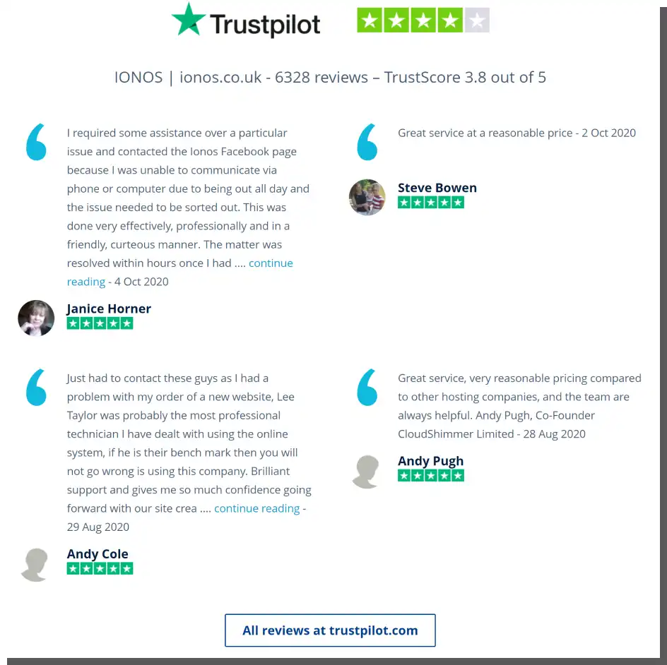
Credibility Indicators
A Pricing Page should contain logos of companies, awards, certificates, fragments of testimonials, few-sentence reviews, user ratings, and several other tools and techniques increasing credibility.
The reduction of negative emotions is one of the effects of a properly designed page of this kind. Clients need positive reinforcement, especially when they analyze the price list and make a purchasing decision.
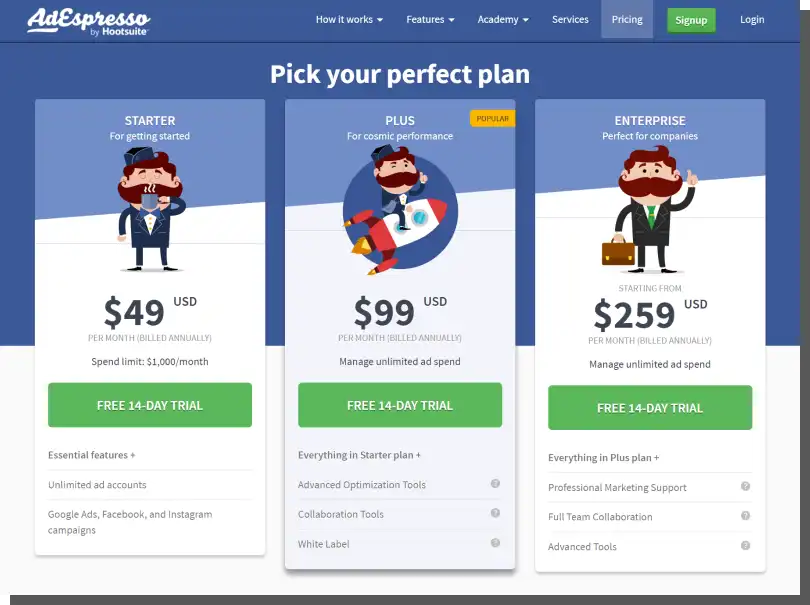
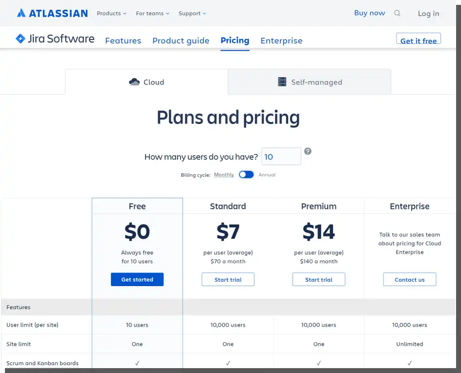
The optimal number of packages
A paradox is a well-known phenomenon, both to psychologists and professional vendors. Having too many options to choose from doesn't support sales. And having too few choices also doesn't do it. Four variants are too many, two is not enough, and three is precisely the amount that people statistically most often expect.
The number of packages, variants, and pricing options often shows the difference in capabilities and increases the sense of having a choice. It also allows the customer to discover their own expectations. Contrary to what you may think, clients, including B2B customers, aren't always sure what they need.
The choice of three pricing tiers guarantees less cognitive effort, speeds up decision-making, and allows them to discover their lowest, minimal, and highest, maximal expectations. This usually results in the selection of the middle option, which is the most frequently chosen.
Contact channels
The FAQ section, although very important, can't answer more specific, individual questions that can appear during the analysis of the price lists.
Encouraging customers to contact you and making this contact as convenient (omnichannel) as possible is an excellent way to make the B2B Pricing Page maximally converting.
Contact forms, chatbots, and CTA buttons are the most popular solutions which should find their way to this subpage.
Free Packages and Trial Periods
The possibility of testing a tool (especially in the case of SaaS offers) isn't only a sales technique but also a certain standard that customers expect — or even demand.
By involving the customer in the product or service, it's much easier to sell access to it after the trial period.
Also, increasingly more companies decide to offer trial periods not only in a basic version but also in a more advanced one.
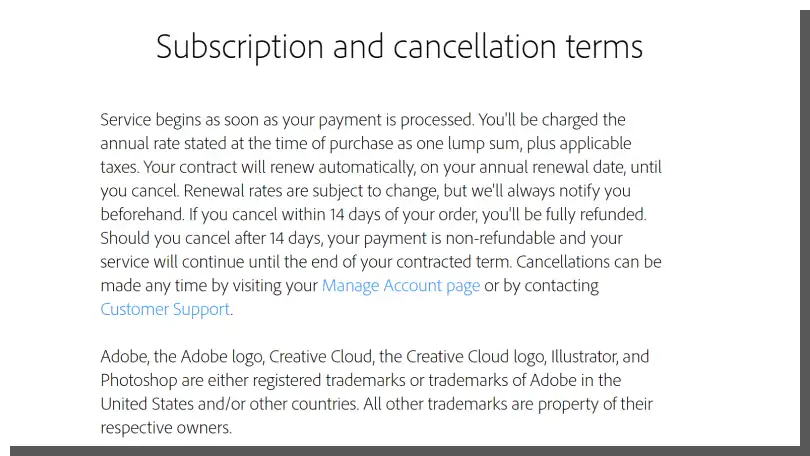
Unfortunately, many companies saw this kind of solution as an opportunity to use dark patterns, resulting in huge frustration and resistance from customers. It also was a reason for the appearance of an opposite trend. Today pro-customer behavior involves giving access without the need to provide a credit card number.
A best practice is also moving away from automatic cost charging. Today, an acceptable solution is asking a customer if they're interested in renewing the service and obtaining their consent.
Therefore, the price list should inform the customer in detail, clearly, precisely, and preferably in a step-by-step formula about the following:
- What do they pay for?
- When will they pay?
- How much will they pay?
- When and how can they resign?
The order of the presentation of packages, plans, variants
From the cheapest pricing tier to the most expensive one? Or maybe the other way around, from the most expensive to the cheapest? You can find a considerable amount of industry literature and research defending both approaches. The arguments for one solution and the other are quite strong. We won't settle this dilemma.
We think it can be resolved not based on universal theories but on practice. You should decide which order of presentation to choose based on the A/B test results. Because only they can decide whether a given variant, in your case, results in a higher conversion rate.
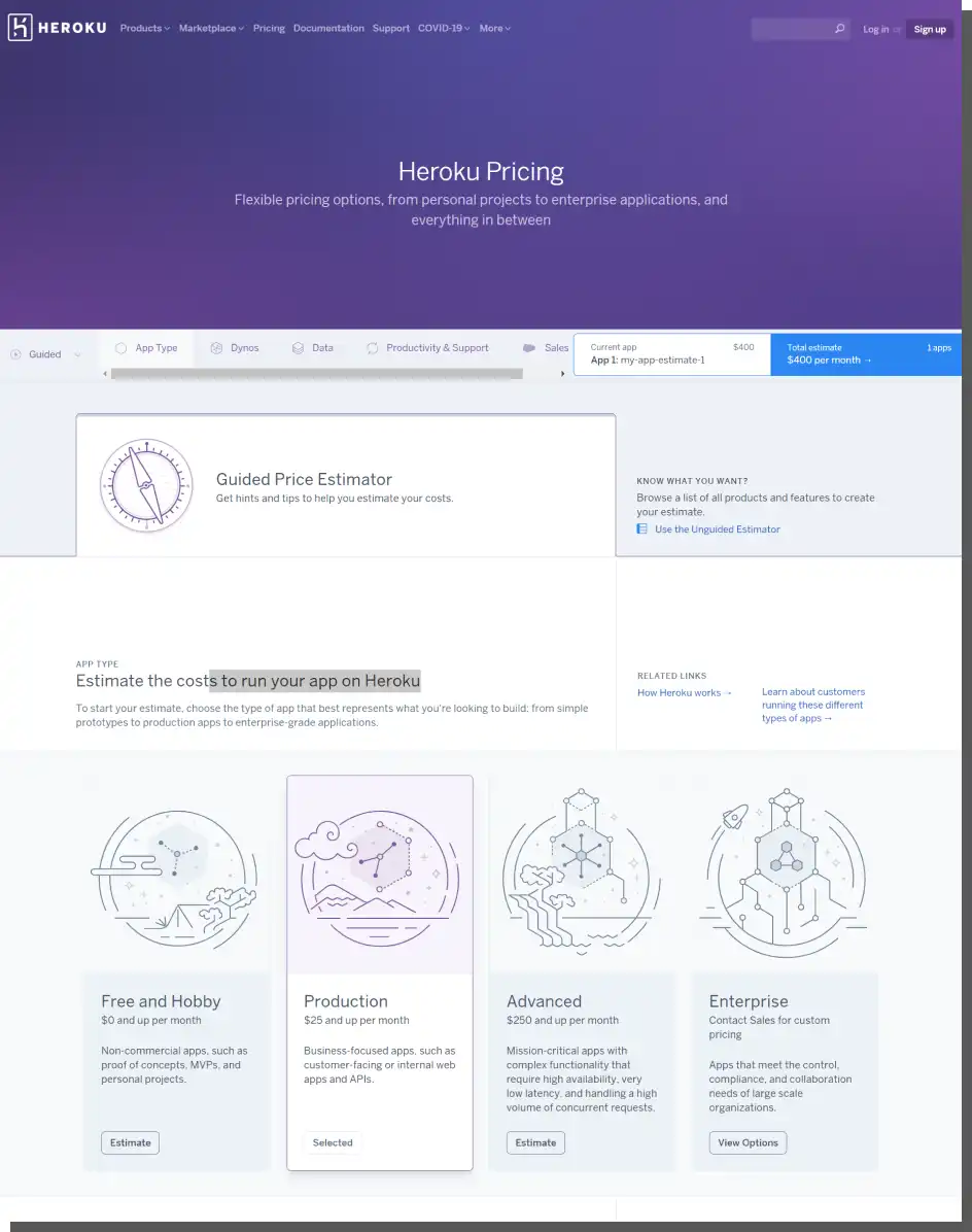
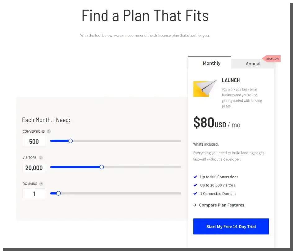
Designing a price list with gamification elements
Sometimes the offer is so complex (multidimensional) that it's hard to encapsulate it in a simple package. Sometimes you need to check what result will appear because of the change made. Calculators, configurators, and sliders are practical tools. They involve and provide pleasure (always consciously).
Using the need for fun and gaining benefits through choice is a great way to obtain a user's attention and acquire a customer. Such tools also have psychological significance. For example, they provide a sense of control over the price list, and the offer seems to be customized and adapted to needs. It's the effect of independent decisions.
A B2B-friendly Pricing Page — Nielsen Norman Group recommendations
The uniqueness of B2B relationships (e.g., frequent price negotiation) imposes a unique approach to the design of a B2B Pricing Page. In the mentioned at the beginning report, researchers from NN Group suggest avoiding a situation in which prices on a B2B are unavailable.
Although we should mention that they don't suggest it but treat it as a cardinal mistake. Why, according to them, it's so mortally important?
Even if it's impossible to show prices — due to the nature, complexity, and conditions — researchers recommend providing estimated, typical examples of prices.
This gives users a basic understanding of the price range. According to them, even an estimated cost is helpful. Especially at the stage of collecting offers from the market and comparing them.
The estimated price from the customer's perspective is much more helpful than a lack of it. It's much more convenient than the need to take action to obtain it. Well, it's hard not to agree with that. This sounds really rational and sensible.
Moreover, according to American researchers, redirecting customers to forms rather than providing prices has psychological consequences. Users can see the lack of price as an expression of:
- Secretiveness
- Dishonesty
- Low credibility
- Unkindness.
An equally severe mistake is providing prices on a Pricing Page without displaying them on a product page. Redirecting to a Pricing Page, usually extensive, to get a single numerical value lowers the Customer Experience (CX). Again, this is pretty obvious. However, still, many B2B companies make this mistake.
Also, delaying the listing of all costs associated with the purchase (e.g., taxes, transportation costs) lowers the conversion rate. Online purchasing is characterized by a desire to economize activities.
That's why no user will go through a purchasing process only to find out at the end that they don't want to buy anything. They should be able to quickly decide whether additional costs are high, low, or acceptable.
From the NNG report, you can also find out that the price has a vital function which suggests the following:
- Category (professional product vs. consumer product, original product vs. similar product)
- Status (exclusive product vs. low-cost product)
- Possible purchase volume (wholesale price vs. retail price).
For the majority of B2B users, this information is clear because it's a part of their professional competencies and knowledge. It's true that the attractiveness of a price isn't the most crucial factor in B2B.
But the lack of a Pricing Page and the unavailability of prices on public sites doesn't allow a customer to fully assess the attractiveness of a given offer. And this is expressed in the relationship between a price and other factors.
Purchase scenarios and examples of prices, costs
You should supplement all kinds of calculators and configurators, especially if they offer many functions and variables, with examples of typical purchasing scenarios. Why?
According to researchers from Nielsen Norman Group, the use of tools for cost, price estimation requires more effort, which B2B users don't always want to incur.
Often to use them, it's necessary to know data that the user doesn't have. A sample scenario gives them a much quicker idea of the conditions offered.
An ideal B2B Pricing Page
What should it contain? All the crucial information in a given industry, whose interdependencies make for an attractive offer. As we wrote before, the attractiveness of the price must coincide with the attractiveness of other aspects (e.g., delivery time, delivery costs, order fulfillment capabilities, uniqueness, size, and customization).
For example, an equally important variable, often related to price, is the time of delivery. Low cost but long delivery time may be less attractive for many companies than high cost but quick delivery time.
Anchoring of crucial variables allows you to anchor the price not only in the prices of competitors or variants but also in the numerical value of equally important elements and variables (e.g., regarding the number of days and months needed to fulfill an order and maximal size of an order in a given timeframe).
A very interesting recommendation is also to compare prices when the sold product is second-hand. The price of a new product is a very effective anchor, especially when expressed numerically and in percentages.
How to design a Pricing Page on a website? Summary
To design successful Pricing Pages and B2B Pricing Pages, you should consider all functions that prices and a price list have.
Ensuring a simple, clear, and helpful presentation of prices (designing friendly tables and simple pricing), packages, and capabilities is crucial.
Just like it's crucial to reduce the fear, doubts, and uncertainty that B2B customers feel.
A B2B Pricing Page should inspire trust, contain elements reinforcing its credibility, and allow users to see the value not only in the numerical value of prices but also in their relationship to other variables that make up an attractive offer in a given industry.
If you want to inspire yourself further, we recommend looking at the best Pricing Page examples presented by HubSpot in the article "12 Best Pricing Page Examples To Inspire Your Own Design."
Disclaimer
The sample prices presented in the article do not constitute a commercial offer within the meaning of the Polish Civil Code.


