Content analysis in UX, website content audit, content analysis as part of usability testing, and services like UX audits are essential parts of the usability evaluation of a website or mobile application.
Content audit and content analysis allow us to learn how understandable, attractive, helpful, and useful the offered content is for users.
It's about the wide range of the subject of the study – from articles found in blog sections to descriptions of products, services, and microcopy.
Using heuristics to test the usability of websites or mobile applications and to improve human-computer interaction is nothing new.
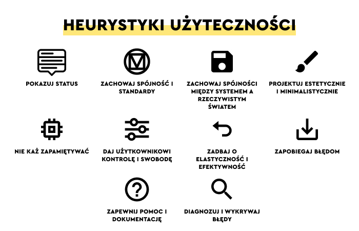
As an example, it suffices to mention perhaps the world's most famous set of Jakob Nielsen's usability heuristics – we described them in the article "Usability Heuristics by Jakob Nielsen."
Nielsen's heuristics describe the principles of interface design, such as visibility of system status, aesthetic and minimalist design, user control and freedom, maintaining consistency, error prevention, and more.
By the way, we also encourage you to read another of our articles, "10 Rules of Home Page Design According to Jakob Nielsen," in which we described how to use his heuristics in everyday design practice.
UX research and UX audit usually aim to analyze usability through heuristics related to purely design issues.
However, content analysis in UX research has a more profound purpose. It should be treated as a method as useful as usability tests of navigation or performance of individual elements of user interfaces (e.g., the design of a payment form or an error message).
What are the Content Analysis Heuristics? What website Content Analysis Heuristics should we use?
What role does website content analysis play in optimizing a website in terms of User Experience?
What advantages does this research method have? Can we create a useful information architecture without Content Analysis Heuristics?
We will provide the answer in a moment.
We cordially invite you to read the article!
What are Heuristics?
From a linguistic perspective, heuristics is a term that comes from the Greek word heuriskō.
In ancient times (because that's how distant the origin spans), it signified the activity of finding or discovering something; it also meant inference.
Its modern application in the social sciences originated in the '50s and is linked to Herbert Simon, the Nobel Prize-winning economist who popularized the concept.

Simon noted that people in the process of making rational choices are very often subject to cognitive limitations and need specific guidelines.
Heuristics are clues that counteract monotonous and lengthy analyses. It's a kind of expression, a summary. Simultaneously concise and full of meaning. Instead of making work-intensive, time-consuming analyses and indulging in endless studies of contexts, people prefer quick assessments, diagnoses, and categorizations. Based on previous experience and previously acquired knowledge. And this is the purpose of heuristics.
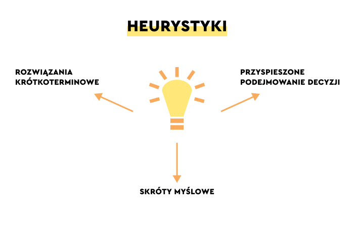
Let's look at the concept of heuristics from a psychological perspective. We can see a definition according to which heuristics are a kind of mental shortcut that allows us to solve problems that arise efficiently, quickly, and effectively.
As Kendra Cherry notes in her article "What Are Heuristics?", people prefer heuristics because of the following:
- Attribute Substitution – more difficult questions are replaced by simpler ones that are easier to answer.
- Effort Reduction – minimizing cognitive effort.
- Fast and Frugal – speed and savings.
Heuristics are extremely handy.
They make it possible to evaluate, categorize, make decisions, and economize energy expenditures almost automatically.
If every problem had to be analyzed multidimensionally, we would have to spend a great deal of time and energy on such a task.
Heuristics are among the most popular tools that make an inference (e.g., whether the length of the text is appropriate) more enjoyable. They allow us to make sure that, for example, the user interface design ensures user control, keeps users informed, provides feedback, and maintains consistency, as well as helps users recognize what they're looking for in an interface.
The best metaphor for heuristics, making quick judgments and decisions, is the thumbs-up and thumbs-down gestures.
What is heuristics analysis of website content?
Heuristics analysis is defined as a process in which UX researchers use principles developed in research practice to evaluate a website in terms of its usability for the end user (e.g., whether online store labels or error messages are understandable to them).
Heuristics are also defined as methods and ways of answering important questions about how a digital product works, its impact, and how it fulfills needs and achieves goals.
In the field of usability testing, they provide insights, conclusions, and arguments that are very helpful in the design process.
In particular, they're helpful in terms of decision-making.
For example, how to improve, in terms of content, the path to purchase in an online store or how to improve the product descriptions of an online store.

The authors of the article "Heuristics Problem-solving techniques that result in a quick and practical solution," which is available on the Corporate Finance Institute website, write about the practical dimension of using heuristics in project and business processes, which are, after all, interconnected.
Heuristics, while they have their limitations (e.g., they are more prone to subjectivity, narrowing of perspective, or a simple preference to analyze selected problems at the expense of others), also have strong advantages.
The main advantages of heuristics analysis include the following:
- Taking quick, relatively inexpensive measures to identify usability problems with a website or mobile app preliminarily.
- Providing data, conclusions, and arguments to make a design or business decision, which is especially important in situations where UX/UI designers and stakeholders operate under time pressure.
- Simplifying problems using mental shortcuts, referring to previous experience and acquired knowledge.
In short, using heuristics analysis makes it possible to identify the problem, obtain a preliminary diagnosis, and determine directions and methods for further research.
Heuristics analysis, often offered in UX audits, provides a quick, low-cost answer based on well-described, identified, and analyzed usability problems and expressed in an accessible formula of heuristics.
It points out quite precisely, although in general form, what doesn't work in a digital product in accordance with users' expectations.
In more colloquial language, heuristics analysis, heuristic evaluation involves the assessment of a website's content by one or more researchers.
Selected content is evaluated and assessed using principles and usability criteria – heuristics.
Content Analysis Heuristics
The ability to use heuristics to analyze a site's content, language layer (including keywords), and how it communicates with the users is extremely valuable.
In her article "Content Analysis: A Practical Approach," Colleen Jones singled out four main benefits of conducting a content analysis of a website or mobile app.
The main benefits include the following:
- A clear, transparent, and focused description of the content in terms of its usability for the user of websites.
- The ability to benchmark – compare current content with past content, proprietary content with competitive content.
- The ability to prioritize optimization activities in terms of time, content structure, size of individual content, relationships between content, the proportion of text and graphic layers, accessibility of given content, functions that content is supposed to fulfill, and its style and tone.
Heuristic analysis of content (and the possible errors it detects) is used to identify usability problems, but its purposes can be and are much broader.
By conducting a study, an audit of the usability of content, it's also possible to:
- Discover more specific usability problems that need to be corrected
- Uncover hidden opportunities, which is equally important
- Diagnose barriers and obstacles limiting users in achieving objectives
- Evaluate multidimensionally content (e.g., in terms of its value and effectiveness)
- Evaluate the content in terms of multiple aspects (such as structures and used language).
Evaluating content through heuristics is essential for optimizing content and its core elements in terms of User Experience.
Its primary goal is to analyze all content (from microcopy to expert blog articles) in terms of:
- Substantive content
- Language
- Style
- Grammar and punctuation
- Communications
- Visual aspects (the way it is presented).
The result of the content audit is the identification of fragments that may be considered problematic.
In particular, it's about discovering content that, from the user's perspective, is:
- Incomprehensible (in the semantic, syntactic sense, it's about the used vocabulary and terminology and the way information is conveyed)
- Useless (e.g., data or irrelevant text on one of the subpages)
- Redundant – an obstacle to accessing useful content
- Inaccessible – due to the language, the length of the article, and the way it is formatted (which affects its readability and scannability)
- Worthless – in terms of substantive content.
The worthlessness of the content can manifest in two ways:
- Through content lacking substance, informational, exploratory, or instructional value (e.g., SEO Presell Page Articles).
- Through hyper-substantive content that makes the text hermetic, incomprehensible, or understandable to a very narrow audience (e.g., Expert Content articles).
Equally important, heuristic analysis of the content of a website or mobile application can be performed:
- By a single expert (in the case of very complex websites, the team may include several experts and UX researchers).
- In a relatively short time – from a few hours (for really small websites) to a few days.
Of course, there are some limitations to this research method, the most important of which is pointed out by Jakob Nielsen himself in the article "How to Conduct a Heuristic Evaluation."
The main limitations of usability evaluations with heuristics include the following:
- Limitations of the researcher, who can't entirely distance themselves from their own preferences and biases – unable to be impartial.
- Inability to detect all and/or crucial usability problems.
- The need to involve several experts who can discover a more complete, complex, and diverse spectrum of usability problems.
The divergence of problems is one issue; the other is optimization recommendations, which have the most value when they're the result of aggregating the findings of individual UX researchers.
The report that will be complementary in terms of diagnoses and optimization suggestions will be able to determine the following more accurately:
- The most useful content authors
- Styles, forms, tones, arguments, and rhetorical tricks used in the content offered on a website
- The periodicity of the content update and the extent of this update
- The role that the content should play and the form that this role can most effectively achieve
- Users' language preferences, needs, competencies, experiences, and communication styles.
In addition, a content analysis should facilitate making decisions regarding:
- The structure of the information architecture
- The length of individual content
- Style and tone
- Language – in particular, the proportion between formal and colloquial language
- Methods of presenting the information.
Let us now turn to a discussion of the heuristics themselves, which are both research tools and determine the scope, subject, and method of content research.
The most important Heuristics for analyzing the content of digital products
Content analysis heuristics make it possible to examine content from multiple angles.
They're meant for analytical and critical review of the functions, purposes, and tasks the content fulfills for a user, reader, or audience.
Among the top heuristics for content analysis are:
- Accessibility
- Voice and Style
- Clarity and Accuracy
- Completeness
- Appropriate Structure
- Bounded Horizons
- Collocation
- Consistency
- Usefulness
- Currency
- Multiple Access Paths
- Influence and Engagement
- Information Scent
- Redundant, Out-of-Date, Trivial (ROT).
Accessibility Heuristics
A prerequisite for the usability of content is its accessibility on a website.
Content that is difficult to access, that isn't supported by an adequately designed visual hierarchy and a search function, and that can't be easily spotted in the scanning process is content with low usability.

If the content is extremely important from the user's perspective, it should be displayed in an easily accessible and prominent place. And the path leading to it should be shorter.
Voice and Style Heuristics
We should tailor the way we speak, the way we write, and the way we communicate to the:
- Linguistic competence of the recipients (e.g., their level of education, the language used in daily communication)
- Language preferences of the target audience (e.g., jargon, informal, colloquial language, plain language, slang)
- Subject, purpose, and function of a given content
- Social distance that recipients want to keep
- Expected comfort of communication – the complexity of a text should be based on the audience's capabilities and expectations
- Image that the author of the content wants to build in the minds of its audience.
Clarity and Accuracy Heuristics
The way of presenting problems, argumentation, showing information, data, providing appropriate feedback, and indicating solutions, etc., should be characterized by both clarity and accuracy.
However, excessive meticulousness – while positive in itself – can't dominate the main goal, which should be effectively communicating with a reader.
We can only achieve effective communication if the information is conveyed with consideration of the reader's cognitive abilities, how much of the content is new to them, how familiar they're with the subject matter, and thus to what extent the content will challenge them cognitively.
Clarity and readability of content should always outweigh its accuracy and the need to offer comprehensive content.
Completeness Heuristics
Completeness of content means that all references and links work correctly and don't lead to an error page.
Website users have a limited tolerance for non-functioning, inaccessible, and incomplete content. Incomplete websites are viewed very negatively.
Especially if incomplete content disrupts processes, user journey, or understanding of operations.
Appropriate Structure Heuristics
We should organize content based on users' mental models. At the same time, the way it is organized should not favor one way of finding it over another.
We should support different ways of seeking information.
Website analysis is also an analysis of how a website fits into the specific mental models of particular target groups.
Bounded Horizons Heuristics
As a general rule, content on a website should be organized in a way that clearly indicates its scope and size.
Website users should be able to estimate the extent and depth of the content offered to them relatively quickly.
As such, any excess, illogic structure and its overextension is perceived as unusable and raises the cost of interaction.
Collocation Heuristics
Content with similar subjects, functions, and meanings should be grouped, making it easier to search and giving a much better overview; thanks to this, it's much more illustrative.
Organizing a large amount of content with a similar subject, meaning, and function should be structured according to a clear and consistently applied criterion.
Consistency Heuristics
The consistency of the site's content makes it much more friendly, logical, and easy to use.
That is why content analysis and website analysis should focus specifically on the problem of consistency. Content structures that encompass similar fields should be as consistent as possible.
Consistency of content positively impacts the speed of content scanning and the ease of finding relevant fragments. It can also reduce user frustration.
Usefulness Heuristics
The usefulness of content means, above all, being able to answer the questions a reader asks when looking for information on a website.
Useful content must, first and foremost:
- Meet the needs, goals, and interests of users
- Be relevant, illustrative, clear, and simple
- Be presented in a way that makes it easy to understand.
Currency Heuristics
Making sure that the content is up-to-date and is constantly being updated is extremely important.
Outdated content, content that contains information of questionable authenticity, is content that affects the user's attitude toward all content published on a website.
Outdated content (or content about which there is a strong suspicion of invalidity) is a source of intense frustration and is a common reason for abandoning a site.
Analysis of websites cannot overlook this problem.
Multiple Access Paths Heuristics
If the content is relevant from the user's perspective, we should offer access to it through multiple paths (e.g., in the search results of the website's internal search engine, in links, and in the menu structure).
Multiple access is based on diverse ways of thinking, categorizing, and labeling a given content.
As a general rule, multiple access paths provide better accessibility for more users.
An excellent example of the implementation of this heuristic is faceted search.
Influence and Engagement Heuristics
The main goal of content is to engage a user. An engaged user is a user who feels emotions while reading.
The content should not only affect the reader in the substantive, cognitive layer but also emotionally.

Even the most specialized content, addressed to experts in the subject, operating with jargon should not be devoid of elements that bring the reader and the author closer, creating between them not only a thread of understanding but also sympathy.
Information Scent Heuristics
The metaphor of information trail refers to any proximity clues (suggesting distance, position, location) that simultaneously indicate the value and cost of access.
A website's content should provide users with clues to clarify what can be found under a particular link.
Redundant, Out-of-Date, Trivia (ROT) Heuristics
Useful content meets a need and provides clear, practical answers to questions.
It should be up-to-date and devoid of elements perceived as irrelevant, redundant, meaningless, and unnecessarily attention-absorbing.
Useful content should change the state of consciousness, knowledge, beliefs, attitudes, or goals.


