
Do you know what errors 400 and 403 mean? What does 404 mean? 500? Or 503?
While browsing the web, visiting websites, online stores, or B2B platforms at some point, mysteriously and unexpectedly, you're reaching the end of the Internet.
The website you've wanted to see was supposed to exist, but it doesn't. It existed before, or it didn't at all.
"It happens to the best of us," you may say. And you will be right. So, it's unsurprising that they appear while you browse through your favorite website or platform or when you come across it through a search engine or link from a forum, online groups, or under your friend's post.
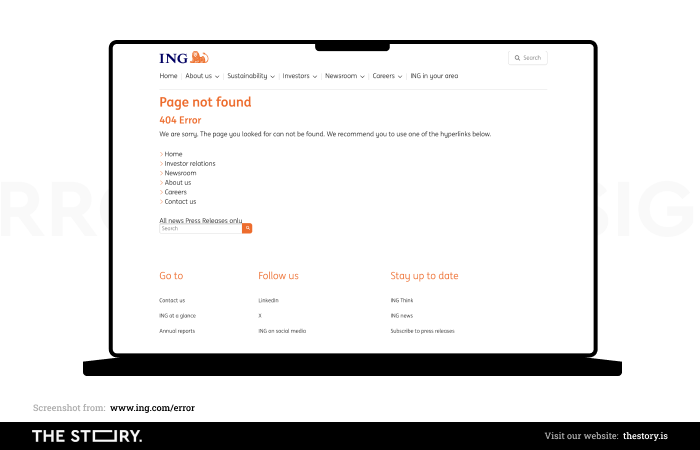
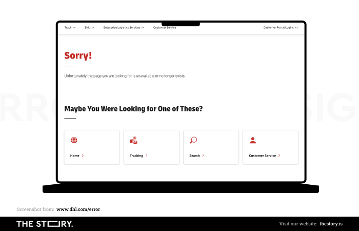
ING Bank's 404 error page.
Websites that no longer exist are a constant element of the Internet scenery. They're also a design problem, a challenge.
A custom error page is significant from a purely UX perspective, especially its appearance and functionality.
An error is always an undesirable situation, but it's also an opportunity to present the platform from a better, more helpful, friendlier, and informal perspective.
400, 403, 404, 500, and 503 errors, what do they mean?
For starters, here is a brief guide to errors or, rather, a guide to HTTP status codes.
Naturally, Error 404 (404 Page Not Found) is the most common HTTP status code (an error) that has become a symbol of errors. However, there are other errors you'll encounter while browsing the web.
What does Error 400 mean (400 Bad Request)? It frequently suggests that a web browser's request can't be processed for some reason.
Here's the answer if you want to know what Error 401 (401 Unauthorized) means. It means that the attempt to log in failed. Incorrect authentication can occur for various reasons, such as the wrong login or password.
What does Error 403 mean? 403 Forbidden means the user was denied access to the website content. It signifies that the user doesn't have permission to view a particular portion of the site (there is no index file). The most popular error, Error 404 (404 Not Found), means a given website wasn't found.
The situation looks entirely different in the case of Error 500 (500 Internet Server Error). What does Error 500 mean? It appears along with an internal server error and often implies an issue with the .htaccess file.
So, what does Error 503 mean? If you see 503 Service Unavailable on your screen, then be sure that the server is unavailable. It usually happens when it's overloaded or in the middle of maintenance work.
What is a custom error page?
Of course, we can present you with a very formal definition of error pages based on the state of the HTTP code, but we prefer a more informal definition. According to it, a custom error page appears when the correct page can't be displayed for the user for various reasons.
The most common reasons for an error page appearance include the following:
- Link rot — a link that redirects users to a page that no longer exists
- Incorrectly entered address by a user
- Server error
- Other errors and disruption of communication on the client-server line.
While the second reason looks pretty human, evident, common, and unavoidable, the rest require some explanation.
Websites constantly change their content and structure. They're updated more or less frequently, their addresses change, and their subpages are deleted or edited.
The larger the site, the bigger the problem of controlling all the external and internal links.
A custom error page is a certain necessity that can't be eliminated.
Outdated links are no less common and unavoidable than typical human errors — typos or miswritten words.
The necessity to accept the occurrence of errors and links that lead to nonexistent subpages may be a little depressing, but that's why error pages exist.
They don't only inform about what just happened but suggest possible solutions to the problem. They're also a great opportunity. For what? We'll tell you in a moment.
Although you can't control errors, you can control the error messages displayed for users when they face such a problem.
Custom error pages are a simple design task that also raises dilemmas.
For example, regarding image, message tone, brand presentation, navigation, and providing a positive user experience (UX).
Custom error pages and their consequences
Let's start by complicating our discussion. What custom error pages are?
They certainly are a:
- Message
- Hint
- Explanation
- Solution to the problem.
But that's not all; error pages are also:
- A stressful situation that has emotional, cognitive, and behavioral consequences
- Very unpleasant disruption of the user flow
- Very strong cognitive friction
- Last but not least, it's a necessity, an opportunity, and a chance.
Errors are frustrating and disappointing, undermine trust, and reduce credibility and a sense of safety.
Errors are a source of stress, uncertainty, and disorientation. In short, they're an emergency that requires quick, specific, and adequate intervention.
In this regard, it's worth listening to the advice of the author of two fascinating articles, "Designing for stressed out users | Part 1" and "Designing for stressed out users | Part 2." H Locke, the author, looks at the problem from the perspective of cognitive psychology and UX/UI design practice.
Users feel the most stress while using digital products when they can't achieve a goal they want to obtain.
They can't reach it for more or less understood reasons. Often (of course, not exclusively), these are objective and external reasons.
For instance, the user wanted to check the content of a given website, so they clicked the link that was supposed to take them to it, but instead of the content they were interested in, they received something they didn't expect.
That's precisely why custom error pages are essential in such situations. However, they shouldn't look like a sad road sign, and they often resemble one.
Remember that surprise, disappointment, frustration, helplessness, and the desire to recover control and escape grow with time.
Whoever was surprised at least once by the 404 error page knows what we're talking about.
Negative emotions rise faster and strengthen the less understandable and solvable cause of the error. The less a custom error page (e.g., offering a link to the home page) can defuse negative emotions, the less it explains and the less helpful it is.
The typical emotional-cognitive reaction to such a situation is a sense that the problem is:
- Complex
- Time-consuming
- Difficult
- Incomprehensible
- Uncontrollable — the chance of recovering control is small.
Furthermore, such beliefs, whether true or imagined, affect how users see the possibility of achieving the goal.
The more the situation is seen in the above categories, the more the goal seems distant and unachievable, and from there, it's a quick way to abandon a site and look for a properly working one.
Fortunately, the situation isn't hopeless, and it's possible to counter the emergence of such reactions.
Why is an original and custom error page the best?
We mentioned above that a custom error page, even if troublesome, is also an opportunity. Now, we'll focus on this positive aspect.
An organization, when creating its custom error page, has an opportunity to present itself as:
- A savior — or at least a helpful friend who saves you from trouble, shows you what you need to do, and explains what happened.
- A not-so-bad-culprit — polite and feeling responsible for what happened, sometimes expressing it very charmingly.
- A helper — with a sense of humor and lightness who tries to relieve tension and show that it's not worth crying over spilled milk.
An organization, through an Error Page, can show that it:
- Understands and doesn't underestimate the problem
- Controls the situation, and everything will be back to normal in a moment
- Still is trustworthy, and the error is a rare exception from the rule
- Is equally empathetic, emotional, polite, helpful, practical, and professional
- Is responsible but doesn't treat itself too seriously and is not devoid of humor.
Thus, custom error pages are helpful in terms of marketing, image, usability, and UX. They're a tool for improving the flawed user experience.
They redirect to appropriate parts of the platform, which is also helpful from the SEO perspective.
What should the custom error page look like?
On the Internet, you can find two variants of error pages:
- Pages in a standard formula that are very formal, factual, and reserved.
- Pages in a humorous formula that are light, use elements of fun, games, and interaction.
Which variant is better? Avoiding the answer a little—but only seemingly—we can say that the one that better serves the organization's goals.
While it's true that everything in the world of digital products depends on context, goals, users, etc., organizations still underestimate the potential of error pages.
Both in terms of marketing and attention to user experience. To be more specific, in terms of the quality of navigation, smoothness, and ease of achieving goals and completing tasks—in short, in terms of usability.
If an error is a fire, then an error page in a firefighter.
Error pages have a unique role to play. They're useful for psychological reasons but also related, as we've said, to usability. Today, the usability of a website is a priority issue.
400, 403, 404, 500, and 503 errors are its negation; solving them is necessary and beneficial.
What should an error message contain?
A custom error page should be, above all else, communicative and helpful. What does it mean?
First, an error page should allow the user to recover cognitive and behavioral control over the situation quickly. Thus, it should inform them about the following:
- What happened (what kind of error are they dealing with)?
- Why did it happen (who caused the error)?
- How can the problem be solved, and who can do it?
- When can the problem be resolved?
Who? Where? Why? How fast? The error page should include answers to these questions, and they should be expressed in the following ways:
- Understandable for laypeople
- Concise
- Specific
- Simple, as free of IT jargon as possible
- Understanding and empathetic
- Free from accusatory and condescending tones
The effect of the message on the error page should result in a change in the user's cognitive and emotional state. First of all, the user should make sure that:
- They're safe, and they're no longer in danger.
- The situation is easy to control.
- The solution is within reach of the proverbial 1-click.
- They can solve the problem by themselves without involving cognitive resources or the support of third parties.
This message should be reinforced through elements that arouse positive emotions and associations, allowing users to identify positively, for example, with the brand hero.
The most frequently used elements that have a huge potential to evoke positive emotions include the following:
- Humorous graphics and comic strips
- Engaging and attractive compensations and gratifications (e.g., games)
Therefore, the custom error page is an opportunity to transform a negative experience into a positive one and to build solid connections between the brand, organization, and user experience.
It's worth remembering that the most engaging, memorable, positively impactful messages are those that evoke positive emotions.
Even the most factual message, devoid of elements arousing emotions, won't be as effective regarding UX as its counterpart. Humor relieves stress; seriousness and emotional coldness have no such property.
Another issue that should be considered to obtain a positive and satisfactory user experience on error pages is the choice of vocabulary/language in which the situation is described.
For example, instead of using the highly emotionally impactful word "error," it's better to use the less telling term "mistake."
Replacing emotionally charged words with euphemisms lowers stress levels. It's also worth avoiding phrases, verbs, and onomatopoeias that emphasize the negativity of the situation.
Designing a custom error page — design patterns
The most critical design pattern is making the custom error page functional and helpful for the user.
In reality, the humorous end of the Internet should allow the website user to quickly go back to viewing the correct content of the platform.
Hence, the navigation on custom error pages is essential—it should point users back to the most optimal start, which is usually the home page.
It's the most optimal solution because it gives them access to the entire website and its functionalities.
Another crucial pattern is the visual/graphical universalization of the custom error page. From the website user's perspective, the information about the type of error isn't the most significant.
More important than whether they're dealing with Error 404 or Error 503 is whether a custom error page can reduce their stress and show them what to do.
Graphical universalization of a custom error page is more effective and reduces the amount of programming and design work.
The functionality and usability of a custom error page are in no way higher than that of a universal one, in which the layout doesn't include information about the type of error.
Maintaining the consistency of a custom error page is vital to offering positive UX. It should be visually, graphically, and aesthetically identical to the branding of the entire website.
An error page is a natural part of every web application, and as such, it should increase the level of trust in the platform, brand, or organization.
Making it anonymous with little visual connection to the brand is a diminishing action, undermining its credibility.
A recommended pattern is to offer compensation for the problem, such as a discount code. This gesture will ease many negative emotions and provide an additional incentive for the customer to buy or use the services.
Custom error page design. Summary
- The most common cause of an error page is a rotten link, an error in the URL, or a server error.
- Outdated links are no less common and unavoidable than typical human errors — typos or miswritten words.
- Custom error pages raise dilemmas regarding the tone of the message, navigation, and ensuring a positive user experience (UX).
- A custom error page is simultaneously a message, hint, explanation, and solution to the problem.
- It's also a stressful situation, a disruption of the user flow, a necessity, an opportunity, and a chance.
- Typical errors are frustrating, undermine trust, lower credibility, and are a source of stress, uncertainty, and disorientation.
- Users feel the most stress while using digital products when they can't achieve a goal they want to obtain.
- The surprise, disappointment, frustration, helplessness, and desire to regain control caused by the error grow over time.
- A custom error page shouldn't resemble a sad road sign.
- A custom error page is simultaneously an undesirable situation and allows the organization to present itself from a better, more helpful, kind, and informal side.
- When creating its custom error page, an organization can present itself as a savior, culprit, or helper.
- With an error page, an organization can show that it doesn't underestimate the problem and controls the situation, a rare exception to the rule.
- Custom error pages are helpful in terms of improving usability and UX.
- Who? Where? Why? How fast? An error page should contain answers to these questions.
- The message should affect the users' mental and emotional states. First, they should ensure they're safe and not in danger.
- Elements that arouse positive emotions include humorous graphics and engaging, attractive compensations (e.g., games).
- A custom error page is an opportunity to transform negative experiences into positive ones.
- The most engaging, memorable, positively impactful messages evoke positive emotions.
- The appropriate language choice is a critical issue when designing an error page.
- Nevertheless, making a custom error page functional, consistent, and universal is essential. This will encourage people to buy and use the offer.


