Usability Testing of websites is a rather broad term within which Comparative Usability Testing is also distinguished.
This type of research is designed, as the name suggests, to compare two or more projects, prototypes, or websites, to learn about their effectiveness, efficiency, and the satisfaction they evoke.
Comparative Usability Testing allows us to find the answers to the questions of the speed of execution of tasks and the number of errors made during their execution compared to competing, alternative products and designs.
They provide insight into the emotions that arise during the tasks.
In other words, comparative research will help evaluate and analyze the product in comparison with other solutions, especially concerning usability problems, which is an area of interest not only for researchers but also for UX designers, and developers.
Comparative data is used in the process of optimizing digital products, and it serves to obtain market advantages to offer products that are better tailored to the needs, expectations, and capabilities of their end users.
Why is it worth measuring and comparing usability? How to conduct Comparative Usability Testing?
What to pay attention to when comparing digital products? What are the best practices for conducting Comparative Usability Testing?
Today we are going to answer these questions.
We invite you to read the article!
What is the usability of digital products?
In the article "Usability," published on the Interaction Design Foundation's blog, Usability is defined as a measure of how well a specific user in a particular context can use a digital product or its design to effectively, efficiently, and satisfactorily achieve a particular goal.

When thinking about usability, we should keep in mind the following:
- the effectiveness with which a user can perform a task
- the efficiency, which determines the amount of necessary effort invested
- the satisfaction that determines the user reactions that occur during interaction with a digital product
In other words, the usability of a digital product is high if its users can easily and seamlessly use the product and achieve their objectives.
However, we can look at usability from a different, more profound perspective. According to Jakob Nielsen's definition, published in his article "Usability 101: Introduction to Usability," usability is a quality attribute that assesses how easy user interfaces are to use.
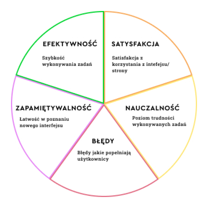
Usability, according to Nielsen, consists of five elements:
- Learnability – determines the ease with which users can complete tasks when they first interact with a digital product.
- Efficiency – the speed at which users can perform tasks once they have learned how the system works.
- Memorability – the ease with which users can return to using the product proficiently after a long break.
- Errors – the number and severity of user mistakes and the ability to fix them.
- Satisfaction– the pleasure of using a particular product.
A useful digital product is a product:
- that allows us to achieve our goals easily and seamlessly
- that is a source of pleasure
- whose use doesn't involve a lot of mistakes.
Usability testing of a digital product involves registering the behavior of the product's users through various techniques, methodologies, and tools that help answer crucial questions.
Usability testing can take the form of quantitative research, in which users' actions are quantified (e.g., time to perform a task, number of errors are measured), or qualitative research, in which various types of heuristics are used (e.g., Jakob Nielsen's Usability Heuristics).
What are the most important usability metrics?
After reading the above definitions, Usability may seem to be a rather abstract category and prone to subjective evaluations.

But certainly, it's not the case because it can be expressed with very concrete metrics that allow it to be:
- measured
- and compared.
The most important usability metrics include:
- success rate
- effectiveness indicator
- efficiency indicator
- satisfaction indicator.
The success rate is both one of the most important indicators and one of the easiest to measure.
The success rate measures how many respondents complete a task created by a researcher (e.g., correctly complete and submit data via a form).
The percentage of users who complete the task successfully is a measure of the effectiveness of a digital product.
The effectiveness indicator keeps track of the user's mistakes during the task. The number of errors made suggests smaller or larger usability problems.
We should anticipate and prevent errors in the design process.
Usability testing allows us to go beyond the designer's limited perspective, create a reasonably comprehensive list of problems, and organize them by type and importance so that we can prioritize them appropriately.

Among the most common errors are:
- unintentional actions (such as clicking on the wrong link)
- omissions, oversights
- misunderstanding of labels, resulting in incorrect data entry
- misinterpretation of functions, information, objectives, and activities.
The efficiency indicator allows us to diagnose elements, functions, and processes that cause friction, which occurs on the side of the system, not the user (for example, the loading speed of a page).
The satisfaction indicator helps determine how satisfied users feel after completing a task.
The level of user satisfaction, represented by different types of ratings (numerical or verbal), makes it possible to measure the user's emotional reaction.
Comparative Research – why measuring usability matters
Poor usability of a website, web, or mobile application mainly results in the following:
- low conversion (e.g., fewer inquiries, subscriptions, downloads, etc.)
- low sales
- questionable reputation, leading to a lower number of spontaneous recommendations
- lower retention
- higher Bounce Rate
- higher Cart Abandonment Rate.
The relationship is relatively straightforward – better usability means better user experience, which directly translates into more sales, loyalty, and engagement, to higher ratings and reviews in Rating Systems.
Usability testing and measurement of usability make it possible to:
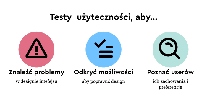
- diagnose errors, usability issues
- discover preferences, reaction methods, actions
- identify barriers, error-prone elements
- optimize a product in terms of usability at the very early stages of its development
- determine the attractiveness of a product in comparison with competing solutions.
The last of the advantages of measuring usability refers to Comparative Usability Testing, which allows us to look at a digital product not only from the user's perspective but also from the perspective of:
- strengths and weaknesses
- methods of solving design problems
- offering solutions that resonate with users' needs, expectations, habits, and capabilities.
Comparative Usability Testing
Comparative research makes it possible to compare:
- concepts (such as interface variants prepared by designers)
- prototypes
- selected elements of the application
- applications with each other.
Comparative research provides knowledge regarding the following:
- system performance
- system effectiveness
- the satisfaction that the system provides.
It also allows us to answer questions: What is the source of the difference? Why is it a source of the difference?
In Comparative Usability Testing, success rate, effectiveness rate, efficiency rate, and satisfaction rate are often used for comparisons.
That helps avoid the limitations of a qualitative perspective, often dominated by "I like/I don't like" opinions.
Comparative Usability Testing should provide an opportunity to decide which solution is more optimal for users, i.e., allowing them to perform a task faster, more simply, with fewer errors and greater satisfaction.
By using quantitative metrics and having the opportunity to explore alternative design solutions, we can obtain much more insightful feedback because when we compare products against each other, differences and quality are best seen.
Sometimes, it is challenging to be fully aware of our preferences without comparison. It's hard for users to pinpoint the problem's source and why using an application or a website is causing issues.

By confronting several approaches to solving a given task, it is possible to precisely identify which elements are directly or indirectly responsible for usability problems.
The ability to collect quantitative data makes Comparative Usability Testing much more:
- unbiased
- objective
- less susceptible to the limitations of self-awareness of respondents
- reliable and credible.
As part of the standard Comparative Usability Tests, the following data is collected:
- percentage of task completion
- time of task completion (usually in the form of an average)
- number of clicks required to complete a task
- number of errors.
The comparison of entire applications, selected elements, and prototypes has the advantage of aggregating quantitative results, which makes business, design, and technology decisions much less dependent on opinions, preferences, or biases.
Comparative Research – best practices
Comparisons, to have exploratory as well as observational value, must be made with the help of the following:
- the same sets of scenarios and tasks
- tasks that are possible to achieve in all compared systems
- instructions that don't use the terminology used in any of the tested systems
- different testers, eliminating the Serial-Position Effect and avoiding the influence of the first tested application on the perception of the second
- establishing the rank, priority, status, and relevance of problems
- determining the impact of a given experience on the way the system reacts, acts, and evaluates
- the optimal number of solutions that are being compared (no more than 3 – respondents tend to have difficulty remembering and comparing more than three systems)
- appropriately similar and different systems – they can neither be too similar because the differences become unclear nor too different because the lack of similarities prevents a valid comparison.
It is also worth remembering that Comparative Usability Testing should be treated as a source of data rather than as a tool for resolving disputes or design dilemmas.
Its goal is to obtain unbiased information, not to discover innovations but to optimize them.
Comparative research is not a tool for reinventing the wheel. It also should be used wisely, and a good general rule is to limit the number of elements and functions to compare and select only the most important ones.

Testing multiple solutions is simply too time-consuming, costly, as well as organizationally and methodologically demanding.
It is also best practice to supplement quantitative data with opinions that should be collected at the right time, namely:
- After a given task is completed – this allows us to obtain information about impressions that may fade over time.
- At the end of testing the next functionality – people naturally compare solutions without much encouragement. Therefore we should use this tendency to obtain feedback.
- At the end of the test session – for a more general assessment and a more comprehensive comparison.
Evaluation of competing design alternatives should be carried out using a standard scale (such as the Likert Scale) so that there is a more reliable comparison of responses and evaluations.
When conducting Comparative Usability Testing, it is essential to counteract the bias effect.
That is why it is best practice to change the order of presenting the compared solutions. Each respondent should compare solutions arranged in different orders (e.g., A-B-C; C-A-B).
Comparative Usability Testing. Summary
- Usability measures how well a user in a particular context can use a digital product or its design to effectively, efficiently, and satisfactorily achieve a specific objective.
- The usability of a digital product is high if its users can easily and seamlessly use the product and achieve their objectives.
- Usability is a qualitative attribute that helps assess how easy the interface is to use.
- Usability, according to Nielsen, consists of five elements: Learnability, Efficiency, Memorability, Errors, and Satisfaction.
- The most important usability metrics include success rate, efficiency, effectiveness, and satisfaction.
- Poor website, web, or mobile application usability primarily results in lower conversion rates, lower sales volume, higher Bounce Rates, and Cart abandonment rates.
- Comparative research, UX testing, and application usability testing aim to compare two or more phenomena, designs, prototypes, and applications to discover their effectiveness, efficiency, and satisfaction they bring.
- Comparative Usability Testing allows us to evaluate and analyze a product compared to other solutions, especially regarding usability problems (such as how its navigation works).
- The results of comparative research are used to gain market advantages and offer products better suited to the needs, expectations, and capabilities of their end users.
- In Comparative Usability Testing, success rate, effectiveness rate, efficiency rate, and satisfaction rate are often used for comparisons.
- UX research, qualitative UX research, UX research with users, and UX usability testing should provide the ability to decide which solution helps accomplish a task faster, more simply, with fewer errors and greater satisfaction.
- The ability to collect quantitative data makes Comparative Usability Testing much more: unbiased, objective, reliable and credible.
- Comparisons, to have exploratory as well as observational value, must be made with the help of the same sets of scenarios and tasks, instructions, and different testers.
- Comparative Testing, comparative analysis should be treated as a source of data, not as a tool for resolving disputes or design dilemmas (e.g., what navigation should look like).


