Push notifications, which are so natural to the environment of the mobile channel, drive some people mad, while others are delighted.
In particular, if they make it possible to buy something cheaper or remind them of an important dentist visit.
Perhaps they aren't necessarily liked because of the reminder of a visit to the dentist. But anyone who has ever waited for a flight that didn't happen knows how helpful information about its delay is, particularly if it's sent directly to a mobile phone.
However, the design of these small messages causes many problems, such as timing, form, length, personalization, and adaptation to the requirements of a specific platform.
Push notification design requires a lot of sensitivity, tact, and restraint.
Last but not least, understanding the audience's needs is essential, as in a fraction of a second, satisfied users can become annoyed, frustrated enemies of a mobile app, ready to uninstall it.
Push notifications are a great supplement to app functionality, but they also require understanding and awareness of their capabilities, limitations, opportunities, and risks.
In short, they require learning how to design them.
Read this article to learn how to ensure good communication and improve user experience in mobile apps with push notifications.
We cordially invite you to read on!
What are push notifications?
Almost every smartphone and mobile application user has encountered push notifications at least once. They represent the essence of the mobile channel.
Push notifications in mobile apps are standard today. You can see them very often on the smartphone screen.
What exactly are they? Concise messages that contain essential information, an offer, a system message, a hint, or a warning.
Push notifications are displayed in at least several places—simultaneously or optionally. We'll encounter them by unlocking the screen, using the phone, or using a specific app.
Their omnipresence raises the question of whether we like to receive notifications and messages as users of smartphones and mobile apps.

From the point of view of communication, but most importantly usability and user experience, push notifications have a vital function. They're an example of the first of Jakob Nielsen's heuristics.
As a reminder, the first heuristic—Visibility of System Status—refers to the need to inform the user about the system's current state. It provides feedback.
Push notifications also exemplify the third of Ben Shneiderman's Eight Golden Rules, which reads Offer Informative Feedback.
The system (not just the operating system but also the mobile application) should always allow users to understand the situation comfortably.
Notifications should report the system's status, that is, what is currently happening in the application. Does it work correctly? What tasks does it perform? What state is it in (e.g., ready to work or update)?
As you can easily guess, feedback and messages, not excluding push notifications, are essential to a positive, satisfying, and desirable user experience.
They're an essential part of marketing communication.
As a user, you should ensure that the applications you use aren't passive tools but active ones, able to initiate interaction and recognize your needs and expectations.
Which is possible, among other things, thanks to the geolocation function. For example, think of push notifications about nearby restaurants during lunchtime or gas stations when driving on the highway for the fifth hour.
Types of push notifications
Push notifications can have different sources, be sent for various reasons, and fulfill different purposes. They can be divided into web push notifications and mobile push notifications.

Notifications can also meet very different needs. For example, regarding the following:
- Security (e.g., weather alerts)
- Fun and entertainment (e.g., games)
- Control (e.g., notifications related to expenses)
- Organization, structuring, and goal setting (e.g., messages regarding meetings)
- Membership (e.g., notifications from discussion groups, forums, or social media)
- Attention (e.g., FOMO — Fear of Missing Out)
Push notifications are most commonly displayed on the following:
- Interfaces of applications — as a hint, clue, or explanation
- Web browsers — usually as ads or recommendations
- Desktop screens
- Lock screens
The source of notifications can be:
- Operating systems: They're an essential source of information about the system's state (e.g., availability of internal memory, battery level).
- Applications that were installed on the phone.
- Web applications viewed in web browsers.
Push notifications most often take the following forms:
- Graphical form
- Animated form
- Auditory form
- Audio-visual form
Push messages can be designed as follows:
- Speech bubbles, icons (in instant messaging, for example)
- Jingles
- Banners
- Badges
- Verbal alerts
Push notifications raise several questions and dilemmas, often regarding the following:
- Frequency
- Content
- Adequacy and relevance (personalized push notifications)
- Form of communication
- Importance
The last issue may cause the most problems because it's related to correctly estimating, feeling, and knowing the expectations of web and mobile push notification recipients.
Their demand for such messages, their assessment of their value and usefulness, and their tolerance for notifications that are always intrusive in some way.
The importance of push notifications and messages
While from the push notification sender's perspective, its value, importance, and relevance may be obvious and very well motivated, evaluating its usefulness may be extremely different from the recipient's perspective.
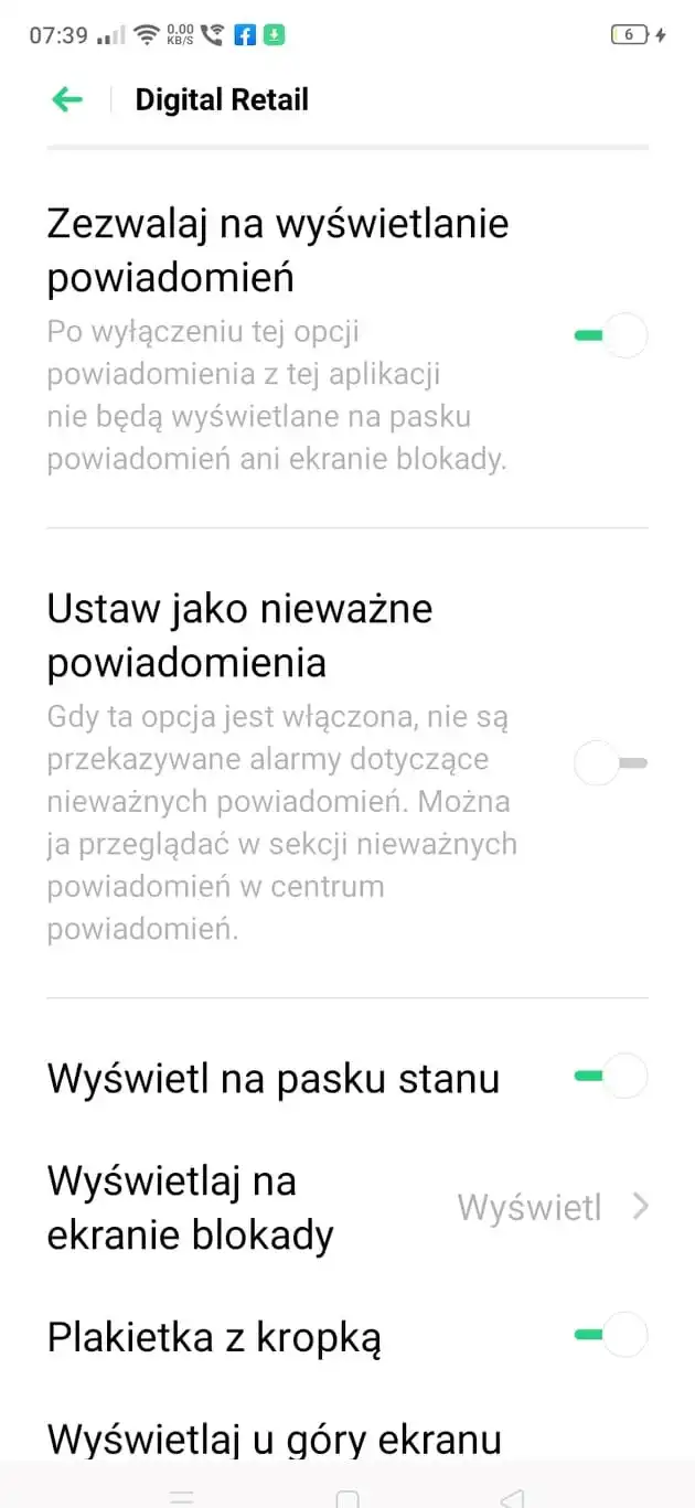
Prioritizing push notifications is simply essential.
Frequently, push notifications are assigned to one of three categories of importance:
- High
- Medium
- Low
Determining to which category should a given notification belong is primarily a matter of intuition, experience, and knowledge, but also an accurate assessment of its:
- Up-to-dateness
- Adequacy to the situation, context
- Usefulness — the notification should have some practical, helpful value
- Appropriateness
- Importance and indispensability for the user.
The high-priority category most often includes notifications, which require immediate attention and action because they inform users about the following:
- Errors
- Threats
- Exceptions
- Need to confirm actions that are potentially harmful to the user
The medium category includes notifications that don't require immediate action. These are:
- Notifications about changes
- Expressions of gratitude
- Confirmations
Notifications that fall into the low-priority category require little attention and action. Most often, they include messages containing information about:
- Status
- Novelties
The assignment of a notification to a given category entails determining the presumed demand for such a message. Not every notification is the same.
While the relevance of push notifications belonging to the first category is obvious to users, the middle and last categories cause more doubts and dilemmas.
This results from the character and importance of given messages and the character of push notifications.
The character of push notifications
Imagine a typical mobile phone user who usually has dozens of applications installed.
If they haven't set conditions for receiving push notifications for each of them, it's easy to imagine they're downright plagued with them daily.
This is especially true since it's difficult to imagine a competitive application today that wouldn't take advantage of the capabilities of a particular device and the mobile channel.
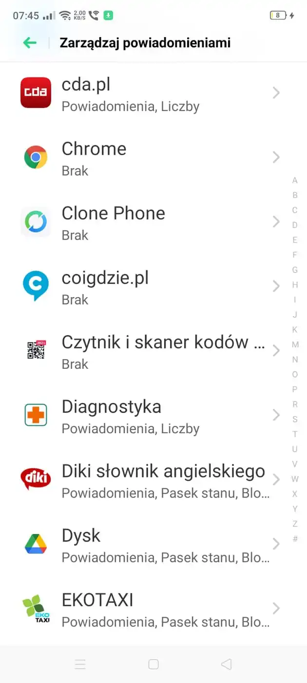
The problem is also related to the policies of the platforms themselves.
IOS applications are required to obtain permission to send push notifications.
The Android platform doesn't impose such requirements on applications running on it. Permission is an optional matter, not mandatory.
You should remember that each application will fight for its user's attention, which, when added up, can create a situation of excess stimuli and information.
In many cases, this results in a defensive reaction, such as turning off the option to receive push notifications (an undesirable option but of moderate harm to business owners) or uninstalling the application (a destructive option for the business owner).
This is why such an essential issue in the push notification design is their quality and value, understood as the following:
- Attractiveness
- Importance
- Adequacy
- Frequency
- And above all — practicality and usefulness
You can also recognize the application's value by the quality of the notifications it sends.
As their name suggests, push notifications are a rather intrusive and ruthless form of getting a mobile app user's attention.
They always involve disruption and distraction of concentration. They involve interference with currently running processes, actions, and operations, which can also belong to various categories of importance. The conflict between the two is inevitable; however, its strength and consequences vary.
This is why it's so essential to provide the option to manage or disable notifications.
One of the biggest design mistakes is hiding or making it difficult to access this functionality.
Apps that aren't open to users' needs in terms of managing push notifications offer poor UX.
A general principle that supports improving the user experience of a mobile application is the ability to configure push notifications precisely, flexibly, and multi-dimensionally. In particular, this concerns the issue of their sending time, frequency, quantity, and priority of importance.
It's easy to imagine that push notifications disrupting sleep and work and interfering with holiday time will cause frustration and annoyance. They're the nightmare of every mobile device, and so is a text message sent at the wrong time.
It's easy to envision notifications that are hard to close and remove to be counter-effective.
Notifications that disrupt work and the tasks performed in the application are easy to imagine as intruders. Consequently, users might drop the app altogether.
We should add that an advertising text message is also viewed like that.
When to provide push notifications?
Timing is perhaps the most critical issue when thinking about designing push notifications and if you want to offer a positive UX.
One of the most recommended design patterns is allowing users to specify rules for receiving push notifications in terms of time.
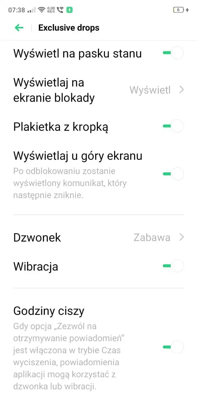
In particular, this applies to time management during:
- Circadian rhythm, in which there is a clear division between work, rest, and sleep
- Seasons, specific time of year
- Daily routine (related to chores and daily activities)
- Secular holidays and church holidays
- Planned activities and duties.
In other words, when designing notifications, you should be meticulous about the temporal context in which you'll send the push message. Ensure that it doesn't interfere with customers' specific needs and activities.
The message must arrive at a neutral time when it won't be perceived as unwanted, disruptive, harmful, or violating customers' cultural norms.
The designer should, therefore, consider in particular to what extent a specific push notification matches the following:
- Time of year, season
- Month — also in terms of its beginning, middle, and end (which is related, for example, to the structure of expenses, financial capabilities, or typical patterns of purchasing products)
- Day of the week
- Hours during the working day or time off
Important questions that you should ask yourself in the context of the relationship between notification and the time of its delivery are:
- What will the recipient be doing at that time?
- In what situation will they be (e.g., business, private)?
- What role does a particular moment in time play in their life (e.g., does it affect their work or leisure time)?
Push notifications design: The best UX patterns
The push notification UX design is the ability to answer the following questions:
- Will receiving a push notification be useful?
- Will it be perceived as important, helpful, or needed?
- Will it make using the app more straightforward and more satisfying?
- Do users expect to receive a notification?
- What attitude do customers, users of this type of functionality, have toward them?
- What form of notification is the most attractive to users?
- To what extent can notifications be insistent?
- To what degree should they be discreet and tactful?
The answers to the above questions set the design framework aimed at ensuring proper UX.
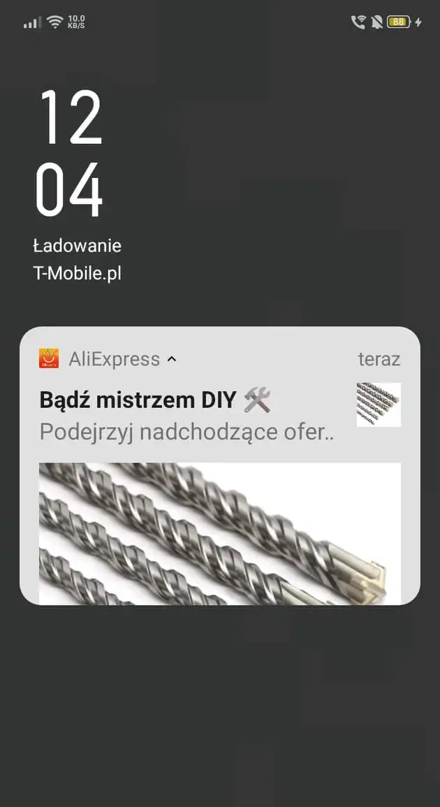
It's advisable to design push notifications as messages:
- Of relatively small size — they shouldn't obscure the entire screen, especially the critical thumb zone.
- That are concise, simple, and understandable, directly communicating their meaning and conveying the most important information, especially since platforms impose character limits.
- Rich with graphics, animations, and audio content while considering the differences resulting from the platforms' policies.
- Valuable — enabling the user to receive a specific benefit.
Contrary to their name, the most common goal of push notifications is not just to inform the user but to prompt a specific action.
That is why hyperlinks, which redirect users to specific tabs, functionalities, and offers, are their constant element.
Microcopy in push notifications
UX writing plays a special role in notifications because of the character limit or perception of such messages, which users read in fractions of seconds.
That is why it's vital to properly formulate and format the verbal message and combine it with a graphic.
Concise, short, communicative, persuasive, but rich push notifications are designed to attract and gain the mobile application user's attention and evoke the need to interact with the notification.
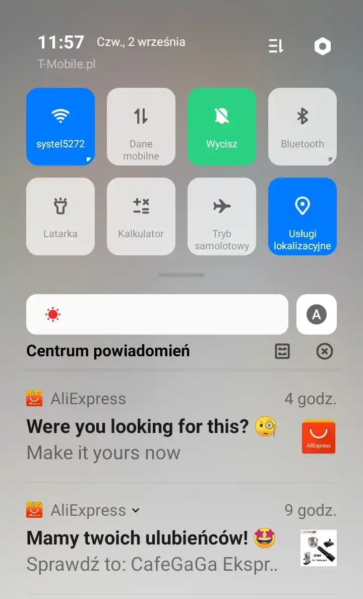
An excellent way to achieve these effects is to refer to universal attractors related to:
- User curiosity (e.g., by informing about novelties)
- User benefits (e.g., by offering free samples, discount codes, and tokens)
- The need for inclusivity or exclusivity — to secure access to something essential or unique.
The most common mistakes made when designing push notifications
The errors most often relate to push notifications' content and distribution when you look at the problem from a more general perspective.
Among the most common mistakes in creating content are overly long descriptions that don't respect character limits and the diversity of content presentation on different devices and platforms.
The length of the descriptions is also significant in terms of the visual-verbal harmony of the message. Both verbal and graphic layers should create a coherent, complementary, and clear message.
Very often, the descriptions also sin with excessive creativity, which, while usually desirable, is not always advisable in the case of push notifications. You should remember that notifications have a utility function.
A notification is supposed to be helpful to the user, to bring real value, and not merely be interesting but not necessarily practical entertainment.
Many applications don't care about respecting the user's time. Push notifications are sent out repeatedly, almost in a spammy manner.
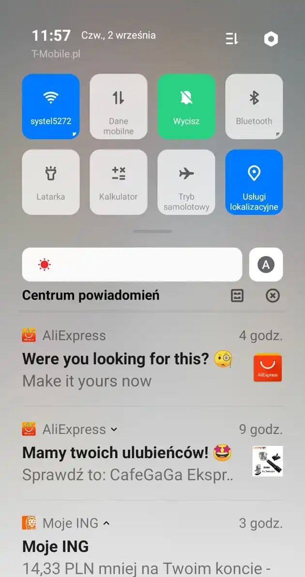
Such ill-considered, chaotic, and mass communication that favors quantity over quality must bring a lot of harm.
Not only to a single mobile app, but it also discourages users from this functionality.
The frequency of push notifications never turns into quality, and the scale effect can't compensate for the damage. You should remember this when planning your calendar for distributing push notifications.
Understanding the audience's needs, style, and lifestyle — especially their habits, routines, and preferences — is much more effective, although it's neither easy nor cheap. It requires relevant research and updates.
An equally common problem affecting the quality of the user experience is excessive message massification, which doesn't consider the character of each audience group.
Personalizing push notifications translates into greater acceptance, higher conversion, and perception of the brand and functionality.
You should also remember that not all industries have the same level of acceptance and permission regarding sending push notifications. The most natural and desirable are industries where time and information about status, availability, and changes are critical.
The tourism and hotel industry, transportation, financial services, e-commerce, news media, and streaming platforms are where push notifications meet with the greatest acceptance and enthusiasm. This is because they bring substantial value to the user's life.
Good metaphors for illustrating the usefulness of push notifications are those of concierge, assistant, and manager.
They allow you to find out about flight changes, the ability to book a room that has been reserved until now, learn about your account balance, or get news about the state of the economy and stock market performance.
Respecting the notification delivery time is extremely important, even in such compatible industries.
In short, you need to carefully consider your push notification strategy if you want it to be effective and achieve the desired results. This will allow you to send messages that users will appreciate.
Designing mobile push notifications. Summary
- Push notifications arouse various emotions and attitudes, ranging from extremely negative to almost enthusiastic. They also generate different levels of user engagement.
- They are a ruthless form of getting a mobile app user's attention.
- Designing push notifications poses many problems regarding timing, form, length, personalization, and customization to the requirements of a given platform.
- Designing and distributing push notifications requires a lot of sensitivity, tact, and restraint.
- Push notifications are concise messages that contain essential information, an offer, a message, a hint, or a warning.
- They're displayed simultaneously or optionally in at least several places.
- They are examples of two very important heuristics: Jakob Nielsen's Visibility of System Status and Ben Shneiderman's Offer Informative Feedback.
- Push notifications are vital to a positive, satisfying, and desirable user experience. They're an essential part of mobile services and increase the engagement of mobile app users, both new and already attracted ones.
- Push notifications come from different sources, are sent for various reasons, and fulfill different purposes. They also allow you to take advantage of the smartphone's native functionalities.
- Prioritizing push notifications is an essential practice that helps improve the UX of a mobile app.
- Push notifications can be divided into three categories of importance. Determining which category a given notification should belong to is primarily a matter of intuition, experience, and knowledge. It's also important to decide when to send notifications and how many.
- The high-priority category most often includes notifications requiring immediate attention and action.
- The medium category includes notifications that don't require immediate action.
- Notifications in the low-priority category usually contain information about status or novelties. They're typically sent to maintain relationships.
- Each application fights for its user's attention, which, when added up, can give rise to a situation of excess stimuli and information. This often results in a defensive reaction in the form of turning off the option to receive push notifications or uninstalling the app. The costs of such activities are easy to imagine.
- Apps that aren't open to users' needs in terms of managing push notifications offer really poor UX.
- Timing is the most critical issue in designing push notifications.
- Mobile messages must arrive at a neutral time when they aren't perceived as unwanted, disruptive, harmful, or violating cultural norms.
- The most common goal of push notifications is to prompt a specific action. Hyperlinks are their permanent element.
- Concise, short, communicative, persuasive texts are designed to attract and gain the mobile application's user's attention and evoke the need to interact with the push notification.
- Mistakes in the design of push notifications most often relate to their content and distribution.
- A notification is supposed to be helpful to the user and to bring real value.
- The level of acceptance of push notifications is inconsistent. Industries where information about time, status, availability, and changes is crucial have the highest level of acceptance of receiving push notifications.


