Jakob Nielsen is a respected usability specialist who almost always wears a bow tie and openly expresses his opinions.
The co-founder of the Nielsen Norman Group is considered an IT conservative who years ago criticized solutions based on Flash, a technology that died in 2020.
Following ten usability heuristics, we present Nielsen's home page design advice supplemented by our comments. They will make any website much better.
A short introduction to Nielsen's Heuristics
Before we jump into specific guidelines regarding home page design, let us briefly mention what Nielsen's heuristics consist of (you can also encounter them under the name Nielsen-Norman heuristics).
We also have seperate articles about them where we get into more details, therefore we won't describe them in depth here. We recommend taking a look at "Usability heuristics by Jakob Nielsen - part 1" and "Jakob Nielsen's Usability Heuristics and Website Design."
For now, all you need to know is that Nielsen's usability heuristics consist of the following principles:
- Visibility of system status: A design should inform users of what's happening through appropriate feedback.
- Match between system and the real world: A design should use words and concepts familiar to the user.
- User control and freedom: Users make mistakes, so they should be able to undo actions easily.
- Consistency and standards: Users should not ponder whether different actions mean the same thing; be consistent and use industry standards.
- Error prevention: Try to eliminate error-prone conditions.
- Recognition rather than recall: Minimize users' memory load by making options and elements visible.
- Flexibility and efficiency of use: Allow the use of shortcuts to make processes more flexible and efficient.
- Aesthetic and minimalist design: Interfaces should include relevant information.
- Help users recognize, diagnose, and recover from errors: Error messages should use plain language and suggest a solution.
- Help and documentation: If needed, provide documentation that is focused on the user's task and its completion.
While these particular heuristics focus more on interaction design and user interface design, keeping them in the back of your mind while designing your home page is still useful. Especially if you would like to perform a heuristic evaluation of it (heuristic evaluation is a usability inspection method).
Without further ado, let us move on to the home page design principles.
1. A slogan for a website
Jakob Nielsen advises that in a visible place on a site (preferably next to the logo), there should be an advertising slogan that encapsulates the basic message and mission of the site. Focus on making the slogan attractive as well as communicating what users gain when they visit our site.
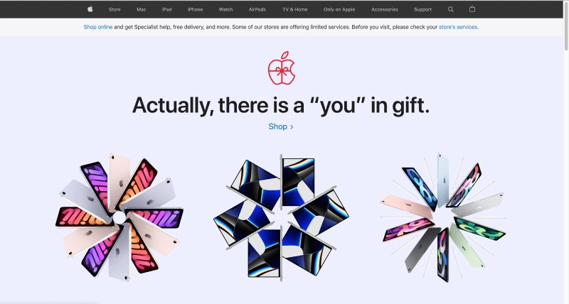
The slogan must be consistent with the brand, the product, and the target group. Remember that if you run, for example, a portal for young people, you should rather bet on "light" communication, which will include, for example, idiomatic expressions. A message directed to an adult audience that has taken an interest in your corporate website will look different, of course.
2. Tag title – website positioning
Start the tag title with the company's name and then add a short description of the website – you should use phrases that will allow it to position well in Google. Moreover, the tag title plays an important role when sharing articles on Facebook, for example. This is because the preset text is automatically taken as the description of a given page.
For example, the WordPress admin panel allows you to add an alternative title that will appear alongside the shared content. Even if it is not downloaded, the problem will be solved by the Sharing Debugger provided by Facebook.
3. Description of the company/organization
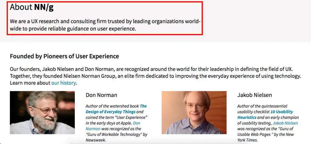
Remember the section where you will describe your company/organization. All you need to do is add, for example, an "About us" page. It's a mistake to leave this space blank with the intention of filling it in later. It looks unprofessional, especially in the case of a corporate website.
Remember it's important to keep users informed about who your company is and what it does, as it can be a factor that will influence potential customers' decisions on whether to buy/start cooperation with your organization.
4. Website and its starting points
Starting points are elements that lead further into the structure of the site. With their help, users will more easily find the most frequently searched elements of the website. The task of starting points is to show what can be found and done within your site. Starting points are especially needed on corporate websites that contain a lot of information.
5. Search engine
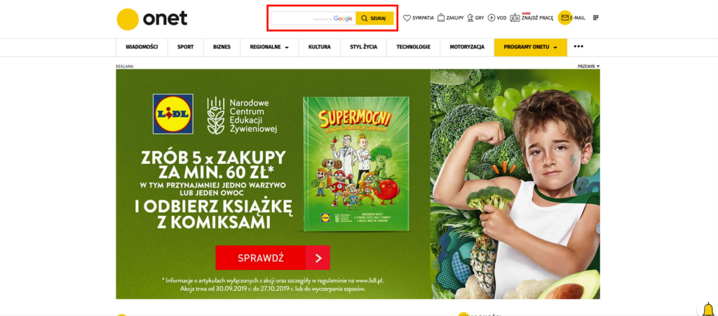
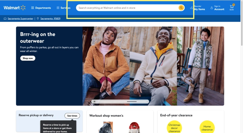
The search engine is another fundamental element on Jakob Nielsen's list of home page design principles. The expert recommends placing it in a visible place, such as in the upper right corner of the screen. Nielsen hints that the search field should allow the user to type in at least 27 characters.
6. Promoting the content of the website
The home page should serve you to promote the most important or recently added products or articles. It's good to attach attractive graphics to them (we write about the selection of images below) and, of course, be sure to include links within them.
It's also crucial to keep a natural and logical order of presenting the content so the user can easily follow it.

7. External links
Describe the links with appropriate words, making it easier for users to browse the home page. Jakob Nielsen points out that a bad practice is to always present users with links that start with the company name. Marieke McCloskey, a user experience specialist at Nielsen Norman Group, says that good links are descriptive, unique, and begin with keywords.
It's also advised not to use generic words like "click here," you should inform the user what they are going to get by clicking on a link. To do that, use text that carries a meaning. For example, instead of writing "click here to see the article," use the article's title. Thanks to that, the user will instantly know what hides under the link and whether they are interested in the article.
Moreover, if a link redirects the user to something other than a web page, ensure the link's text states that.
Additionally, make it easy to differentiate between visited and unvisited links using different colors, e.g., blue for unvisited links and purple for visited.
8. Easy access to the content
Jakob Nielsen explains that users tend to memorize content easily on the home page. The problem begins when other materials later replace them. Internet users may then have trouble finding them. So, you need a short list with the latest content and a link to the permanent archive.
9. Visual design that will improve interaction
Home page elements don't require complicated illustrations or windows. Jakob Nielsen warns that users treat graphics as advertising, so they direct their attention to elements of the website that seem more useful.
Pop-ups, in particular, are the nightmare of the Internet user, and we don't just mean advertising pop-ups. Users are sometimes met with an annoying newsletter invitation upon entering a website. Designers forget that a user interested in an electronic newsletter would find it on their own. A web design company conducted a study showing that, on average, 80% of clicks on the "x" sign were for a newsletter.
Jakob Nielsen wants a website to be devoid of graphics that contribute nothing to the content. Minimalism in website design has been used for a long time, but the increase in its popularity has only become noticeable in recent years. The minimalist design allows users to find what is important to them quickly. This, of course, translates into a lower bounce rate.
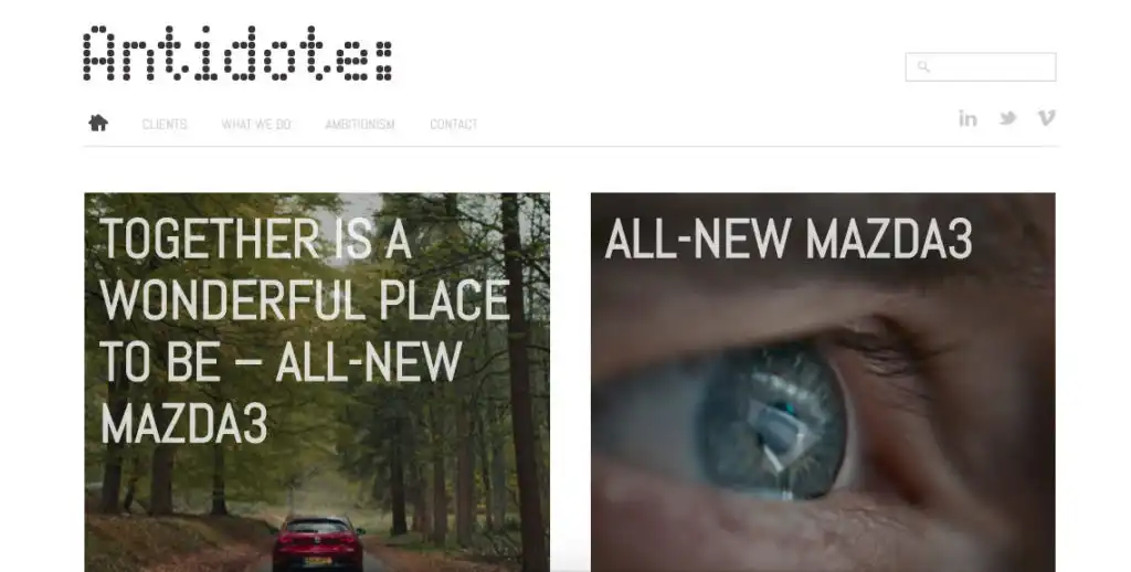
The dominance of mobile devices enforces the minimalist design of websites. The first sign of the coming changes came in 2015: the number of Google searches was then higher on smartphones and tablets than on computers (you can read more in our article: a mobile version of a website). One of the elements characteristic of minimalist design is, among others, a hidden menu, which is opened with "hamburger" – horizontal bars, usually located on the top right.
The fundamental elements of a minimalist website design include a user-friendly interface, using a maximum of three colors (not applicable to photos), and hidden navigation.

10. Reasonable selection of photos
Graphics are primarily meant to complement the content, so you should use them wisely. Are you also annoyed by the photos of artificial-looking people that stock websites teem with? Photographs with "ordinary" people, rather than models with "stuck-on" faces, will usually work much better. The crucial thing is that the photo should always be related to the topic you are covering.
Pawel Tkaczyk, the author of the books "Zakamarki marki" (The Nooks and Crannies of Branding) and "Grywalizacja" (Gamification), says that it all depends on your needs and financial capabilities. However, he advises against using stock photos when introducing a client or their team. He argues that authenticity is vital in such cases.
11. Page reload and refresh
Nielsen states that sudden reloading of home pages causes users to feel confused, and the action itself feels intrusive. Especially when a home page's content constantly changes or suddenly leads to displaying error messages.
Let's also remember that such unexpected reloading and refreshing of a home page may also have an impact on the user's memory load depending on how fast their internet connection is. If it's long, then there's a chance that the user may forget what they were looking for on a home page in the first place because not only did the page reload, but the content also changed.
To solve this problem, Nielsen recommends providing an additional tool to provide users with real-time data without reloading the page.
In the case of refreshing, he advises only changing content like news updates. Other more static elements, such as photos or graphics, should be left alone so as not to confuse the user even more.
12. UI Widgets
It's recommended not to use too many widgets in user interfaces on home pages as they can unnecessarily draw attention to themselves instead of the crucial content.
The general principles in this regard boil down to the following:
- Use widgets in places where you want users to click on
- Avoid the use of many text entry boxes, particularly at the top of a screen where the search box is located
- Don't overuse drop-down menus.
13. Navigation
One of the functions of a home page is to direct the user to other elements of the website. To do that, you need to make sure that its navigation works as best as possible. The user's navigation should not consist of trial and error activities.
Nielsen's suggestions regarding this matter look as follows:
- Put navigation in a visible place. Avoid locating it above horizontal rules or banner areas; otherwise, users will ignore it.
- Group similar items in the navigation area. It will help users recognize related categories and see the full offer of the products or services that you offer.
- Don't create many navigation areas for the same types of links.
- Don't place a link to a home page on a home page. For example, the " home " button leading to a home page should be inactive. It will save users from the additional effort of clicking on the button only to see that nothing has changed.
Who is Jakob Nielsen?
Jakob Nielsen comes from Copenhagen. He holds a doctorate in computer science from the Danish University of Technology. His resume includes work for IBM, Bellcore, and Sun Microsystems. Since 1998, he and Donald Norman have been running the Nielsen Norman Group, a web development consulting firm. Nielsen has published more than ten books, such as "Designing Functional Websites," and has written numerous articles on usability.

Nielsen believes in the "low-cost utility engineering" theory, according to which:
"Basic usability tests of websites, applications, or products do not require specialized equipment
They can be carried out by people without much experience
In many cases, it is enough to conduct a test on five people to obtain most of the knowledge about usability problems."
Were you intrigued by the Jakob Nielsen home page design principles we presented? We invite you to read other articles as well!


