Heuristic analysis is a method of assessing user interfaces that aims to identify usability problems. Jakob Nielsen has developed ten usability heuristics that describe the elements and principles of user interface design that often generate errors.
In this article, I'll describe the first five heuristics.
1. Heuristic — Visibility of System Status
1. Heuristic: Nielsen says that the system should always keep users informed about what is happening through appropriate feedback within a reasonable time.
Process transparency helps users correctly understand their tasks. This allows users to make the right decisions.
Interaction with a system should be understood as a process or a series of predetermined processes (e.g., use of a form, ordering a product, sending an email). When moving around a system, the user asks two fundamental questions: where am I, and what is happening now?
An excellent example of informing the user about the place and status of the system is the application form on the website of the medical company kcrcro.com, which was designed by The Story.
Where am I?
First of all, always inform the user of the place/section of the system. By using breadcrumbs, the user knows they are in the "join our team" section and that they are applying as a "researcher."
What's happening?
The second element is navigation during detailed processes. Our user can see the six-level navigation bar. The game of colors informs them that they are on 2 of the 6 steps.
In the online store, a similar mechanism may inform the user that they have placed some items in their cart, but they still have to choose the delivery form and make the payment.
This screen has another essential functionality. It allows the user to select a set of variables and, most importantly, informs them which variables they have chosen and provides an easy opportunity to change decisions.
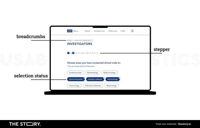
An example taken from kcrcro.com by The Story
The solutions discussed above, inspired by J. Nielsen's first heuristic, keep the user continuously informed about their choices. Moreover, the user has control over the process in which they participate.
Meeting the standards resulting from the first heuristic is the essential condition for a satisfactory interaction with the system for inexperienced and experienced users.
2. Heuristic — Match Between the System and the Real World
The system should be written in the user's language, using words, phrases, and concepts known to the user, not system-oriented terms.
Follow real conventions and present information in a natural and logical order.
One of the most basic principles of user-oriented design is understanding their thinking and context of use. You must remember that you are not the users for whom you design.
You are not the user!
Nielsen's second heuristic indicates the need to research users.
User language
Language in an application that's adapted to the user has a positive effect on its functionality on several levels.
First, natural language allows you to understand the website's content quickly. Thanks to this, users identify the site as the place that meets their needs.
Second, remember that users scan a website for important information/keywords. If these words are well chosen and natural for the user, the chance of keeping them there for longer increases significantly. If not, the visit will last a matter of seconds.
The language's naturalness is also important for SEO. Users will use search terms for your site that are the same as the keywords used in the search engine.
It also works the other way around. The occurrence of relevant terms on a website makes it rank higher in the context of searching for a specific entry.
In short, your website should speak the users' language.
User World
You can help users find your site by following generally known and intuitive design standards. I refer here to web application design principles and more generic cultural norms.
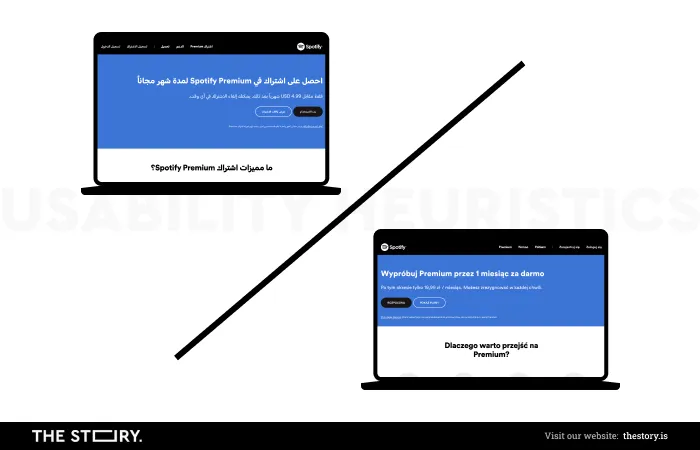
It is customary to reserve the top left corner of a website for its logo. This obvious principle comes from the convention of reading from left to right. In right-to-left languages, the logo is shown on the right.
This difference is clearly visible when using the Polish and Hebrew Spotify start pages. Both sites contain the same content, but the Hebrew layout mirrors the left-to-right version.
3. Heuristic — User Control and Freedom
Users often choose functions by mistake, so they need a clearly marked "emergency exit" to leave an unwanted subpage without having to go through a lengthy dialogue. Remember the "undo" and "redo" options.
Sometimes, users get lost or go a step too far. Let's remember the facilities that allow you to move freely between different system levels.
You can't be sure that the user knows how they got to where they are now, and even if they may, they probably want to avoid repeating the whole process from the beginning.
Therefore, by adding the "undo" option, you will improve the user's comfort, as they do not have to follow the path from the beginning, and, secondly, increase their control over the interaction with the site, positively affecting the satisfaction level.
In implementing Nielsen's third heuristic, online stores are guided by the maxim "the customer comes first." By providing complete freedom in navigating the site, you also offer comfort to the user. If you make it easier for them to choose a product and place it in their cart, you must ensure they can remove it just as easily. The last thing you want is for the user to solve this problem by closing the page.
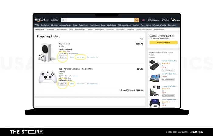
An excellent example of how to apply this principle in practice is the construction of the Cart page at Amazon.com.
After the user has decided what they want to buy on the product's page, as many as three fields in the cart stimulate the user, giving the opportunity to increase the order (marked in yellow).
On the other hand, users can easily remove products from the cart or reduce the number of products ordered.
The user has complete control over the selection of products.
4. Heuristic — Consistency and Standards
Users should not wonder if different words, situations, or actions mean the same thing. Follow the standards of your platform.
Nielsen's fourth heuristic refers to the system's internal coherence. This principle applies especially to large systems where many people are involved in the design process.
You cannot allow a situation in which the user has made an effort to learn the terminology/functioning of your platform and feels discomfort when suddenly encountering a different standard.
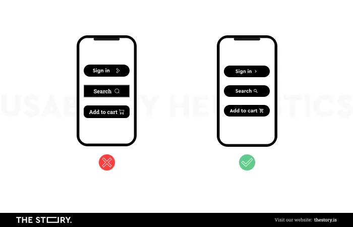
Format consistency
Correct design must be based on consistent standards that allow the user to learn and understand how to navigate your site easily. Your design decisions determine whether the user finds themselves in the "world" of the system you have created.
It's about creating standards that ensure internal consistency.
The first step to creating an internally coherent ecosystem is to develop standards, both in terms of graphics and terminology.
Graphic consistency
From the branding point of view, identification should be characteristic and distinguishable from the market environment. That is why you focus on more elementary principles of coherent design in this heuristic, such as universal link designation, CTA, text structures, etc. However, there is no need to reinvent the wheel.
Generally accepted standards should be used for a very simple reason. Users spend most of their time on other websites. In this way, they get used to generally accepted solutions.
Users spend most of their time on other sites.
Jakob's Law of Internet User Experience
Steven Krug, in the book "Don't make me think," is part of the narrative of Jakob Nielsen, but allows the possibility of introducing a new solution, but only on one condition — the new solution must be much better in terms of functionality and be easy to assimilate.
How to create standards?
- First, describe them with examples. When writing instructions, it's worth using an image that often speaks better to people, especially designers, than a description.
- Prepare a checklist of standards to be met by the proposed solution.
- Remember to check compliance with the developed standards for new projects.
- When designing, remember about generally accepted standards.
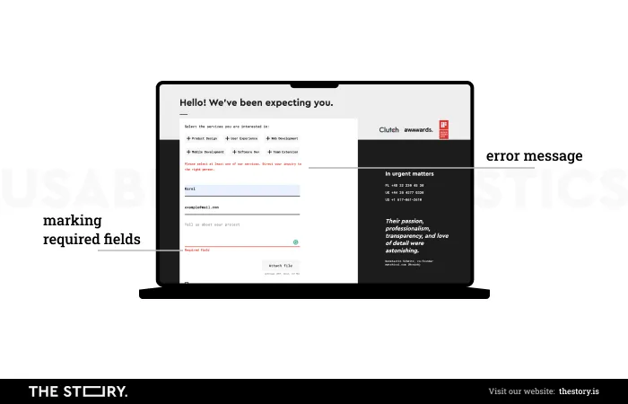
5. Heuristic — Error Prevention
Users are often distracted when performing a task. Prevent unconscious mistakes by suggesting, applying limitations, and being flexible.
Designing interactive systems requires humility. The most outstanding authors in the field of UX point out that the person responsible for user errors is primarily a designer who did not ensure they solved all possible problems.
It's crucial to let users recognize, diagnose, and recover from errors if you want them to stay on your site and not abandon it.
It's impossible to eliminate error-prone conditions entirely. However, there are several general principles that, when followed, help to make the system immune to the most common errors.
- First, when surfing the web, users mainly use short-term memory. Therefore, you should create systems that store as much data as possible for your users. So, the performance of tasks on your site requires them to confirm the correctness of information rather than remembering and entering it (minimizing the user's memory load).
- Secondly, users should be asked to confirm the deletion of items. Regardless of whether they will be photos, applications, or other elements, the user should be additionally informed about the scope of changes made (e.g., highlighting/counting deleted photos) and their consequences (e.g., no possibility of restoring or keeping in the bin for 30 days). Additionally, present users with an option to confirm the choice or action they're about to take.
- Current systems allow advanced logical control of data entered by users. It's worth checking the correctness of the entered data in terms of format and informing where the potential error lies. A good example is Grammarly.com. The system checks the grammatical correctness of the text but displays an explanation for each suggested correction.
- Unfortunately, you cannot predict all system use scenarios, so users will make mistakes. It's worth supporting the ability to cancel the action. Gmail is a good example; it allows you to cancel the sending of an email a few seconds after clicking "send."
To understand user errors
The psychologist and UX guru Don Norman distinguishes two types of user errors: slips and mistakes. This distinction is important because it refers to different mechanisms of formation. I will describe below what they characterize and how to avoid them.
* Based on the book Don Norman, The Design of Everyday Things, Karakter, 2018
Slips
Slips are minor errors or irregularities that occur during a task. They appear when the user wants to perform an action but, as a result, does something different but similar. An example would be missing a letter in the text or email address or choosing too many or too few products in the cart.
Mistakes are most often the result of running on "autopilot." They happen more often to "experts," i.e., users who know the system well.
How to avoid slips?
The best remedy for slips that result from haste or lack of attention is to help users achieve the required level of precision and encourage them to check the correctness of the data. To this end, you can:
- Apply thoughtful restrictions — when purchasing flight tickets, users can choose the departure and arrival dates in the calendar. The calendar highlights the selected dates and marks (usually by shading) days between them. In this way, the user can, without additional effort, verify the correctness of the length of the stay.
- Use hints — users do not need to know the exact wording/terminology used on your platform, so use hints. An interesting example is the terminyleczenia.nfz.gov.pl application, which allows users to search for the first available medical service date. Medical terminology is not intuitive, so a well-designed search by keyword is a basic element of this interface.
- Ensure well-thought-out default settings — i.e., tailored to the user's needs and reality. The jakdojade.pl web application remembers the time of the searched connection. The next time the user searches in the same tab a few hours later, the time does not update by default. As a result, users see results for connections that departed even a few hours earlier.
- Use thoughtful formatting of fields in forms — the form usually collects information that you can subject to thorough, logical control. Checking is necessary because the data is often entered into the database. The designer's task is to translate the database requirements to the user. Therefore, instructions and error messages should be displayed clearly, accurately, and understandably.
Mistakes
Mistakes are a higher-caliber error. They appear when the user's goal is inappropriate for the problem or task they're currently performing. The most common reason is usually incorrect or insufficient information needed to complete a task. However, designers can potentially significantly reduce these types of errors.
A practical example of a mistake is correcting the contact form details in the wrong field.
Let's imagine the system displays an error message in the data but does not provide information about the reason for the error. After the first data check, the desperate user will probably start to think of a new date or phone number format.
The whole problem stems from an inadequate way of informing the user how to complete the form; hence, they make errors. Error messages can counter this problem, provided that they are clearly designed and tell the user exactly where and what the problem is.
How to avoid mistakes?
- First of all, user research should be conducted — errors may result from the designer not understanding how users think about performing a given task. As a result, they design a flow adapted to their own ideas. Proper knowledge about the user helps match the tool more accurately to the user's perspective.
- Secondly, generally accepted conventions in design should be used — remember that your users spend most of their time on other websites (Jacob's Law). This means that you can (and even must!), by using general standards, help users understand how your platform works.
- You should communicate how to use the system correctly. If you clearly show how the elements of your platform function (e.g., you need to inform about the correct date format/phone number, etc.), users won't make mistakes, and their correction won't be frustrating for them.
- Results preview — users may not be fully aware of the effect of completing an action. That is why it's worth creating a visual for the change and asking the user if they're sure that they want to make it.
If you want to know more about the rest of the heuristics, we recommend you read part 2 of this article, where we discussed the following heuristics in more detail: recognition rather than recall, flexibility and efficiency, aesthetic and minimalist design, help users recognize, diagnose, and recover from errors, and help and documentation.
Hero shot: YouTube/NNgroup


