Rebranding the clinical research company KCR
KCR is a global company in the clinical research industry. In 2019, we undertook a company rebranding project for them, and our target market was Boston. By 2019, KCR was included in the TOP 10 CRO companies in the world, according to proclinical.com.
Re-branding and a business problem
Our task was to cope with several business challenges facing the company: reorganization, the creation of sub-brands that would allow them to communicate solutions, not services, as well as support for KCR in building its position as a leader on the global market.
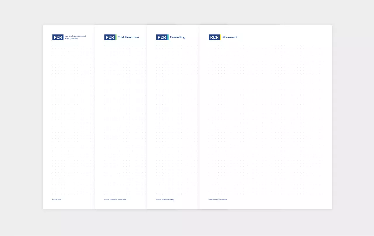
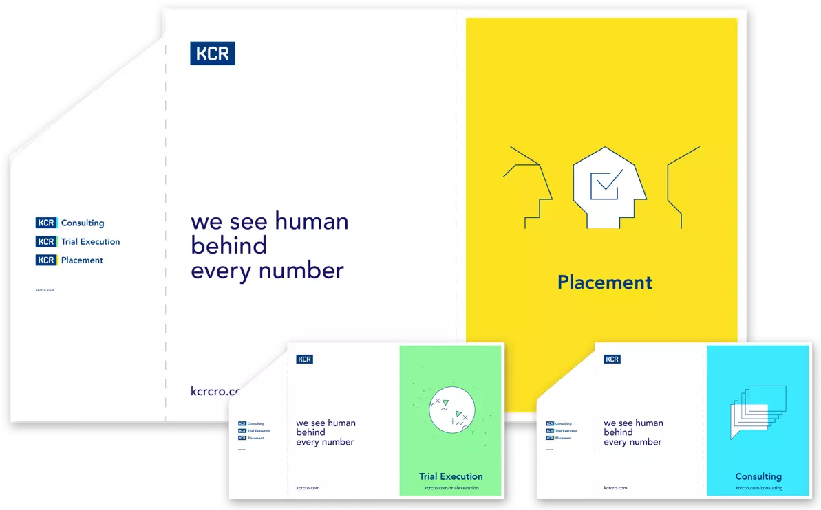
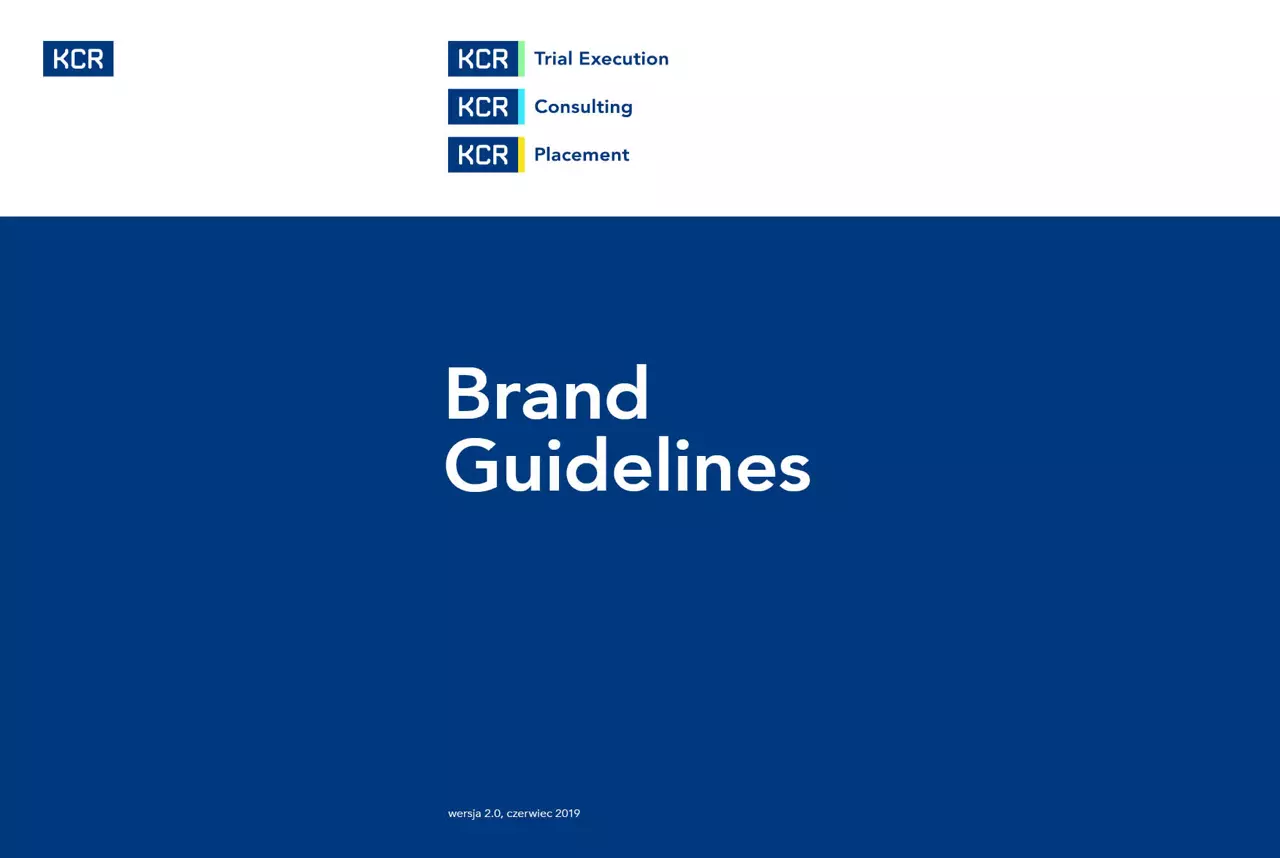
New brand architecture
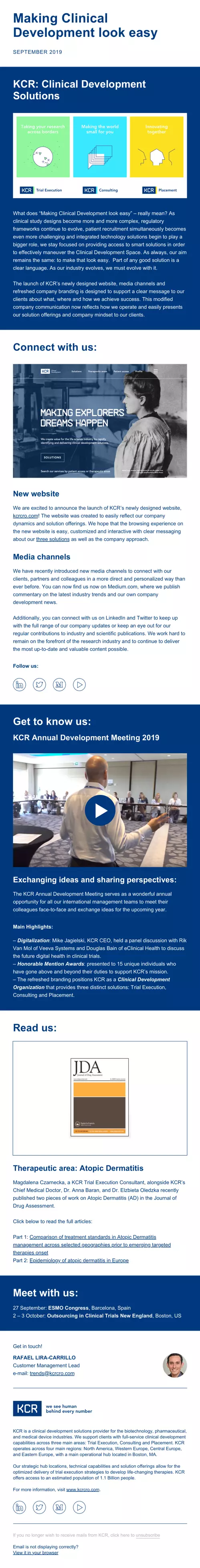
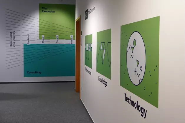
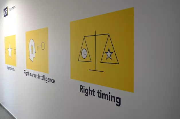
The new architecture reflects the new organization of the company and the idea of providing solutions rather than providing services. Trial Execution - conducting clinical trials, Consulting - consulting in the field of planning and conducting research, Placement - outsourcing of experts and specialists.
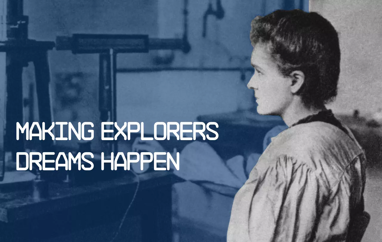
Images
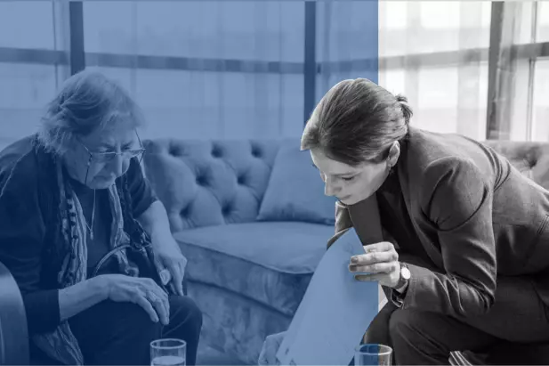
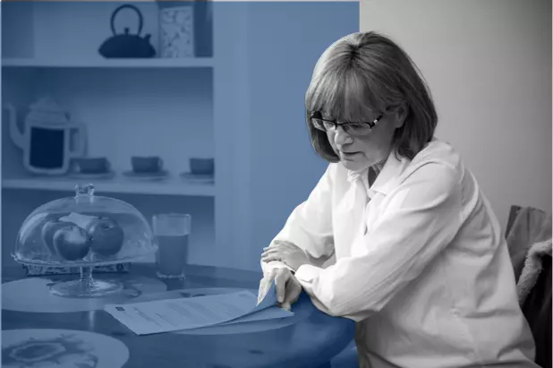
Designing a system for images that will make the brand stand out on the one hand, and prove useful on the other, is a challenge. We focused on the brand's new colors and a diffusion effect, which convey the idea: "We see human behind every number".


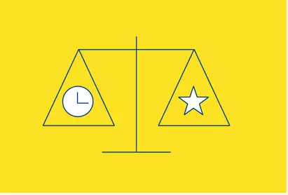
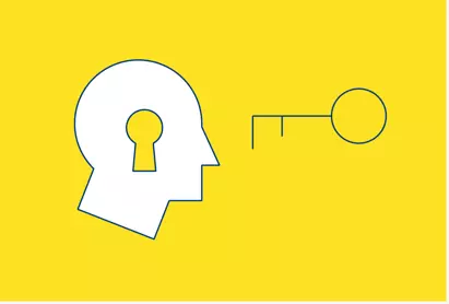
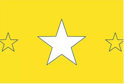
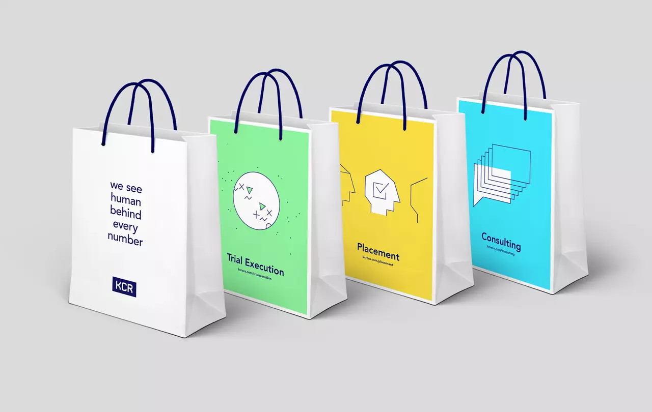
Illustration
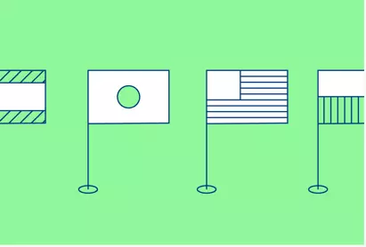
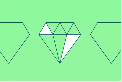
Illustrations are a logical development of the sub-brand identity system. The right color combines the image with the right sub-brand. Each illustration reflects a theme, a metaphor, with the same style of creation and composition.


Icon
We have designed a special set of icons reflecting the company's operations. Icons are an important element of the visual language of the brand, and their appearance results directly from the design of the sub-brands and illustrations.
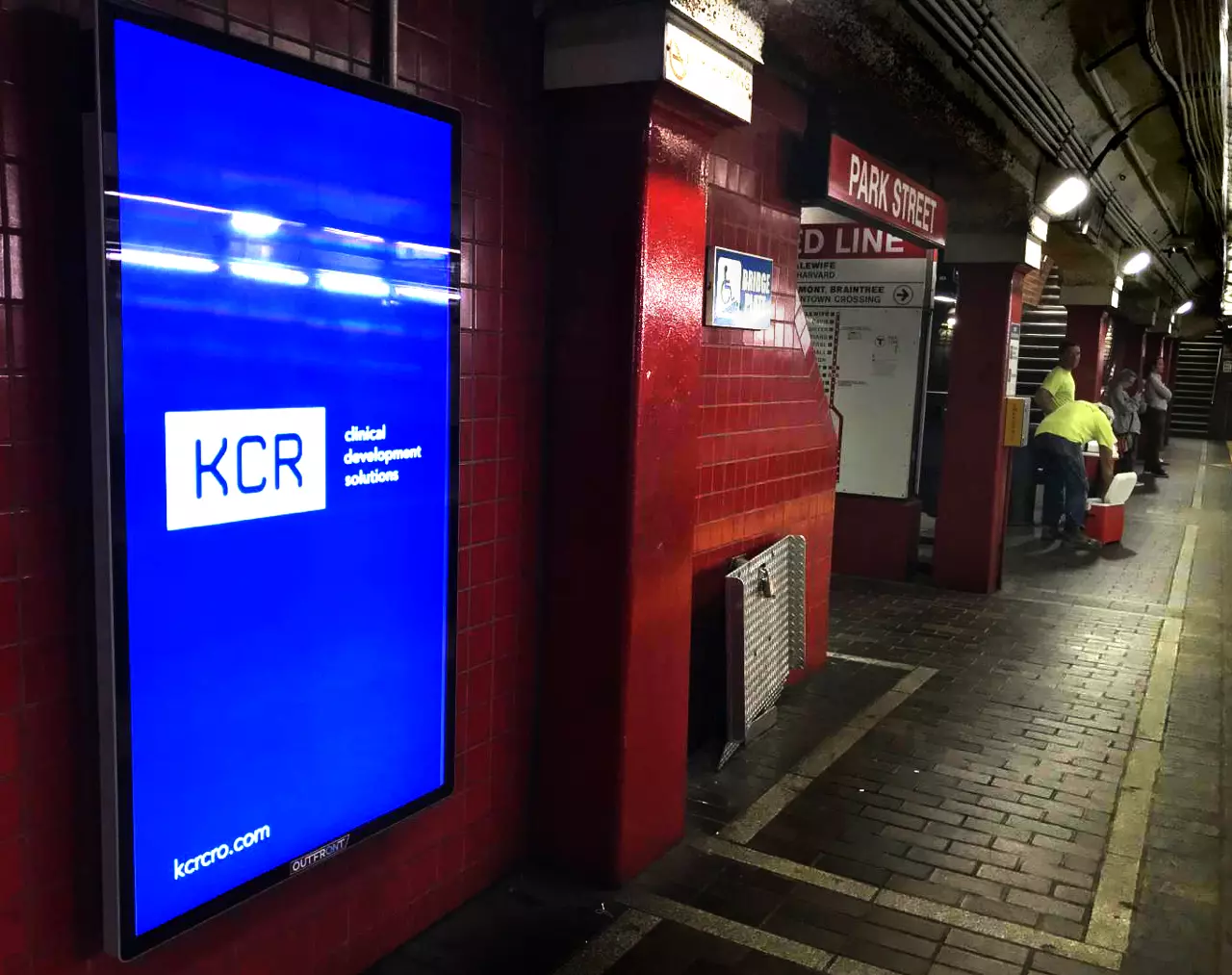
Image service
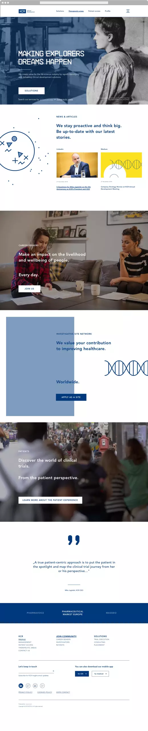
One of the main brand mediums, through which we tested ideas and verified our work throughout the entire process, was the company's new website. It fulfills the goals of stakeholders of the enterprise, i.e. clients, employees, clinical centers and patients.
Corporate mailing
We have developed a new method for electronic mailings. It allows the use of popular mailing communication tools.
Office space
Rebranding led to changes in the company's headquarters interior. The office space is a great medium for communicating change in a wider sense.
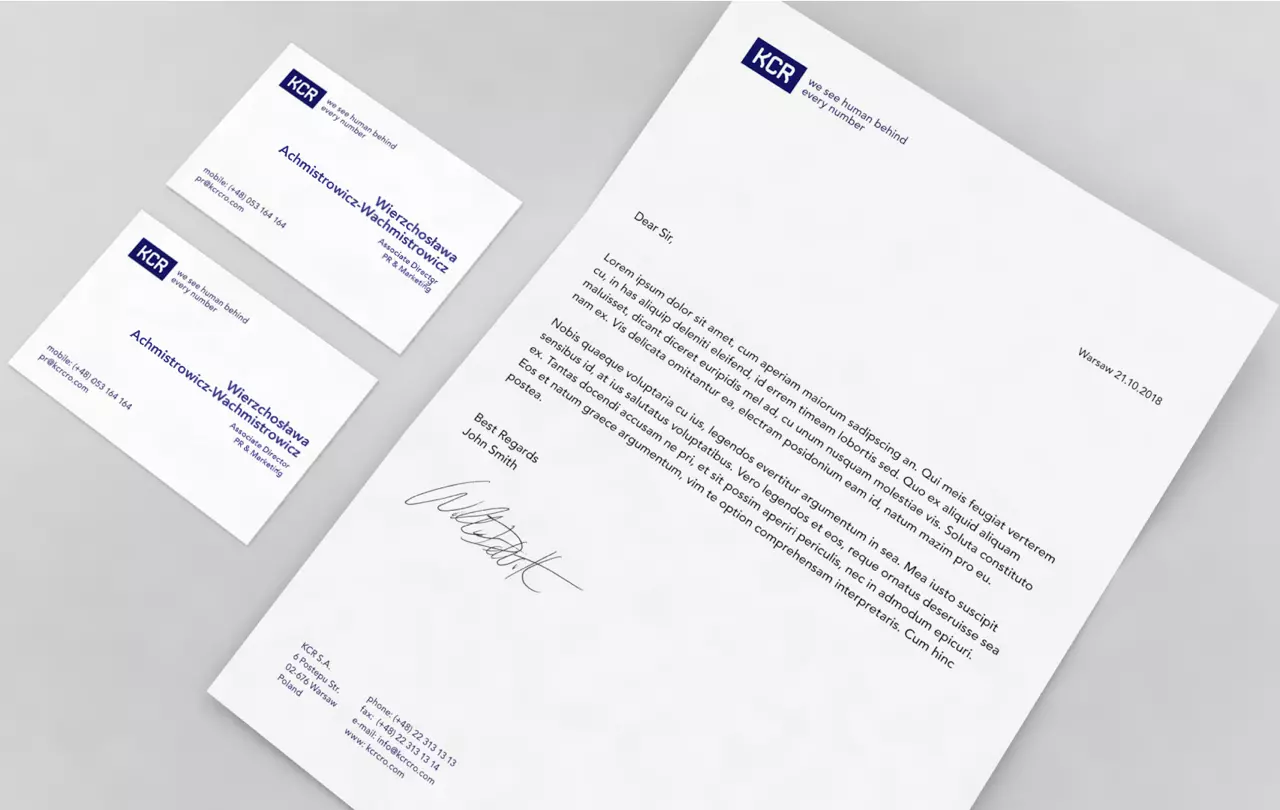
Tools for everyday work
We designed the entire line of tools used by the company's team. From paper media to digital media - presentation and document templates.
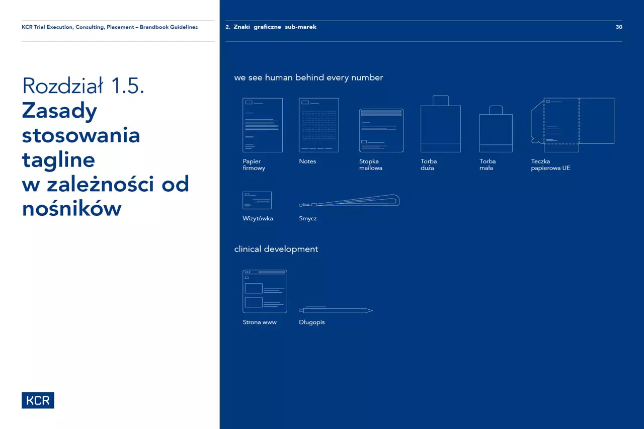
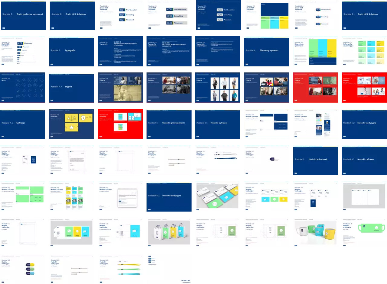
Brand Guidelines
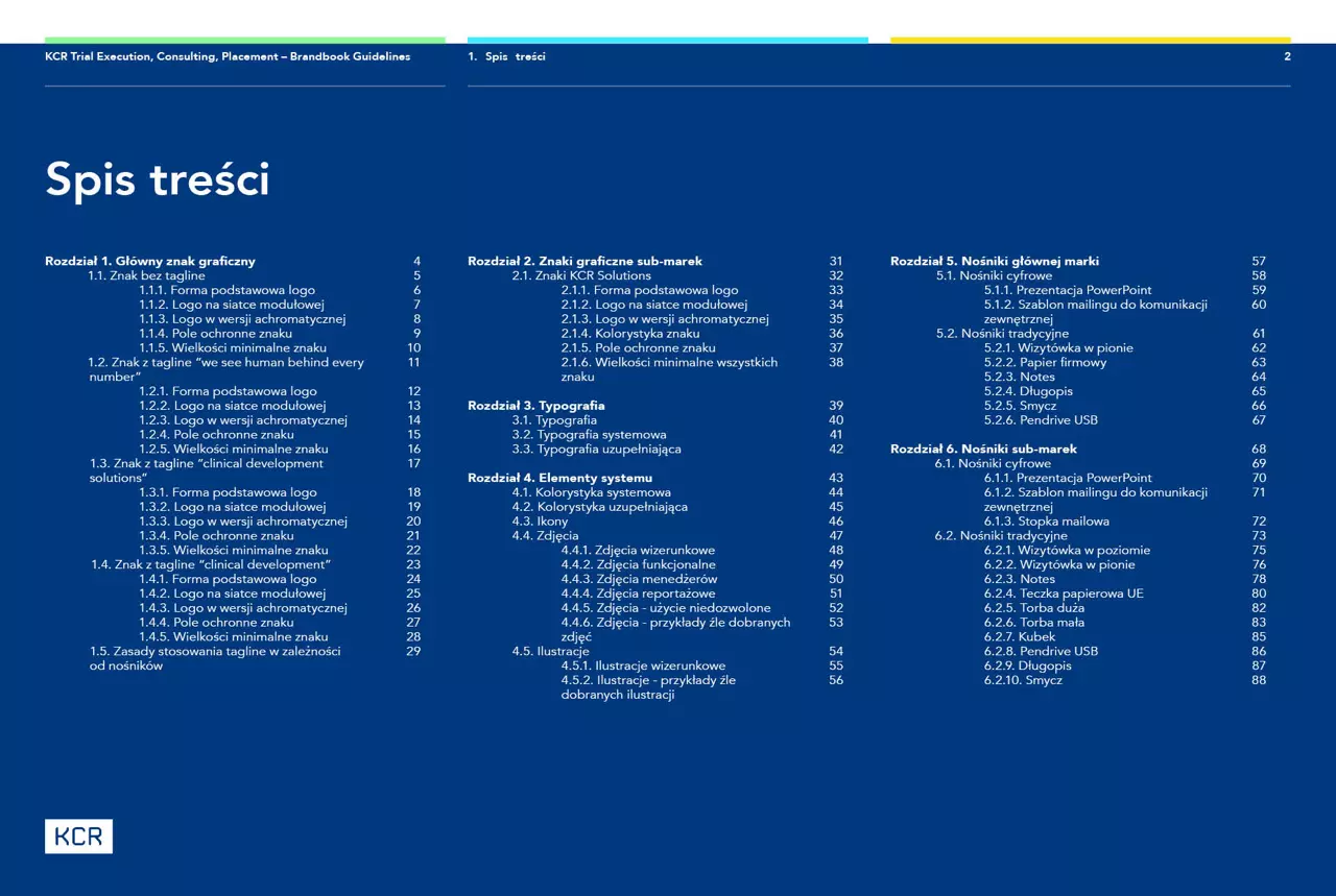
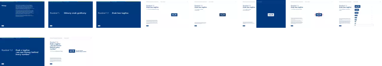
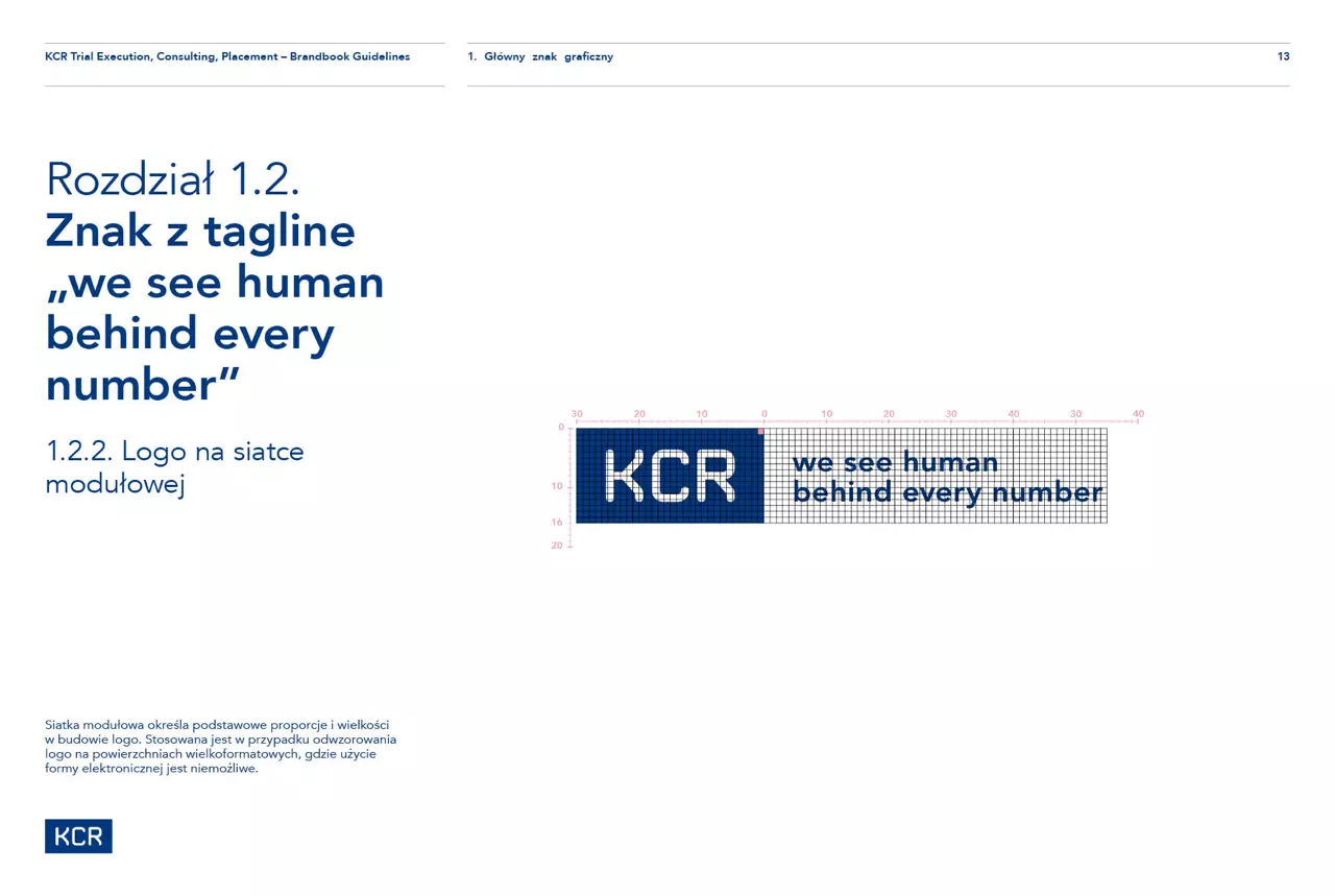
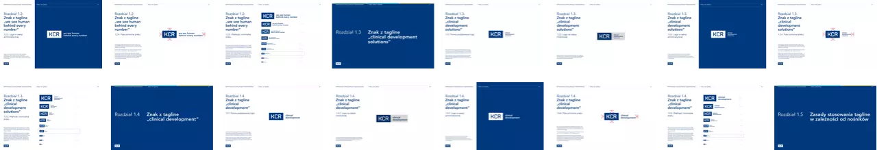
The brand new identity system has been documented by us in the almost 100 page brand manual.
Design system?
While working on rebranding, we used the Design System approach, but its expression and documentation will be presented in subsequent projects. Meanwhile, we share the contents of the underlying document - the Brand Guidelines.