Today, we will write about hearts ;-) When purchasing products in online stores, you often click on them, so you don't have to look for the desired products in the future. What function do we have in mind?
Of course, we mean Wishlists, Shopping Lists, and so on. We think about the "Add to favorites" function.
You can also encounter the name Want list.
Do you know why creating, offering, and optimizing Wishlists is so important in E-Commerce? No?
Then read this article! You just have to!
Why do customers need Wishlists?
Before we answer this question, we need to pose further questions that will lead us to obtain the correct answer to the main one. Thanks to them, you will see the problem from a slightly different perspective.
Why do people spend an average of just over 3 minutes during each session in an online store?
Why do they buy so little during this time and perform such a small number of relevant interactions from the perspective of the online store owner?
Let us remind you that the Conversion Rate in E-Commerce ranges from 2 to 3 percent. What does that mean?
Before we answer, we need to add that we took the above data from a fascinating article, "The E-Commerce Industry's 12 Most Critical Metrics".
So why do people eagerly visit stores but not buy anything in them?
The majority of E-Commerce customers don't visit stores to buy something. The most common motivation is the desire to see the assortment, learn about prices, compare products and learn about their features.
And often also (especially in the case of the young generation Z), the desire to have fun and experience something pleasant and exciting.
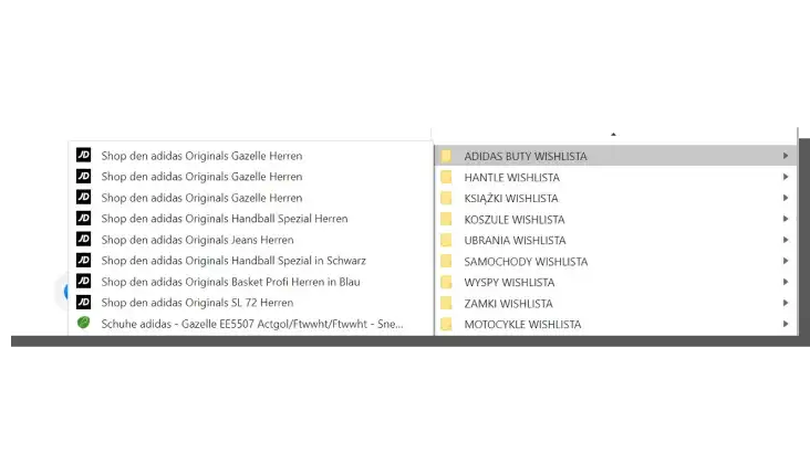
When visiting stores customers work really hard. The results of this work were most often seen in two places — shopping carts and bookmark folders in browsers. Today they are primarily seen in wishlists.
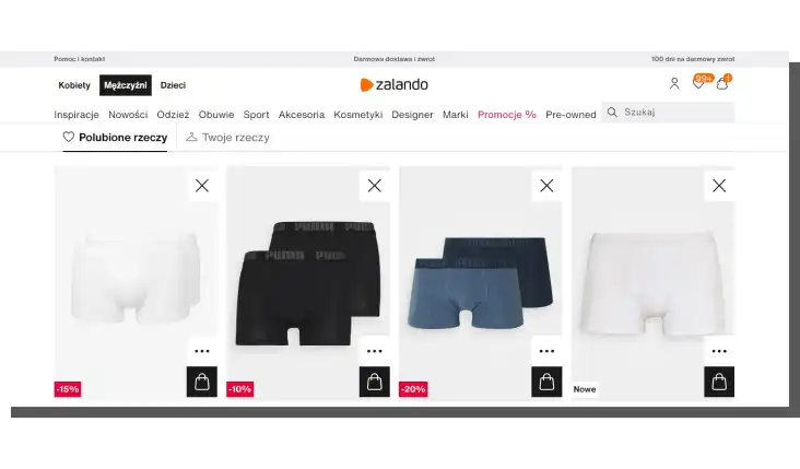
For this work, this preselection not to be in vain (we think that nobody would like to count on the quality of human memory in this matter); it is necessary to offer a tool that will save its result.
The implementation of the function "Add to the list/wishlist" is not a creation of "fancy features" but a tool that supports sales.
Don't you believe me? Then ask people who were buying online when wishlists were unavailable on product cards.
We have people like that on our team, and they remember that all their efforts were wasted because, at that time, products added to the cart but not purchased simply disappeared from it. In some cases, with the end of the session; in others, after a certain time. And with them, their desire to buy also vanished.
Generally speaking, everybody was losing.
Alright, but now we will proceed to another issue. Wouldn't it be simpler not to remove items from the shopping cart?
Why do users need wishlists? Think about it for a moment.
Shopping cart vs. Wishlist
The shopping cart and wishlist dilemmas were interestingly and thoroughly described in the article "Shopping Cart or Wishlist? Saving Products for Later in Ecommerce," published on the NN Group blog.
Page Laubheimer rightly observes that users frequently treat the shopping cart as a flash drive on which they save choices they intend to return to in the indefinite future.
However, this remark should be supplemented. Of course, it's not just about the shopping cart's mnemonic function (supporting remembering). Users also have different motivations.
They want to purchase at a different time because they want to wait for the following:
- Better financial situation
- Different, more profitable price — although not directly, they expect a discount
- Product to be paired with other products — bundled offer
- A desired variant of the product to appear (such as size, color, or accessories)
- Option to compare products (for example, when a new version appears).
As well as wait for the possibility to:
- "Own" the product without purchasing it or getting closer to buying it
- Specify their preferences, often preceded by searching, filtering, sorting, or comparing
- Create collections (to compile a full outfit, for example)
- Plan purchases.
As you can see, multiple motivations raise the problem of conflict of interest. Because the shopping cart does not support these needs, it serves to (or it used to) make a quick and convenient purchase. Only after that can it have these hidden, implicit, and unplanned functions mentioned above.
The conflict of functions was particularly frustrating and severe when it was necessary to purchase a product that was not included in this handy list.

If the products on it cannot be bought, or customers need to make a different purchase, a problem emerges. They need to erase the list and destroy their work to buy.
This situation may result in resentment toward the store or prompt them to buy elsewhere. It can impact the user experience (UX).
That is why the online store should offer the option to:
- Save products on the wishlist
- Create an unlimited number of shopping lists
- Edit the wishlist (offer sorting, for example)
- Move products "from" and "to" the cart.
As well as offer the possibility to:
- Move products between the lists
- Add comments, notes
- "Coupon Clipping" in the form of informing the user about changes in the offer of a given product based on selected criteria (concerning the price, delivery time, delivery price, or return).
With this supplement, we can return to Page Laubheimer's findings, especially since he points out another crucial issue, namely concerning the method of presentation of these functions.
According to him, they should be:
- Discoverable
- Clearly labeled
- Transparently easy to use
- Low-effort.
In other words, users need to notice them, understand their usefulness, and use them effortlessly and without unnecessary costs and conditions (such as creating an account).
It's vital to avoid the "something for something" logic — function for a registration. It sounds very unpleasant, almost like blackmail, and certainly, it's not a practice that you should implement.
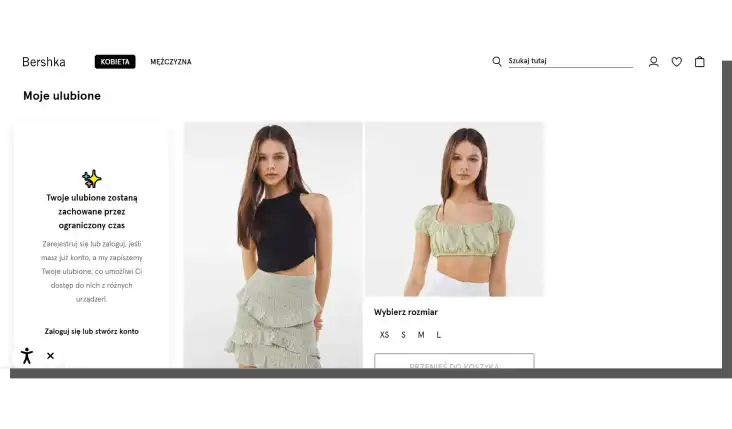
It is also worth noting that the icons of the wishlist have already become highly conventionalized. The heart icon is one of the most frequently used. Less popular are star or plus icons and CTA buttons.
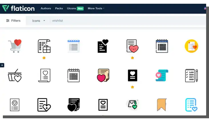
Similarly to labels, the names of this function are also subject to conventionalization, and those we use in this article are among the most popular.
Functions of the Add to Favorites function
The versatility of this function is probably its most significant advantage. Lists of favorite items and products are an analytical and sales tool for store owners.
For their customers, they are functionality that meets critical purchasing needs. If only to save time and work and to easily achieve purchasing goals or to have the ability to receive additional benefits.
From the point of view of online store owners, the justification for their use is even greater.
Wishlists:
- Express a need
- Enable to confront and match demand with supply
- Allow store owners to plan the inventory better
- Help support customer loyalty and increase retention
- Are an indicator of market trends
- Are a reasonable justification for mailing (e.g., informing about renewed availability or discounts)
- Can be easily shared, thanks to which they are an attractive promotional tool (WOMM — word-of-mouth marketing).
But also:
- Can be shared in a private, public, and visible when shared formula
- Support customization of the offer
- Play the role of the shop assistant
- Help create Personas
- Generate traffic
- Generate hype for a given product and support current trends
- Engage the user of the online store emotionally
- Can bundle products from the wishlist with recommended products, most frequently purchased items, those on sale, or with reduced prices.
Simply put, wishlists make the buying and selling process simpler and faster.
Designing Wishlists for E-Commerce
In the full sense of the word, wishlists are tools supporting experiences and achieving a positive user experience.
Do they always do that? Unfortunately, the Baymard Institute's study doesn't answer this question affirmatively.
In the article "The Current State of E-Commerce Product Page UX Performance (19 Common Pitfalls)," which summarizes the situation in E-Commerce, 60% of online stores require creating an account to use the wishlist function, which from the UX (and UX design) standpoint is a severe mistake.
Researchers from Baymard do not deceive themselves — these conditions reduce the effectiveness of this functionality and its availability.
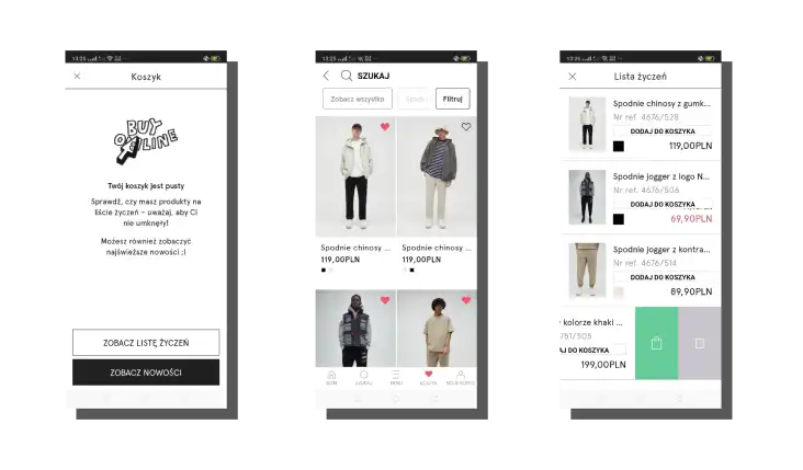
That's why its use should be recommended and obvious — online stores should offer to add products to the wishlist for guests, customers that don't want to create an account as a requirement.
The presentation of the product in the online store can't only serve as an overview. Users should be able to view the offered products and also add them to the wishlist.
The functionality of the online store should meet the broad needs of customers.
Another good design pattern is to offer the ability to customize and edit the list. The customer should also be able to choose whether to share or view it.
Wishlists should not only be discoverable but also treated as a tool as important as the shopping cart with which they should be closely integrated.
Expressing thanks for the effort and engagement and rewarding users for the work done (with discounts, for example) is also a recommended method for increasing the attractiveness of this tool.
Suppose you are wondering how to increase E-Commerce sales and avoid shopping cart abandonment; you are still uncertain about what the E-Commerce customer expects. Be glad because you have just found the answer to these questions.
Wishlists improve the quality of shopping and create another functional sales funnel. They help establish relationships and encourage activities.
Therefore, it is crucial not only to know what the customer can do with the wishlist but also what the store can do with the data acquired from it.
Most importantly, the data from this source can be used as a rational basis for building a strategy.
Other design patterns recommended for creating the wishlist include the following:
- Including its icon and/or button on the product lists, product pages, shopping carts, or main menus
- Creating a separate, fully functional product page with "favorites"
- Ability to browse saved products in the category tabs
- Option to sort products from the list according to various criteria
- Possibility to add multiple products from the list to the cart in bulk
- Ability to create pairs or groups of products that are purchased simultaneously.
Designing Wishlists for M-Commerce
Shopping in the mobile channel is more focused on tasks than browsing and familiarizing with the offer. Thus, shopping lists make even more sense.
Why? We know it can seem counterintuitive.
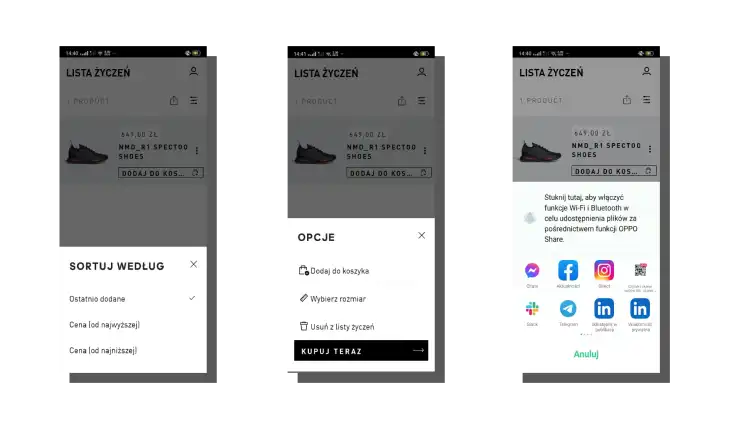
For a simple reason — customers expect continuity of experience. They expect a smooth transition between channels, tasks, and objectives. For example, the situation can look like this: The customer is browsing through products on a desktop computer and adds them to the wishlist. However, they finalize the purchase on the mobile phone while waiting in the subway, using the previously prepared list.
Experiences in the web channel must have consequences in the mobile channel and vice versa. Experiences need to complement, cumulate and support each other.
Functionalities can't compete with each other they should serve to achieve goals regardless of the type of device. Consumers' purchasing decisions often depend on this.
When designing lists of favorites in the mobile channel, you should primarily ensure the following:
- Availability and discoverability of these functionalities
- Visibility of icons which should be available in the main menu on the product cards
- The convenience of determining options of the product from the level of the wishlist
- Speed of finalizing the purchase through readable and highlighted Buy/Add to cart button.
Designing Wishlists for E-Commerce and M-Commerce. Summary
- The majority of E-Commerce customers visit stores to see the assortment, learn about prices and compare products.
- When searching or browsing through the assortment, customers perform work.
- The results of this work were most often seen in shopping carts and bookmark folders in browsers.
- Currently, the shopping list has taken over the role of bookmarks and carts.
- The implementation of the function "Add to the list/wishlist" is not a creation of "fancy features" but a tool that supports sales.
- Users still often use carts as flash drives.
- They save products in them that they intend to come back to in the indefinite future.
- Usually, customers want to make purchases at a different time because they wait for, among other things, a better financial situation and a more profitable price and because they want to buy something in a bundle.
- The need to create product lists often conflicts with the shopping cart function.
- The shopping cart primarily serves to make a quick and convenient purchase.
- The online store should offer the option to save products on the wishlist, create an unlimited number of product lists, and ability to edit the wishlist (offer sorting), among other things.
- Above all, the wishlist should be discoverable and unambiguously labeled, easy to use, and effortless.
- Icons of wishlists have been conventionalized.
- The heart icon is one of the most frequently used.
- Labels and names of this function also have been conventionalized.
- Lists of favorite items and products are a practical analytical and sales tool for store owners.
- For E-Commerce and M-Commerce customers, they are functionality that meets purchasing needs. For example, it allows them to save time and work, and achieve goals faster.
- Shopping lists, among other things, allow store owners to match demand with supply, plan inventory, support customer loyalty and increase retention.
- Online stores should also offer the ability to add products to the wishlist for guests.
- Offering the wishlist in exchange for something deteriorates the user experience.
- Design patterns recommended for creating the wishlist include, among other things: presenting its icon on product lists, product cards, shopping carts, and the main menu.
- Experiences in the web channel must have consequences in the mobile channel and vice versa.
- Experiences need to complement, cumulate and support each other.
- When designing a list of favorites in the mobile channel, you should primarily ensure increased availability and discoverability of these functionalities, visibility of icons, and convenience of determining product options from the level of the wishlist.


