I asked myself if anyone was even looking on the Internet for an answer to the question of how to design a good About Us page. Using the benefits of web analytics tools, I checked the number of users' inquiries regarding the term "How to design About Us page?" It turned out that almost nobody asked this question.
"Description of the company's operations," "description of the company - example," and "About Us page" — had more results, but I was not interested in the effective description of the company at that moment. "How to write a company description" — you can find many guides like this that provide advice on this topic. But it's useless for designing the About Us page. The phrase "about use page example" also didn't get to the heart of my problem.
Meanwhile, according to NN Group's research, the information provided on the About Us page is one of the crucial deciding factors in the process of generating a lead in B2B or B2C sales.
In addition, the About Us page is one of the most challenging stages of developing a website from the customer's perspective. In a board meeting, no Marketing Director would be fully prepared to answer the question "How to design an About Us page? No Chairman would precisely know what this page should contain. Decision-makers would most likely fill it with an email, a list of services, and the rest with photos. Why?
It's widely accepted that the most crucial point of the program of every website is the presentation of offered services or products. Managers put all their effort into this part of the portal.
But what about the information on what the company is? Why is it worth choosing it? On which page will customers find this answer? When you visit the "About the Company" page, why do you think it's the most tedious part of the website?
Considering the About Us page as irrelevant is like thinking that the user of an online store immediately arrives on the product page after visiting it, adds a product to the cart, and moves straight to the checkout with a prepared Mastercard.
The situation looks similar with B2B portals. Please show me a customer who, when choosing a web development company, or a website designer, looks only for information about services and immediately sends an email requesting an estimate. I can bet that you won't find one.
That's what your customers think of you. When looking for a law firm, clinical research organization, logisticians, or 1000 bags of self-leveling screed, the customer pays attention to the entirety of the company's image with which they plan to work (I don't only talk about email, phone number, etc.). You should keep this in mind.
In this article, we'll not only present the recommendations of the Nielsen Norman Group but also talk about what the About Us page should contain and how to write and design it properly.
Enjoy!
Why an About Us page is important?
The answer to this question may seem obvious, but we still want to answer it. Writing a good About Us page helps you sell your services and acquire new customers and even potential employees.
People generally prefer to buy things or use the services of organizations they're well-acquainted with. Therefore, it's no wonder they go to the About Us pages to find information about the organization they may work with.
About Us pages serve customers and help them connect to your business. Thanks to them, they can assess what the cooperation with you will look like and discover if your values align with theirs.
They also are an excellent opportunity to build your personal brand.
That is why the About Us page is a crucial element of a website. It's also one of the most visited pages on a site; therefore, it would benefit your organization to take good care of it.
In short, the About Us pages facilitate decision-making and improve sales. Additionally, they're also crucial from the perspective of the first impression effect.
We can boil down the functions of an About Us page to the following:
- Helps support familiarity and inspires trust
- Assists customers with understanding your offer
- Shows your organization from a more human perspective instead of a cold business one.
A little bit of theory. Cognitive patterns and Zaltman's metaphors
Customers think in patterns. They link their previous experiences with some situation, object, or person. These are the so-called cognitive patterns.
People talk about first impressions. This is precisely it. The first impression is nothing more than a cognitive pattern. A cognitive pattern and your evaluation influence whether the girl you've met will become your wife or whether the person you've met will become a customer.
As if that wasn't enough, Gerald and Lindsay Zaltman exist. In their work "How Customers Think," these two researchers propose a thesis stating that customers' perception consists of metaphors.
According to them, metaphors are fundamental structures of the thinking and acting of individuals. There are shallow metaphors — at the language level, e.g., "drowning in debt" — and deep metaphors — that are the fundament of perceiving reality and influencing people's value system, that is, the definition of balance, relationships, or journeys.
Understanding how customers categorize products in a given segment allows marketers to adapt the message and convince users of their brand. It's like finding the Holy Grail of selling services or products.
The situation looks similar regarding company presentation — its image should match the cognitive patterns of its audience group. But that's not all. There are metaphors that all customers use, e.g., trustworthy company, quality of service, or quick service. It's not enough to write, "We are a trustworthy company." You need to piece together the image of the organization worthy of trust like a puzzle with 1,000 pieces. Our web development company handles the puzzle or, to be precise, puts together the image of the company worthy of trust from zero.
We've found out that the company, with the help of a website, should answer its customers' cognitive patterns and metaphors.
What else should you keep in mind when designing a good About Us or About the Company page?
What should an About Us page contain?
An effective About Us page should include all the relevant information regarding your company. It is a place where you have an opportunity to present your brand's identity. It allows potential customers to learn the company's history and culture.
According to the article "20 About Us Page Examples With Templates (2023)" on Shopify, the following components should be included on the About Us page:
Your brand story
This element is all about the origins of your business. You can present in a way that will make it easier for the customers to connect to you and your company.
Who you serve
What do you offer, and who is your target audience? What needs and problems does your product fulfill or fix?
How you operate
Demonstrate your business model. If your company does something unique that makes it stand out against the competition, show it!
The face of your business
Show off the pictures and brief descriptions of the company's founders and crucial team members.
Persuasive content
Make use of call-to-action buttons, testimonials, social media accounts, and other content that will help you persuade potential customers to use your company's services.
Shopify also offers some About Us page examples and templates, so we encourage you to take a look at their article.
How to write a good and effective About Us page?
Now that you have a brief outline of what to keep in mind when creating an About Us page. We'll present you with the steps you should take to make the most of this opportunity to show off your company.
A great article on HubSpot by Lindsay Kolowich Cox describes how to write a good About Us page. Below we present a summarized version of the steps you can take to make your About Us page as good as possible.
Lindsay Kolowich Cox recommends taking the following eight steps:
1. Establish a mission statement.
State your goal, mission, and what your business aspires to do. Give the customers and site visitors something that they will care to remember.
2. Outline your company story.
Share your company's story, even if it's a short one. You can describe the times before you started your business before your company history even began. Tell a story about what motivated you to create your own company. Adding your personal story to the mix will help potential clients connect better with you and your organization.
3. Reveal how you've evolved.
In short, show how your organization has progressed and improved over the years. Tell your visitors what helped your venture grow and develop. Show them where you've started and when you are now.
4. State your "aha!" moment.
Describe the moment that was a turning point for your organization or maybe a realization that pushed you to start your own business. What inspired you to go in the direction you are currently heading in?
5. Explain whom you serve.
This step is familiar to what Shopify suggests, meaning, describe your core customer, your target audience so that potential new customers and website visitors know if your company solves the problems they need solving.
6. Explain what you're offering them.
You can use the About Us page to showcase your services and offers. Focus on a brief explanation of what needs your business fulfills, and if needed, redirect the website visitor to a page where you describe the company's offer in more detail.
7. Cite examples of whom you've served.
In this step, mention the customers you've worked with, present your best and most successful creative projects and leave a link to case studies, testimonials, and social proof. These will help to persuade the website visitor and impact the potential customer's decision.
8. Describe your values.
Here tell customers about what your company culture looks like, the company values/brand values, and even your personal core values. This will help attract not only potential customers but also employees.
About Us page design
Lindsay Kolowich Cox goes a step further and also provides design tips for About Us pages.
Namely, she suggests the following:
- Choose the right color scheme
- Include creative visuals
- Choose the right staff photos
- Use readable fonts
- Avoid long paragraphs and sentences
- Make the page responsive
- Focus on load time.
We don't want to go into too much detail here as she explains each tip in depth in the abovementioned article, so once again, we highly recommend reading it. Lindsay Kolowich Cox also mentions the best About Us page examples and templates.
About Us page: dos and don’ts
The article "How to Write a Winning About Us Page: 8 Dos and Don'ts" on Search Engine Journal provides guidance on what to do and what to avoid during the creation of the About Us page.
Research your target audience
Market research can help you determine and improve the company's content strategy, keyword strategy, and unique selling proposition. In short, it allows you to get to know your audience better and offer them the solutions they need.
Keep the organization's story succinct
Yes, it's important to tell your customers where you come from and who you and your company are, but at the same time, you don't want to bore your audience to death. Select those aspects of your story that the customers would deem helpful and leave out the rest. In conclusion, keep it simple and interesting.
Use "You" and not "We"
Focus on telling your customers what you can do for them. Address them directly as you would have a normal conversation with them.
Don't focus on features
There is no need to mention the functions of your product or service on the About Us page. That's not what the customers are looking for there. They want to find out what benefits your organization can bring them and what problems you can solve.
Share your company values
We mentioned this numerous times in this article (and that applies to the previous points as well), but the fact that this recommendation repeats in many sources only adds value to it.
You can take this opportunity to show that your organization values things such as diversity, inclusion, and ethical business practices.
Don't include too much content
It's understandable to want to show all of the company's positive features and its history, but as we mentioned, you don't want to bore the site's visitors. Not to mention that most website users simply scan websites and rarely read pages from cover to cover.
That's why it's important to emphasize only the crucial pieces of information.
Hire a copywriter if possible
Business owners may find it difficult to distance themselves from the brand and write objectively about it. Therefore, hiring a professional copywriter can help keep the About Us page on track and ensure it is as objective as possible.
Don't forget about user experience
I don't think we need to emphasize that user experience is crucial. So make sure your About Us page is easy to navigate, with a clear headline, organized content sections, and call-to-action buttons. Make use of responsive design so that it works well both on mobile and desktop devices.
85 principles for designing company websites and the About Us page
As always, NN Group, Jakob Nielsen's company, did an amazing job. Every year Nielsen performs a study and releases a report, "Presenting Company Information on Corporate Websites and in About Us Sections."
The findings of this report are covered on 252 pages and include 85 guidelines for corporate website design. The report is payable; therefore, to save you money and time, we will touch on some, in our opinion, important guidelines.
About Us page. Seven conclusions of Nielsen's report regarding presenting information about a company
First conclusion. Presenting information about a company on a website. Focus on the Desktop.
Most B2B customers, when asking themselves who the company is, conduct their searches via desktop devices rather than mobile devices. However, you can't forget about the latter and put all the focus on desktop devices because of Google's guidelines.
In The Story's experience, the analysis of a company and its presentation in B2B relationships is done 82% of the time on the desktop.
Second conclusion. The trust of the customer = Transparency + Authenticity
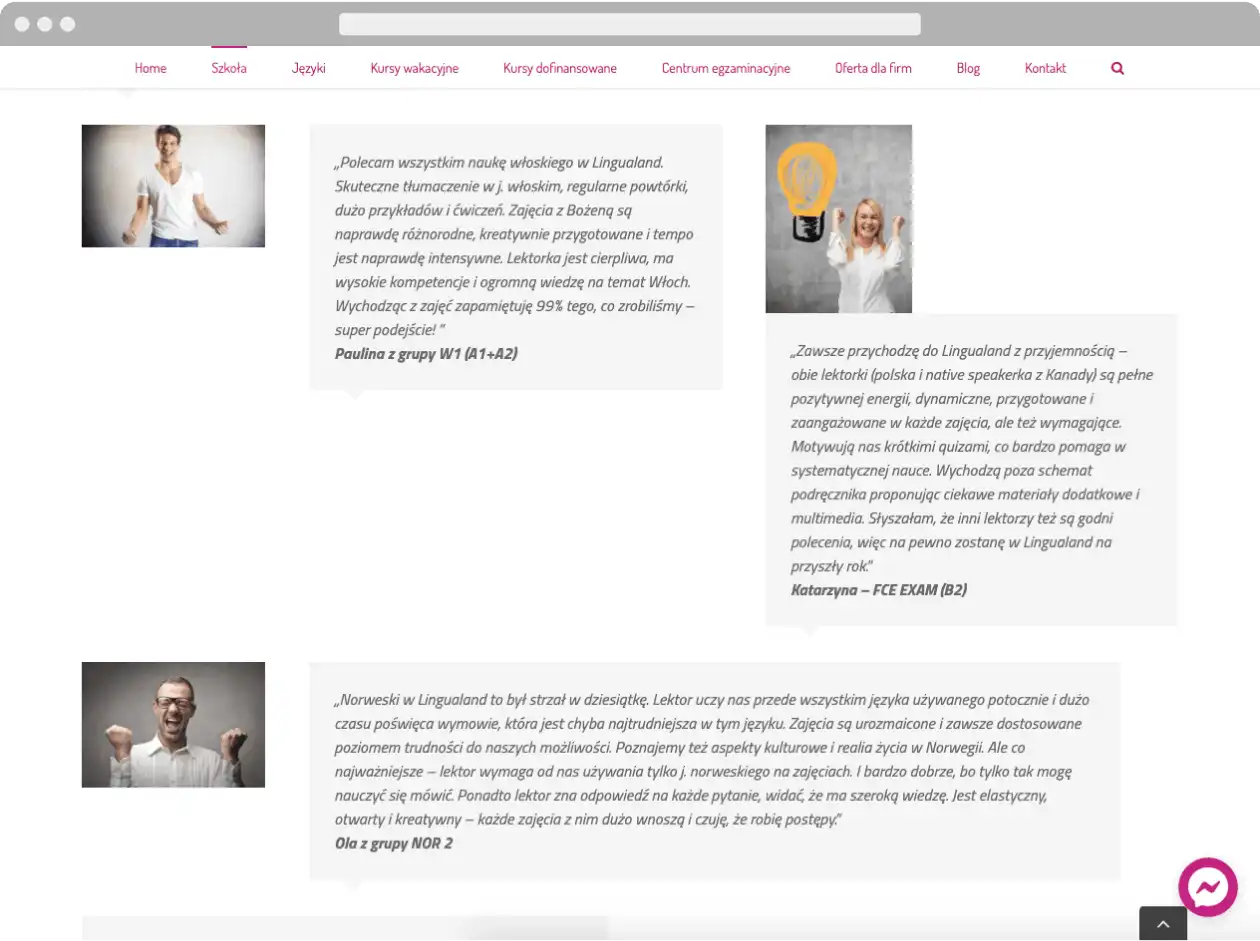
Users expect companies to use real photos of their employees (Ban on iStock!). Credible and unambiguous "recommendations from satisfied customers" ease fear and skepticism because customers feel more comfortable contacting a company that others have checked.


Third conclusion. Avoid content full of official statements, and photos
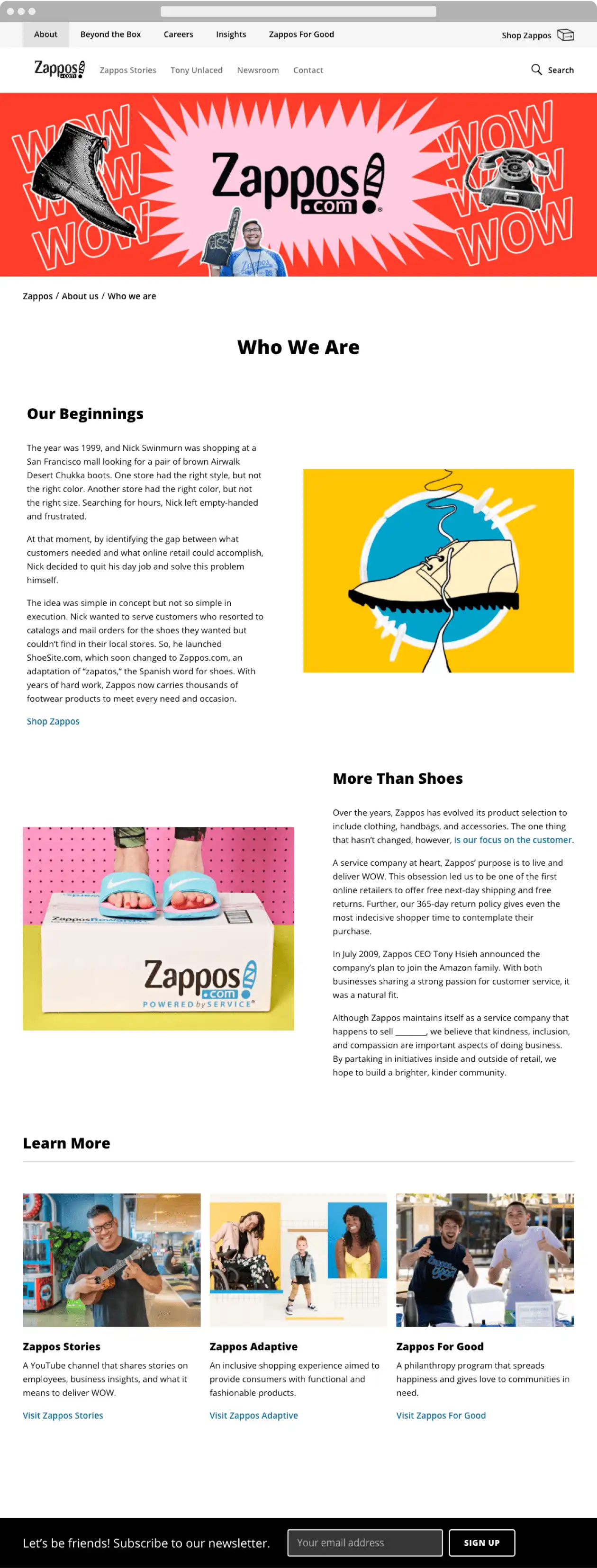
Users are tired of websites overloaded with official content. Zappos' website uses simple language and emotions to tell its story.
The "friend" image is emphasized at every step of the company's communication — in pictures, illustrations, and text. To leave no doubts, Zappos finishes the About Us section with a newsletter subscription form and CTA (call to action) "Let's be friends! Subscribe to our newsletter."
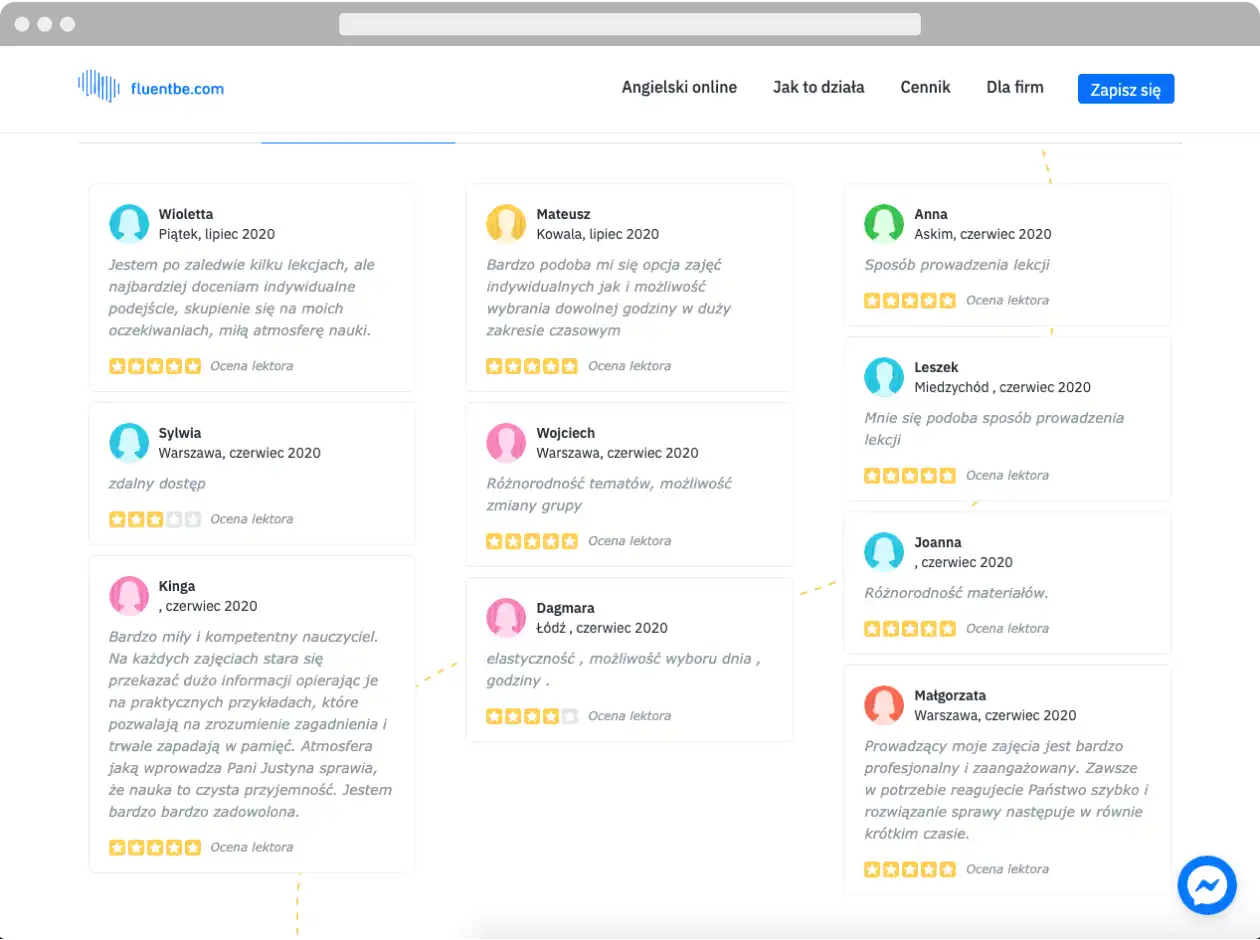
Fourth conclusion. When presenting the opinions of customers, don't choose only those with 5 stars
Users don't always trust what the company's website says. That's why they verify information on social media, portals with opinions, and browsers.
Users know perfectly well that you can censor customers' opinions shown on the About Us page. A site showing only positive opinions inspires uncertainty and "triggers" limited trust. That's why Jakob Nielsen recommends balance — presenting honest opinions and also referring to places where customers can check more reviews about the company.

Fifth conclusion. Answer the justified skepticism of users
The skepticism of users isn't a coincidence. Data protection violations, online fraud, and other negative user experiences with online sales have become a daily occurrence for all of us. It's worth not forgetting about that.
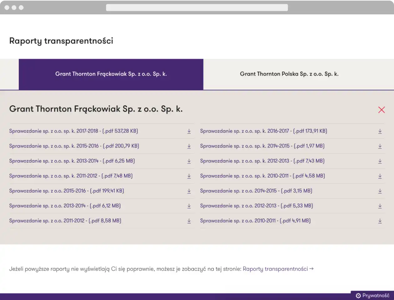
Websites, online stores, transactional portals, and portals with online services need a strong About Us section. Users often wonder who stands behind the business, how it's financed, and if it's credible.
Here are some of the most frequently asked user questions:
- If I order a product, can I trust the company to deliver it to me?
- Will the company refund the money if the product is in bad condition?
- Will it send me spam if I leave my contact information?
- What portion of the donation to the nonprofit organization will be used for the cause rather than administrative fees?
Sixth conclusion. The size of the company influences how it's perceived
Naturally, it depends.
According to a study, users believed they would get support, better convenience, and better prices more often from large companies than from small ones. They attributed their concern to the belief that small companies will have lower reliability than large ones. Meanwhile, just as many participants were skeptical of large companies, as they felt they would be less honest and helpful than small ones.
What about you? Do you prefer small or large companies?
Seventh conclusion. Explain what you are doing
The website needs to explain what the company does, and its content should exhaustively answer this question. It seems obvious, but for many organizations, it's a challenge. Often companies avoid details to stay open to various options for business cooperation. Many companies use jargon and difficult-to-understand words. Too often, companies mistakenly assume that users understand their business.
Here it is worth adding "not always." Using jargon in the B2B industry allows companies to inspire trust and attract customers.
For example, we say that we are a UX agency and a web development company. We intentionally use these phrases — we want customers who are looking strictly for UX and web development. In the second sentence, we explain that we have been creating websites and dedicated applications for companies through product design and UX design since 2009.
You may think we are making a mistake by using jargon terms such as "product design" and "UX Design." Perhaps. Whereas we know how hard it is to work with customers who don't know what our methods are and the added value they bring. Thus, we sift the web queries that come to us.
The most common mistakes in presenting the company on the About Us page:
- Hard to find critical information, e.g., contact details, email address
- Content without content
- Photo galleries
- Blocks of text
- Cluttered interfaces
- Inadequate selection of font size, color, and contrast
- Assaulting sales tools
- Failure to adapt the layout to mobile devices.
What positively affects the reception of the company presentation and the About Us page:
- Graphic design consistent with the company's image and appropriately selected content
- Authentic photos
- Simple layout and consistent structure of navigation on desktop and mobile
- Easy to find contact details, addresses
- It's worth presenting the company's social activities
- Recommendation from reputable sources (rankings, trade communities, catalogs).
Instead of a summary
In the report, I found a fragment of a statement from one of the respondents taking part in Nielsen's study that captures the heart of the matter.
I was recently invited to a job interview. While preparing for the recruitment meeting, I looked at the website. I looked at the mission statement, the customer list, how they describe their products and their employees. I look at it and feel that if they hired a high school student to make a website, I don't want to work for such a company.
If that's how a potential employee thinks about the company, what does a potential customer think?
After reading this article, we encourage all those who still don't quite know how to present their company and employees on the website to contact us. We know Nielsen's report from cover to cover and use it in our work every day.
I invite you to keep an eye on our blog because soon, there will be an article on how to inspire trust and portray the most important people in the company on the website. As well as how to create an interesting description of the company and team while keeping in mind the positive experience of the recipient. See you soon!


