Maruta Wachta is a Polish law firm specializing in IT projects. In addition to winning cases and legal advice, Maruta Wachta's lawyers are known for their training activities.
Our goal was to design a website that would sell the law firm's training offer. Clearly according to the needs, with the possibility of making a purchase. In a word, an online store where you can buy a good deal of legal knowledge in the field of IT projects.

We analyze the offer. We take the list of the clients' trainings and filter it from the point of view of the user’s needs.
Trainings are divided into categories:




Translation into the interface:




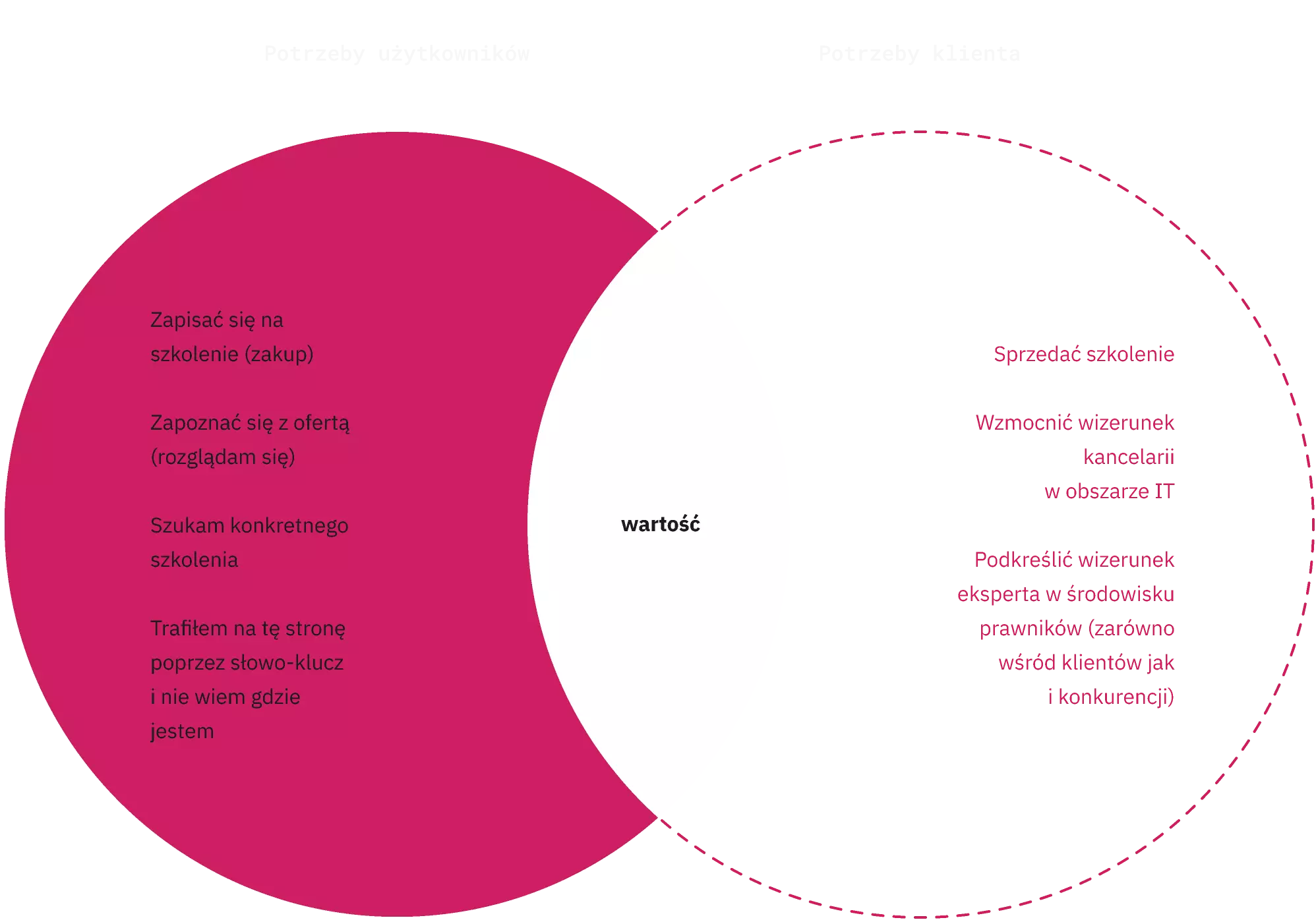
We select four basic user stories for customers who visit the training store: the basic scenario "I want to buy", the alternative scenario "I am looking for a specific training", "I came by accident" and "I am looking at the offer, but I am not looking for anything specific". We write down each user story into user flows and determine what the content of the website and its map should be.


"Law school unlike any other" allows us to distinguish the law firm's offer from others. There are a number of negative associations about legal training that result from the specifics of this profession and teaching method. We want to highlight a new approach and a different way of conducting classes.

We transfer the experience of training participants into the online world.
The search for training often takes place on the way to work or home. Sometimes during a meal, boring lecture or meeting. We are sure that the share of mobile users will be significant. At the same time, we cannot imagine designing differently than starting from a smartphone (mobile-first).


