Jakob Nielsen, a famous usability expert and founder of the Nielsen Norman Group, has created 10 principles that we should follow when creating websites.
You may have already read about the first five in Krzysztof Jarocki's article, but now we invite you to read part two, from which you will learn about Jakob Nielsen's remaining heuristics.
Heuristics 6. Let users choose instead of forcing them to remember
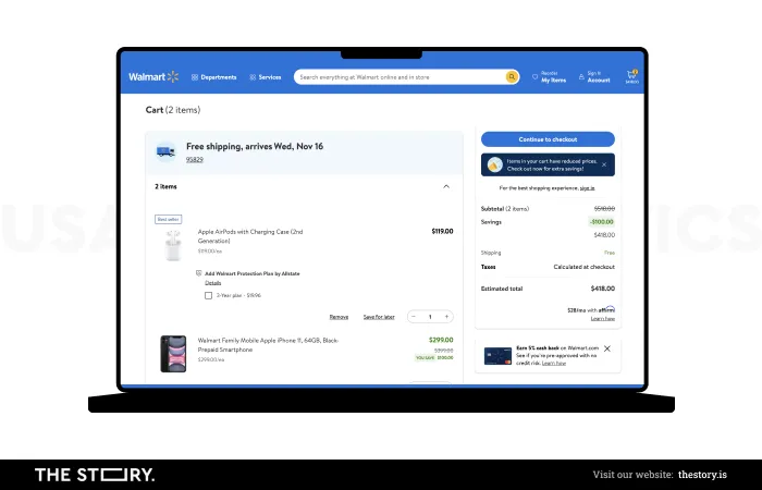
Nowadays, Internet users are lazier than ever. So it would be naive to think that they will go to our website and try to remember the information on it.
Let's imagine that a customer places an order in an online store. They're already halfway through the process when they find that to proceed to the next step; they need to check the information on the previous subpage, such as the product weight.
That may result in the abandonment of further purchases. So let's make the site as readable as possible. We should ensure that a user can handle its operation through visual elements, for example, functions in the form of icons.
Heuristics 7. Ensure flexibility and efficiency
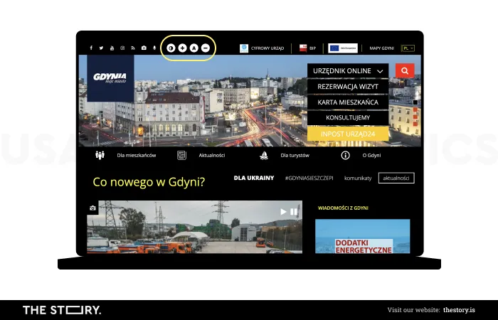
Every user is different – a lot depends on how smoothly they can navigate the web; their habits or health condition are also significant.
In such a situation, our task is to make a website flexible enough to make as many users as possible feel comfortable on it.
For example, we should consider the option of changing the font size, which makes the information more readable for everyone.
Although the Ctrl + (or Command +) keyboard shortcut allows us to enlarge a window on our own, not everyone knows about this option. In addition, we have to pay attention to the loading time of a site – the shorter it is, the greater the chance of keeping an Internet user.
Heuristics 8. Be mindful of aesthetics and moderation
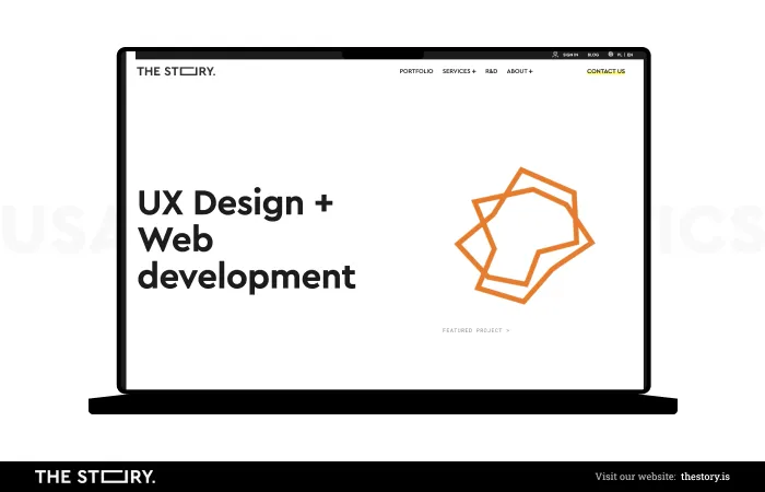
Statistics prove how much eye-friendly design matters nowadays. It only takes 50 milliseconds for Internet users to form an opinion about our website – it's when they decide whether to stay on it or leave it.
We have "more" time – a whopping seven seconds – to make an impression on another person.
Minimalism is now leading the charge in web design – too many elements are visually repellent and make it difficult to navigate a website.
Heuristics 9. Ensure effective handling of errors
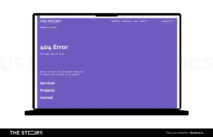
When an error occurs on a website, the user must be given a clear message that they can take further action, such as using a search engine or looking at a site map to help them navigate.
We should use simple language and suggest a solution. At the same time, we should remember that we don't want Internet users to think that the appearance of the error was their fault.
Heuristics 10. Provide assistance and documentation
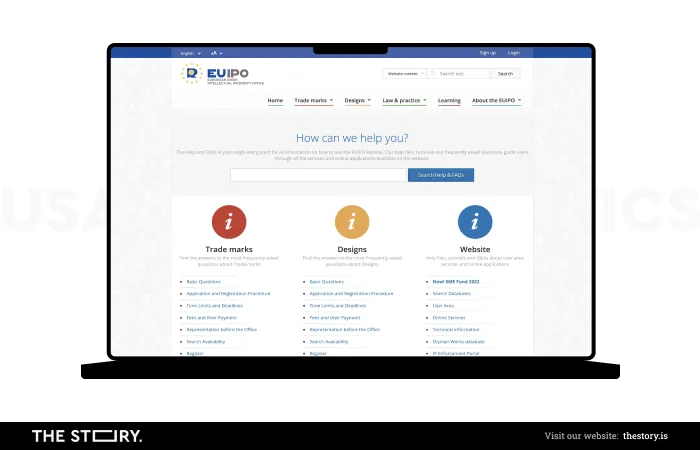
It is worth keeping in mind that even the best-performing website can cause problems for a user. Therefore, helpful information should be easy to find.
Among other things, a FAQ section or a glossary of difficult terms comes in handy, although if you already use such words, it's best to explain them alongside the text.
When we blog, we should post links to other related articles, which will give a reader a complete picture of an issue.
Image in the title: YouTube/NNgroup


