
Functional attributes are a strong currency and market differentiator of any digital product whose performance — regarding results and process fluidity — is a priority.
However, other elements like branding or aesthetics also determine user satisfaction.
When designing mobile applications, we can't forget about other features and prioritize functionalities only. It's equally important how a mobile app looks and what emotions, attitudes, and reactions it evokes.
Even the most functional digital product won't gain a crucial market position if it is neglected in terms of aesthetics, emotion, personality, and branding.
It's worth remembering the fundamental principle that products we like, find attractive, and arouse positive emotions in us are considered more functional.
Even if we look at them objectively and observe that they're, for example, inefficient or slow.
We arrive at the key questions we'll address in this article.
How to design look and feel for digital products and mobile applications? What goals should UX/UI designers set for look and feel?
What exactly constitutes the look and feel of a mobile application? What is the scope of these problems, and how should they be dealt with?
How to define the most optimal look and feel for a mobile application?
Well, enough questions. It's time to answer them!
We invite you to read on!
What is the look and feel?
Before we move on to the definition of look and feel, let's recall a remark made in the article "User Interface Design," published on the Interaction Design Foundation website.
The article's authors are conscious that mobile app design, digital product design, and UI design are processes in which UX/UI designers should also focus on appearance and style.
Designers should create interfaces that users find easy to use and enjoyable, evoking positive emotions and attitudes.
Combining these two goals can only create a product that addresses complex and multidimensional needs.
End-user interfaces should be equally:
- Useful
- Sympathetic
- Pleasant
- Satisfying
- Frustration-free.
At the same time, they should effectively communicate a brand's values (not only literally but also through other elements that affect a user, such as colors or forms) and strengthen users' trust.
Look and feel in UI and web design is often defined as a set of features of a digital product (e.g., a mobile app) that significantly impact users' reactions. It concentrates on the visual and interactive aspects of digital products.
In other words, look and feel is about how an interface's visual appearance and workings affect emotions.
In the Techopedia dictionary, look and feel is defined as selected visual aspects of user interface appearance and style.
The look and feel consists of the following elements:
- Colors
- Forms and shapes
- Layouts
- Typography
- Web controls (such as text fields)
The look and feel of a web or mobile app also refers to:
- The structure and layout of elements (which is evaluated not only in terms of functionality but also aesthetics).
- Aesthetic taste.
When looking at "the look" from yet another perspective, we can say that this concept refers to the appearance of a mobile application (the arrangement of elements within a single screen and a sequence of screens following one another).
Looking at "the feel" from a different perspective, we can say that the term refers to the impressions users experience when interacting with a mobile application.
Look and feel is a unique way of combining and using elements and defining functional relationships and aesthetic interface elements (such as size, proportions, and color schemes).
Appearance, aesthetics, and the impressions emerging during the interaction heavily influence users' responses to a mobile app.
The look and feel has an impact on the following:
- Branding elements (it helps identify a brand and express its personality)
- Image (assigns certain values, goals, roles, and meanings to a brand)
- Performance and ease of use (by using dominant design conventions)
By considering the look and feel in the design and creative process, it's possible to make a digital product, a mobile application, not only useful, practical, and needed but also to give it a personality, thanks to which a peculiar bond is created between an application and a user.
A mobile app allows us to perform tasks and adds unique value to their performance.
It offers something that other functionally similar mobile applications don't.
The look and feel allows us to think about the product in terms of personality and what kind of impression it's supposed to give.
A product can be perceived as:
- Modern or old-fashioned, traditional
- Serious or informal
- Approachable, casual, inclusive or hermetic, occasional, exclusive
- Masculine or feminine
- Aimed at young people or aimed at older people
- Hard or soft
- Innovative or conventional.
Of course, the above list is an example. There are many more dimensions of personality, traits, attributes, and values. Their hierarchy and number depend on a project and the effect a mobile application wants to achieve.
The characteristics we want to assign to a particular digital product also depend on the contexts in which users will use it, the role it will play in their life (e.g., whether they will use it for personal or professional purposes), business objectives, as well as on characteristics (social, demographic, cultural) of its end users.
By taking care of look and feel, we can control an app's impact on users and direct their feelings and reactions.
UX design, UI design, and thinking in terms of look and feel allow us to control the impact of an isolated factor, element, or characteristic (such as color, shape, or size) and the specific configuration of such features.
Awareness of how various elements interact with mobile app users individually, in pairs, in groups, and in broader arrangements is essential for offering a positive user experience.
Moreover, look and feel allows us to position a mobile application, especially if it's a standalone product that doesn't belong to a product family or isn't from an extensive portfolio.
Mobile application development — the role of crucial look and feel elements
It's time to examine the crucial aspects responsible for the look and feel of mobile apps more closely.
Design conventions and look and feel
No mobile application is currently developed in a design or market vacuum. That's why UX/UI designers must consider future users' expectations, which will be based on their past experiences.
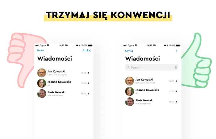
Design conventions (ways of solving functional problems) have developed in every industry and for every application type, constituting a particular norm for users.
Referring to design conventions is a way to meet expectations and create a perception that an application is easy to use and requires no effort and time to learn how it works.
Patterns familiar to a user should also be familiar to a visual designer. Reinventing the wheel is unnecessary.
Especially since there are widely accepted "manuals" in the form of standards offered by the two largest mobile app-providing platforms: the Human Interface Guidelines from Apple and the Material Design from Google.
The impact of icons, graphics, illustrations, and photographs on the look and feel
Icons that are a visual representation of functions (e.g., a trash can icon commonly signifying the delete function), colors that suggest states (e.g., red representing an error), and shapes (e.g., rectangular buttons) have also become conventionalized.
Skeuomorphism is a technique for increasing the communicability of buttons.
The website's visual design of screens, in which graphic elements (e.g., illustrations) are combined with photographs, animations, and audiovisual materials, is something natural.
Websites rich in visual elements but not overloaded with them, created by following the latest visual, aesthetic, and design trends (e.g., Flat design), are seen as professional, credible, and inspire trust.
How important are the color scheme and color saturation in look and feel?
Colors especially affect human emotions.
To users, they represent a message that is simultaneously:
- Emotional (e.g., stimulate, soothe)
- Informational (e.g., suggest meanings, roles, and functions)
- Instructional (e.g., together with the shape, they suggest how to use a given functionality)
- Appealing (e.g., they prompt users to perform an action)
Colors are a message, a way of creating perceptions, attitudes, and emotions that facilitate the creation of interfaces. They suggest status, role, function, meaning, value, and targeted audience.
When shaping the look and feel of a mobile application in terms of color, the following are of particular importance:
- A defined color palette (a set of leading, accent, and complementary colors)
- Color intensity, brightness, and saturation
The role of animation in shaping the desired look and feel
We wrote more extensively about the role of animation in design and about offering a positive user experience in a separate article, "Motion Design."
In the case of look and feel, consistency between an application's defined personality and its moving exemplification is vital, which makes interface design problematic. Expressing values, characteristics, attributes, and roles through movement or narrative is difficult.
At the same time, the benefit is enormous, as users greatly appreciate animations for their greater visual appeal (compared to static graphics and/or images) and because they're more communicative and useful.
Animation allows us to convey the characteristics of a brand or an application that are difficult to communicate with words, graphics, or photos.
The dynamic of changes, perspectives, viewing angles, and elements set in motion simultaneously suggest what an application is and is not.
Language, tone, style, the form of communication, and its importance in look and feel
It's very important to communicate with users in a way that adjusts the style, tone, form, and language (e.g., formal, colloquial), whether it is correct or relevant to the mobile application's functions and purposes.
The language makes an application understandable, friendly, sympathetic, and likable. How we speak to users affects how they perceive us, their attitudes toward us, and their bias toward our application.
Whether they want to stop using it as soon as possible, or on the contrary, they feel comfortable with such communication.
Language helps:
- Define social and emotional distance
- Reinforce authority
- Position a mobile app
- Select users
- Build understanding (e.g., with allusions, quotes)
- Determine a brand's relationship with itself and its users.
Usability of a mobile app and look and feel
Usability is a message!
The speed, reliability, seamlessness, logic, accessibility, efficiency, and helpfulness of an application, interface, and mechanisms are the litmus test for branding.
If an application positions itself as modern and fast but works like it is outdated and slow, we'll never achieve the desired image.
The impact of typography on look and feel
Family, typeface, and font size. Font combinations. Matching the font to a function and role (text block, headline, label). Font readability. Adequacy in terms of industry, type of service, and functionality.
All these issues must be considered if we don't want the look and feel to be random and inconsistent with our intentions, goals, and expectations.
The typography used also plays a part in building personality, communicating values, or facilitating using a mobile app.
This is especially true since mobile device screens' size, resolution, and mode (portrait mode vs. landscape mode) are essential and can be a source of satisfaction or frustration.
Look and feel of mobile applications
Mobile devices and mobile applications are governed by their own rules, as we've written many times in our Journal's knowledge path "mobile applications." This unique nature should be understood and considered when determining the look and feel.
To some extent, complementary and competing approaches to mobile application design established within the Material Design and Human Interface Guidelines are primarily focused on making the user experience in the mobile channel as satisfying as possible.
We wrote about the difference between Google's and Apple's approaches in the article "Designing mobile applications for Android and iOS."
Leaving aside the differences between these two approaches, it's worth noting what they have in common, which is significant in defining the desired look and feel.
As the creators of the Material Design and Human Interface Guidelines assure us, when designing mobile applications, it's essential to:
- Ensure harmony, clarity, and accessibility.
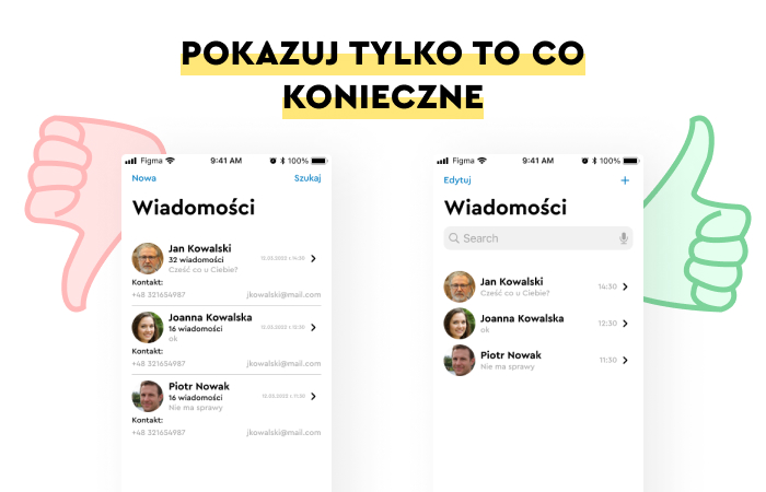
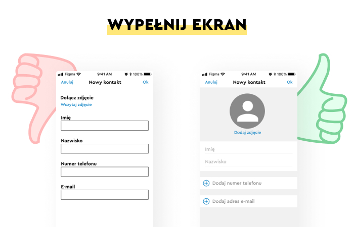
- Maintain a well-understood simplicity and readability (less is more is the most relevant principle in mobile UI design).
- Ensure predictability of how functionalities work, where they're located, and how they're used.
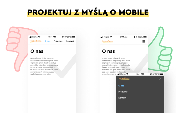
- Recognize the channel's specificity regarding the structure of needs, capabilities, expectations, and experiences. It's a high priority to refrain from creating a mobile version as a copy of a desktop version.
- Understand the limitations of the mobile channel and its specifics (screen size, tactility, interaction with the interface through gestures, and specific features available only on phones).
- Respect differences (e.g., no hovers in mobile applications).
- Remember that successful actions are more dependent on manual skills, which are determined, for example, by age.
- Consider different attitudes towards a device's operation and capabilities—mobile phones and applications installed on them are expected to respond faster to user actions.
In the case of mobile applications, elements such as color, shapes, motion, typography, microcopy, graphics, icons, speed, reliability, interface consistency, and microservices (task-oriented design in general) are becoming particularly important.
How to design a mobile look and feel? Summary
- Mobile applications should be equally refined in functional, aesthetic, emotional, and branding dimensions.
- UX/UI designers should also pay attention to the user interface's appearance, aesthetics, and style.
- Look and feel can be defined as a way of connecting, using elements, defining functional relationships, and using aesthetic interface elements.
- The overall aesthetic appeal and the impressions and emotions that emerge during the interaction influence users' responses to a mobile app.
- Activities regarding look and feel are primarily used to shape a mobile application's branding, image, and efficiency.
- Look and feel, considered in the design process, allows us to give a mobile application personality, creating a bond between an application and a user.
- The characteristics we want to assign to a particular digital product depend on the contexts of use, the role it will play in a user's life, business objectives, and the social, demographic, and cultural characteristics of its end users.
- Thinking in terms of look and feel allows us to control the influence of an isolated factor and a specific configuration of characteristics.
- Referring to design conventions is a way to build a perception that an application is effortless to use.
- Colors especially affect human emotions.
- Colors are a message that creates perceptions, attitudes, and emotions. They suggest status, role, function, meaning, value, and target audience.
- In the case of look and feel, consistency between an application's defined personality and its moving exemplification is vital.
- Animation allows us to convey the characteristics of a brand or an application that are difficult to communicate with words, graphics, or photos.
- It's of great importance to communicate with users by adjusting style, tone, and form of language.
- Speed, reliability, seamlessness, logic, accessibility, and efficiency are the litmus test for branding.
- The typography used also plays a part in building personality, communicating values, or facilitating using a mobile app.
- In the case of mobile applications, elements such as color, shapes, motion, typography, microcopy, graphics, icons, speed and reliability, interface consistency, and microservices are becoming particularly important.


